
More Related Content
What's hot
What's hot (18)
Viewers also liked
Similar to Question 1
Similar to Question 1 (20)
Recently uploaded
Recently uploaded (18)
Question 1
- 1. Question 1 Of Evaluation In what ways does your media product, use, develop or challenge forms and conventions of real media products?
- 2. There are many different forms of conventions for media magazines and for each a front cover, contents page and double page spread they are all different. I have tried to follow along with the conventions of each product because this makes it look professional and it shows I understand the conventions of a real media product. The following conventions are for each product: Front Cover Conventions: Masthead Barcode/Price Main Feature Stories Feature Stories Main Image Plug Date and Issue Web Address Contents Page Conventions: Main Feature Story Subheadings Images Contents Heading Feature Stories Regulars Columns Subscription Page Numbers Double Page Spread Conventions: Main Image Drop cap Pull quote Main Article in Columns Page Numbers Stand First
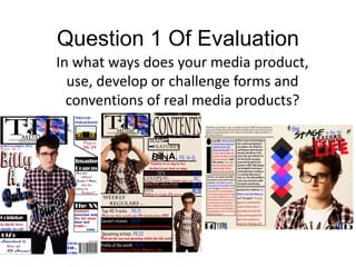
- 3. Front Cover A front cover page is exactly what attracts reads in the first place because if the front cover doesn't look interesting then readers wont be interesting in a product, so this is one of the most important factors you have to remember that it needs to look colourful and attractive. Here is my front cover page: For my front cover I have tried to follow the convections of one as best as I can and I have succeed following the convections of a front cover page. I have included everything that I listed before and I have made it look presentable and attractive to look at. I have chosen the simple colour scheme because red, black and blue all stand out from white so this is a good contrast with one another. I have chosen feature stories related to my genre which is Indie, these collaborate to express the genre, also most of these bands are on the rise so this creates a niche market audience because these bands aren't really aimed for a mass audience other than Coldplay. . I have chosen 3 different font types which I have used continuously through my products. I created the logo myself on Photoshop, I created it to look quite British in relation to the colour scheme, TIE is abbreviation of This Is England so this is an English magazine.
- 4. Masthead Main Feature Story Plug Barcode/Price Feature Stories Main Image Date and Issue Web Address
- 5. Contents PageThe content page is where the reader can find all the information they need and to find where what interests them on which page. This is the page were readers can decode what they want to read and not, this is an important page, it needs to be full of information. This is my contents page, I have followed most of the conventions but I also challenge some. The ones I have challenged are the columned layout, subscription and the editors letter. I believe that the contents page should be there for information and page numbers that's why I haven't included them because I could add more features like another image or the regulars. However I have followed the remaining conventions like including all the feature stories that were included on the front cover, it is important to do this because if the reader only wishes to read one individual story and it isn't featured on the contents page they will have to go through the entire magazine to find it and this isn't good customer service and can put mistrust into a product, so that’s why you include the stories that are featured on your front cover. I have included main headings and I have made the main feature story bigger than the rest, this is to show the reader that this is the main story and the most important from the other ones. I have also included weekly regulars because this entices people to continue reading because these may interest them in some way plus it shows that my product can follow conventions. I have followed the same colour scheme but have changed the background colour, I have changed the background colour because on the front cover it was used to attract the interest of the reader but this new background makes everything look a bit more indie because other magazines wouldn't change the background colour so I am challenging this convention to show that my product is for a niche and indie target audience.
- 6. Subheadings Images Contents Heading Main Feature Feature Stories Page Numbers Regulars
- 7. Double Page SpreadA double page spread is where all the information is needed for your main feature story and easily has to be one of the most visually stunning products. I have followed all the conventions for a double page spread because the information on a double page spread has to be accurate. I have chosen to do a medium close up shot and make my model look at the camera because I believe this creates a direct mode of address with the audience and creates a bond like no other. I have structured the article in columns because this makes the product look professional and it makes the article look more presentable and make sit easier to read. For this article it is a Q&A and to show this I have picked red and show this I have picked red and blue text to make it clear to the reader that when I am asking a question it is blue and when Billy is answering it is in red, this adds a bit of an indie style to it also because most magazine would not do this. I have included a drop cap to indicate to the audience that this is were the article starts. The symbols down the middle is a connotation of life that one thing just overlaps each other and that we always worry about something else than another thing, this reflects the article because Billy is talking about getting his life back onto track, this also adds an attractive side to it because the magazine would be folded in half so it make a symmetrical shape creating an indie style to the article. This is my double page spread, I have followed all the conventions for the double page spread. On all magazine double page spreads they have an image that takes up at least a quarter of the page and I have done this with my magazine,
- 8. Main Image Drop Cap Main Article In Columns Page Numbers Pull Quote Stand First
- 9. Consistency In a professional real media product consistency is one of the main features that you have to take into consideration. This is because some readers don't like change, some readers like the way things are so it is important to always think about consistency, because if you don't you may loose out on long term subscribers who don't like the change unless they know that its a regular thing that the product does. There are a couple of main things that need to be consistent throughout a magazine: The same colour scheme all throughout the magazine The same font Page numbers matching with the page These are three of the main three features that have to consistent throughout the magazine it is the conventions of the magazines. I have followed these conventions through by using the same fonts, colour scheme and the page number matching the contents page, I have also added a few other consistencies that I will show you.
- 10. Consistent Colour Scheme Throughout my three main products, I have used the colour scheme of white, black, red and blue. I have used these colours because they stand out from on another and makes a good contrast. The only thing I have changed has been the colour scheme and I explained this earlier on by showing the audience that this is an indie genre so it does different things from other genres. I chose this colour scheme because it matches with the UK flag which are these colours, other than black, to show to the reader that this is an English made magazine.
- 11. Consistent Fonts Throughout my main products I have used three different fonts which include: Baskerville Old Face Magneto Agency FB These are the 3 main fonts that I used throughout my media products. Using the same fonts throughout is a convention of media products. You use the same fonts throughout because it shows that the fonts are used for this particular issue of the magazine. I used these three fonts because they are all different and all are quite unique. They are easily readable fonts and all look quite ‘indie’ which reflects the genre.
- 12. Consistent Page Numbers It is important to have consistent page numbers that are featured in your contents page, because if the page numbers don't match with the contents page then the reader will have to look through the whole magazine to find the one thing that they wish to read and that will be annoying and frustrated for the reader. However by having consistent page numbers you can reduce this stress and anger because they will be coordinate with the contents page. I have followed this convention by coordinating my double page spread with my contents page and this shows my products follow the conventions and is consistent.
- 13. Consistent Images Now this isn't a nesserscary consistency but I thought about this and I believe it makes the product look more professional. Every image that I have used they all have direct address to the readers. As I said before I believe doing this creates a bond like no other with the artist and the reader, it makes the reader feel special because it looks like they are looking at you and only you. This isn't normally a convention of a media product but I thought this would be beneficial because it creates a bond and this makes the reader more intrigued with the magazine and this can decide whether they buy the magazine or not.