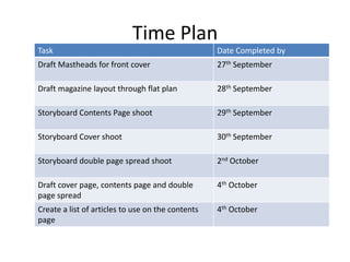
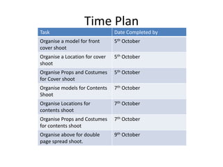
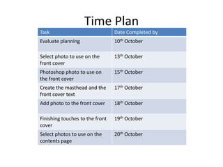
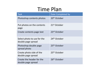
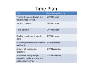
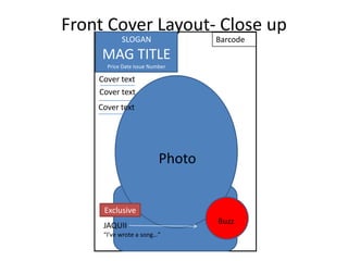
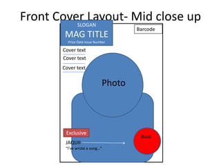
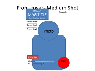
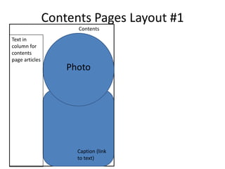
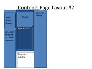
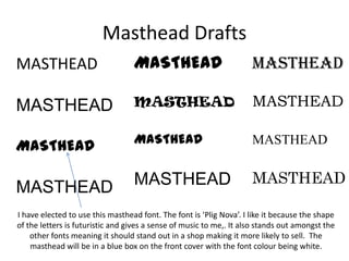
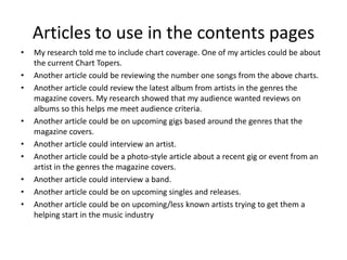
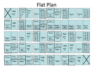
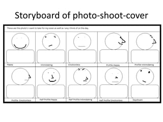
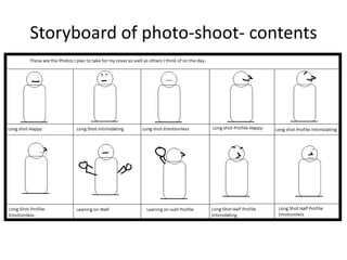
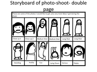
2. Time Plan
Task Date Completed by
Draft Mastheads for front cover 27th September
Draft magazine layout through flat plan 28th September
Storyboard Contents Page shoot 29th September
Storyboard Cover shoot 30th September
Storyboard double page spread shoot 2nd October
Draft cover page, contents page and double 4th October
page spread
Create a list of articles to use on the contents 4th October
page
3. Time Plan
Task Date Completed by
Organise a model for front 5th October
cover shoot
Organise a Location for cover 5th October
shoot
Organise Props and Costumes 5th October
for Cover shoot
Organise models for Contents 7th October
Shoot
Organise Locations for 7th October
contents shoot
Organise Props and Costumes 7th October
for contents shoot
Organise above for double 9th October
page spread shoot.
4. Time Plan
Task Date Completed by
Evaluate planning 10th October
Select photo to use on the 13th October
front cover
Photoshop photo to use on 15th October
the front cover
Create the masthead and the 17th October
front cover text
Add photo to the front cover 18th October
Finishing touches to the front 19th October
cover
Select photos to use on the 20th October
contents page
5. Time Plan
Task Date Completed by
Photoshop contents photos 20th October
Put photos on the contents 21st October
page
Create contents page text 23rd October
Select photo to use for the 24th October
double page spread
Photoshop double page 25th October
spread photo
Create photo side of the 25th October
double page spread
Create the header for the 26th October
double page spread
6. Time Plan
Task Date Completed by
Type first column text of the 26th October
double page spread.
Second column 26th October
Third column 26th October
Double check everything is 29th October
done
Make improvements based on 5th November
feedback
Answer all evaluation 23rd November
questions
Make sure everything is 25th November
uploaded to the website and
nothing is missing.
7. Front Cover Layout- Close up
SLOGAN Barcode
MAG TITLE
Price Date Issue Number
Cover text
Cover text
Cover text
Photo
Exclusive
JAQUII Buzz
“I’ve wrote a song…”
8. Front Cover Layout- Mid close up
SLOGAN
Barcode
MAG TITLE
Price Date Issue Number
Cover text
Cover text
Cover text
Photo
Exclusive
Buzz
JAQUII
“I’ve wrote a song…”
9. Front cover- Medium Shot
SLOGAN
Barcode
MAG TITLE
Price Date Issue Number
Cover text
Cover text
Cover text
Photo
Exclusive
JAQUII Buzz
“I’ve wrote a song…”
10. Which Design I will use
• I have decided to use the ‘Mid-Close up
design’. This is based on my research into front
covers. Most of the front covers I researched
used a medium close up as their main photo
on the cover and therefore using this
convention will make my magazine more
professional looking.
11. Contents Pages Layout #1
Contents
Text in
column for
contents
page articles
Photo
Caption (link
to text)
12. Contents Page Layout #2
Contents
Article
Front Photo
Cover
Image
Mini article
Editorial/I
ntroducti
on to the
magazine.
Contents
articles
13. Which Design shall I use?
• I have decided to use the first layout of the
contents page. This is based on ‘The Source’
contents page which effectively had two big
photo’s (or perhaps I could use one big photo)
with a relatively small amount of text. This will
make my magazine appear more professional
because it will be based on a real magazine. H
14. Double Page Spread Layout #1
Header
Column
Photo of text
Column
of text
PULL QUOTE
Column Column
of text of text
15. Double Page Spread Layout #2
Header
Photo
Column Column
Column of text
of text
of text
Column Column Column
of text of text of text
16. Which Design shall I use?
• I have decided to use the first design for my
Double Page Spread. This is because I feel that
it is an easier design for me to replicate whilst
based on my research. Most of the pages I
researched had a photo one side and text the
other so this design will make my magazine
appear more professional.
17. Masthead Drafts
MASTHEAD MASTHEAD MASTHEAD
MASTHEAD MASTHEAD
MASTHEAD
MASTHEAD MASTHEAD MASTHEAD
I have elected to use this masthead font. The font is ‘Plig Nova’. I like it because the shape
of the letters is futuristic and gives a sense of music to me,. It also stands out amongst the
other fonts meaning it should stand out in a shop making it more likely to sell. The
masthead will be in a blue box on the front cover with the font colour being white.
18. Mode of Address
• My target audience for this are fans of music as my magazine is now a
piece of multi-genre music. This means that it should be informal so it
relates to them better. My main age group is 15-24 who mostly speak
informally to each other thus emphasising the need to use informal
language.
• Magazines however don’t use words like ‘lol’ or ‘obs’ or ‘wtf’ in the text,
so to make sure my magazine is more professional it should use full
English words but maintaining the informal tone.
• The actual tone should be formal, whilst appearing casual and easy to read
as the research I conducted into this form of magazine used that style of
address to the readers. For my magazine to be as professional as possible I
should attempt to use a similar tone. This means using “talk” style
language, with correct grammar and real words.
19. Colour Scheme
• From my research I deduced that white, black, red and blue
are the main colours of text on a front cover. For this reason
my front cover will use these three colours to make it appear
more professional.
• The background of the pages in a magazine, as shown by my
research, is white with black-blue style text as they both look
professional and clearly stand out from each other, so inside
the magazine my pages will be white with black text. Maybe
an off-white could be used as this is more visually interesting
and dynamic than what plain white is.
• The masthead will be blue so that it stands out and represents
multi genre feelings, whilst the “Exclusive” box will be red so
that it stands out and attracts the audiences attention.
20. Fonts
• Most of the cover pages I researched used bold fonts
such as this but with fonts that represent the
central artist, meaning that I should use a Century
style font to keep multi-representation going as well
as an Artist theme.
• Inside the contents page and double page spread a
font like ‘Century Gothic’ was used because it is
clear to read. For this reason my contents and double
page spreads will use the font ‘Century Gothic’ for
ease of reading.
21. Articles to use in the contents pages
• My research told me to include chart coverage. One of my articles could be about
the current Chart Topers.
• Another article could be reviewing the number one songs from the above charts.
• Another article could review the latest album from artists in the genres the
magazine covers. My research showed that my audience wanted reviews on
albums so this helps me meet audience criteria.
• Another article could be on upcoming gigs based around the genres that the
magazine covers.
• Another article could interview an artist.
• Another article could be a photo-style article about a recent gig or event from an
artist in the genres the magazine covers.
• Another article could interview a band.
• Another article could be on upcoming singles and releases.
• Another article could be on upcoming/less known artists trying to get them a
helping start in the music industry
22. Flat Plan
contents Header Photo Text in Header
t Pho
Adv t Pho e t t t
columns t t t
t t t
to e e e
ert e
x
to x Photo e
x
e
x
e
Text in Photo
e
x
e
x
e Photo Photo x x x
t x columns x t t
t t t t t t
t t
Photo Header
Photo Text in Header
Adv t t t columns
e e e
Text in ert x x x
Photo Text in Photo Photo Photo Photo Photo Photo Photo
columns article article article
t t t columns article article article
Header Photo Text in Header
Adv t t columns Adv t t t
t t t t e e e
Photo Photo
ert e e e
Photo ert e e e Photo x x x
Photo x x x Text in Photo x x t
article x t t
article article t t t columns t t t
Photo Header Header
Text in Photo Text in
Adv
Photo columns Adv t t t columns Adv t t t
Photo ert Photo
e e e
ert ert Photo
e e e
Text in x x x Text in Photo x x x
Text in columns t t t t
t columns t
columns
Text in Photo Text in Header
Photo Text in
Adv Photo Text in
Adv
columns columns columns t t t columns
Photo Photo Text in Photo ert e e e Photo ert
Text in x x x Text in Photo
columns t t columns
columns t
23. Organisation of models. Contents
• I have organised
one model for
the contents
again through
text. We have
agreed to shoot
during a free
lesson on Friday
21st October.
25. Contact details of models
Contents: Megan Collins
Mobile: +4478689756966
Double Page Spread ad Cover: Joanna Oakley
Mobile Number: +447538419213
26. Costume and props- Cover and Double
Page
• No props required. To give a rock-pop style
look my model has agreed to wear a denim
jacket, dull pink top and jeans. This gives the
rock connotations whilst the pink adds the
pop element to the costume.
27. Costume and props- contents
• No props required. A green jacket would look
bold and again give mainstream music
connotations whilst expensive looking clothes
would give successful music connotations.
Quite a few teenagers wear jeans so this is an
effective way of attracting that particular
target market.
31. Reasoning
• The reason there is a range of personas and a mix
of ideas in the storyboards is so that when it
comes to producing the magazines I have a lot of
different pictures to chose from and can
therefore convey different personas easily and
am not constricted to the one personality. This
also gives me a lot of leverage with the articles as
I am not constricted to the one personality.
• My contents page only has long shots as in my
research it was mainly long shots.
32. Organisation of Location- Cover/DPS
• I feel a studio location will
work best for the cover, as
most magazines tend to use
studios for their cover pages
and using this location could
make mine appear more
professional.
• For the DPS, a vibrant
background that can be
dimmed and blurred, to put
more focus on the model
should be used. Perhaps a park
location that could be
Photoshopped into an effective
image.
33. Organisation of Location- Contents
• I feel a wall would be a simple as
it is not constricting and could
help add to the multi-genre look
which is common in these types
of photographs. And since I can
use my own wall permission
would not be required and
would therefore be simple
enough to use.
• I think the wall should be plain,
simple and clear so that it’s less
likely to draw genre conventions
from it.
34. Cover Reece Form
ACTIVITY IS THE LOCATION SUITABLE FOR ADDITIONAL COMMENTS
PRODUCTION?
Look around the location. Yes It will add to and help create
an intimidating look and will
relate to the audience.
Talk to people there, organise filming permissions. Not required as there is a studio I can use the College’s studio.
at College.
Identify the equipment you need to use. Camera I own a camera
Examine and identify any potential health and safety issues No health and safety issues as no
(Both people and equipment related issues e.g. crowd cables are used, it’s just a
numbers being controlled; using safe cabling practices and compact camera with nothing
video equipment being set up in a sensible location that else.
does not block access points or that damages the
environment or frightens livestock)
Check the position of the sun and lighting conditions. Artificial lighting can easily be Flash may be required.
manipulated.
Look for interesting shots and camera angles. As it is a studio I can experiment
with different angles and ideas.
Check the electricity supply. (For the majority of exterior No electricity supply required.
locations you will be using battery power)
Do a test sound/video recording and check for potential Sound and video will not be
noise problems (traffic noise may be a problem; is a recorded.
location on a main flight path to an airport?)
Confirm times and dates with technical crew/actors or 22nd October 2PM-3PM
anybody you are interviewing, etc.
Arrange car parking, access, loading, security, where Not required. My subjects live on the same
possible. street as me so they can walk
to the wall easily.
Make sure everybody concerned with your video Been arranged through text.
production knows what is happening and what is expected
of them when on location.
35. ACTIVITY
Contents Reece form IS THE LOCATION SUITABLE FOR ADDITIONAL COMMENTS
PRODUCTION?
Look around the location. Yes It will add to and help create a
multi genre feel.
Talk to people there, organise filming permissions. Not required as I can use one of
the walls at College or a public
wall n Henley.
Identify the equipment you need to use. Camera I own a camera
Examine and identify any potential health and safety issues No health and safety issues as no
(Both people and equipment related issues e.g. crowd cables are used, it’s just a
numbers being controlled; using safe cabling practices and compact camera with nothing
video equipment being set up in a sensible location that else.
does not block access points or that damages the
environment or frightens livestock)
Check the position of the sun and lighting conditions. Lighting can be altered and Flash may be required.
manipulated on Photoshop if
required.
Look for interesting shots and camera angles. Close up and mid shots would
work best as it is a wall.
Check the electricity supply. (For the majority of exterior No electricity supply required.
locations you will be using battery power)
Do a test sound/video recording and check for potential Sound and video will not be
noise problems (traffic noise may be a problem; is a recorded.
location on a main flight path to an airport?)
Confirm times and dates with technical crew/actors or 21sr October 2PM-3PM
anybody you are interviewing, etc.
Arrange car parking, access, loading, security, where Not required. My subjects live on the same
possible. street as me so they can walk
to the wall easily.
Make sure everybody concerned with your video Been arranged through twitter.
production knows what is happening and what is expected
of them when on location.
36. Double Page Spread Reece Form
ACTIVITY IS THE LOCATION SUITABLE FOR ADDITIONAL COMMENTS
PRODUCTION?
Look around the location. Yes Vibrant so it can easily be edited.
Talk to people there, organise filming permissions. The studio has been booked for the time
agreed with the model.
Identify the equipment you need to use. Camera, Flash
Examine and identify any potential health and safety issues No health issues.
(Both people and equipment related issues e.g. crowd numbers being
controlled; using safe cabling practices and video equipment being set up
in a sensible location that does not block access points or that damages
the environment or frightens livestock)
Check the position of the sun and lighting conditions. Lighting conditions can be manipulated by
me in Photoshop if required.
Look for interesting shots and camera angles. Lots of different mini-locations can be
used and altered to try and make it work.
Check the electricity supply. (For the majority of exterior locations you Batteries will be charged the day before.
will be using battery power)
Do a test sound/video recording and check for potential noise problems No video or sound will be recorded.
(traffic noise may be a problem; is a location on a main flight path to an
airport?)
Confirm times and dates with technical crew/actors or anybody you are T23rd October 2:15-15:15PM
interviewing, etc.
Arrange car parking, access, loading, security, where possible. Not required as there is a park near
College.
Make sure everybody concerned with your video production knows what This has been done by allowing my
is happening and what is expected of them when on location. model to see the idea storyboard I have
for shots of her.
37. Double Page Spread
• I have elected to make my double page spread
based on an interview with an artist. One of
the magazines I researched had an interview
as their double page spread so therefore this
would be good for mine.
• I will improvise the interview and use
questions that lead on from answers to try
and make it appear as natural as possible.