Integration and Automation in Practice: CI/CD in Mule Integration and Automat...
Questionnaire results
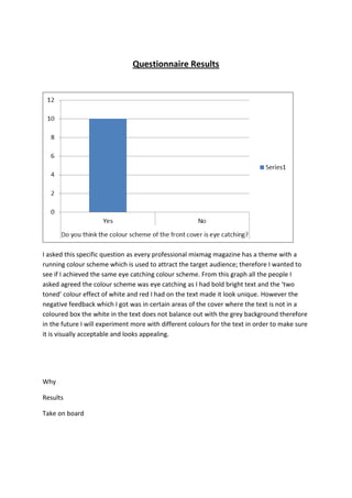
1. Questionnaire Results
I asked this specific question as every professional mixmag magazine has a theme with a
running colour scheme which is used to attract the target audience; therefore I wanted to
see if I achieved the same eye catching colour scheme. From this graph all the people I
asked agreed the colour scheme was eye catching as I had bold bright text and the ‘two
toned’ colour effect of white and red I had on the text made it look unique. However the
negative feedback which I got was in certain areas of the cover where the text is not in a
coloured box the white in the text does not balance out with the grey background therefore
in the future I will experiment more with different colours for the text in order to make sure
it is visually acceptable and looks appealing.
Why
Results
Take on board
2. This was an obvious question to ask as if the cover lines looked confusing and the audience
found it difficult to read them, and then it would evidently have a negative effect on them
and could in return turn away people from purchasing the magazine. All the people who
answered said they found the magazine easy and simple to read therefore I feel I achieved
the sector of the required task.
3. The people who I surveyed said they believed the front cover was up to a professional standard as
there are eye catching colours which stood out and made it look professional; also I had an actual
mixmag front cover while they were answering the question and said it was up to a professional
standard. However as my main image has her face covered up so the audience do not get to see
what my main image looks like therefore next time I will take a picture showing their face.
I got a positive response as the majority of the people said they would purchase this cover as it was
edited to a professional standard, and the text boxes and sentences were what would have been in a
actual mixmag cover, I asked this specific question as I was trying to achieve a professional front
cover and from the responses I got were positive. Now I have used the software and I know what
4. The people who answered this question were not dance music fans however they agreed my image
was appropriate as it had a blur effect on it, also the way my main image was dressed was a ‘urban’
style of dress which people said suited the theme of the magazine, however the negative feedback I
received was they could not see the main images face as it was covered, therefore I know next time
not to cover up my main images face up.
I got 100% positive feedback for this as the feedback I received was positive, as people said the
double effect of colours I had on the text which was red and white stood out and made it look
unique, also the fact I had a red colour theme which was bold and stood and made it look eye
catching and would make people want to purchase the magazine.