This media product develops and challenges conventions of real music magazines in the following ways:
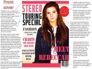
1. Common magazine design elements like headers, mastheads, cover lines, and fonts are used to look professional and establish continuity.
2. Photographs of the artist are featured prominently on the cover and inside pages following conventions, while customized elements like colors and layouts make it distinct from other magazines.
3. The contents page includes section headings, images, page numbers and a sidebar - all conforming to typical magazine style - to help readers navigate easily.