Independent Joka Escorts ✔ 8250192130 ✔ Full Night With Room Online Booking 2...
Your Media Challenge
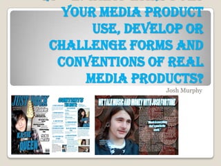
1. your media product
use, develop or
challenge forms and
conventions of real
media products?
Josh Murphy
2. Front Cover EXAMPLE
The cover image is placed to the left, which is
used in several magazines made by Kerrang
(One of my rival magazines)
I decided to have the image at the side because it
allows all of the information to be placed on one
side of the page, which I prefer to the others
which is usually b bit scattered.
The colour of my magazine is Blue, Black and White. I like
the way that blue goes with black and white, as well as the
most popular colour chosen in my questionnaire being blue.
The masthead on my cover is using the mesquite std font, I
chose this because it looks rocky and has a gothic feel. I
decided that having it large was the best way, along with
the main headline it’s the first thing that grabs the views
eyes. The title is simple and explains everything in the
magazine in just two words.
The language used in the cover lines is simple and
informal, which perfectly applies to my planned target
audience. I used a different front to my masthead, as
that font should never be used in any others, the font
used in these is Poplar std,
3. Contents page I have used four photographs in my contents page, one of which
is of my front cover for the editors note. The other three are all
relevant to the subtext related to the image, such as a guitar for
the ‘Monthly guide’ and a picture of Sean for ‘Sean's Reviews.’
I have three columns of text, each with various headlines and
subtitles with matching information with each headline. The
writing in the columns isn’t overbearing and is nice and
simple, explaining what they can expect to find inside of the
magazine.
The headings on the page stand out from the rest of the text, this
is done so that the reader will instantly recognise the
headlines, and so that repeat readers will easily be able to find
the section they could specifically be looking for and what page it
is on.
The colour scheme used on the contents page follows that off the
front cover, I did this because it is instantly recognisable which
magazine the page belongs to, and so that views would get used
to the colour and would associate the colours with my magazine.
Once again I decided to use simple, informal language for the
contents page (Just as I did for the front cover.) I chose to do
this because it welcomes people to the magazine, and so it
doesn't feel like a lecture book, more of a fun interesting read.
4. For the double pages spread I
took pictures of Josh Fortune
and placed it on the left side of
the page, for the coins in the
background I took a picture of
several coins and copied several
of these on top of each other to
give the effect of lots of money. I
used the coins because of Josh’s
second name, Fortune.
Once again I have three
columns, these are spread across
a single page as the image is
used on the other.
The heading is bring and
standout, it will be the first thing
the reader sees when looking at
the page, it mentions money
with links with Josh’s second
name and the background
image.
Again I used a similar colour scheme, but I did Unlike my contents page and front cover, the double
not implement the colour black onto the page page spread uses slightly informal language, I did
because with the coins in the background it this because the interview is informative, but at the
would not stand out, I use standout colours same time it is not to serious, so some aspects of it
and images in my magazine, so it would not be are informal, so it’s still enjoyable and not a chunk of
keeping with the tone of my magazine. text from a school book
Double Page Spread