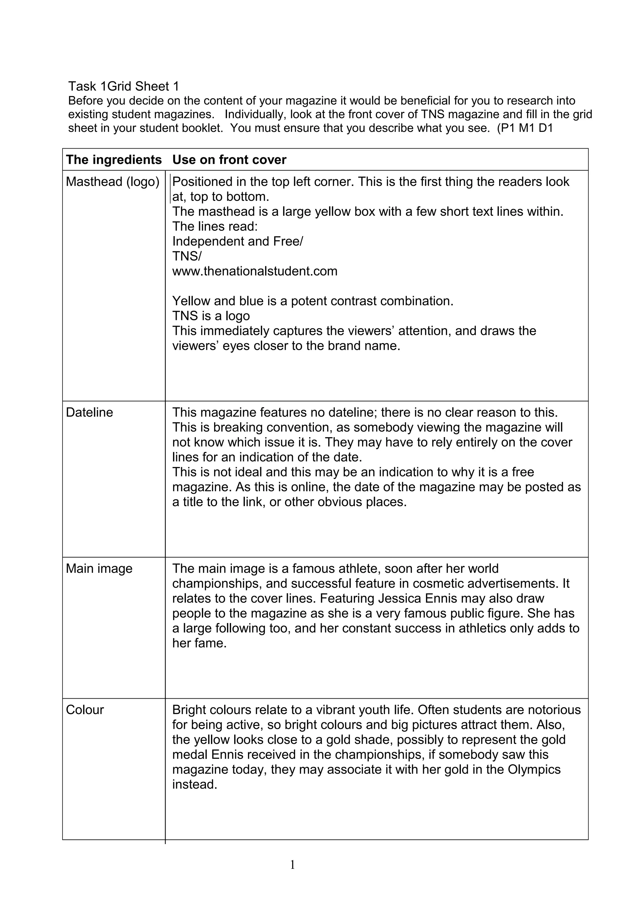
This document provides a grid sheet analysis of the front cover of the TNS magazine. It describes the key elements seen on the cover in detail, including the masthead, dateline, main image, colors, cover lines, left third, barcode, and selling line. The analysis notes how each element is designed and positioned on the cover, and how the choices relate to conventions and help attract readers, particularly students. Overall, the summary analyzes the cover design and highlights how it aims to appeal to its target audience.


![1 detailed class analysis of music magazine one nme[1]](https://cdn.slidesharecdn.com/ss_thumbnails/1detailedclassanalysisofmusicmagazineonenme1-131009061108-phpapp01-thumbnail.jpg?width=640&height=640&fit=bounds)


