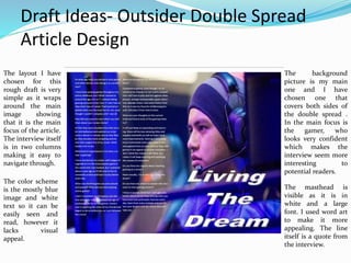
The document contains multiple draft layout designs for the front cover, content page, and article pages of a magazine.
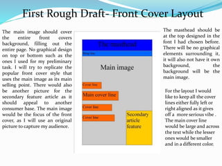
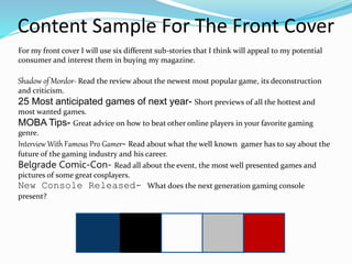
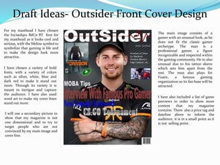
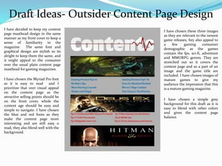
For the front cover design, the author experiments with different masthead styles, fonts, image placements, and additional elements. They receive feedback to simplify the design and improve readability.
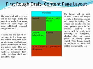
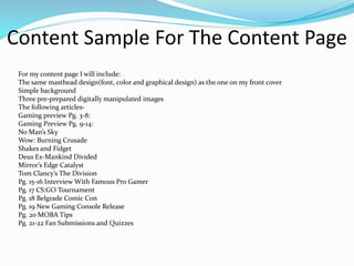
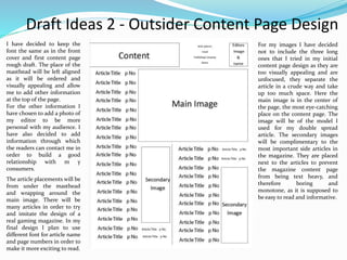
For the content page, the author tests different masthead designs, background styles, image selections, and font choices. Feedback notes the designs could be more visually appealing and professionally formatted.
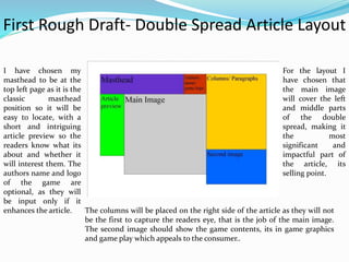
In later drafts, the author makes adjustments like modifying backgrounds, image framing, masthead placement, and contact information to create a more cohesive, reader-focused magazine layout.
Analysis of existing Media Studies short films-
Introduction
Analysis of 'A Vida Doce'
Analysis of 'Aqua'
History of Short films
Short film codes and conventions
Shooting a short film
Development of initial film idea-
Introduction
Potential film ideas
Evaluation of film ideas
Chosen idea
Genre conventions
Brain storming
Film idea- initial synopsis
Inspirational stimulus
Film idea- developed synopsis
Evaluation
Pitch-
Introduction
Mood board
Target audience
Film Synopsis
Camera style
Locations
Characters
Film budget
Taglines
Target audinece
Endorsements
Media concepts and theories
Evaluation
White wonder, Work developed by Eva TschoppMansi Shah
White Wonder by Eva Tschopp
A tale about our culture around the use of fertilizers and pesticides visiting small farms around Ahmedabad in Matar and Shilaj.
7 Alternatives to Bullet Points in PowerPointAlvis Oh
So you tried all the ways to beautify your bullet points on your pitch deck but it just got way uglier. These points are supposed to be memorable and leave a lasting impression on your audience. With these tips, you'll no longer have to spend so much time thinking how you should present your pointers.
Dive into the innovative world of smart garages with our insightful presentation, "Exploring the Future of Smart Garages." This comprehensive guide covers the latest advancements in garage technology, including automated systems, smart security features, energy efficiency solutions, and seamless integration with smart home ecosystems. Learn how these technologies are transforming traditional garages into high-tech, efficient spaces that enhance convenience, safety, and sustainability.
Ideal for homeowners, tech enthusiasts, and industry professionals, this presentation provides valuable insights into the trends, benefits, and future developments in smart garage technology. Stay ahead of the curve with our expert analysis and practical tips on implementing smart garage solutions.
2. First Rough Draft- Front Cover Layout
The main image should cover
the entire front covers
background, filling out the
entire page. No graphical design
on top or bottom such as the
ones I used for my preliminary
task. I will try to replicate the
popular front cover style that
uses the main image as its main
selling point. There would also
be another picture for the
secondary feature article as it
should appeal to another
consumer base. The main image
would be the focus of the front
cover, as I will use an original
picture to capture my audience.
The masthead should be
at the top designed in the
font I had chosen before.
There will be no graphical
elements surrounding it,
it will also not have it own
background, the
background will be the
main image.
For the layout I would
like to keep all the cover
lines either fully left or
right aligned as it gives
off a more serious vibe .
The main cover line
would be large and across
the text while the lesser
ones would be smaller
and in a different color.
3. First Rough Draft- Content Page Layout
The masthead will be at the
top of the page , using the
same font as the front cover
masthead. there might be
some additional graphical
designs around it.
The layout will be split
between content and images
to make it less monotonous
and more intriguing. The
images will be related to the
most popular game in the
contents section. The
contents will be equally split
according to categories,
whether they are about
games or simply game
related. This design should
be simple yet attractive and
not too much over the top.
I would use the bottom of
the page for less important
and informative parts such
as giveaways notifications,
poster promotions or even
and editors note . This part
will not be attractive or
flashy as consumers don’t
really care about the lower
part of the page.
4. First Rough Draft- Double Spread Article Layout
I have chosen my
masthead to be at the
top left page as it is the
classic masthead
position so it will be
easy to locate, with a
short and intriguing
article preview so the
readers know what its
about and whether it
will interest them. The
authors name and logo
of the game are
optional, as they will
be input only if it
enhances the article.
For the layout I
have chosen that
the main image
will cover the left
and middle parts
of the double
spread, making it
the most
significant and
impactful part of
the article, its
selling point.
The columns will be placed on the right side of the article as they will not
be the first to capture the readers eye, that is the job of the main image.
The second image should show the game contents, its in game graphics
and game play which appeals to the consumer..
5. Content Sample For The Front Cover
For my front cover I will use six different sub-stories that I think will appeal to my potential
consumer and interest them in buying my magazine.
Shadow of Mordor- Read the review about the newest most popular game, its deconstruction
and criticism.
25 Most anticipated games of next year- Short previews of all the hottest and
most wanted games.
MOBA Tips- Great advice on how to beat other online players in your favorite gaming
genre.
Interview With Famous Pro Gamer- Read about what the well known gamer has to say about the
future of the gaming industry and his career.
Belgrade Comic-Con- Read all about the event, the most well presented games and
pictures of some great cosplayers.
New Console Released- What does the next generation gaming console
present?
6. Draft Ideas- Outsider Front Cover Design
For my masthead I have chosen
the Incised901 BdCn BT font for
my masthead as it looks cool and
serious, with the lifeline symbol to
symbolize that gaming is life and
to make the design look more
attractive.
I have chosen a variety of bold
fonts, with a variety of colors
such as silver, white, blue and
dark red to make it stand out
more. Through its variety it is
meant to intrigue and capture
the audience. I have also used
word art to make my cover lines
stand out more.
I will use a secondary picture to
show that my magazine is not
one dimensional and to try to
target people who are not
convinced by my main image and
cover line.
The main image consists of a
gamer with an unusual look, as he
does not fit the classic gamer
archetype. The man is a
professional gamer, a figure
recognizable and respected within
the gaming community. He in also
unusual due to his tattoo sleeve
which sets him apart from the
rest. The man also plays for
Fnatic, a famous gaming
organization so its fan base will be
attracted.
I have also included a list of game
previews in order to show more
content that my magazine
contains. There also a price tag and
dateline above to inform the
audience, it is in a small point as it
is not selling point.
7. Deconstruction Of Front Cover
I like the style of the main image, the pose and costume present the model as a serious professional in the
entertainment industry. The model also has an appropriate look for the magazine name, due to his regular
non-geek look and tattoo sleeve. I also like the idea of a second image showing other content in the
magazine. The placement of my main cover line is good, as it is clearly visible. I like some of the fonts that
I used, as they are visually appealing, even though some of the color scheme doesn’t mix well with the
background main image. I think the position of my barcode, dateline and price tag are appropriate. The
masthead I have chosen is also appropriate and pleasing as it uses my chosen font and has a cool graphical
feature, the li8feline, that makes it stand out.
However, I will exclude the previews part of the front cover and the small snapshot as it feels forced and
makes the front cover unnecessarily crowded. I could also place the other cover line either right or left
aligned to make it more focused. The bottom part of the front cover page feels empty and boring as
nothing is going on there, as it is a less important area I might try to incorporate my second image there
instead of at the top. The overuse of different fonts makes the magazine front cover fee amateurish, even
though it was an experiment to see if it would work. I will keep my magazine front cover titles as they are
related and relevant to the magazine.
8. Content Sample For The Content Page
For my content page I will include:
The same masthead design(font, color and graphical design) as the one on my front cover
Simple background
Three pre-prepared digitally manipulated images
The following articles-
Gaming preview Pg. 3-8:
Gaming Preview Pg. 9-14:
No Man’s Sky
Wow: Burning Crusade
Shakes and Fidget
Deus Ex-Mankind Divided
Mirror’s Edge Catalyst
Tom Clancy’s The Division
Pg. 15-16 Interview With Famous Pro Gamer
Pg. 17 CS:GO Tournament
Pg. 18 Belgrade Comic Con
Pg. 19 New Gaming Console Release
Pg. 20 MOBA Tips
Pg. 21-22 Fan Submissions and Quizzes
9. Draft Ideas- Outsider Content Page Design
I have decided to keep my content
page masthead design in the same
manner as my front cover to keep a
sense of familiarity in the
magazine. The same font and
graphical design are stylish so its
alright to keep them the same, and
it might appeal to the consumer
over the usual plain content page
masthead for gaming magazines.
I have chosen the Myriad Pro font
as it is easy to read and I
prioritize that over visual appeal
on the content page as the
attractive selling points should be
on the front cover, whole the
content age should be easy and
simple to navigate. I have chosen
the blue and red fonts as they
make the content page more
interesting and are still easy o
read, they also blend well with the
background.
I have chosen these three images
as they are relevant to the newest
game releases, hey also appeal to
a few gaming consumer
demographic as the games
contain the fps, sci-fi, adventure
and MMORPG genres. They are
stretched out so it covers the
content page and so a part of an
image and the game title are
included. I have chosen images of
mature games to give my
audience the impression that this
is a mature gaming magazine.
I have chosen a simple grey
background for this draft as it is
easy to blend with other colors
and gives the content page
balance.
10. Deconstruction Of Content Page
I have chosen to copy the design of my front cover masthead and use it as my content page masthead as it is
masthead that I find attractive and eye-catching. The familiarity it creates is also beneficial as it shows that
my magazine is not too formal. I find the images are a great addition as they are mature and relevant to the
magazine, they are well done as they show a part of the character and leave the rest to intrigue and
imagination and on top of that uses the official game font. The font for the contents are acceptable as they
are simple and easy to read which I find most important for content page fonts.
However I disapprove of the background, layout and color scheme. The background scheme is far too simple
and boring, although grey is a well balanced color is far too dull to be a content page background without
and pattern or other colors. I think that the color scheme does not work in this content page, as the blue and
red seem out of place and too bright for a mature magazine. The layout is too conventional yet very
unattractive. The images are not well framed and are placed in a very simple method. The division of the two
text columns also seems a bit unprofessional and careless.
11. Draft Ideas 2 - Outsider Content Page Design
I have decided to keep the
font the same as in the front
cover and first content page
rough draft. The place of the
masthead will be left aligned
as it will be ordered and
visually appealing and allow
me to add other information
at the top of the page.
For the other information I
have chosen to add a photo of
my editor to be more
personal with my audience. I
have also decided to add
information through which
the readers can contact me in
order to build a good
relationship with m y
consumers.
For my images I have decided
not to include the three long
ones that I tried in my initial
content page design as they are
too visually appealing and are
unfocused, they separate the
article in a crude way and take
up too much space. Here the
main image is in the center of
the page, the most eye-catching
place on the content page. The
image will be of the model I
used for my double spread
article. The secondary images
will be complimentary to the
most important side articles in
the magazine. They are placed
next to the articles to prevent
the magazine content page
from being text heavy, and
therefore boring and
monotone, as it is supposed to
be easy to read and informative.
The article placements will be
from under the masthead
and wrapping around the
main image. There will be
many articles in order to try
and imitate the design of a
real gaming magazine. In my
final design I plan to use
different font for article name
and page numbers in order to
make it more exciting to read.
12. Sample Of The “Interview With
Famous Pro Gamer” Article
For my double spread article I will include a list of potential question I will use in the interview.
When did you decide to start a gaming career?
At what age have you started to play games and when did you start doing it as a profession?
What kind of experience is it to have a career in gaming?
Any thoughts on the game you play professionally, do you think it’s going to change and how?
What are the games you enjoy playing the most?
What was the first game you ever played and passed?
Do you have any advice to people who also want to start gaming careers?
What are your thoughts on the current state and future state of the gaming industry?
What are your thoughts on the gaming community?
How did your parents react when you told them about your career choice?
Do you get along well with you teammates?
What do you think of the team and company?
Who are you current rivals and why?
Have you though about switching to another game?
How did the first tournament you entered go?
Do you have any regrets about choosing gaming as a career?
13. Draft Ideas- Outsider Double Spread
Article Design
The layout I have
chosen for this
rough draft is very
simple as it wraps
around the main
image showing
that it is the main
focus of the article.
The interview itself
is in two columns
making it easy to
navigate through.
The color scheme
is the mostly blue
image and white
text so it can be
easily seen and
read, however it
lacks visual
appeal.
The background
picture is my main
one and I have
chosen one that
covers both sides of
the double spread .
In the main focus is
the gamer, who
looks very confident
which makes the
interview seem more
interesting to
potential readers.
The masthead is
visible as it is in
white and a large
font. I used word art
to make it more
appealing. The line
itself is a quote from
the interview.
14. Deconstruction Of Double Spread Article
I have chosen to do a very conventional interview design as I like the overall layout of it, with the background
image spreading over both sides, but the interviewees only on one side. I think the image choice is very
intriguing to the audience, as the model is wearing the gaming headgear to show in what type of interview he
is, and he also has a confident and focused facial expression which is very enticing and convincing. The only
part of the image I dislike and would avoid doing myself is the right top corner laptop and the bars under the
gamer which have been blurred out and in my opinion make the image a bit unfocused. I will try to mimic
this image style for my final design.
On the other hand my layout was not very attractive. I have not written the short summary and introduction
of the interview as there was not enough space to comfortably do so. The color scheme of only blue and white
is also unattractive to and extent as it gets boring and is not very eye-catching, it only advantage being that
the white color invisible as it contrasts the blue color. For my final design I would try to make the text more
easily readable and still manage to fit the interview I have written, if not then I will rewrite it, with the short
introduction and the masthead quote. I like the size of the masthead as it covers the while lower page and is
clearly visible, however I would change its color and design to make it stand out much more.
15. Double Spread-Article Sample
At what age have you started to play games and when and why did you start doing it as a profession?
I have been playing games throughout my entire childhood, but I think I started at around the age of 6 or 7. I
started taking gaming seriously since I was 17 and I had no idea what type of career I had wanted so I picked
what was the most fun for me, even though I couldn’t compete until I was 18. I am fully devoted to my career,
my time is now.
How did your parents react when you told them about your career choice?
At first they were shocked since they are a bit old-fashioned and wanted me to become a doctor or lawyer, but
as time flew by they became more accepting and are now fully supportive of my career which means a lot to
me.
What kind of experience is it to have a career in gaming?
I have started out my career with League of Legends as it is the most popular game in the world and I was
hooked, but I switched about a year ago to CS:GO and its fun to constantly evolve and learn to play better
every day.
What was the first game you ever played and passed? When did you start playing online games?
I don’t remember my first game, but the first one I ever fully completed was age of mythology. As for online
games I think it was in eighth grade when all my friends had begun to do so before me, so I just followed the
crowd.
Any thoughts on the game you play professionally, do you think it’s going to change and how?
I think the competitive scene is really starting to bloom so in my opinion the game is doing great as it is
attracting more and more people to play it both professionally and casually.
16. Double Spread-Article Sample
What are the games you enjoy playing the most?
Competitive games, even though I try to convince my friends I’m not overly competitive I still love to play and
win against other players, and get unreasonably upset when I lose. Besides those I also enjoy Rome Total War
as it was my favorite childhood game and I still play it from time to time.
How did the first tournament you entered go?
Honestly, it wasn’t a very good experience since I got too nervous and couldn’t perform t the best of my
abilities, but it’s alright since it was the icebreaker.
What are your thoughts on the current state and future state of the gaming industry?
It will just keep on expanding and improving, there will be new amazing titles and sequels constantly as well
as major hardware improvements. Gaming is becoming more mainstream every day, since it contains games
from so many various titles and genres it can appeal to anyone nowadays. I don’t think this industry will falter,
but rather it will keep evolving and satisfying the masses of consumers.
What are your thoughts on the gaming community?
I think it is simply amazing, how everyone contributes to the community of their favorite games. I think all of
it is awesome, from the artwork and cosplays to the fan-made videos. It’s because of the community gaming
has become so popular in modern society.
Do you have any regrets about choosing gaming as a career?
None actually, I’m as they say “living the dream”.
Do you have any advice to people who also want to start gaming careers?
I know it sounds cliché but I can’t give any better advice so just keep playing what you love most and
continually improve every day, learn from every mistake and just follow your dreams and see where they will
take you.
17. Magazine Pitching
After I have completed my primary and secondary research and my gaming magazine rough drafts and
critically analyzed them I have found out that-
•Interview double spread articles are very uncommon in the gaming magazine industry
•Content page usually use 1-3 images or photos
•The front cover almost always uses a medium shot to show off the featured character
•The font that are used are simple and easy to read
•The color scheme is not too complex, it has complimentary colors mixed together to create a visually
pleasing magazine but it does not go over the top as its main selling points are the magazines images,
which are stunning and the main focus in the front cover, content page and double spread article.
•Double spread articles that are in the interview form are almost always split into two parts, one
containing a huge image that covers an entire page containing the interviewee and the other
containing the title and text.
•The target audience for y magazine are Gamers, people who play video games as a hobby. My most
common demographic is late teens and young males aging from 16-22. they are interested in reviews
of the current games, hardware information, gaming tips and advice and the e-sports scene.
I believe that my gaming magazine will be successful as it is very unconventional compared to the
other modern gaming magazines, as it uses real models for the front cover ,content page and double
spread article which is refreshing from a market of gaming magazines which mostly or completely use
graphic images. I would like to make a magazine that is unique in its own sense that can appeal to all
the gaming demographics using the appropriate images, mode of address and design style.