Download to read offline

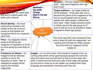


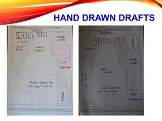
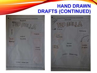
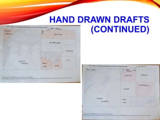
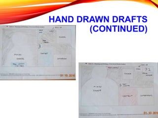

The document provides details about planning a new hip hop magazine, including color schemes, price, target audience, frequency of release, cover images, branding, and font styles. The target audience will be 16-25 year olds. The magazine will be released monthly and priced at £2.99. The cover will feature up-and-coming artists to attract readers. The brand identity and font styles were selected to fit with the hip hop genre.


