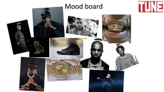
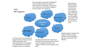
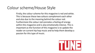
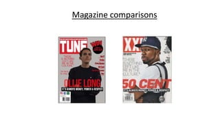
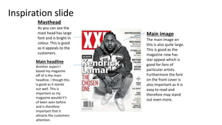
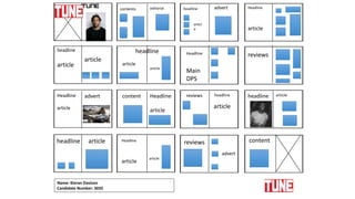
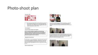
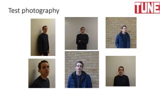
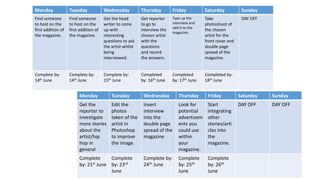
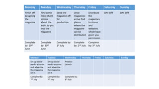
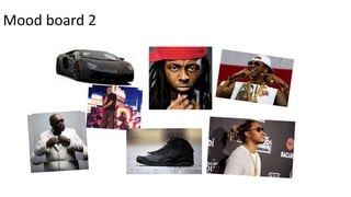
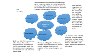
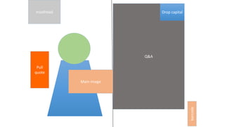
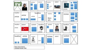
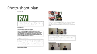
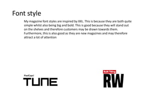
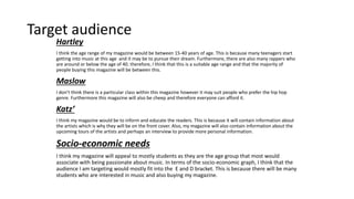
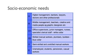
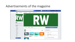
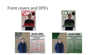
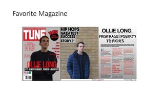
This document provides details on the planning and design of two weekly hip hop magazines. It discusses color schemes, target audiences, types of images to be used, and branding strategies. The color scheme for the first magazine is red and white, while the second magazine's color scheme is green, white, and black. Both magazines will target 15-35 year olds and feature a variety of big name hip hop artists to appeal to different readers each week. Close up and angled photos will be used throughout to showcase the artists. The logos and mastheads will be bold, bright colors to stand out on shelves.
This document provides details for planning and designing a proposed weekly hip hop music magazine. It includes mood boards, ideas for magazine elements like the masthead, color scheme, types of images, target audience, and examples of magazine covers. Production plans are outlined, including finding office space, hiring staff, conducting interviews, photo shoots, and magazine distribution. Comparisons are made to similar magazines like XXL for inspiration. The target audience is identified as 15-35 year olds interested in hip hop music.
The document provides details for planning and launching two new hip hop magazines. It includes mood boards, draft magazine covers, production plans, target audiences, and inspiration comparisons from existing magazines. The first proposed magazine would be called "Tune" with a red and white color scheme targeting 15-35 year olds. The second magazine would be called "RW" with a green, white, and black color scheme also aimed at 15-35 year olds. Both magazines would feature different artists on the weekly covers and contain interviews, photos, and articles about hip hop music. Production plans outline tasks from hiring staff to distribution over 3 month periods to launch the magazines.
The document provides details for the planning and production of two hip hop music magazines called Tune and RW Magazine.
It includes sections on the mood boards, target audiences, branding, production schedules, and comparisons to similar magazines like XXL.
The target audience for both magazines is 15-35 year olds. They will have a consistent brand identity with bold colors and logos appearing on every page. The production plan outlines weekly deadlines to hire staff, conduct interviews, take photos, design pages, and distribute the first issue by early July.
The document discusses plans for two hip-hop magazines called Tune and RW. It includes details on the magazines' mastheads, colour schemes, target audiences, layouts, and designs. For inspiration, it examines the popular magazine XXL. The document explores font styles, mood boards, draft covers, and double page spreads. It aims to establish brand identity and appeal to 15-35 year olds interested in hip-hop music and culture.
This document summarizes the key things the author learned from creating a preliminary school magazine to developing a full music magazine product. The author gained skills in InDesign and improved their photography technique. Their initial images lacked quality but they later conducted a planned photoshoot. The author also broadened their style to be more varied and professional. Overall, the author maintained some consistent elements like free offers and catchy headlines between the magazines, while improving technological skills and magazine design quality.
The document discusses research conducted for a student's music magazine coursework project on hip hop genres. It includes an analysis of an existing hip hop magazine called Vibe and a questionnaire distributed to students aged 14-20 about their music preferences and what they want in a magazine. Key findings from the questionnaire indicated that most listeners were 14-16, listened to hip hop and R&B, and preferred gossip features in a magazine that costs £1-2.
The document provides information about Q magazine, a popular UK music magazine published monthly since 1986. It is published by Bauer Media Group, a large European media company. Q magazine targets music buyers aged over 25 and covers a range of pop/rock music styles from current artists. It maintains a consistent red and white color theme across issues. The target audience theories of Katz and Hartley are discussed in relation to Q magazine's readers.
1) The document describes a student magazine project for an indie/alternative music magazine targeting 16-25 year olds.
2) Key details of the magazine include a feminine color scheme and fonts to attract a female audience, and representing the target audience as unique individuals rather than stereotypes.
3) Feedback from the target audience was positive about the colors, fonts, and contents page providing information in bite-sized chunks.
The document provides details about planning a new hip hop magazine, including color schemes, price, target audience, frequency of release, cover images, branding, and font styles. The target audience will be 16-25 year olds. The magazine will be released monthly and priced at £2.99. The cover will feature up-and-coming artists to attract readers. The brand identity and font styles were selected to fit with the hip hop genre.
This document analyzes the target audience for a magazine. It describes the gender, race, age, location, socioeconomic status, and psychographic profile of the intended readers. The conclusion summarizes that the magazine aims to attract younger audiences aged 15-19, both male and female, by featuring a popular Black artist. It expects to appeal to students and unemployed youth interested in R&B music.
- The document discusses the planning and design process for two music magazines called MO Magazine and Catalyst Magazine.
- For MO Magazine, the target audience is ages 16-24, from socioeconomic classes C2 to E. The magazine will have a yellow, black, and white color scheme.
- Catalyst Magazine's target is also classes C2 to E but ages 15-21. Its colors are blue and white.
- Mood boards and hand drawn drafts are presented to illustrate the magazine designs and layout concepts. The goal is to create magazines that will inspire and inform readers.
Connor Wood created a magazine aimed at younger classic rock fans aged 16-25. He targeted this group because typical classic rock magazines appeal to older audiences. The magazine would be distributed by Bauer Media, which also distributes similar magazines.
For the cover, Connor featured a new artist representing the magazine's target demographic. He used styles of dress and posture emulating classic rock icons to appeal to readers. Through the design process, Connor learned to use tools like Photoshop and Publisher effectively and improved conventions like bolder text and clearer formatting compared to his preliminary work.
The document summarizes the author's magazine project. It discusses various design elements of the magazine including the masthead, fonts, images, and layout. It also discusses the intended audience as music fans aged 16-19, and potential publishers such as Bauer Media Group. The author learned how to use the design software Serif to construct the magazine, and felt they improved significantly on layout and design from their preliminary task.
The document describes a media magazine product targeting middle class teenagers interested in hip hop music. Key points:
- The magazine targets middle class teenagers ages 14-20 by setting an affordable price and using colloquial language.
- It would be distributed by institutions like Forbes that have expanded beyond business to hip hop magazines.
- The creator learned photo editing skills in Photoshop like the healing and cloning tools in making the magazine.
The document discusses the target audience for a music magazine. It would target mature individuals between 16-45 years old with an interest in rock/alternative music. While appealing to both genders, it is slightly more oriented towards males due to the chosen artists, color scheme, and style of articles. The wide age range is possible because the magazine covers bands that appeal to different subsets within that overall range but share a musical style. Distribution by IPC media would make sense as they already distribute a similar magazine, NME.
AS Media Studies - Music Magazine Evaluation SundasBostan
The document discusses the author's choice to create a hip-hop music magazine targeted towards 16-24 year olds. A survey found this age group prefers hip-hop music because it relates to their generation and lifestyle. The magazine, called "Amplify", uses conventions from real music magazines such as positioning exclusive interviews in the left third and including a strap line under the masthead. Images on the cover and inside pages feature urban styles and poses to appeal to readers.
The document outlines Owen Shepherd's process for creating two magazines called "Top Dolla" and "Roll Up". It includes mood boards, proposals, graphic layouts, and production plans. The magazines will target 16-25 year olds and focus on hip hop music. They will each have 40 pages and cost £2.99 per monthly issue. Black, red, yellow and orange will feature prominently in the color schemes and designs.
The document discusses planning for a new music magazine. It will target audience categories A-C2, who are high professionals and skilled workers with disposable income. The magazine will need to be high quality with well-known artists to appeal to this audience. It will also have an appealing color scheme without too many bright colors. The magazine aims to be the best in its field like "Vogue" is for fashion magazines. It will have only top artists and an iconic logo/theme. The tone will be formal like magazine "Q" and the style will be plain with one or two bold colors and a prominent cover photo. Magazines like "Rolling Stone" and "Q" provide examples of effective designs and styles for
The magazine represents social groups as follows:
1. Age is represented through models that are 16-17 years old, implying the target audience is young people interested in R&B and indie music.
2. Gender is represented equally, with both male and female models used on the cover, contents page, and double page spread.
3. Race and ethnicity are somewhat represented, with the cover model not being white British, however other models are white British, conforming to typical music magazine representation.
The document outlines a proposal for a new indie/rock music magazine called "BEATS". It discusses the magazine's genre, content, promotions, production plans, budget, target audience, and pre-production materials like brand identity, draft pages, and planned images. It presents the final front cover and a double page spread interview as an example. Future issues are expected to include similar content like interviews, reviews, and promotions. The proposal projects profit growth over 5 years from magazine sales.
The document provides research on magazines NME and Q as inspiration for a new music magazine focusing on indie/alternative genres. Key details include:
- NME and Q are cited as inspiration due to focusing on indie/alternative music. Conventions like large mastheads and cover stars will be replicated.
- Target audiences for both magazines are described as mainly male, aged 20-30 with interest in indie/alternative music. Exclusive content draws readers.
- Evidence is given for replicating cover stars and layouts from magazines to attract target audiences through recognition and personal identification.
Unit 13 (LO1) – Understanding existing print-based media products and how the...mdelmar97
Mojo is a monthly music magazine published in the UK since 1993. It focuses on classic rock music and targets upper middle class readers aged 35 and older. The magazine promotes itself through social media platforms and aims to build connections between readers and artists. It uses in-depth articles and reviews to provide surveillance of the music industry and help readers find community and identity through their shared love of classic rock.
Unit 13 – Planning and Pitching a Print based Media Product (LO2)mdelmar97
This document contains the slide contents for a presentation on the development of a music magazine concept. It includes slides on mood boards, font styles, magazine layout plans, photography plans, cover and spread designs, and proposals for two magazine title ideas - "Tune iN" and "Beat". Key elements that are explored include house styles, color schemes, graphic layouts, and annotated codes and conventions for the magazine designs. The presentation shows the process behind conceptualizing and designing the different elements of an original music magazine.
The document provides details about the target audience and design choices for a magazine about chart music. The primary audience is teenagers and young adults aged 16-25 who enjoy listening to popular artists in the top 40 charts. Surveys were conducted to inform decisions about offers, branding, purchases, styles, and models featured in the magazine. The magazine aims to represent both male and female readers by featuring artists that appeal to both genders. Styles and facial expressions of models are used to represent the target age group and convey a sense of seriousness about music news. The magazine challenges and develops conventions of other media products like NME by including bold designs, catchy headlines and stories, and free offers to attract readers.
The production plan outlines the process for launching TUNE magazine over 12 weeks, including hiring staff, conducting interviews, designing pages, sending the magazine for printing, distribution, and social media promotion, with the goal of the first issue being released on July 3rd. Key aspects are securing an artist for the cover interview and photoshoot, integrating articles and advertisements, and quality control through editing and proofreading.
Here are a few suggestions to improve the interview draft:
- Ask more open-ended questions to get more detailed answers from the artist. For example, instead of just asking if they have a favorite song, ask them to describe their favorite song to perform and why it connects with audiences.
- Follow up on interesting details from their answers with additional questions. For example, when they mentioned enjoying meeting fans from different countries, you could ask what are some memorable fan interactions they've had or cultural differences they've noticed.
- Vary the types of questions between more lighthearted ones (like about a good luck item) and ones that provide artistic insight or background on their career/upcoming projects.
- Consider asking about
The document outlines plans for two proposed print magazines - A.I.R and Simpatico. Both magazines would target a similar audience to NME magazine, focusing on indie, rock and alternative music genres. They would include articles, reviews, photos and more. A.I.R would cost £3.50 per weekly issue while Simpatico would be £2.50. Both magazines would be 64 pages and use similar designs as NME, with bold fonts and colors. Promotion would begin through posters, leaflets and local media. The goal is for either magazine to eventually compete with publications like NME.
The document provides details on the design aspects of two rap music magazines. Some key points include:
- The magazines will target 15-40 year olds and have affordable prices between £2-3.
- They will have a weekly publication schedule and focus on rap artists with star appeal on the covers.
- The color scheme will be bold and bright, taking inspiration from XXL magazine's use of red. Logos and mastheads will be repeated on every page for branding.
- Layouts will follow magazine conventions with prominent mastheads, cover lines, barcodes and main images on the front covers. Interior pages will feature interviews, photos and drop caps for visual interest.
The document provides details about the proposed design of a new music magazine called "A". It discusses the color scheme, fonts, and target audience. For the color scheme, a blush colored masthead on a white background is proposed to convey qualities like happiness, love and youth. The masthead font "Café & Brewery" is chosen for its visibility while the body text uses the easy-to-read font "Verdana". The target audience is identified as young adults who may aspire to be like the famous musicians featured in the magazine.
The documents provide details on the proposed layouts, designs, and target audience for two electro music magazines called Pulse and Electro Eskimo. Key details include:
- The magazines will have a weekly release schedule and target 16-24 year olds who enjoy electro-pop artists like Alan Walker and Tobu.
- The color scheme will be bold blacks, whites, and blues to stand out on newsstands. Thumbnail images of other artists will also be included.
- Inspiration is taken from existing magazine layouts, including large central images, differentiated text sizes, and consistent logo placement.
- Draft layouts and typeface options are presented, with the goal of a professional,
The document provides an analysis of magazine covers and design elements. It discusses techniques used in existing magazine covers that could be applied to the student's own music magazine cover design. These include limited color schemes, positioning of mastheads, use of artist photos, and themes that appeal to target audiences. The student considers fonts, picture editing, representation of social groups, and potential media institutions for distribution.
The document provides an analysis and evaluation by Samantha Pople of various magazine covers in order to inform the design of her own music magazine cover. She looks at color schemes, layouts, fonts, and main images on existing covers from magazines like Q, Rolling Stone, and NME. Samantha decides on a 2-4 color scheme with contrasting colors and either bold or pastel hues. She also experiments with editing photos and choosing appropriate fonts and images for her own cover.
The document summarizes the process of evaluating existing magazines to help design a new music magazine. Key points analyzed include covers, color schemes, fonts, photo editing, conventions, target audiences, and potential distributors. Existing magazines provided inspiration on techniques like limited color palettes, prominent mastheads, and featuring artists to represent the genre. The goal was to create an eye-catching cover that established the magazine while appealing to both male and female readers across various music interests and ages.
The document discusses pop music and media representation. It then provides details about how the author constructed their music magazine, including following conventions of real magazines, representing social groups, choosing a media institution for distribution, attracting their target audience of teenage girls and young women, and what they learned about technology from the process.
The document discusses how the student created the front cover of their indie/rock music magazine. They attempted to base the aesthetics of their magazine cover on existing magazines in the genre like NME, Q Magazine, and The Rolling Stones magazine. Some conventions they followed included featuring guitars, using mixed colors, and placing the masthead in the upper left corner. The student also developed some features from these magazines, like using quotes and small plugs. They challenged a few conventions as well, such as rearranging design elements. The student learned skills using editing software like Fireworks and GIMP in constructing their magazine cover.
Yelim Chung analyzed various music magazines to understand generic conventions like placement of cover lines and mastheads. This informed the design of their own music magazine featuring fictional artists across genres like hip hop, pop and R&B. Feedback from a target audience of 16-30 year olds was also gathered. While some conventions like multiple colors were omitted, the simplistic style drew inspiration from Billboard magazine to effectively engage the intended youth audience.
This document provides details about Ollie Long's plans for two rap/hip-hop magazines called "ANTI" and "Major". It includes information about the target audience, which will be mainly males aged 15-45 from socioeconomic classes C1, C2, and D. Ollie also discusses the magazine layout, colors, mastheads, and includes mood boards and draft designs. The production plan outlines tasks like choosing content, conducting interviews, and incorporating photographs over a two week period.
Here are some key legal and ethical issues Bauer Media may face:
- Copyright infringement - Using others' creative works without permission could lead to lawsuits. Proper attribution and licensing is important.
- Defamation/libel - Publishing factually inaccurate information that damages someone's reputation is illegal. Thorough fact-checking is needed.
- Privacy - Unauthorized use of someone's name, image or private details could violate their privacy rights. Consent is required.
- Offensive/harmful content - Content promoting hate, violence or illegal acts poses legal and ethical risks. Community standards must be considered.
- Conflicts of interest - Financial ties or biases must be disclosed to maintain transparency and credibility. Editorial
1. The document discusses the design elements of magazine covers, including mastheads, images, color schemes, and layouts.
2. It compares the document author's own magazine cover design to covers of real magazines like Vibe and NME.
3. The author explains how they used and experimented with different design elements and technologies to create a unique and appealing cover for their intended audience of teenagers interested in hip hop music.
The document describes the design elements and conventions used in a mock student-created magazine covering hip hop music. Key design elements include a masthead referencing a Jamaican reggae song, the use of direct eye contact in a portrait on the cover, main cover lines, placement of images and text following design principles. Color schemes, fonts and layouts are used to create visual interest and appeal while maintaining the style of other hip hop magazines. Both conventional design elements and some unconventional touches like mock Polaroids are incorporated.
This document outlines plans for a new music magazine called "Lyrical" focused on pop and rock music. It discusses the target audience as 16-30 year olds from socio-economic classes B-C2 of both genders. It proposes a monthly circulation to allow time to source stories and images. The color scheme, masthead font, and social media strategy are described. Sample pages from an issue include contents, editor's note, interviews, reviews, advertisements and competitions. Inspiration is drawn from Billboard magazine in terms of layout and design elements.
The student created a magazine targeted towards teenagers interested in pop punk music. They conducted research including a survey to understand their target audience. They created drafts and flat plans of the magazine layout, taking conventions from analyzed magazines. The student improved the drafts, making the design and colors more cohesive. Feedback from research and drafts helped the student create a magazine that effectively appeals to their target audience.
This document provides information about NME magazine, including its target audience, publisher, and circulation numbers. NME targets mainly men aged 17-30 with an interest in new music. It has experienced declining circulation, with an average weekly sale of 18,184 in 2013 dropping to 14,312 in 2014. NME is published weekly and its publisher is Timeinc.UK. The magazine aims to cover the past, present, and future of music through features, interviews, and reviews that appeal to its target psychographic groups of survivors and explorers interested in music and social change.
The document discusses ideas for two music magazines called Flat Bass and TV. For Flat Bass, the summary proposes keeping a casual layout seen in the inspiration magazine XXL, including repeating its color scheme and placing the main headline at the bottom of the cover. For TV, it suggests a more professional design seen in the inspiration magazine, with a bold font, memorable masthead, and color scheme of black, red, and yellow. Both magazines aim to attract mature music fans through interviews, gossip, and previews of upcoming content to encourage monthly purchases. Repetition of elements from inspiration magazines and subtle differences are intended to clearly communicate the genre while keeping the magazines unique.
The document provides details about plans for a music festival, including:
- Two hand-drawn draft layouts for the festival poster with the logo and performance dates/acts in different configurations.
- Details on the campaign message focusing on unique acts that appeal to fans of rap/hip hop and providing an escape, to be advertised through print media using bright colors and bold fonts.
- Plans for the digital poster background including a dark blue/purple gradient and added image of stars/galaxy, as well as taking inspiration from Coachella for the house style/color scheme.
This document discusses an advertising campaign for the Coachella music festival. It aims to raise awareness of the festival and its artists in order to increase ticket sales and future brand awareness. The target audience is primarily ages 18-35 who are interested in social interaction at music festivals. The campaign uses print, social media, a mobile app, and website to advertise details on artists, ticket purchasing, and festival information. Audio-visual ads aim to excite viewers and non-attendees about the fun atmosphere through footage of crowds enjoying the music. Legal and ethical considerations include following advertising standards on targeting minors and protecting consumers from scams.
Twitter is a social media platform that allows users to share messages known as tweets. It has over 500 million tweets per day and its target audience is young adults aged 16-34. Twitter makes most of its revenue from advertisements. While it provides a platform for sharing ideas, it also faces legal issues around false advertising, copyright infringement, trademark protection, and potential libel claims over damaging user comments.
The document provides details on photo shoot plans and graphic layouts for two proposed magazines - Tune and RW. It includes proposed color schemes, house styles, masthead designs, cover layouts, and double page spread layouts. Sample graphics and draft designs are presented for both magazines. Guidance is given on legal issues, ethical considerations, copyright, data protection, and the editor's code of practice that should be followed when producing a magazine.
The document provides instructions for designing magazine pages, including always placing the masthead in the top left corner, centering the main image, and positioning cover lines and other elements around the main image to attract readers' attention. Guidelines are also given for elements like the barcode, strapline, and interviews that need to be easily visible or take up full pages. Proper placement of these elements is described as important for standing out and engaging the audience.
The document provides details on photo shoot plans and graphic layouts for two proposed magazines - Tune and RW. It includes proposed color schemes, elements to include on the cover like the masthead and cover lines. It also provides sample graphic layouts for the magazines' double page spreads. Hand drawn draft conclusions are provided for what the finished magazines may look like.
The document summarizes the production process of Q magazine. It discusses setting a publication date to establish a schedule. It then covers editorial and budget decisions, acquiring content from staff writers and external contributors, sub-editing for accuracy and style, page layout using desktop publishing software, and synergy across various media platforms like social media and a subscription service. Competitors include NME, Mojo, and XXL magazines. Q magazine has a monthly circulation of around 44,000 and aims to appeal to a wide audience with its eclectic music coverage. The publisher Bauer Media takes an ambitious approach to succeed across magazines and radio.
The document provides details about a music magazine called Q Magazine published by Bauer Media. It discusses Bauer Media as the publisher, including its ownership structure and operating model. It also covers Q Magazine's brand ideology, target audience, production process, and analysis of print and digital content. Competition and the magazine's position in the market are examined as well. The purpose of Q Magazine and the genres it covers are described.
The document provides details about the production of a magazine called TUNE, including:
1. A production plan that outlines the schedule and tasks for developing the magazine, such as setting up equipment, hiring staff, conducting interviews, designing pages, and distributing the magazine.
2. A calendar of events that will be advertised in the magazine, like music festivals happening in the upcoming year, which could attract customers.
3. Legal and ethical issues related to running a magazine, including avoiding discrimination, following copyright law, and complying with the Editors' Code of Practice for accurate and non-biased reporting.
This document discusses plans for photo shoots and magazine layouts for two hip hop magazines called Tune and RW. For Tune, the color scheme is red and white to convey energy and passion for hip hop music. Proposal 2 discusses RW using green to seem fresh and ambitious. Layout templates are provided for magazine covers, double page spreads, and flat plans for both magazines with placement of elements like mastheads, images, and articles. Step-by-step guides describe how to create these magazine elements in Photoshop.
The document provides feedback from a survey conducted using Survey Monkey about improving a pitch. The most common feedback was to speak louder during the pitch and improve the cover lines on a magazine cover. Other feedback indicated the proposals and target audience were suitable but some magazine covers could be made more appealing. The survey feedback will help the person improve aspects of their pitch and magazine covers.
This document discusses different types of newspapers and their key characteristics. It describes "red top" tabloids as British newspapers with red mastheads that emphasize crime stories and gossip. It also discusses broadsheets as having a larger page size and focusing more on in-depth journalism. Free newspapers are supported by advertisers and handed out for free in urban areas. The document provides examples and links for further information about these different newspaper genres.
The document provides guidance on magazine layout design. It states that the masthead should always be placed in the top left corner to stand out and attract attention. The main image is always centered as it will have a "star effect" on audiences. Cover lines are placed around the main image and include quotes from artist interviews. The Q&A takes up the full second page to interest people in the cover artist. Final sketches are chosen to base magazine designs on positioning of elements like the masthead and Q&A. Font styles are inspired by other magazines to stand out on shelves. Potential magazine elements like target audiences and frequency are considered.
The production process involved taking photographs, editing images, laying out the front cover and double page spread using desktop publishing tools, and completing the magazine by July 8th for the product launch. Key deadlines included completing interviews, photoshoots, and final magazine design by the end of June, with the last deadline being July 8th for the product launch of the first issue.
The document provides details on photo shoot plans and graphic layouts for two proposed magazines - Tune and RW. It includes proposed color schemes, elements to include on the cover like the masthead and cover lines. It also provides sample graphic layouts for the magazines' double page spreads. Hand drawn draft conclusions suggest the layouts are examples of what the finished magazines may look like.
The document provides information about the production process of Q magazine. It discusses setting a publication date and managing the schedule. It describes the editorial and budgetary decisions where article topics are chosen. It outlines the process of acquiring content through in-house and commissioned writers. It details the steps of sub-editing, page layout, and placing advertisements. Finally, it discusses Q magazine's use of various social media platforms and its website to further promote the magazine.
The document is an analysis of Q Magazine, a UK music magazine published by Bauer Media. It discusses the publisher and ownership structure, operating model, brand ideology, target audience, content, competitors, and other key aspects of the magazine. The analysis is presented over multiple slides and provides details on Q Magazine's position as the UK's best-selling music magazine and Bauer Media's strategy and goals in publishing the magazine.
The document describes the materials and equipment used for a pitch about creating a magazine. It includes images of a camera, computer, tripod, and smart board that were used to film and present the pitch. Feedback from the pitch was also gathered through a survey monkey questionnaire. The feedback identified areas for improvement such as speaking louder and changing some magazine cover lines. A production plan was then created laying out the weekly tasks needed to produce and distribute the first issue of the magazine over a one month period.
The document is a slide presentation analyzing the music magazine Q, published by Bauer Media. It covers topics such as the publisher and ownership structure, brand ideology, target audience, production process, and analysis of print and digital content. The presentation contains 38 slides with detailed information and explanations about Q magazine, its publisher, and their approaches to content, audience, and marketing.
The document is a slide presentation analyzing the music magazine Q, published by Bauer Media. It covers topics such as the publisher and ownership structure, brand ideology, target audience, production process, and analysis of print and digital content. The presentation contains 38 slides with detailed information about Q magazine, including its purpose to inform readers about new music through coverage of various genres and artists.
A Strategic Approach: GenAI in EducationPeter Windle
Artificial Intelligence (AI) technologies such as Generative AI, Image Generators and Large Language Models have had a dramatic impact on teaching, learning and assessment over the past 18 months. The most immediate threat AI posed was to Academic Integrity with Higher Education Institutes (HEIs) focusing their efforts on combating the use of GenAI in assessment. Guidelines were developed for staff and students, policies put in place too. Innovative educators have forged paths in the use of Generative AI for teaching, learning and assessments leading to pockets of transformation springing up across HEIs, often with little or no top-down guidance, support or direction.
This Gasta posits a strategic approach to integrating AI into HEIs to prepare staff, students and the curriculum for an evolving world and workplace. We will highlight the advantages of working with these technologies beyond the realm of teaching, learning and assessment by considering prompt engineering skills, industry impact, curriculum changes, and the need for staff upskilling. In contrast, not engaging strategically with Generative AI poses risks, including falling behind peers, missed opportunities and failing to ensure our graduates remain employable. The rapid evolution of AI technologies necessitates a proactive and strategic approach if we are to remain relevant.
ISO/IEC 27001, ISO/IEC 42001, and GDPR: Best Practices for Implementation and...PECB
Denis is a dynamic and results-driven Chief Information Officer (CIO) with a distinguished career spanning information systems analysis and technical project management. With a proven track record of spearheading the design and delivery of cutting-edge Information Management solutions, he has consistently elevated business operations, streamlined reporting functions, and maximized process efficiency.
Certified as an ISO/IEC 27001: Information Security Management Systems (ISMS) Lead Implementer, Data Protection Officer, and Cyber Risks Analyst, Denis brings a heightened focus on data security, privacy, and cyber resilience to every endeavor.
His expertise extends across a diverse spectrum of reporting, database, and web development applications, underpinned by an exceptional grasp of data storage and virtualization technologies. His proficiency in application testing, database administration, and data cleansing ensures seamless execution of complex projects.
What sets Denis apart is his comprehensive understanding of Business and Systems Analysis technologies, honed through involvement in all phases of the Software Development Lifecycle (SDLC). From meticulous requirements gathering to precise analysis, innovative design, rigorous development, thorough testing, and successful implementation, he has consistently delivered exceptional results.
Throughout his career, he has taken on multifaceted roles, from leading technical project management teams to owning solutions that drive operational excellence. His conscientious and proactive approach is unwavering, whether he is working independently or collaboratively within a team. His ability to connect with colleagues on a personal level underscores his commitment to fostering a harmonious and productive workplace environment.
Date: May 29, 2024
Tags: Information Security, ISO/IEC 27001, ISO/IEC 42001, Artificial Intelligence, GDPR
-------------------------------------------------------------------------------
Find out more about ISO training and certification services
Training: ISO/IEC 27001 Information Security Management System - EN | PECB
ISO/IEC 42001 Artificial Intelligence Management System - EN | PECB
General Data Protection Regulation (GDPR) - Training Courses - EN | PECB
Webinars: https://pecb.com/webinars
Article: https://pecb.com/article
-------------------------------------------------------------------------------
For more information about PECB:
Website: https://pecb.com/
LinkedIn: https://www.linkedin.com/company/pecb/
Facebook: https://www.facebook.com/PECBInternational/
Slideshare: http://www.slideshare.net/PECBCERTIFICATION
Physiology and chemistry of skin and pigmentation, hairs, scalp, lips and nail, Cleansing cream, Lotions, Face powders, Face packs, Lipsticks, Bath products, soaps and baby product,
Preparation and standardization of the following : Tonic, Bleaches, Dentifrices and Mouth washes & Tooth Pastes, Cosmetics for Nails.
How to Build a Module in Odoo 17 Using the Scaffold MethodCeline George
Odoo provides an option for creating a module by using a single line command. By using this command the user can make a whole structure of a module. It is very easy for a beginner to make a module. There is no need to make each file manually. This slide will show how to create a module using the scaffold method.
हिंदी वर्णमाला पीपीटी, hindi alphabet PPT presentation, hindi varnamala PPT, Hindi Varnamala pdf, हिंदी स्वर, हिंदी व्यंजन, sikhiye hindi varnmala, dr. mulla adam ali, hindi language and literature, hindi alphabet with drawing, hindi alphabet pdf, hindi varnamala for childrens, hindi language, hindi varnamala practice for kids, https://www.drmullaadamali.com
A workshop hosted by the South African Journal of Science aimed at postgraduate students and early career researchers with little or no experience in writing and publishing journal articles.
বাংলাদেশের অর্থনৈতিক সমীক্ষা ২০২৪ [Bangladesh Economic Review 2024 Bangla.pdf] কম্পিউটার , ট্যাব ও স্মার্ট ফোন ভার্সন সহ সম্পূর্ণ বাংলা ই-বুক বা pdf বই " সুচিপত্র ...বুকমার্ক মেনু 🔖 ও হাইপার লিংক মেনু 📝👆 যুক্ত ..
আমাদের সবার জন্য খুব খুব গুরুত্বপূর্ণ একটি বই ..বিসিএস, ব্যাংক, ইউনিভার্সিটি ভর্তি ও যে কোন প্রতিযোগিতা মূলক পরীক্ষার জন্য এর খুব ইম্পরট্যান্ট একটি বিষয় ...তাছাড়া বাংলাদেশের সাম্প্রতিক যে কোন ডাটা বা তথ্য এই বইতে পাবেন ...
তাই একজন নাগরিক হিসাবে এই তথ্য গুলো আপনার জানা প্রয়োজন ...।
বিসিএস ও ব্যাংক এর লিখিত পরীক্ষা ...+এছাড়া মাধ্যমিক ও উচ্চমাধ্যমিকের স্টুডেন্টদের জন্য অনেক কাজে আসবে ...
Introduction to AI for Nonprofits with Tapp NetworkTechSoup
Dive into the world of AI! Experts Jon Hill and Tareq Monaur will guide you through AI's role in enhancing nonprofit websites and basic marketing strategies, making it easy to understand and apply.
Main Java[All of the Base Concepts}.docxadhitya5119
This is part 1 of my Java Learning Journey. This Contains Custom methods, classes, constructors, packages, multithreading , try- catch block, finally block and more.
Executive Directors Chat Leveraging AI for Diversity, Equity, and InclusionTechSoup
Let’s explore the intersection of technology and equity in the final session of our DEI series. Discover how AI tools, like ChatGPT, can be used to support and enhance your nonprofit's DEI initiatives. Participants will gain insights into practical AI applications and get tips for leveraging technology to advance their DEI goals.
it describes the bony anatomy including the femoral head , acetabulum, labrum . also discusses the capsule , ligaments . muscle that act on the hip joint and the range of motion are outlined. factors affecting hip joint stability and weight transmission through the joint are summarized.
5. Magazine
ideas
Masthead
Colour scheme
Types of images
frequency
Brand identity
Target audience
Same throughout, bold colours. Bright/dark
colours can be interpreted as anger or a
certain attitude. For example, if I was to use
red, I would use it consistently throughout
and also make sure it stands out.
Close ups with
different angles.
For example, on
the front cover
there will be a
main image and
there will also be
different images
used throughout
for variation. This
will connote the
presence of the
artist.
Weekly magazine. However this
magazine will have a good
variety of content throughout
and each issue will be much
different.
15-35 year olds. This is because the
magazine will be a weekly issue but
it will be affordable. This is
important because if the magazine
is not affordable then especially
teenagers may not be interested.
Star appeal and big artist. Furthermore,
there will also be a good variation of artist
in order to appeal to everyone. The
magazine will also contain its logo on each
page
Tune
RW magazine
12. Colour scheme/House Style
Firstly, the colour scheme for this magazine is red and white.
This is because these two colours complement each other
and also due to the meaning behind the colour red.
Furthermore the colour red connotes a feeling of energy
within this magazine and is also emotionally intense. This is
important as the function of this magazine is to update the
reader on current hip hop music and to help them develop a
passion for this type of music.
14. Inspiration slide
Masthead
As you can see the
mast head has large
font and is bright in
colour. This is good
as it appeals to the
customers.
Main image
The main image on
this is also quite large.
This is good as the
magazine now has
star appeal which is
good for fans of
particular artists.
Furthermore the font
on the front cover is
also important as it is
easy to read and
therefore may stand
out even more.
Main headline
Another aspect I
based my magazine
off of is the main
headline. I though this
is good as it stands
out well. This is
important as my
magazine wouldn't’t
of been seen before
and is therefore
important that it
attracts the customers
attention.
18. Font style
PixelCaps!
My magazine font styles are inspired by XXL. This is because they are both quite
simple whilst also being big and bold. This is good because they will stand out
on the shelves and therefore customers may be drawn towards them.
Furthermore, this is also good as they are new magazines and may therefore
attract a lot of attention
19. Production Plan – Launch Date –
Monday Tuesday Wednesday Thursday Friday Saturday Sunday
Look for
office
space, staff
and
equipment
.
Set up all
equipment
and get
ready to
start the
magazine
process.
Set up
interviews
for job roles
such as
editor,
writer,
designer
and others
available
within the
business.
Set up
interview
s for job
roles such
as editor,
writer,
designer
and
others
available
within the
business.
Set up
interviews
for job
roles such
as editor,
writer,
designer
and
others
available
within the
business.
DAYS OFF DAYS OFF
Complete
by: 5th
June
Complete
by: 6th June
Complete
by: 9th June
Complete
by: 9th
June
Complete
by: 9th
June
Week 1
20. Monday Tuesday Wednesday Thursday Friday Saturday Sunday
Find someone
to host on the
first addition of
the magazine.
Find someone
to host on the
first addition of
the magazine.
Get the head
writer to come
up with
interesting
questions to ask
the artist whilst
being
interviewed.
Get reporter
to go to
interview the
chosen artist
with the
questions
and record
the answers.
Type up the
interview and
add it to the
magazine.
Take
photoshoot of
the chosen
artist for the
front cover and
double page
spread of the
magazine.
DAY OFF
Complete by:
14th June
Complete by:
14th June
Complete by:
15th June
Completed
by: 16th June
Completed
by: 17th June
Completed by:
18th June
Monday Tuesday Wednesday Thursday Friday Saturday Sunday
Get the
reporter to
investigate
more stories
about the
artist/hip
hop in
general
Edit the
photos
taken of the
artist in
Photoshop
to improve
the image.
Insert
interview
into the
double page
spread of the
magazine
Look for
potential
advertisem
ents you
could use
within
your
magazine.
Start
integrating
other
stories/arti
cles into
the
magazine.
DAY OFF DAY OFF
Complete
by: 21st June
Complete
by: 23rd
June
Complete by:
24th June
Complete
by: 25th
June
Complete
by: 26th
June
21. Monday Tuesday Wednesday Thursday Friday Saturday Sunday
Finish off
designing
the
magazine
Find some
more short
stories
about the
artist to put
into the
magazine
Send the
magazine off
for
production
Once
magazines
arrive find
places
where the
magazine
can be
distributed
.
Distribute
the
magazines
to stores
and
websites
which have
given you
permission
DAY OFF DAY OFF
Complete
by: 29th
June
Complete
by: 30th
June
Complete by:
1st July
Complete
by: 2nd July
Complete
by: 3rd July
Monday Tuesday Wednesday Thursday Friday Saturday Sunday
Set up social
media account
and advertise
the magazine
on it.
Set up social
media account
and advertise
the magazine
on it.
Product
Launch
Complete by:
7th July
Complete by:
7th July
Complete by:
8th July
22. Target audience
Hartley
I think the age range of my magazine would be between 15-40 years of age. This is because many teenagers start
getting into music at this age and it may be to pursue their dream. Furthermore, there are also many rappers who
are around or below the age of 40. therefore, I think that this is a suitable age range and that the majority of
people buying this magazine will be between this.
Maslow
I don’t think there is a particular class within this magazine however it may suit people who prefer the hip hop
genre. Furthermore this magazine will also be cheep and therefore everyone can afford it.
Katz’
I think my magazine would be to inform and educate the readers. This is because it will contain information about
the artists which is why they will be on the front cover. Also, my magazine will also contain information about the
upcoming tours of the artists and perhaps an interview to provide more personal information.
Socio-economic needs
I think my magazine will appeal to mostly students as they are the age group that most would
associate with being passionate about music. In terms of the socio-economic graph, I think that the
audience I am targeting would mostly fit into the E and D bracket. This is because there will be many
students who are interested in music and also buying my magazine.
25. Connotations behind the name.
• The connotations behind the name Tune firstly represent the fact that
within this magazine you can find high quality music. Furthermore, it
also connotes that the magazine will be music related considering it is
called ‘TUNE’.
26. “Repeat” - Steve Neale(1980)
Tune/Rap Weekly
With my magazines I will firstly be
repeating t it is easily recognisable.
The logo on every page on the
magazine. This is important as it will
be a new magazine and therefore it
will be important for people to
recognise it. Secondly, there will be
various images on the front cover and
other pages. however., on the front
cover there will be a main stand out
image. This is good as it will have star
appeal and therefore could influence
customers to buy these magazines.
And I will finally make sure that the
logos of my magazines stand out. This
is important because they will
therefore be easy to see in stores and
it is also significant that it is easily
recognisable.
XXL
Firstly, XXL magazine have a a logo
which stands out. This is because
it has a bright red colour and bold
writing. This is good as it will stand
out to customers on the shelves of
stores. Furthermore this logo is
evident on every page of their
magazine which is important as
the customers will therefore
recognise who XXL are. Within the
magazine also contains double
page spreads and lots of images.
This is important because it gives
the readers an understanding of
who stars on the current issue of
the magazine and perhaps the
smaller articles within.
30. Magazine
ideas
masthead
Colour scheme
Types of images
frequency
Brand identity
Target audience
Same throughout, bold colours. Bright/dark colours
can be interpreted as anger or a certain attitude. For
example, on my first magazine the colour scheme is
red and white and on my second magazine the colour
scheme is green with white and black
Close ups/mid
range shots with
different angles.
For example, on
the front cover
there will be a
main image and
there will also be
different images
used throughout
for variation. This
will connote the
presence of the
artist.
my magazine will be a Weekly
magazine. This magazine will
have a good variety of content
throughout and each issue will
be much different due to the
variety of artists that will be on it
every week.
15-35 year olds. This is because it is
often the case that mostly
teenagers are the people who like
rap/hip hop music and would also
be most interested in my magazine
and the artists who with feature on
it every week.
Star appeal and big artist. Furthermore,
there will also be a good variation of artist
in order to appeal to everyone. The
magazine will also contain its logo on each
page
Tune
RW magazine
37. House style/Colour scheme
• The connotations of the my second magazine, RW would be that it is
a colour associated with energy and freshness, therefore bringing
something different to the standard rap magazine. This colour scheme
also connotes the ambition of this magazine to succeed and become
a well known name within the hip hop/rap industry.
39. Inspiration slide
Masthead
As you can see the
mast head has large
font and is bright in
colour. This is good
as it appeals to the
customers.
Main image
The main image on this is
also quite large. This is
good as the magazine
now has star appeal which
is good for fans of
particular artists.
Furthermore the font on
the front cover is also
important as it is easy to
read and therefore may
stand out even more.
Main headline
Another aspect I based my
magazine off of is the main
headline. I though this is
good as it stands out well.
This is important as my
magazine wouldn't’t of
been seen before and is
therefore important that it
attracts the customers
attention.
42. Font style
PixelCaps!
My magazine font styles are inspired by XXL. This is because they are both quite
simple whilst also being big and bold. This is good because they will stand out
on the shelves and therefore customers may be drawn towards them.
Furthermore, this is also good as they are new magazines and may therefore
attract a lot of attention
43. Production Plan – Launch Date –
Monday Tuesday Wednesday Thursday Friday Saturday Sunday
Look for
office
space, staff
and
equipment
.
Set up all
equipment
and get
ready to
start the
magazine
process.
Set up
interviews
for job roles
such as
editor,
writer,
designer
and others
available
within the
business.
Set up
interview
s for job
roles such
as editor,
writer,
designer
and
others
available
within the
business.
Set up
interviews
for job
roles such
as editor,
writer,
designer
and
others
available
within the
business.
DAYS OFF DAYS OFF
Complete
by: 5th
June
Complete
by: 6th June
Complete
by: 9th June
Complete
by: 9th
June
Complete
by: 9th
June
Week 1
44. Monday Tuesday Wednesday Thursday Friday Saturday Sunday
Find someone to
host on the first
addition of the
magazine.
Find someone to
host on the first
addition of the
magazine.
Get the head
writer to come up
with interesting
questions to ask
the artist whilst
being interviewed.
Get reporter to
go to interview
the chosen
artist with the
questions and
record the
answers.
Type up the
interview and
add it to the
magazine.
Take photoshoot
of the chosen
artist for the front
cover and double
page spread of
the magazine.
DAY OFF
Complete by:
14th June
Complete by:
14th June
Complete by: 15th
June
Completed by:
16th June
Completed by:
17th June
Completed by:
18th June
Monday Tuesday Wednesday Thursday Friday Saturday Sunday
Get the
reporter to
investigate
more
stories
about the
artist/hip
hop in
general
Edit the
photos
taken of the
artist in
Photoshop
to improve
the image.
Insert
interview
into the
double page
spread of the
magazine
Look for
potential
advertisem
ents you
could use
within
your
magazine.
Start
integrating
other
stories/arti
cles into
the
magazine.
DAY OFF DAY OFF
Complete
by: 21st June
Complete
by: 23rd
June
Complete by:
24th June
Complete
by: 25th
June
Complete
by: 26th
June
45. Monday Tuesday Wednesday Thursday Friday Saturday Sunday
Finish off
designing the
magazine
Find some
more short
stories about
the artist to
put into the
magazine
Send the
magazine off
for production
Once
magazines
arrive find
places
where the
magazine
can be
distributed.
Distribute the
magazines to
stores and
websites
which have
given you
permission
DAY OFF DAY OFF
Complete by:
29th June
Complete by:
30th June
Complete by:
1st July
Complete
by: 2nd July
Complete by:
3rd July
Monday Tuesday Wednesday Thursday Friday Saturday Sunday
Set up social
media
account and
advertise the
magazine on
it.
Set up social
media account
and advertise
the magazine
on it.
Product
Launch
Complete by:
7th July
Complete by:
7th July
Complete by:
8th July
46. Target audience
Hartley
I think the age range of my magazine would be between 15-40 years of age. This is because many teenagers start
getting into music at this age and it may be to pursue their dream. Furthermore, there are also many rappers who
are around or below the age of 40. therefore, I think that this is a suitable age range and that the majority of
people buying this magazine will be between this.
Maslow
I don’t think there is a particular class within this magazine however it may suit people who prefer the hip hop
genre. Furthermore this magazine will also be cheep and therefore everyone can afford it.
Katz’
I think my magazine would be to inform and educate the readers. This is because it will contain information about
the artists which is why they will be on the front cover. Also, my magazine will also contain information about the
upcoming tours of the artists and perhaps an interview to provide more personal information.
Socio-economic needs
I think my magazine will appeal to mostly students as they are the age group that most would
associate with being passionate about music. In terms of the socio-economic graph, I think that the
audience I am targeting would mostly fit into the E and D bracket. This is because there will be many
students who are interested in music and also buying my magazine.
49. Connotations behind the name
• Firstly, RW stands for ‘Rap Weekly’. The connotations
behind this name would be that it brings you high
quality rap from various artists every week.
Furthermore it also connotes that the genre of the
magazine will be mainly ‘RAP’ and the publisher
wants to provide you weekly with the best articles,
interviews and DPS’ on various music information.
51. Printing quotes and costs
https://print24.com/uk/
I have decided to print 15,000 copies of this magazine
to start off with. There is also 28 pages per magazine
which includes four cover pages with artists featuring
on them. This magazine will also cost around 40p per
magazine which means it will also be making £1.50
per magazine.
53. Advertising revenue
In my magazine I'm going to have 15 full page
advertisements, this means that I’m going to make
£45,375(15 x £3025)
Furthermore I'm also going to have 5 half page
advertisements, this means I'm going to make £7560
(5 x £1512)
Therefore, altogether from advertisements I'm going
to make £52,935 (£45,375 + £7560)
54. Plan for the future
• For the future, I hope to continue to publish my magazine and gain
customers in order to make revenue. This is important as it will then
help me to expand and sell my magazine globally.