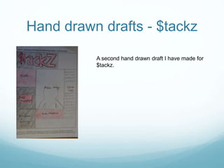
Download to read offline
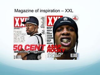
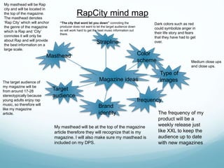
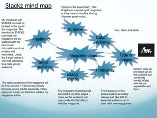
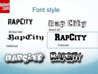
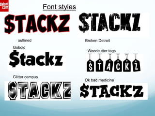
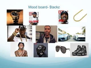
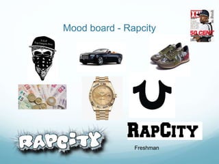
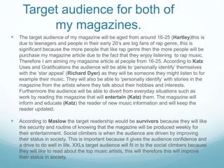

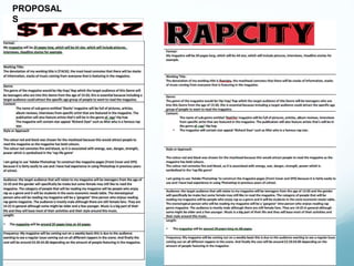
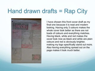
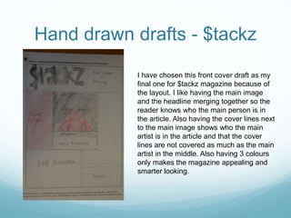
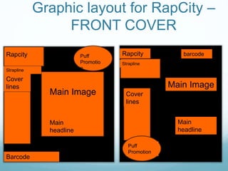

The document provides details about the development of two rap/hip-hop magazines titled "$tackz" and "RapCity". Key details include: - The target audience for both magazines will be 16-25 year olds who listen to rap music. - "$tackz" will use red, black, and grey colors and "RapCity" will use red, black, and white. - The mastheads, or magazine titles, will be "$TACKZ" and "RapCity" in distinctive fonts. - Both magazines will be released on a weekly basis like the inspiration magazine "XXL".


![Coveranalysis[1]](https://cdn.slidesharecdn.com/ss_thumbnails/coveranalysis1-130207060729-phpapp02-thumbnail.jpg?width=640&height=640&fit=bounds)


