Download to read offline


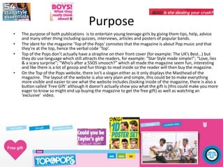
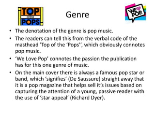
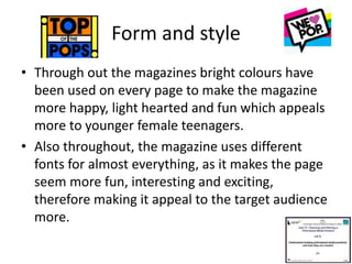
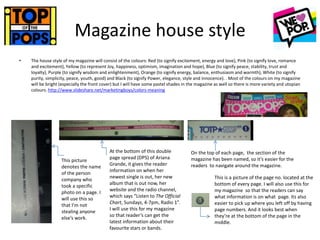
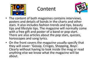


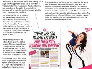

The document discusses the purpose, genre, form and style, target audience, and content of two teen girl magazines - Top of the Pops and We Love Pop. The purpose of both magazines is to entertain young teenage girls through tips, advice, interviews, quizzes and posters of popular bands. The genre is pop music, as indicated by the titles and covers featuring pop stars. The magazines use bright colors, fun fonts and informal language to appeal to their target audience of pre-teen and early teen girls. They include interviews, fashion tips, beauty advice and free gifts/posters. The magazines aim to educate and inform readers about pop culture while fostering relationships through features on celebrities.