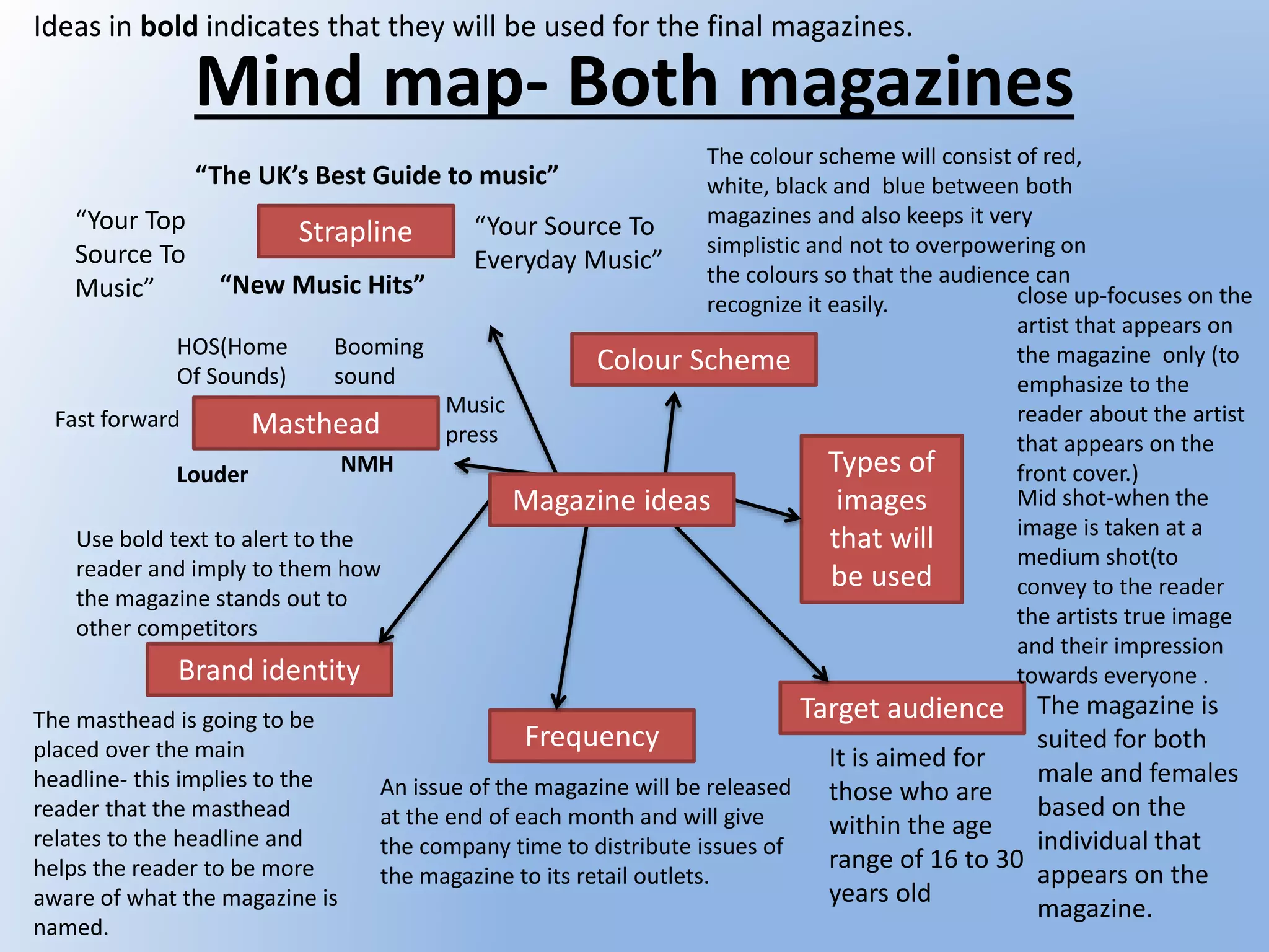
This document outlines plans for two music magazines targeting 16-30 year olds. Key details include:
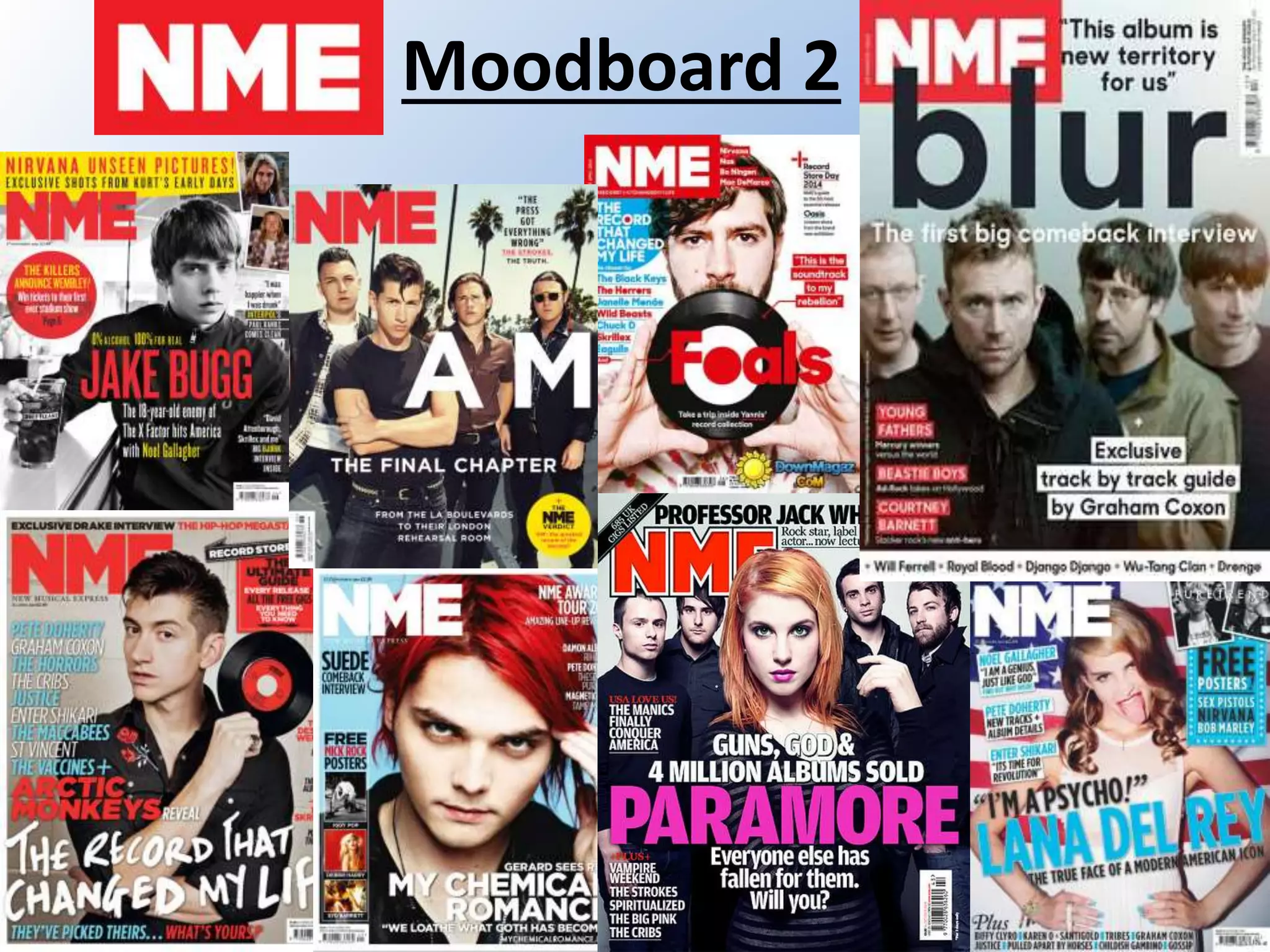
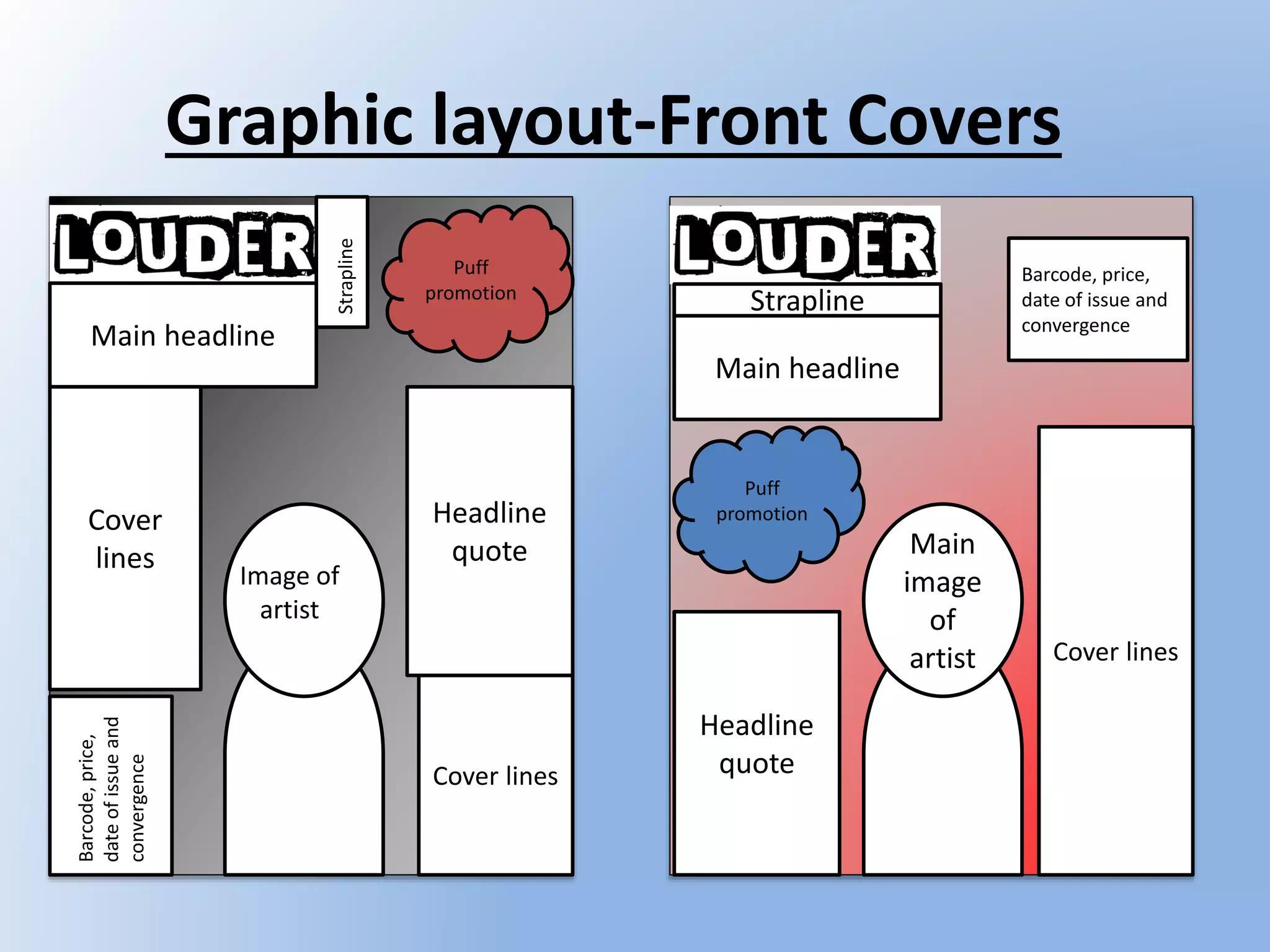
- The magazines will have similar color schemes of red, white, black, and blue for brand consistency.
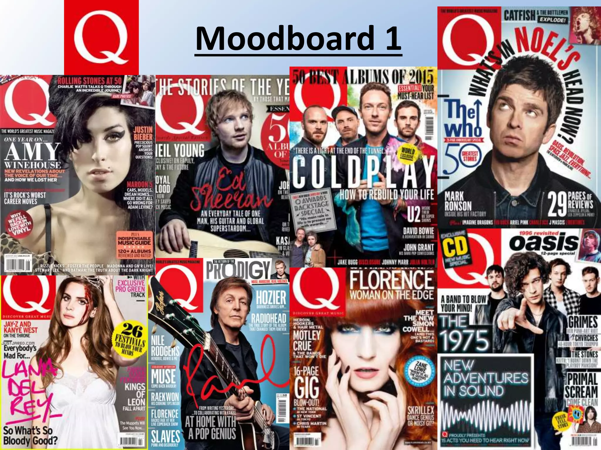
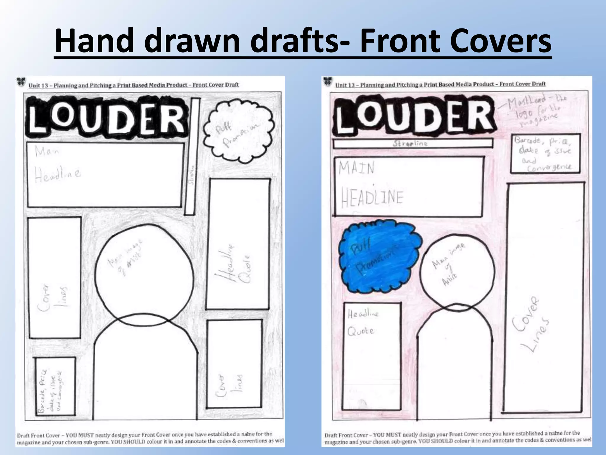
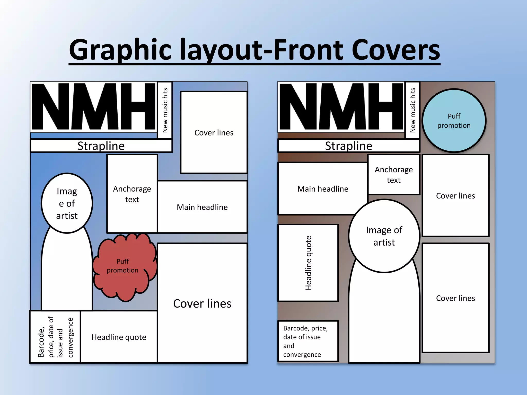
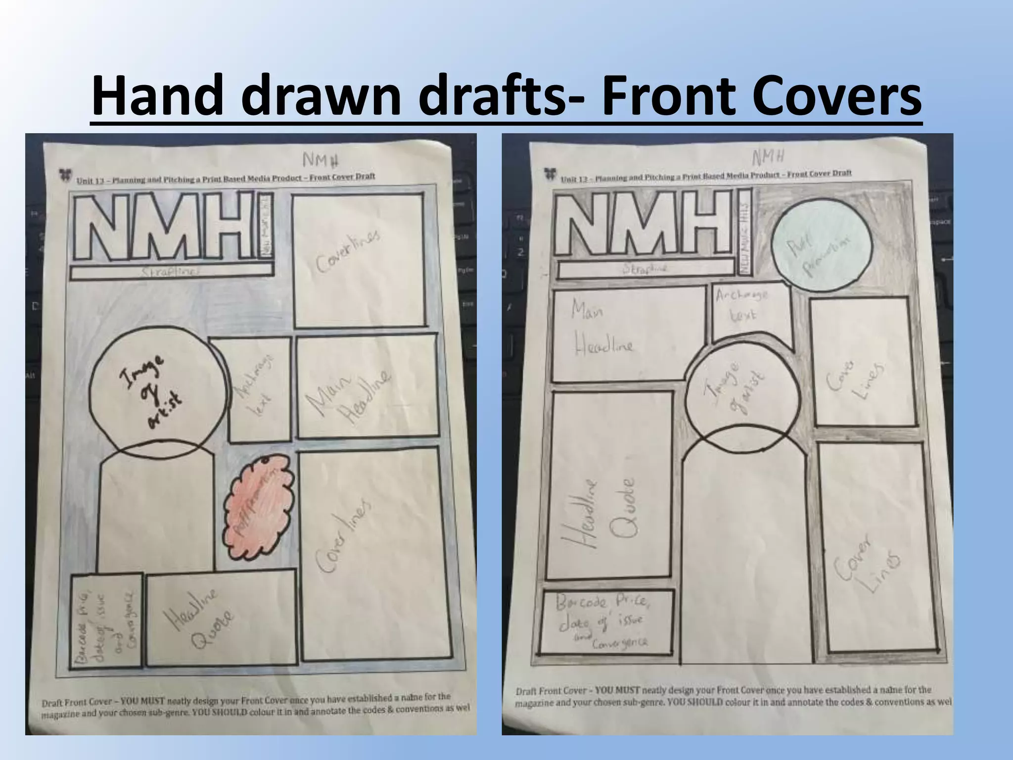
- Images on the covers will be close-ups or mid-shots of artists to emphasize or convey their image.
- The mastheads will use bold fonts like "The Bold Font" and "CF Green Corn" to stand out visually.
- Issues will be released monthly to allow time for distribution. The magazines will have A4 size to fit content.