Download to read offline

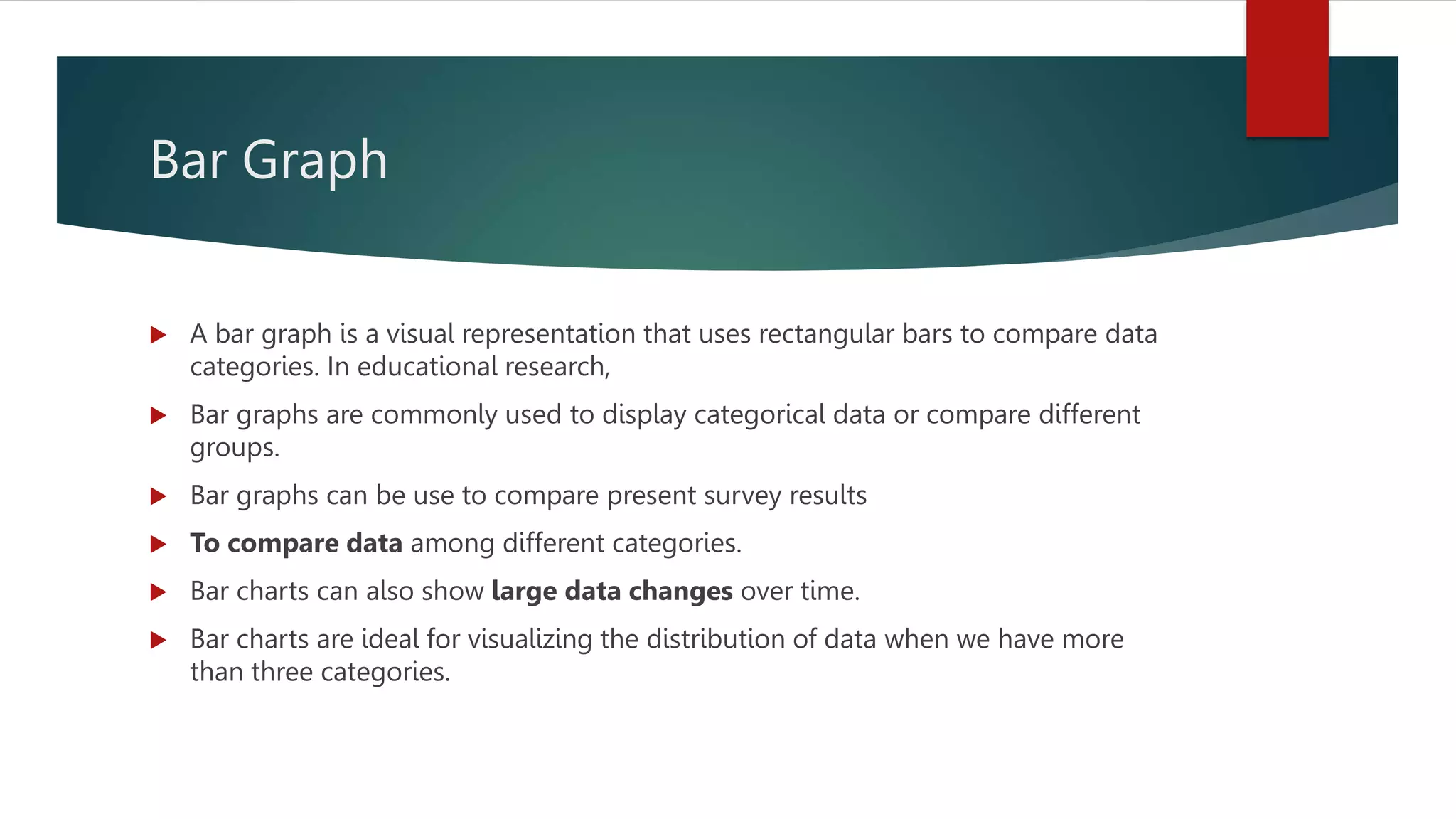


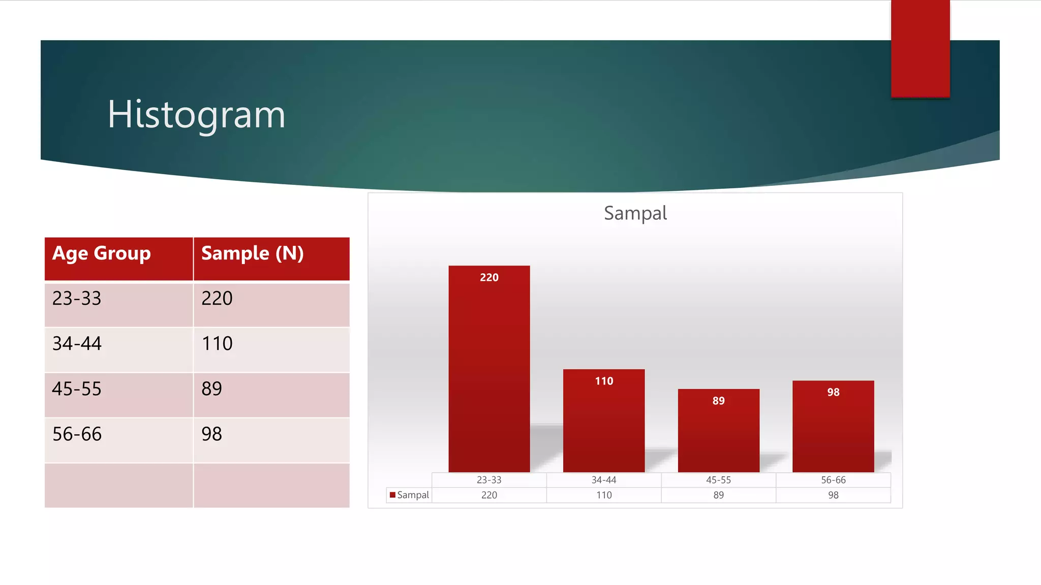

The document outlines various types of graphs and charts, including line graphs, bar graphs, pie charts, and histograms, along with their applications in educational research. It emphasizes how these visual representations help to analyze, compare, and communicate data effectively, highlighting their usefulness in illustrating trends, proportions, and distributions. Each graph type is described in terms of its structure and specific use cases for displaying data.