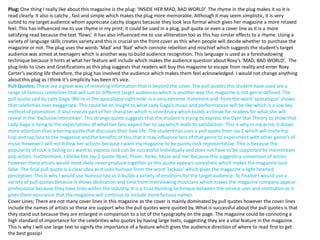
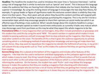
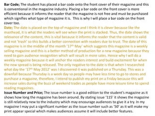
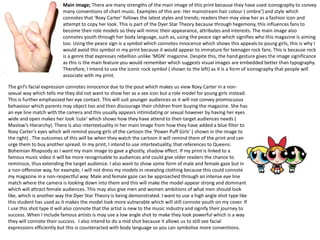
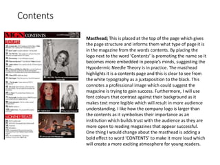
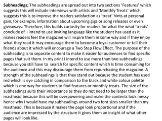
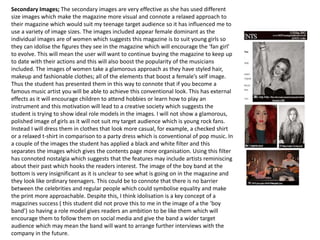
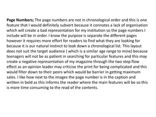
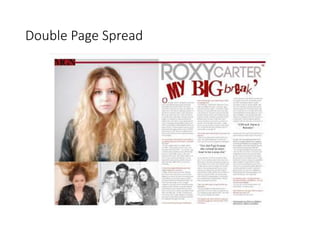
The document provides a detailed analysis and critique of a student-created magazine cover. Some key points:
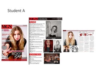
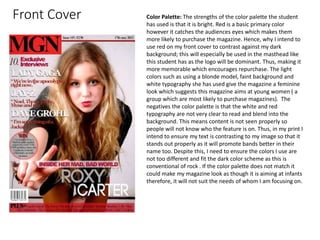
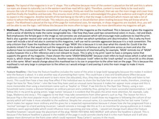
- The student cover uses an effective color palette, layout, masthead, feature headline, plug, pull quotes, cover lines, and main image to target young female readers.
- The analysis critiques some minor weaknesses like unclear masthead text and placement of some elements.
- It also notes conventions the summarizer will apply to their own rock music magazine cover, like using iconic symbols, catchy language, and exclusive interviews to build audience interest.
