SlideShare a Scribd company logo
1 of 23
Textual Analysis 2- Hyperlinked Pages
Layout
Conventionally, websites always come in different layouts depending on the theme or genre and to ensure their website looks unique to prevent a
sameness. However, there is a conventional guideline which many institutions follow, which is by separating the typography at the top of the page and
then the features and images at the bottom. This is so that the reader can guide their way through the site and decide which label will suit their needs to
get a taste of what genre the magazine to decide whether it will attend to their individual needs, this magazine appears upper class due to the features
so it will suit wealthy business owners in this area of the UK. Thus, as there are numerous labels stretched across the first third of the page it informs the
reader and allows them to decide whether it will interest them. This means the right target audience can be achieved, for this particular institution, it is
people living in the Surrey/Hertfordshire/London outskirts area who will be local to current events and this relatability means people are more
encouraged to continue reading through the site. The Uses and Gratifications Theory can be achieved here as people will read it to be educated on
whether they can find their interests within the sites which means that it prevents confusion which frustrates readers and could essentially lead to a
negative reputation. The images cannot be completely seen unless you scroll down the page so it also creates curiosity about the features which
encourages people to discover more and with success this anticipation will lead to repurchase. All of the labels are evenly spaced out to give the page a
symmetrical look which is more eye catching as it looks organised and neat which implies it will be a less stressful read; giving people a purpose to
reading the page. Meaning the Uses and Gratifications Theory will again be achieved as people will read to soothe the troubles from work and read as a
form of escapism. Thus, in a positive way, it isolates people and allows them to temporarily revert to their own personal world; giving people a sense of
privacy. The neat layout and distinction between labels suits professionals living in the region as it will be relatable to the structured and formal
documents they read in their lives, therefore this familiarity will make people feel more comfortable reading the page. However, the layout will not
appeal to a younger audience who prefer a more informal layout, for example, with the pictures more dispersed to have intertextual links to a collage or
scrap book. Therefore, this organised layout suggests that the target audience are of an older generation as the fixed layout is more mature which will
make the reader feel catered to as it will not feel illiterate or poor quality; thus giving the reader assurance. However, the images are different sizes which
still allows the page to look varied and creative which connotes that people will be entertained throughout their navigation of the website, increasing
consumer trust. This is important to influence a positive two step flow effect as people may use hashtags to talk about the institution which will create a
buzz and allow it to become more well known or as this is an elderly audience due to the features such as interior decorating which young people
usually cannot afford, the two step flow effect is more likely to take place through word of mouth. Still this will increase the popularity.
Conventional layout- similar to
‘EXCLUSIVE’.
Banner
The banner includes hyperlinks to the homepage to allow the reader to begin at a starting point and gives them a
place to refer back to which means the purpose of this is for guidance. This is supportive of individuals intellectual
needs as it will allow them to feel more confident using and researching into the website which means they are
more likely to revisit the page and purchase the magazine it’s self which will increase profits and allow the
institution to increase production values to reach a mass audience in this region. Moreover, the banner is placed in
a conventional location at the top of the page; this is so that it is easy to refer back to when using the search engine
and this convenience will mean people will have a more enjoyable read through the site, supporting their Maslow’s
Hierarchy of Needs as their emotional needs will be reached as they will feel happy and valued. The colour scheme
is also conventional; monochrome has been used as black and white are binary opposites so text is legible to
prevent annoyance and therefore the text is clear and identifiable to inform readers which will make people feel
supported. Monochrome is also very fashionable at the moment and has been seen on the catwalks so this
demonstrates modernity which will allow the older audience to feel more youthful but also attract a younger
audience to highlight how low key the webpage is relevant to pop culture which will encourage them to explore the
site to find out more; hooking their attention. The banner only takes up a small proportion of the page to allow the
features to gain maximum recognition as these are the main selling points which will grab peoples attention. Thus,
as the banner is minute compared to other elements on the page it connotes that it has less significance which
means the features will get acknowledged and therefore the regional activities and events of this region will
become bigger and better. The Uses and Gratifications Theory will be achieved as social solidarity will take place as
a hype is built. Capital letters have been used for each subheading of the banner and this conventional as the letters
are symmetrical which gives the page a professional look as all of the letters are equal sizes, if there were lower
case, this may look childlike so it suits the elder audience who will appreciate a classic look as this is what they are
familiar with, for example, when reading newspapers. The use of capitals also is matched with the capitals used in
the masthead so it creates brand identity as it gives the page a particular style which is sophisticated which will be
memorable from the type of typography and boost institutional recognition.
Banner
The lexis of ‘home’ connotes comfort as it is a place of privacy and relaxation so this is an incentive to the reader that the institution
will make them feel welcome. Thus, interactivity takes place and individuals will feel closer and part of the industry and repurchase
to continue this hype. ‘Home’ is also used as a guide for people to start their tour around the site so placing it here means that the
reader has a trouble free experience which means content is likely to be encoded ( liked) by them to influence their return as they
will not have the stress of finding the search engine, this is why my search box will be placed in an obvious position. The second
subheading is separated from ‘home’ which makes it evident that they are different pages. ‘Our magazines’ connotes variety to
suggest that there are many issues to read and this will boost audience satisfaction because there is lots of content to explore and
this reduces boredom which discourages the two step flow effect as people will not choose to discuss the print on social media.
This is why I will include something like this in my production as it is an incentive to the reader that they have choice to find out
more and therefore appears worthy of their time and this hooks their interest. The company also appears salivated through the
team spirit atmosphere created by the use of ‘our’ and ‘us’ which highlights to readers that they will be accepted in society which
will both boost their self esteem ( so Maslow’s Hierarchy of Needs is met due to the peak of emotional needs) and encourage
friendships to form ( so The Uses and Gratifications Theory is achieved), as these theories are both met, it means readers are at
paramount satisfaction to allow the institution to gain a noble reputation and reach a wider demographic. The language used
‘contact us’ is another way to interact and build a connection with the reader too as it makes them feel as though they can gain
support from the company and get more involved; thus, equality is demonstrated as it shows how people can report any issues
openly which means quick resolutions can be made to prevent annoyance. The search box is additionally placed conventionally on
the right hand side like many other search engines such as ‘Firefox’ so it means people will again have a smooth navigation which
therefore caters to the readers needs; this being to have a relaxing journey and to discover further through the site. This
exploration will hook the readers attention and ensure they read through other features to allow all of the site to be acknowledged.
Logo
The logo is conventionally the largest font on the page and this is to signify the institution and to allow it to become recognised by readers,
therefore, the larger it is, the more likely it will become noticed and acknowledged and therefore become a familiar brand. Most institutions use the
logo as there brand identity, for example, VOGUE and Heat magazines have an iconic logo which is memorable and clear that it is connected to
fashion and gossip magazines which ensures they will attract women who want to discover more about beauty and celebs- therefore their unique
selling points are triggered by idolisation.. Thus, the idea is more the logo to become universal. Therefore, as the logo is large it connotes superiority
and dominance to allow readers to feel impressed by the institution and also have more trust within it as it will appear of a higher status. The large
size could also connote the power of this region as London is the capital and a place of tourism and business so it connotes how the people will feel
elite due to the success of this area bringing pride which will encourage people to discover more about this area. Moreover, as London is the capital,
people who do not live in the region may even purchase so that they can join in and again this builds a united nation and shared culture which
means The Uses and Gratifications Theory is achieved. However, the logo is not too overpowering on the page to appear egocentric which could be
off putting for readers as it would not be inviting. Moreover, the size of the masthead is still visual and welcoming as it allows other features to also
appear important which means media imperialism is avoided. This is something I will follow in my production because although I want to show
Leicester as a place to be proud of, I still do not want the institution to appear too dominant as it is just starting out and people will need to become
comfortable with it in order to appreciate it. However the logo is placed unconventionally on the left of the homepage rather in the centre which
gives the homepage a unique look to allow it to stand out as people will be curious of what else the page will include which increases reader
continuity. On the other hand, the logo appears to be competing with an advertisement which is stretched over ¾ of the masthead space. This could
be to convey the region of the magazine as ‘exclusive’ does not reveal the area however the advertisement does which means it will attract wealthy
Londoners who will be interested in middle class leisure activities such as ballroom dancing. However our eyes are instantly drawn to the
advertisement as it is brighter and appears more exciting which means the logo is likely to be ignored. The weaknesses of this is that the logo is
likely to be ignored and therefore not embedded into the audiences minds, which limits the two step flow effect as people will not remember the
name to share with their friends which means they will struggle to reach a mass audience. This is why in my production, the logo will be placed in the
centre as this is where our eyes are naturally drawn to and therefore recognition will be at a peak which means looking for the magazine in shops
will be easier. Thus, profits will increase which could suggest more money into the community for local festivals which will allow the city to have a
celebratory vibe to create a positive atmosphere.
The logo uses the word ‘exclusive’ and this is appealing as it connotes that this is
a regional magazine that is niche by only catering to people in this area and
therefore the reader will feel special as the institution creates a ‘VIP’ perception
as it creates a clique of people in this area. The Uses and Gratifications Theory is
then again demonstrated as communities join together however people from
other regions may feel excluded from the action which makes them feel
irrelevant which means a small demographic can only be reached and profits
cannot boom. The typography has a type writer style due to the spaced
alignment of letters and serif text which suits the elder audience as it has
intertextual links to the 1950’s due to the vintage style that it creates which
connotes to the reader that the website/magazine will focus on classic styles and
events that are mature enough for the audience. However, due to the rise of the
subculture of ’hipsters’ vintage is a current fashion in its self so younger readers
who want to feel alternative will be attracted as it could suggest it will include
quirky events to go to, thus, in some ways, the typography connotes modernity.
Moreover, as the letters are aligned separately, the logo is more likely to be
memorized as it is read letter for letter which encourages people to return and
keep up to date with the fashions, events and lifestyles in this area. The
masthead also uses the same colour palette as the banner at the top, this is to
show continuity and to give the brand a classic identity which appears timeless
to the reader which instantly gives it more poise as the institution appears long
term as black is something that never goes out of style. A male hipster.
Advertisement
The ad flash that is placed next to the masthead is here to gain attention to attract the typical target audience of this
institution, middle class, middle aged- elderly people who have a lot of leisure time, for example, people who are self
employed. Therefore by placing it here, it will instantly pull in readers who are curious to start a new activity.
Moreover, although this dominates the masthead, it could suggest it has more importance however it also gives the
institution a higher reputation as it suggests they have sponsors which is something only large institutions can afford
and therefore people are more reluctant to read in order to feel important and noble- like the institution its self.
Furthermore, the ad is eye catching due to the bright colours as they are bold and visual to give the page vibrancy to
prevent it looking plain due to the basic colour scheme of the typography. The colours used in the ad and the
strawberries are suitable for the season ( July) as it emphasizes the summery vibe in order to build excitement for the
sunny weather, BBQ’s and seaside trips. The Uses and Gratifications Theory is achieved because people will have
purpose to reading the page and that is to relax and chill to get in complete summer mode. Also, this theory is
emphasized as people will ‘learn to dance’ which gives it an educational purpose which means intellectuals in the area
will want to enhance their knowledge, especially the retired who have a lot of spare time. Moreover, ballroom
dancing is an elderly event which is suited to this age group as it may bring nostalgia to their youth where many met
their ‘sweethearts’ and therefore, they click on the link to revert to their past.
Advertisement
The lexis used in the advertisement makes the event appear more spectacular as ‘luxury’ has been used to make it
appear upper class which anchors meaning behind the logo as people will feel ‘exclusive’ for having this opportunity.
The language in this advertisement is well developed and formal and this suits London professionals who socialize in
educated circles however my target audience which is young women would find it too structured and therefore
unable to identify with as women in their 20’s are focused on having fun, going to parties and having a care free
lifestyle. This is why in my production, the language will be informal and youthful however without sounding
childlike in order for them to connect to the institution more effectively. Another indicator that the institutions focal
target audience is middle to upper class is the reference to champagne which is an expensive drink that only the
wealthy can endure in. Especially for an area where the average salary is £32,500 a year and many celebrities live
here such as David Attenborough ( suited to the elder audience) means that this drink is suitable to the glamourous
lifestyle in London. However, as it is free it could promote equality as it allows people of all social circles to
experience this activity; therefore it prevents the company from appearing ignorant and gaining Marxist opposes
due to excluding those of a lower class. The champagne drink is also a sign of celebration so it implies that the
reader will feel rewarded and therefore creates a positive atmosphere.
Advertisement
The advertisement uses small typography is used to give the advertisement a quaint and cute to suit the theme of
the advertisement which is British Summer. However, for an older audience, without sounding patronising they may
need glasses to read the smaller typography so it could be distressing to read. This is why in my production, the
typography will be big and loud to support those with visual deficiencies as it is a way that it can cater for all and
reach their Hierarchy of Needs, as they will feel acknowledged. The serif classic font has been used as it connotes
the institution will focus on traditional dancing which for younger people would be un relatable and almost comical.
This is why instead of focusing on elderly activities, I will include events such as festivals as these are major events
that are exciting due to the music and fashion. The colour scheme used in typography anchor the background as
they are both pink so it emphasizes the sweetness of summer. It could suggest that the target audience is mainly
women as pink is a symbol of femininity too. The champagne colour of the italics makes it feel more special and
encourages people to crave the strawberry, champagne combination so it influences membership. In addition, the
use of italics creates poise and elegance which is symbolic of dancing too so it is another way of attracting
members.
Labels
The labels are conventionally placed horizontally and this allows them to be spread out and fill up the page to
prevent it from looking bare, therefore connoting to the reader that the site is full of content. Also, horizontal
reading is more fluent as we naturally read left to ring rather than top to bottom so it supports the readers needs as
it is a familiar structure which makes their navigation easier. The typography used is tight, tall, capital and serif and
this is a conventional font used in magazines such as VOGUE, so by following this, it conveys that the institution is
traditional which will appeal to the elderly audience as they will want to follow classic styles and activities to remain
sensible rather than the youth who will want to be less sophisticated and more daring. Therefore, this is why
perhaps in my production, more modern typography will be used so that it connotes that the styles are on trend
and fashion future. Faint horizontal lines have been used to separate the banner of labels to give the page a
contemporary to ensure it does not look too old fashioned to make it irrelevant but it also ensures the labels are
distinct to get more recognition. It additionally makes the page look more organised and professional so people are
more likely to read further through as it implies that the information given is completely valid. Grey typography has
been used to give the page a washed look which makes it look fresh and new to connote the relevance of the
information- again a low key method of building trust. The colour scheme also prevents a clash with the black
masthead which makes the logo stand out and the page look more visual overall so content will be encoded as
preferred reading takes place due to the neatness which prevents people from feeling chaotic when they read.
The label which states ‘WHATS ON’ has an informal tone to it due to the language however the use of capitals makes it appear
more loud to suggest that there are many exciting events for people to go to, therefore causing the audience to anticipate about
what may be included. The Uses and Gratifications Theory is again demonstrated because as this refers to events it implies it will
bring people together so social solidarity will take place as people can share the experience and build a buzz in this area. This
promotes home businesses and events which is something I want to achieve in my production as it builds a better connection with
the lifestyle of the people and boosts interactivity. Next the labels ‘HOMES&GARDENS’, ‘STYLE’, ‘FOOD AND DRINK’, ‘TRAVEL’,
‘MOTORING’ signify a variety to suit a variety of people, both men and women which means a wider demographic can be achieved
and boost popularity as it may be bought for households or husbands and wives. This means there is no issue of sexism as men
and women are catered to equally and this means it encourages a united nation and prevents the stigma that lifestyle magazines
are only for women. It will therefore encourage a mass two step flow effect as people tell there friends or see people reading it in
public and then purchase a print to join in on the hype. The use of the word ‘PEOPLE’ connotes involvement with the industry, for
example, with celebrities so this builds curiosity of who the institution is linked to and gives it a more respected status due to this
connection. Therefore, iconography becomes a huge selling point as people will purchase to find out ‘exclusive’ news. The label
which states ‘competitions’ also signifies interactivity as it connotes a chance for people to get rewarded and live the life of those
in the industry. Therefore, the Dyer Star Theory takes place as people will enter as they aspire to be like their idols- due to the
influence of the so-called ‘American Dream’. However, for a wealthy area, competitions could be off putting for readers as it could
make the institution look cheap, although for younger readers such as students it highlights the opportunities available and this
will interesting them as the youth aspire to be rich.
Image 1
The first image aligned on the top, left of the site focuses on exterior design- a topic which is likely
to appeal to people in this area who will have large properties and money to spend on home
décor. Therefore it is suited to their interests and priorities of money spending. This is less likely to
attract people such as students who cannot afford to spend money on decorating- this is why if I
include interior design, it will be interior for apartments and flats rather than grand garden sets that
only suit the middle class in large homes. This means the audience is limited as younger readers
cannot relate to this topic, however it could be seen as inspiration for when they are older. The use
of stone is a symbol of wealth as it is an expensive material which again anchors the lexis on ‘luxe’
in the caption as it appears of a high quality to make readers feel special. The image is suitable to
the season as the green grass and trees connote summer which again connotes relevance. The
brightness of the image creates imagery for the reader of social events such as parties which makes
this garden set appear a necessity. Grey is also a major on trend colour for home décor at the
moment so this connotes relevancy again to ensure this is modern taste. The large furniture chairs
in the centre connote that this will be bring people pride in their homes but additionally, the chairs
are a sign of comfort to suggest people will feel as though they belong in their home and feel they
need to purchase it to reach this goal. The use of the word ‘luxe; is also elite and suggests it allows
readers to indulge which means the Uses and Gratifications Theory is achieved as people read to
relax. Moreover, this is emphasized through the description of the link being ‘tips’ which connotes
that it will be short, easy and not too in depth which could be boring for the reader, thus, the
simplicity means people with busy lives can also enjoy the content. Direct language is additionally
used to connect to reader and this makes it more personal to lure the audience in. They have
described a garden/patio as ‘OUTSIDE SPACE’ which connotes freedom and open plan living which
is something that is suitable for the middle class who can access posh furniture due to wealth.
Image 2The image aligned to the bottom left of the page is focused on the
theme of food, something that is universally loved by everyone so this
reaches out to a wider demographic. The food of ‘shakshuka’ is a healthy
breakfast made up of eggs and fresh produce, something only the
middle class can afford to do as many poorer families cannot afford to
buy fresh produce regularly. Marxists would argue this excludes the
working class and makes them feel irrelevant and this could mean the
company could be criticized and gain a tarnished reputation which will
limit the companies progression. However, the healthy food promotes
wellbeing which meets Maslow’s Hierarchy of Needs as an individuals
physical needs will be on top form. The subheading mentions how it is a
‘weekend recipe’ which implies it is time consuming so many may be put
off the effort as it is not simple. On the other hand, others will see it as a
reward for a week of work and to spend time on things they enjoy such
as cooking which makes the institution more personable. The bright
colours of the dish make it more visual and connotes the cliché’ saying
that people ‘eat with their eyes’ so people will be encouraged to try it.
Moreover, shakshuka is a dish which is eaten in North Africa so it
influences a multicultural society which boosts acceptance of different
norms and values. The image is placed below the interior décor to show
it is less important too to suggest it is of less interest as it is so unique so
people may ignore.
Image 3The image which is placed in the centre of the page is the largest on the homepage which
connotes that is most likely to grab the readers attention, this is due to the celebrity
endorsement used to invite her fans. Moreover, the size of the image reflects her dominance and
superiority in the industry as a pop star and this influences idolisation as people will read to
follow their idol and to get closer to them. Meaning The Dyer Star Theory is achieved as people
will learn more about their idols and this will create the perception that they are ‘real people’
which allows the institution to appear personable. Additionally, the benefits of the celebrity
endorsement is that it will have intertextual links, for example, when one of her songs places such
as ‘Put Your Records On’ will remind people to look up the magazine- as it is a famous song, it is
beneficial as it will be a constant reminder. The song was also released in 2006 which suggests
this feature appeals to adults who will remember the songs release and reverts them back to
their teenage years and will read due to nostalgia. The long shot of the star is taken from a
slightly low angle which shows her power to imply a comeback and to build a buzz over this and
allow her to gain maximum promotion of her music. The audience will feel intrigued to find out
about her music as the low angle connotes her confidence which suggests that it will be sassy.
Moreover, female gaze is explored here as it shows women as independent and self-assured
which will encourage people to aspire to their dreams; implying this invites the younger audience
in who have hopes and goals to reach. However, the star is from Leeds which does not express
‘home grown, local talent’ which connotes media imperialism and does not promote
opportunities for people in the region. This is why in my print, I will promote people such as ‘Miss
Leicestershire’ for example mentioned in the contents page. The desert location for the shoot
suggests it may be Hollywood or Las Vegas, which makes her appear more famous for visiting
such high status places and readers will be curious to find out about her journey as a musician.
The desert is also a symbol that the star is daring by exploring into unknown territories- to
encourage people to be daring and listen to her new album. It also separates the reader from the
star as it highlights how they live completely different lives meaning people will be more amazed
by her stories as they will be extravagant and expected to meet up to the crazy lifestyle of a pop
star.
The pink, metallic two piece worn by the star is a binary opposite to the desert
background as her outfit expresses modernity and the location appears old.
However, her outfit shows how she has returned to the industry as a new person
whilst remaining onto her original roots which means her fans are assured she is
still the person they learned to love. The outfit also allows her to stand out to
connote how she is the centre of attention which again makes her appear more
separate from the reader due to this superiority. Her pink outfit expresses
femininity which means The Fear of Castration is explored as women are shown
as successful which groups such as feminists who will appreciate how women
are shown as free. However for the audience which may be traditional,
patriarchal men, it may be decoded if they feel threatened. The flared trousers
worn have a 70’s vibe which is a trend which shows how the star is stylish and a
fashion icon which means fashion lovers will read due to iconography. The
singers facial expression is straight which connotes she is professional and
serious about her music but there is still an eye line match which connects to
the reader. The Dyer Star Theory is then achieved as hegemony has been
reached as the audience will feel closer and connected to the star. The interview
shows links in the industry however as it is only 5 minutes makes it more
exclusive as it suggests the star is very busy and has little spare time. Therefore,
this assures the reader that they are of a higher status and this allows the
institution to gain respect. The name of the celebrity is placed in the caption in
capital letters and this is to make it obvious to readers that there is celebrity
gossip and people will read to feel special and find out prior to the rest of
society. The typography is also the same of the labels which connotes the
continuity to allow the page to have a particular theme which is classic and
traditional to follow in VOGUE’S footsteps.
Image 4
The fourth image placed on the top right focuses on the MasterChef star ‘Theo
Michaels’ who is from the region of the outskirts of London. By featuring him on the
webpage, it connotes the opportunities that the institutions provide, for example,
offering publicity which is an incentive to people that they can achieve and be
successful which will influence a positive work ethic in the area. The medium close up
shot is so that his face can be identified, as he is not a high class celebrity, he will be less
recognisable so by having a close up shot helps with identification. His face is
additionally in focus so that he stands out and shows his fame in the local area to create
a god like image as he is clear compared to the blurred background and this is showing
the appreciation of his talent. His facial expression is a smirk and a direct eye line match
to show his pride and confidence but also makes him an approachable person so the
Dyer Star Theory is explored as it builds a close connection with the reader which makes
them feel ‘VIP’. The apron he wears is cliché’ for a chef but again makes his occupation
more obvious so people are more likely to have intertextual memories from MasterChef.
Thus, when people watch the show, it will remind them of this institution and influence
them to read another edition or keep up to date with local news. The use of the
language ‘My neighbourhood’ has a homely feel and shows how he is proud of his
region and this incentive will reflect to those in the audience. This means people can
relate to the reality star as well which means interactivity is peaked as audiences will feel
connected to him. Similar to how in Leicester, many people feel connected to the band
‘Kasabian’ due to links through schools or friends. The text however slightly covers his
face which could be seen as disrespectful and demoralizing which could leave the
institution open criticism by his supporters by not offering him complete covering;
however it could suggest the caption is more effective as it is informative by educating
people about his background to give them an insight to the feature. This feature may
again only appeal to older audiences who have the time to invest in cooking and
reading whereas young people who are working or studying will want short features
which will pass a period of time such as a lunch break.
Hyperlinked page within website ‘STYLE’
Layout
At a first glance, the hyperlinked page shows the same layout as the homepage as the first third includes, the
banner, masthead and labels that appear on the homepage. This is to signify continuity which makes it
appear more professional as the brands identity ( the logo) is repeated to show how it is important but also
increase recognition to boost future purchase of the magazine. The advertisement is also repeated to
highlight how the aim is to encourage social solidarity by bringing people together through dancing and by it
appearing once again prevents it from becoming ignored. By placing the original features from the
homepage, it gives the reader a guide to refer back to which is crucial to allow them to navigate confidently
around the site and therefore gives them independence which makes them feel appreciated. The images are
again aligned neatly and symmetrically which is similar to the homepage which makes the institution appear
more professional due to the organisation which is more mature. However, the features are aligned
horizontally with advertisement promotions on the side which is unlike the homepage when they are very
close together and this could be to encourage the reader to discover more as there is anticipation of what
they will see when they scroll down the page which hooks their interest. On the contrary, the advertisements
are placed next to features as puffs to make the reader feel they will be rewarded by making savings which
encourages them to continue to read due to this. Linking to Maslow’s Hierarchy of Needs as many will feel
their economic needs have been fulfilled which will give the incentive that the institution is personable by
giving something back to the reader.
Subheading
The subheading is ‘style’ connotes to the reader the genre of the page
meaning that it will appeal to middle to elderly aged women who desire to
keep up to date with trends but also gain inspiration on age appropriate
clothing and accessorizes too such as subtle print and longer hem lines. Thus,
implying it appeals to women who take pride in the way they look and have an
eye for materialism. The use of red and black is a classic symbol of fashion as
it has intertextual links to the logo of the film ‘The Devil Wears Prada’ which is
a film focusing on the fashion world in New York, therefore it makes it feel
more prestige to the reader. The typography used has a formality to it as it is
serif which instantly makes it more classic and suggests to the reader that it
will include traditional styles to suit their sensible tastes. The typography
mirrors the label on the homepage which is another way of making the brand
identifiable through the style they adapt through continuous use of the same
font so it will become more iconic.
Feature - Suitcase Promotion
The suitcase feature is a relevant theme to focus on as it anchors the publish
date (July) as this is a time when most people go on holiday so people are more
likely to want to invest in a suitcase as it is practical for their current lifestyle. The
images connote a summery vibe as the suitcases a florescent colours which
makes the feature look vibrant and flamboyant and therefore more inspiring to
read. Implying that this will appeal to women who want to stand out and gain
attention, or for sensible to reasons to help people find their suitcase on the
conveyer belt so it gives the feature more purpose and prevents people from the
stress of losing a suitcase so supports their emotional needs as part of Maslow’s
Hierarchy. This feature is more likely suited to the middle class who can afford to
go abroad too and have more spare money to invest in luggage luxury in order
to appear and feel superior. However, it may appeal to young people who want
to explore the world as it is also an essential they will need. The language used in
the feature is inviting, for example, ‘we love’ which makes people feel united by
following this advice to feel accepted and join in on the hype. Linking to the Uses
and Gratifications Theory as social solidarity is demonstrated through the use of
‘we’ by making readers feel part of a society. The alliteration used also makes
the caption more catchy and fun to read so it allows the reader to unwind as it
takes an informal approach. The Uses and Gratifications Theory is again
demonstrated as people will read to distract themselves from the stresses at
work. The typography again matches the labels which is another method of
making the site continuous and more memorable by adapting such a classic style
which will appeal to those who are older as they will be assured content is
catered to them and not the modern youth.
The authors name has also been noted in capitals so that it is
bold and allows him to be noticed for his work. Showing, a
respectful working environment which will allow the institution to
gain a kind and caring reputation which connotes that workers
are not taken for granted. Also as this feature is placed at the top
of the page, symbolises how it is new and fresh and encourages
the audience to feel special by finding out the latest news.
Feature - Suitcase Promotion
In the subheading to the feature, the witty language makes it look exciting to
read and as though it will inspire people to become fashionistas when they
travel. This could be due to the notion of celebrities looking glamourous in the
airports and therefore encouraging the Dyer Star Theory as people purchase to
feel like a star and take on this role. The first few words ‘pack up your troubles’
has many intertextual links that link to both the old and young, for example, it is
a war time song called ‘It’s A Long Way To Tipperary’ which will remind people to
stay positive but also a song by Eliza Doolittle called ‘Pack Up’ which was
released in 2010 so it will also show how they are following recent pop culture.
Also when these songs are heard, it will remind people of the feature and make
them curious to look at the new, news that ‘exclusive’ has. Both show how
holidays are a time to forget about stress and allow our selves to appreciate life
so it sets the feature off on a positive tone. Direct language is also used to
connect with the reader and make them feel more involved in the institution
which allows them to feel closer to the action and create a feeling of pride.
However, the negative language of ‘style conscious’ could appear patronising or
judgemental to readers as it states that fashion lovers have anxiety over their
looks and therefore mean the institution could have a negative reputation which
makes it off putting for the region. This is why in my print, the language will
always have positive connotations to prevent the readers from gaining offence as
this could prevent the institution from progression.
Advertisement
The advertisement again is used to demonstrate how the page has sponsors to connote the links
within the industry to make people feel as though the site will be beneficial to read if they can
find out about new brands and clothing lines. The title of the advertisement uses a sans-serif font
where the letters are separately aligned which connotes modernity. This will mean that older
women will be able to feel young again which is more complimentary to their needs. The grey
typography is also matches to the grey, washed colour scheme on the homepage so it has a
similarity and ensures the page still appears neat which adds to the professionalism. ‘PURE’
suggests that the clothing line will have sophisticated styles which are not provocative as ‘pure’ is
a symbol of innocence so it is for women who want to avoid revealing clothing and more
conservative. The word collection underneath makes it feel more upper class as it suggests that it
only suits to those who hope for a prestige look which could make those of a low income feel
intimidated and de-valued which could lead to a smaller demographic being reached. However,
as most people in this area are middle class, it is less likely to be an issue. The italics used in the
word ‘enjoy’ create imagery for something saying it which makes it more personable but also
adds a smooth tone to the advertisement to break the distance and prevent it from appearing
robotic. The promotion of ‘25% off’ makes readers feel appreciated as it shows how them will
rewarded which makes their purchase of the clothes they will wear worth the while. It also makes
people feel exclusive by finding these secret deals. Therefore people are likely to return to the
site to find out about more discount codes. It may even appeal to lower class women as even
though it may be more formal styles, it gives them an opportunity to feel elite through high
quality clothing so the promotion supports their financial needs by providing them with
opportunities.
Advertisement
The location of the boutique is in the region and this demonstrates their support for local businesses to allow
them to gain success and prevent the dominance of high street franchises which restrict variety in the fashion
industry. Therefore, this is something I aim to promote on my website as it means niche boutiques can reach a
wider demographic and this will increase their profits. The capitals used in the language ‘SHOP NOW’ make it
seem sudden and an incentive for people to rush out and shop. It also symbolises how the promotion is active
which will create a buzz as people will become more involved in the community. The way this is also outlined
with a box makes it stand out and influences people to click on it and interact which also builds a connection
with the audience as more people join. Moreover, the model used is youthful however mature looking (
around the age of 30) which shows how it is suited to a sensible audience. This could suggest that the clothing
will make younger people feel young and beautiful so female gaze will take place as the audience aspire to
have the same presence as the model. Her natural look of brown hair has a classy look and has intertextual
links to Kate Middleton's hairstyle so it suggests it will make women feel like royalty. The direct eye line match
of the model connotes confidence which shows how women should feel confident in their style which will
boost their self esteem too.- thus, people will return to the site to get this feeling again, The pose of the
model which can be seen from the medium long shot is relaxed and casual which shows it promotes an off-
duty style which will vary from people’s work attire and distract them from the boring office fashion which can
become repetitive. The palm print top is an on trend look where institutions such as Topshop promote this
through their dresses; which means women can feel stylish. However as it is long sleeve and navy, it remains
subtle which means it is not too loud for elderly women who want to feel classy rather than stand out. White
jeans are also a simple piece which will attract people as it is practical and can become an investment so
people will feel as though they are saving money. However to prevent the outfit from looking plain, the red
clutch bag brings colour and shows how women should still experiment with fashion in order to stay relevant
which will make them feel more significant. However, although this is suited to the target audience for
‘EXCLUSIVE’ my print will include more unique styles which will encourage women to be bold and crazy which
is part of being young. The site has also used synergy, for example, through having a Pinterest flash of ‘save’
which means people are more likely to remember this promotion. Especially as ‘Pinterest’ is available from the
app store, women will be able to access the look from their smart phones which makes it more convenient.
However, many elder women may not have smart phones so it could be confusing to them so it is likely to go
unnoticed. The word, ‘print’ would be more suitable as many elderly may feel more comfortable with a
physical copy of the promotion; supporting their intellectual needs.

More Related Content

What's hot

Q1 Conventions Evaluation Question
Q1 Conventions Evaluation QuestionQ1 Conventions Evaluation Question
Q1 Conventions Evaluation Questionhollygruncell
 
Homeless evaluation
Homeless evaluationHomeless evaluation
Homeless evaluationashboyne
 
Craft beer cellar online marketing final no changes
Craft beer cellar online marketing final no changes  Craft beer cellar online marketing final no changes
Craft beer cellar online marketing final no changes Kathy Nguyen
 
Music magazine evaluation
Music magazine evaluationMusic magazine evaluation
Music magazine evaluationRE2707
 
User behavior
User behaviorUser behavior
User behaviorPhi Jack
 
Social Action Evaluation
Social Action EvaluationSocial Action Evaluation
Social Action EvaluationChloeandRachel
 
Question 1 - conventions
Question 1 - conventionsQuestion 1 - conventions
Question 1 - conventionslucycoates1
 
Content presentation - Bangkok Conference 2012
Content presentation - Bangkok Conference 2012Content presentation - Bangkok Conference 2012
Content presentation - Bangkok Conference 2012Kirsty Brown
 
Fatual writing analysis
Fatual writing analysisFatual writing analysis
Fatual writing analysisJoeHeadford
 

What's hot (19)

Q1 Conventions Evaluation Question
Q1 Conventions Evaluation QuestionQ1 Conventions Evaluation Question
Q1 Conventions Evaluation Question
 
Evaluation
EvaluationEvaluation
Evaluation
 
Homeless evaluation
Homeless evaluationHomeless evaluation
Homeless evaluation
 
Craft beer cellar online marketing final no changes
Craft beer cellar online marketing final no changes  Craft beer cellar online marketing final no changes
Craft beer cellar online marketing final no changes
 
Question 2
Question 2Question 2
Question 2
 
Music magazine evaluation
Music magazine evaluationMusic magazine evaluation
Music magazine evaluation
 
User behavior
User behaviorUser behavior
User behavior
 
Social Action Evaluation
Social Action EvaluationSocial Action Evaluation
Social Action Evaluation
 
Media evaluation
Media evaluationMedia evaluation
Media evaluation
 
Evaluation
EvaluationEvaluation
Evaluation
 
Question 1 - conventions
Question 1 - conventionsQuestion 1 - conventions
Question 1 - conventions
 
Unit 35 - LO1
Unit 35 - LO1Unit 35 - LO1
Unit 35 - LO1
 
Unit 35 - LO3
Unit 35 - LO3Unit 35 - LO3
Unit 35 - LO3
 
Content presentation - Bangkok Conference 2012
Content presentation - Bangkok Conference 2012Content presentation - Bangkok Conference 2012
Content presentation - Bangkok Conference 2012
 
Unit 35 - LO2
Unit 35 - LO2Unit 35 - LO2
Unit 35 - LO2
 
Unit 35 - LO4
Unit 35 - LO4Unit 35 - LO4
Unit 35 - LO4
 
Fatual writing analysis
Fatual writing analysisFatual writing analysis
Fatual writing analysis
 
Question 1
Question 1Question 1
Question 1
 
Evaluation
EvaluationEvaluation
Evaluation
 

Viewers also liked

Ancillary tasks-student textual analysis
Ancillary tasks-student textual analysisAncillary tasks-student textual analysis
Ancillary tasks-student textual analysischloecotterill1
 
Primavera Training
Primavera TrainingPrimavera Training
Primavera TrainingSanjay Gupta
 
Sabitha_Resume2
Sabitha_Resume2Sabitha_Resume2
Sabitha_Resume2Sabitha S
 
ΒΙΟΓΡΑΦΙΚΟ ΣΗΜΕΙΩΜΑ
ΒΙΟΓΡΑΦΙΚΟ ΣΗΜΕΙΩΜΑΒΙΟΓΡΑΦΙΚΟ ΣΗΜΕΙΩΜΑ
ΒΙΟΓΡΑΦΙΚΟ ΣΗΜΕΙΩΜΑVangelis Karatzas
 
Bahan Ajar Narrative Text (Fable)
Bahan Ajar Narrative Text (Fable)Bahan Ajar Narrative Text (Fable)
Bahan Ajar Narrative Text (Fable)Mulyani Azmi
 
1.cosmeticos de higiene
1.cosmeticos de higiene1.cosmeticos de higiene
1.cosmeticos de higienemaribelfavela
 
India seed market report 2020 |India Hybrid Seeds Market|Vegetable Hybrid S...
India seed market report   2020 |India Hybrid Seeds Market|Vegetable Hybrid S...India seed market report   2020 |India Hybrid Seeds Market|Vegetable Hybrid S...
India seed market report 2020 |India Hybrid Seeds Market|Vegetable Hybrid S...Ken Research Pvt ltd.
 

Viewers also liked (12)

Ancillary tasks-student textual analysis
Ancillary tasks-student textual analysisAncillary tasks-student textual analysis
Ancillary tasks-student textual analysis
 
Focus Group
Focus GroupFocus Group
Focus Group
 
Primavera Training
Primavera TrainingPrimavera Training
Primavera Training
 
Manajemen pemasaran
Manajemen pemasaranManajemen pemasaran
Manajemen pemasaran
 
Sabitha_Resume2
Sabitha_Resume2Sabitha_Resume2
Sabitha_Resume2
 
ΒΙΟΓΡΑΦΙΚΟ ΣΗΜΕΙΩΜΑ
ΒΙΟΓΡΑΦΙΚΟ ΣΗΜΕΙΩΜΑΒΙΟΓΡΑΦΙΚΟ ΣΗΜΕΙΩΜΑ
ΒΙΟΓΡΑΦΙΚΟ ΣΗΜΕΙΩΜΑ
 
Desodorante
DesodoranteDesodorante
Desodorante
 
Bahan Ajar Narrative Text (Fable)
Bahan Ajar Narrative Text (Fable)Bahan Ajar Narrative Text (Fable)
Bahan Ajar Narrative Text (Fable)
 
La piel: Parte II
La piel: Parte IILa piel: Parte II
La piel: Parte II
 
1.cosmeticos de higiene
1.cosmeticos de higiene1.cosmeticos de higiene
1.cosmeticos de higiene
 
La Piel: parte I
La Piel: parte ILa Piel: parte I
La Piel: parte I
 
India seed market report 2020 |India Hybrid Seeds Market|Vegetable Hybrid S...
India seed market report   2020 |India Hybrid Seeds Market|Vegetable Hybrid S...India seed market report   2020 |India Hybrid Seeds Market|Vegetable Hybrid S...
India seed market report 2020 |India Hybrid Seeds Market|Vegetable Hybrid S...
 

Similar to Textual analysis 2 hyperlinked pages

Drafting Textual Analysis
Drafting Textual AnalysisDrafting Textual Analysis
Drafting Textual Analysischloecotterill1
 
Billboards codes and convetnions
Billboards codes and convetnionsBillboards codes and convetnions
Billboards codes and convetnionsSamjohnson98
 
Regional magazine websites codes and conventions
Regional magazine websites codes and conventionsRegional magazine websites codes and conventions
Regional magazine websites codes and conventionsharrydarling777
 
College Magazine Evaluation
College Magazine EvaluationCollege Magazine Evaluation
College Magazine Evaluationj7ralph
 
Analysis of regional websites
Analysis of regional websitesAnalysis of regional websites
Analysis of regional websitesgeehardy
 
Codes and conventions of regional magazine websites
Codes and conventions of regional magazine websitesCodes and conventions of regional magazine websites
Codes and conventions of regional magazine websitesnathan gkikas
 
Evaluation - Question 2
Evaluation - Question 2Evaluation - Question 2
Evaluation - Question 2Matthew James
 
Evaluation - Question 2
Evaluation - Question 2Evaluation - Question 2
Evaluation - Question 2Mjames00
 
Codes and conventions for hyperlinked websites
Codes and conventions for hyperlinked websitesCodes and conventions for hyperlinked websites
Codes and conventions for hyperlinked websitesHakan Tezcanli
 
Media studies evaluation a2 done
Media studies evaluation a2 doneMedia studies evaluation a2 done
Media studies evaluation a2 doneSamstudd
 
Codes and conventions for hyperlinked websites
Codes and conventions for hyperlinked websitesCodes and conventions for hyperlinked websites
Codes and conventions for hyperlinked websitesHTezcanli1
 
Media studies evaluation a2
Media studies evaluation a2Media studies evaluation a2
Media studies evaluation a2Samstudd
 
Fashion and beauty conventions
Fashion and beauty conventionsFashion and beauty conventions
Fashion and beauty conventionsmaisieweaver99
 
Codes and Conventions - WEBSITES
Codes and Conventions - WEBSITES Codes and Conventions - WEBSITES
Codes and Conventions - WEBSITES Alice Broadley
 

Similar to Textual analysis 2 hyperlinked pages (20)

Drafting Textual Analysis
Drafting Textual AnalysisDrafting Textual Analysis
Drafting Textual Analysis
 
Billboards codes and convetnions
Billboards codes and convetnionsBillboards codes and convetnions
Billboards codes and convetnions
 
Regional magazine websites codes and conventions
Regional magazine websites codes and conventionsRegional magazine websites codes and conventions
Regional magazine websites codes and conventions
 
Gcse planning selection
Gcse planning selectionGcse planning selection
Gcse planning selection
 
College Magazine Evaluation
College Magazine EvaluationCollege Magazine Evaluation
College Magazine Evaluation
 
Evaluation
EvaluationEvaluation
Evaluation
 
Evaluation
EvaluationEvaluation
Evaluation
 
Analysis of regional websites
Analysis of regional websitesAnalysis of regional websites
Analysis of regional websites
 
Codes and conventions of regional magazine websites
Codes and conventions of regional magazine websitesCodes and conventions of regional magazine websites
Codes and conventions of regional magazine websites
 
Response to the brief
Response to the briefResponse to the brief
Response to the brief
 
Technologies
Technologies Technologies
Technologies
 
Evaluation - Question 2
Evaluation - Question 2Evaluation - Question 2
Evaluation - Question 2
 
Evaluation - Question 2
Evaluation - Question 2Evaluation - Question 2
Evaluation - Question 2
 
Codes and conventions for hyperlinked websites
Codes and conventions for hyperlinked websitesCodes and conventions for hyperlinked websites
Codes and conventions for hyperlinked websites
 
Media studies evaluation a2 done
Media studies evaluation a2 doneMedia studies evaluation a2 done
Media studies evaluation a2 done
 
Codes and conventions for hyperlinked websites
Codes and conventions for hyperlinked websitesCodes and conventions for hyperlinked websites
Codes and conventions for hyperlinked websites
 
Media studies evaluation a2
Media studies evaluation a2Media studies evaluation a2
Media studies evaluation a2
 
The crack website
The crack websiteThe crack website
The crack website
 
Fashion and beauty conventions
Fashion and beauty conventionsFashion and beauty conventions
Fashion and beauty conventions
 
Codes and Conventions - WEBSITES
Codes and Conventions - WEBSITES Codes and Conventions - WEBSITES
Codes and Conventions - WEBSITES
 

More from chloecotterill1

How did you use media technologies in the construction,research, planning and...
How did you use media technologies in the construction,research, planning and...How did you use media technologies in the construction,research, planning and...
How did you use media technologies in the construction,research, planning and...chloecotterill1
 
How did you use media technologies in the constuction,research, planning and ...
How did you use media technologies in the constuction,research, planning and ...How did you use media technologies in the constuction,research, planning and ...
How did you use media technologies in the constuction,research, planning and ...chloecotterill1
 
Cohesive Marketing Campaigns
Cohesive Marketing CampaignsCohesive Marketing Campaigns
Cohesive Marketing Campaignschloecotterill1
 
Ancilarly Textual Analysis 2-Hyperlinked pages
Ancilarly Textual Analysis 2-Hyperlinked pagesAncilarly Textual Analysis 2-Hyperlinked pages
Ancilarly Textual Analysis 2-Hyperlinked pageschloecotterill1
 
Drafting textual analysis
Drafting textual analysisDrafting textual analysis
Drafting textual analysischloecotterill1
 
Survey Monkey and Social Media Responses From Questionnaire
Survey Monkey and Social Media Responses From QuestionnaireSurvey Monkey and Social Media Responses From Questionnaire
Survey Monkey and Social Media Responses From Questionnairechloecotterill1
 
Textual analysis student work
Textual analysis student work Textual analysis student work
Textual analysis student work chloecotterill1
 

More from chloecotterill1 (15)

Audience feedback
Audience feedback Audience feedback
Audience feedback
 
How did you use media technologies in the construction,research, planning and...
How did you use media technologies in the construction,research, planning and...How did you use media technologies in the construction,research, planning and...
How did you use media technologies in the construction,research, planning and...
 
How did you use media technologies in the constuction,research, planning and ...
How did you use media technologies in the constuction,research, planning and ...How did you use media technologies in the constuction,research, planning and ...
How did you use media technologies in the constuction,research, planning and ...
 
Colour schemes
Colour schemesColour schemes
Colour schemes
 
Resources and equipment
Resources and equipmentResources and equipment
Resources and equipment
 
Paint.NET Research
Paint.NET ResearchPaint.NET Research
Paint.NET Research
 
Audience theory
Audience theoryAudience theory
Audience theory
 
Cohesive Marketing Campaigns
Cohesive Marketing CampaignsCohesive Marketing Campaigns
Cohesive Marketing Campaigns
 
Ancilarly Textual Analysis 2-Hyperlinked pages
Ancilarly Textual Analysis 2-Hyperlinked pagesAncilarly Textual Analysis 2-Hyperlinked pages
Ancilarly Textual Analysis 2-Hyperlinked pages
 
Evaluation question 2
Evaluation question 2Evaluation question 2
Evaluation question 2
 
Drafting textual analysis
Drafting textual analysisDrafting textual analysis
Drafting textual analysis
 
Survey Monkey and Social Media Responses From Questionnaire
Survey Monkey and Social Media Responses From QuestionnaireSurvey Monkey and Social Media Responses From Questionnaire
Survey Monkey and Social Media Responses From Questionnaire
 
Textual analysis student work
Textual analysis student work Textual analysis student work
Textual analysis student work
 
Genre Research
Genre Research Genre Research
Genre Research
 
Genre Research
Genre Research Genre Research
Genre Research
 

Recently uploaded

💕COD Call Girls In Kurukshetra 08168329307 Pehowa Escort Service
💕COD Call Girls In Kurukshetra 08168329307 Pehowa Escort Service💕COD Call Girls In Kurukshetra 08168329307 Pehowa Escort Service
💕COD Call Girls In Kurukshetra 08168329307 Pehowa Escort ServiceApsara Of India
 
💞5✨ Hotel Karnal Call Girls 08168329307 Noor Mahal Karnal Escort Service
💞5✨ Hotel Karnal Call Girls 08168329307 Noor Mahal Karnal Escort Service💞5✨ Hotel Karnal Call Girls 08168329307 Noor Mahal Karnal Escort Service
💞5✨ Hotel Karnal Call Girls 08168329307 Noor Mahal Karnal Escort ServiceApsara Of India
 
Call girls in Vashi Services : 9167673311 Free Delivery 24x7 at Your Doorstep
Call girls in Vashi Services :  9167673311 Free Delivery 24x7 at Your DoorstepCall girls in Vashi Services :  9167673311 Free Delivery 24x7 at Your Doorstep
Call girls in Vashi Services : 9167673311 Free Delivery 24x7 at Your DoorstepPooja Nehwal
 
Call Girls in civil lines Delhi 8264348440 ✅ call girls ❤️
Call Girls in civil lines Delhi 8264348440 ✅ call girls ❤️Call Girls in civil lines Delhi 8264348440 ✅ call girls ❤️
Call Girls in civil lines Delhi 8264348440 ✅ call girls ❤️soniya singh
 
AliExpress Clothing Brand Media Planning
AliExpress Clothing Brand Media PlanningAliExpress Clothing Brand Media Planning
AliExpress Clothing Brand Media Planningjen_giacalone
 
Zirakpur Call Girls👧 Book Now📱8146719683 📞👉Mohali Call Girl Service No Advanc...
Zirakpur Call Girls👧 Book Now📱8146719683 📞👉Mohali Call Girl Service No Advanc...Zirakpur Call Girls👧 Book Now📱8146719683 📞👉Mohali Call Girl Service No Advanc...
Zirakpur Call Girls👧 Book Now📱8146719683 📞👉Mohali Call Girl Service No Advanc...rajveermohali2022
 
High Class Call Girls in Bangalore 📱9136956627📱
High Class Call Girls in Bangalore 📱9136956627📱High Class Call Girls in Bangalore 📱9136956627📱
High Class Call Girls in Bangalore 📱9136956627📱Pinki Misra
 
Hi Profile Escorts In Udaipur 09602870969 Call Girls in Sobaghpura Bhopalpura
Hi Profile Escorts In Udaipur 09602870969 Call Girls in Sobaghpura BhopalpuraHi Profile Escorts In Udaipur 09602870969 Call Girls in Sobaghpura Bhopalpura
Hi Profile Escorts In Udaipur 09602870969 Call Girls in Sobaghpura BhopalpuraApsara Of India
 
Call Girls In Goa 7028418221 Call Girls In Colva Beach Escorts Service
Call Girls In Goa 7028418221 Call Girls In Colva Beach Escorts ServiceCall Girls In Goa 7028418221 Call Girls In Colva Beach Escorts Service
Call Girls In Goa 7028418221 Call Girls In Colva Beach Escorts ServiceApsara Of India
 
Call Now ☎ 8264348440 !! Call Girls in Govindpuri Escort Service Delhi N.C.R.
Call Now ☎ 8264348440 !! Call Girls in Govindpuri Escort Service Delhi N.C.R.Call Now ☎ 8264348440 !! Call Girls in Govindpuri Escort Service Delhi N.C.R.
Call Now ☎ 8264348440 !! Call Girls in Govindpuri Escort Service Delhi N.C.R.soniya singh
 
👉Chandigarh Call Girls 📞Book Now📞👉 9878799926 👉Zirakpur Call Girl Service No ...
👉Chandigarh Call Girls 📞Book Now📞👉 9878799926 👉Zirakpur Call Girl Service No ...👉Chandigarh Call Girls 📞Book Now📞👉 9878799926 👉Zirakpur Call Girl Service No ...
👉Chandigarh Call Girls 📞Book Now📞👉 9878799926 👉Zirakpur Call Girl Service No ...rajveerescorts2022
 
Call Girls In Lajpat Nagar__ 8448079011 __Escort Service In Delhi
Call Girls In Lajpat Nagar__ 8448079011 __Escort Service In DelhiCall Girls In Lajpat Nagar__ 8448079011 __Escort Service In Delhi
Call Girls In Lajpat Nagar__ 8448079011 __Escort Service In DelhiRaviSingh594208
 
Call Girls In Karol Bagh__ 8448079011 Escort Service in Delhi
Call Girls In Karol Bagh__ 8448079011 Escort Service in DelhiCall Girls In Karol Bagh__ 8448079011 Escort Service in Delhi
Call Girls In Karol Bagh__ 8448079011 Escort Service in DelhiRaviSingh594208
 
💞Call Girls In Sonipat 08168329307 Sonipat Kundli GTK Bypass EsCoRt Service
💞Call Girls In Sonipat 08168329307 Sonipat Kundli GTK Bypass EsCoRt Service💞Call Girls In Sonipat 08168329307 Sonipat Kundli GTK Bypass EsCoRt Service
💞Call Girls In Sonipat 08168329307 Sonipat Kundli GTK Bypass EsCoRt ServiceApsara Of India
 
💞SEXY💞 UDAIPUR ESCORTS 09602870969 CaLL GiRLS in UdAiPuR EsCoRt SeRvIcE💞
💞SEXY💞 UDAIPUR ESCORTS 09602870969 CaLL GiRLS in UdAiPuR EsCoRt SeRvIcE💞💞SEXY💞 UDAIPUR ESCORTS 09602870969 CaLL GiRLS in UdAiPuR EsCoRt SeRvIcE💞
💞SEXY💞 UDAIPUR ESCORTS 09602870969 CaLL GiRLS in UdAiPuR EsCoRt SeRvIcE💞Apsara Of India
 
VIP Model Call Girls Buldhana Call ON 8617697112 Starting From 5K to 25K High...
VIP Model Call Girls Buldhana Call ON 8617697112 Starting From 5K to 25K High...VIP Model Call Girls Buldhana Call ON 8617697112 Starting From 5K to 25K High...
VIP Model Call Girls Buldhana Call ON 8617697112 Starting From 5K to 25K High...Nitya salvi
 
Russian BINDASH Call Girls In Mahipalpur Delhi ☎️9711199012
Russian BINDASH Call Girls In Mahipalpur Delhi ☎️9711199012Russian BINDASH Call Girls In Mahipalpur Delhi ☎️9711199012
Russian BINDASH Call Girls In Mahipalpur Delhi ☎️9711199012Mona Rathore
 
Jumeirah Call Girls Dubai Concupis O528786472 Dubai Call Girls In Bur Dubai N...
Jumeirah Call Girls Dubai Concupis O528786472 Dubai Call Girls In Bur Dubai N...Jumeirah Call Girls Dubai Concupis O528786472 Dubai Call Girls In Bur Dubai N...
Jumeirah Call Girls Dubai Concupis O528786472 Dubai Call Girls In Bur Dubai N...hf8803863
 

Recently uploaded (20)

💕COD Call Girls In Kurukshetra 08168329307 Pehowa Escort Service
💕COD Call Girls In Kurukshetra 08168329307 Pehowa Escort Service💕COD Call Girls In Kurukshetra 08168329307 Pehowa Escort Service
💕COD Call Girls In Kurukshetra 08168329307 Pehowa Escort Service
 
💞5✨ Hotel Karnal Call Girls 08168329307 Noor Mahal Karnal Escort Service
💞5✨ Hotel Karnal Call Girls 08168329307 Noor Mahal Karnal Escort Service💞5✨ Hotel Karnal Call Girls 08168329307 Noor Mahal Karnal Escort Service
💞5✨ Hotel Karnal Call Girls 08168329307 Noor Mahal Karnal Escort Service
 
Call girls in Vashi Services : 9167673311 Free Delivery 24x7 at Your Doorstep
Call girls in Vashi Services :  9167673311 Free Delivery 24x7 at Your DoorstepCall girls in Vashi Services :  9167673311 Free Delivery 24x7 at Your Doorstep
Call girls in Vashi Services : 9167673311 Free Delivery 24x7 at Your Doorstep
 
Call Girls in civil lines Delhi 8264348440 ✅ call girls ❤️
Call Girls in civil lines Delhi 8264348440 ✅ call girls ❤️Call Girls in civil lines Delhi 8264348440 ✅ call girls ❤️
Call Girls in civil lines Delhi 8264348440 ✅ call girls ❤️
 
AliExpress Clothing Brand Media Planning
AliExpress Clothing Brand Media PlanningAliExpress Clothing Brand Media Planning
AliExpress Clothing Brand Media Planning
 
Zirakpur Call Girls👧 Book Now📱8146719683 📞👉Mohali Call Girl Service No Advanc...
Zirakpur Call Girls👧 Book Now📱8146719683 📞👉Mohali Call Girl Service No Advanc...Zirakpur Call Girls👧 Book Now📱8146719683 📞👉Mohali Call Girl Service No Advanc...
Zirakpur Call Girls👧 Book Now📱8146719683 📞👉Mohali Call Girl Service No Advanc...
 
High Class Call Girls in Bangalore 📱9136956627📱
High Class Call Girls in Bangalore 📱9136956627📱High Class Call Girls in Bangalore 📱9136956627📱
High Class Call Girls in Bangalore 📱9136956627📱
 
Hi Profile Escorts In Udaipur 09602870969 Call Girls in Sobaghpura Bhopalpura
Hi Profile Escorts In Udaipur 09602870969 Call Girls in Sobaghpura BhopalpuraHi Profile Escorts In Udaipur 09602870969 Call Girls in Sobaghpura Bhopalpura
Hi Profile Escorts In Udaipur 09602870969 Call Girls in Sobaghpura Bhopalpura
 
Call Girls In Goa 7028418221 Call Girls In Colva Beach Escorts Service
Call Girls In Goa 7028418221 Call Girls In Colva Beach Escorts ServiceCall Girls In Goa 7028418221 Call Girls In Colva Beach Escorts Service
Call Girls In Goa 7028418221 Call Girls In Colva Beach Escorts Service
 
Call Now ☎ 8264348440 !! Call Girls in Govindpuri Escort Service Delhi N.C.R.
Call Now ☎ 8264348440 !! Call Girls in Govindpuri Escort Service Delhi N.C.R.Call Now ☎ 8264348440 !! Call Girls in Govindpuri Escort Service Delhi N.C.R.
Call Now ☎ 8264348440 !! Call Girls in Govindpuri Escort Service Delhi N.C.R.
 
👉Chandigarh Call Girls 📞Book Now📞👉 9878799926 👉Zirakpur Call Girl Service No ...
👉Chandigarh Call Girls 📞Book Now📞👉 9878799926 👉Zirakpur Call Girl Service No ...👉Chandigarh Call Girls 📞Book Now📞👉 9878799926 👉Zirakpur Call Girl Service No ...
👉Chandigarh Call Girls 📞Book Now📞👉 9878799926 👉Zirakpur Call Girl Service No ...
 
Call Girls In Lajpat Nagar__ 8448079011 __Escort Service In Delhi
Call Girls In Lajpat Nagar__ 8448079011 __Escort Service In DelhiCall Girls In Lajpat Nagar__ 8448079011 __Escort Service In Delhi
Call Girls In Lajpat Nagar__ 8448079011 __Escort Service In Delhi
 
Call Girls In Karol Bagh__ 8448079011 Escort Service in Delhi
Call Girls In Karol Bagh__ 8448079011 Escort Service in DelhiCall Girls In Karol Bagh__ 8448079011 Escort Service in Delhi
Call Girls In Karol Bagh__ 8448079011 Escort Service in Delhi
 
💞Call Girls In Sonipat 08168329307 Sonipat Kundli GTK Bypass EsCoRt Service
💞Call Girls In Sonipat 08168329307 Sonipat Kundli GTK Bypass EsCoRt Service💞Call Girls In Sonipat 08168329307 Sonipat Kundli GTK Bypass EsCoRt Service
💞Call Girls In Sonipat 08168329307 Sonipat Kundli GTK Bypass EsCoRt Service
 
💞SEXY💞 UDAIPUR ESCORTS 09602870969 CaLL GiRLS in UdAiPuR EsCoRt SeRvIcE💞
💞SEXY💞 UDAIPUR ESCORTS 09602870969 CaLL GiRLS in UdAiPuR EsCoRt SeRvIcE💞💞SEXY💞 UDAIPUR ESCORTS 09602870969 CaLL GiRLS in UdAiPuR EsCoRt SeRvIcE💞
💞SEXY💞 UDAIPUR ESCORTS 09602870969 CaLL GiRLS in UdAiPuR EsCoRt SeRvIcE💞
 
VIP Model Call Girls Buldhana Call ON 8617697112 Starting From 5K to 25K High...
VIP Model Call Girls Buldhana Call ON 8617697112 Starting From 5K to 25K High...VIP Model Call Girls Buldhana Call ON 8617697112 Starting From 5K to 25K High...
VIP Model Call Girls Buldhana Call ON 8617697112 Starting From 5K to 25K High...
 
Russian BINDASH Call Girls In Mahipalpur Delhi ☎️9711199012
Russian BINDASH Call Girls In Mahipalpur Delhi ☎️9711199012Russian BINDASH Call Girls In Mahipalpur Delhi ☎️9711199012
Russian BINDASH Call Girls In Mahipalpur Delhi ☎️9711199012
 
Rohini Sector 24 Call Girls Delhi 9999965857 @Sabina Saikh No Advance
Rohini Sector 24 Call Girls Delhi 9999965857 @Sabina Saikh No AdvanceRohini Sector 24 Call Girls Delhi 9999965857 @Sabina Saikh No Advance
Rohini Sector 24 Call Girls Delhi 9999965857 @Sabina Saikh No Advance
 
Rohini Sector 9 Call Girls Delhi 9999965857 @Sabina Saikh No Advance
Rohini Sector 9 Call Girls Delhi 9999965857 @Sabina Saikh No AdvanceRohini Sector 9 Call Girls Delhi 9999965857 @Sabina Saikh No Advance
Rohini Sector 9 Call Girls Delhi 9999965857 @Sabina Saikh No Advance
 
Jumeirah Call Girls Dubai Concupis O528786472 Dubai Call Girls In Bur Dubai N...
Jumeirah Call Girls Dubai Concupis O528786472 Dubai Call Girls In Bur Dubai N...Jumeirah Call Girls Dubai Concupis O528786472 Dubai Call Girls In Bur Dubai N...
Jumeirah Call Girls Dubai Concupis O528786472 Dubai Call Girls In Bur Dubai N...
 

Textual analysis 2 hyperlinked pages

  • 1. Textual Analysis 2- Hyperlinked Pages
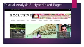
  • 2. Layout Conventionally, websites always come in different layouts depending on the theme or genre and to ensure their website looks unique to prevent a sameness. However, there is a conventional guideline which many institutions follow, which is by separating the typography at the top of the page and then the features and images at the bottom. This is so that the reader can guide their way through the site and decide which label will suit their needs to get a taste of what genre the magazine to decide whether it will attend to their individual needs, this magazine appears upper class due to the features so it will suit wealthy business owners in this area of the UK. Thus, as there are numerous labels stretched across the first third of the page it informs the reader and allows them to decide whether it will interest them. This means the right target audience can be achieved, for this particular institution, it is people living in the Surrey/Hertfordshire/London outskirts area who will be local to current events and this relatability means people are more encouraged to continue reading through the site. The Uses and Gratifications Theory can be achieved here as people will read it to be educated on whether they can find their interests within the sites which means that it prevents confusion which frustrates readers and could essentially lead to a negative reputation. The images cannot be completely seen unless you scroll down the page so it also creates curiosity about the features which encourages people to discover more and with success this anticipation will lead to repurchase. All of the labels are evenly spaced out to give the page a symmetrical look which is more eye catching as it looks organised and neat which implies it will be a less stressful read; giving people a purpose to reading the page. Meaning the Uses and Gratifications Theory will again be achieved as people will read to soothe the troubles from work and read as a form of escapism. Thus, in a positive way, it isolates people and allows them to temporarily revert to their own personal world; giving people a sense of privacy. The neat layout and distinction between labels suits professionals living in the region as it will be relatable to the structured and formal documents they read in their lives, therefore this familiarity will make people feel more comfortable reading the page. However, the layout will not appeal to a younger audience who prefer a more informal layout, for example, with the pictures more dispersed to have intertextual links to a collage or scrap book. Therefore, this organised layout suggests that the target audience are of an older generation as the fixed layout is more mature which will make the reader feel catered to as it will not feel illiterate or poor quality; thus giving the reader assurance. However, the images are different sizes which still allows the page to look varied and creative which connotes that people will be entertained throughout their navigation of the website, increasing consumer trust. This is important to influence a positive two step flow effect as people may use hashtags to talk about the institution which will create a buzz and allow it to become more well known or as this is an elderly audience due to the features such as interior decorating which young people usually cannot afford, the two step flow effect is more likely to take place through word of mouth. Still this will increase the popularity. Conventional layout- similar to ‘EXCLUSIVE’.
  • 3. Banner The banner includes hyperlinks to the homepage to allow the reader to begin at a starting point and gives them a place to refer back to which means the purpose of this is for guidance. This is supportive of individuals intellectual needs as it will allow them to feel more confident using and researching into the website which means they are more likely to revisit the page and purchase the magazine it’s self which will increase profits and allow the institution to increase production values to reach a mass audience in this region. Moreover, the banner is placed in a conventional location at the top of the page; this is so that it is easy to refer back to when using the search engine and this convenience will mean people will have a more enjoyable read through the site, supporting their Maslow’s Hierarchy of Needs as their emotional needs will be reached as they will feel happy and valued. The colour scheme is also conventional; monochrome has been used as black and white are binary opposites so text is legible to prevent annoyance and therefore the text is clear and identifiable to inform readers which will make people feel supported. Monochrome is also very fashionable at the moment and has been seen on the catwalks so this demonstrates modernity which will allow the older audience to feel more youthful but also attract a younger audience to highlight how low key the webpage is relevant to pop culture which will encourage them to explore the site to find out more; hooking their attention. The banner only takes up a small proportion of the page to allow the features to gain maximum recognition as these are the main selling points which will grab peoples attention. Thus, as the banner is minute compared to other elements on the page it connotes that it has less significance which means the features will get acknowledged and therefore the regional activities and events of this region will become bigger and better. The Uses and Gratifications Theory will be achieved as social solidarity will take place as a hype is built. Capital letters have been used for each subheading of the banner and this conventional as the letters are symmetrical which gives the page a professional look as all of the letters are equal sizes, if there were lower case, this may look childlike so it suits the elder audience who will appreciate a classic look as this is what they are familiar with, for example, when reading newspapers. The use of capitals also is matched with the capitals used in the masthead so it creates brand identity as it gives the page a particular style which is sophisticated which will be memorable from the type of typography and boost institutional recognition.
  • 4. Banner The lexis of ‘home’ connotes comfort as it is a place of privacy and relaxation so this is an incentive to the reader that the institution will make them feel welcome. Thus, interactivity takes place and individuals will feel closer and part of the industry and repurchase to continue this hype. ‘Home’ is also used as a guide for people to start their tour around the site so placing it here means that the reader has a trouble free experience which means content is likely to be encoded ( liked) by them to influence their return as they will not have the stress of finding the search engine, this is why my search box will be placed in an obvious position. The second subheading is separated from ‘home’ which makes it evident that they are different pages. ‘Our magazines’ connotes variety to suggest that there are many issues to read and this will boost audience satisfaction because there is lots of content to explore and this reduces boredom which discourages the two step flow effect as people will not choose to discuss the print on social media. This is why I will include something like this in my production as it is an incentive to the reader that they have choice to find out more and therefore appears worthy of their time and this hooks their interest. The company also appears salivated through the team spirit atmosphere created by the use of ‘our’ and ‘us’ which highlights to readers that they will be accepted in society which will both boost their self esteem ( so Maslow’s Hierarchy of Needs is met due to the peak of emotional needs) and encourage friendships to form ( so The Uses and Gratifications Theory is achieved), as these theories are both met, it means readers are at paramount satisfaction to allow the institution to gain a noble reputation and reach a wider demographic. The language used ‘contact us’ is another way to interact and build a connection with the reader too as it makes them feel as though they can gain support from the company and get more involved; thus, equality is demonstrated as it shows how people can report any issues openly which means quick resolutions can be made to prevent annoyance. The search box is additionally placed conventionally on the right hand side like many other search engines such as ‘Firefox’ so it means people will again have a smooth navigation which therefore caters to the readers needs; this being to have a relaxing journey and to discover further through the site. This exploration will hook the readers attention and ensure they read through other features to allow all of the site to be acknowledged.
  • 5. Logo The logo is conventionally the largest font on the page and this is to signify the institution and to allow it to become recognised by readers, therefore, the larger it is, the more likely it will become noticed and acknowledged and therefore become a familiar brand. Most institutions use the logo as there brand identity, for example, VOGUE and Heat magazines have an iconic logo which is memorable and clear that it is connected to fashion and gossip magazines which ensures they will attract women who want to discover more about beauty and celebs- therefore their unique selling points are triggered by idolisation.. Thus, the idea is more the logo to become universal. Therefore, as the logo is large it connotes superiority and dominance to allow readers to feel impressed by the institution and also have more trust within it as it will appear of a higher status. The large size could also connote the power of this region as London is the capital and a place of tourism and business so it connotes how the people will feel elite due to the success of this area bringing pride which will encourage people to discover more about this area. Moreover, as London is the capital, people who do not live in the region may even purchase so that they can join in and again this builds a united nation and shared culture which means The Uses and Gratifications Theory is achieved. However, the logo is not too overpowering on the page to appear egocentric which could be off putting for readers as it would not be inviting. Moreover, the size of the masthead is still visual and welcoming as it allows other features to also appear important which means media imperialism is avoided. This is something I will follow in my production because although I want to show Leicester as a place to be proud of, I still do not want the institution to appear too dominant as it is just starting out and people will need to become comfortable with it in order to appreciate it. However the logo is placed unconventionally on the left of the homepage rather in the centre which gives the homepage a unique look to allow it to stand out as people will be curious of what else the page will include which increases reader continuity. On the other hand, the logo appears to be competing with an advertisement which is stretched over ¾ of the masthead space. This could be to convey the region of the magazine as ‘exclusive’ does not reveal the area however the advertisement does which means it will attract wealthy Londoners who will be interested in middle class leisure activities such as ballroom dancing. However our eyes are instantly drawn to the advertisement as it is brighter and appears more exciting which means the logo is likely to be ignored. The weaknesses of this is that the logo is likely to be ignored and therefore not embedded into the audiences minds, which limits the two step flow effect as people will not remember the name to share with their friends which means they will struggle to reach a mass audience. This is why in my production, the logo will be placed in the centre as this is where our eyes are naturally drawn to and therefore recognition will be at a peak which means looking for the magazine in shops will be easier. Thus, profits will increase which could suggest more money into the community for local festivals which will allow the city to have a celebratory vibe to create a positive atmosphere.
  • 6. The logo uses the word ‘exclusive’ and this is appealing as it connotes that this is a regional magazine that is niche by only catering to people in this area and therefore the reader will feel special as the institution creates a ‘VIP’ perception as it creates a clique of people in this area. The Uses and Gratifications Theory is then again demonstrated as communities join together however people from other regions may feel excluded from the action which makes them feel irrelevant which means a small demographic can only be reached and profits cannot boom. The typography has a type writer style due to the spaced alignment of letters and serif text which suits the elder audience as it has intertextual links to the 1950’s due to the vintage style that it creates which connotes to the reader that the website/magazine will focus on classic styles and events that are mature enough for the audience. However, due to the rise of the subculture of ’hipsters’ vintage is a current fashion in its self so younger readers who want to feel alternative will be attracted as it could suggest it will include quirky events to go to, thus, in some ways, the typography connotes modernity. Moreover, as the letters are aligned separately, the logo is more likely to be memorized as it is read letter for letter which encourages people to return and keep up to date with the fashions, events and lifestyles in this area. The masthead also uses the same colour palette as the banner at the top, this is to show continuity and to give the brand a classic identity which appears timeless to the reader which instantly gives it more poise as the institution appears long term as black is something that never goes out of style. A male hipster.
  • 7. Advertisement The ad flash that is placed next to the masthead is here to gain attention to attract the typical target audience of this institution, middle class, middle aged- elderly people who have a lot of leisure time, for example, people who are self employed. Therefore by placing it here, it will instantly pull in readers who are curious to start a new activity. Moreover, although this dominates the masthead, it could suggest it has more importance however it also gives the institution a higher reputation as it suggests they have sponsors which is something only large institutions can afford and therefore people are more reluctant to read in order to feel important and noble- like the institution its self. Furthermore, the ad is eye catching due to the bright colours as they are bold and visual to give the page vibrancy to prevent it looking plain due to the basic colour scheme of the typography. The colours used in the ad and the strawberries are suitable for the season ( July) as it emphasizes the summery vibe in order to build excitement for the sunny weather, BBQ’s and seaside trips. The Uses and Gratifications Theory is achieved because people will have purpose to reading the page and that is to relax and chill to get in complete summer mode. Also, this theory is emphasized as people will ‘learn to dance’ which gives it an educational purpose which means intellectuals in the area will want to enhance their knowledge, especially the retired who have a lot of spare time. Moreover, ballroom dancing is an elderly event which is suited to this age group as it may bring nostalgia to their youth where many met their ‘sweethearts’ and therefore, they click on the link to revert to their past.
  • 8. Advertisement The lexis used in the advertisement makes the event appear more spectacular as ‘luxury’ has been used to make it appear upper class which anchors meaning behind the logo as people will feel ‘exclusive’ for having this opportunity. The language in this advertisement is well developed and formal and this suits London professionals who socialize in educated circles however my target audience which is young women would find it too structured and therefore unable to identify with as women in their 20’s are focused on having fun, going to parties and having a care free lifestyle. This is why in my production, the language will be informal and youthful however without sounding childlike in order for them to connect to the institution more effectively. Another indicator that the institutions focal target audience is middle to upper class is the reference to champagne which is an expensive drink that only the wealthy can endure in. Especially for an area where the average salary is £32,500 a year and many celebrities live here such as David Attenborough ( suited to the elder audience) means that this drink is suitable to the glamourous lifestyle in London. However, as it is free it could promote equality as it allows people of all social circles to experience this activity; therefore it prevents the company from appearing ignorant and gaining Marxist opposes due to excluding those of a lower class. The champagne drink is also a sign of celebration so it implies that the reader will feel rewarded and therefore creates a positive atmosphere.
  • 9. Advertisement The advertisement uses small typography is used to give the advertisement a quaint and cute to suit the theme of the advertisement which is British Summer. However, for an older audience, without sounding patronising they may need glasses to read the smaller typography so it could be distressing to read. This is why in my production, the typography will be big and loud to support those with visual deficiencies as it is a way that it can cater for all and reach their Hierarchy of Needs, as they will feel acknowledged. The serif classic font has been used as it connotes the institution will focus on traditional dancing which for younger people would be un relatable and almost comical. This is why instead of focusing on elderly activities, I will include events such as festivals as these are major events that are exciting due to the music and fashion. The colour scheme used in typography anchor the background as they are both pink so it emphasizes the sweetness of summer. It could suggest that the target audience is mainly women as pink is a symbol of femininity too. The champagne colour of the italics makes it feel more special and encourages people to crave the strawberry, champagne combination so it influences membership. In addition, the use of italics creates poise and elegance which is symbolic of dancing too so it is another way of attracting members.
  • 10. Labels The labels are conventionally placed horizontally and this allows them to be spread out and fill up the page to prevent it from looking bare, therefore connoting to the reader that the site is full of content. Also, horizontal reading is more fluent as we naturally read left to ring rather than top to bottom so it supports the readers needs as it is a familiar structure which makes their navigation easier. The typography used is tight, tall, capital and serif and this is a conventional font used in magazines such as VOGUE, so by following this, it conveys that the institution is traditional which will appeal to the elderly audience as they will want to follow classic styles and activities to remain sensible rather than the youth who will want to be less sophisticated and more daring. Therefore, this is why perhaps in my production, more modern typography will be used so that it connotes that the styles are on trend and fashion future. Faint horizontal lines have been used to separate the banner of labels to give the page a contemporary to ensure it does not look too old fashioned to make it irrelevant but it also ensures the labels are distinct to get more recognition. It additionally makes the page look more organised and professional so people are more likely to read further through as it implies that the information given is completely valid. Grey typography has been used to give the page a washed look which makes it look fresh and new to connote the relevance of the information- again a low key method of building trust. The colour scheme also prevents a clash with the black masthead which makes the logo stand out and the page look more visual overall so content will be encoded as preferred reading takes place due to the neatness which prevents people from feeling chaotic when they read.
  • 11. The label which states ‘WHATS ON’ has an informal tone to it due to the language however the use of capitals makes it appear more loud to suggest that there are many exciting events for people to go to, therefore causing the audience to anticipate about what may be included. The Uses and Gratifications Theory is again demonstrated because as this refers to events it implies it will bring people together so social solidarity will take place as people can share the experience and build a buzz in this area. This promotes home businesses and events which is something I want to achieve in my production as it builds a better connection with the lifestyle of the people and boosts interactivity. Next the labels ‘HOMES&GARDENS’, ‘STYLE’, ‘FOOD AND DRINK’, ‘TRAVEL’, ‘MOTORING’ signify a variety to suit a variety of people, both men and women which means a wider demographic can be achieved and boost popularity as it may be bought for households or husbands and wives. This means there is no issue of sexism as men and women are catered to equally and this means it encourages a united nation and prevents the stigma that lifestyle magazines are only for women. It will therefore encourage a mass two step flow effect as people tell there friends or see people reading it in public and then purchase a print to join in on the hype. The use of the word ‘PEOPLE’ connotes involvement with the industry, for example, with celebrities so this builds curiosity of who the institution is linked to and gives it a more respected status due to this connection. Therefore, iconography becomes a huge selling point as people will purchase to find out ‘exclusive’ news. The label which states ‘competitions’ also signifies interactivity as it connotes a chance for people to get rewarded and live the life of those in the industry. Therefore, the Dyer Star Theory takes place as people will enter as they aspire to be like their idols- due to the influence of the so-called ‘American Dream’. However, for a wealthy area, competitions could be off putting for readers as it could make the institution look cheap, although for younger readers such as students it highlights the opportunities available and this will interesting them as the youth aspire to be rich.
  • 12. Image 1 The first image aligned on the top, left of the site focuses on exterior design- a topic which is likely to appeal to people in this area who will have large properties and money to spend on home décor. Therefore it is suited to their interests and priorities of money spending. This is less likely to attract people such as students who cannot afford to spend money on decorating- this is why if I include interior design, it will be interior for apartments and flats rather than grand garden sets that only suit the middle class in large homes. This means the audience is limited as younger readers cannot relate to this topic, however it could be seen as inspiration for when they are older. The use of stone is a symbol of wealth as it is an expensive material which again anchors the lexis on ‘luxe’ in the caption as it appears of a high quality to make readers feel special. The image is suitable to the season as the green grass and trees connote summer which again connotes relevance. The brightness of the image creates imagery for the reader of social events such as parties which makes this garden set appear a necessity. Grey is also a major on trend colour for home décor at the moment so this connotes relevancy again to ensure this is modern taste. The large furniture chairs in the centre connote that this will be bring people pride in their homes but additionally, the chairs are a sign of comfort to suggest people will feel as though they belong in their home and feel they need to purchase it to reach this goal. The use of the word ‘luxe; is also elite and suggests it allows readers to indulge which means the Uses and Gratifications Theory is achieved as people read to relax. Moreover, this is emphasized through the description of the link being ‘tips’ which connotes that it will be short, easy and not too in depth which could be boring for the reader, thus, the simplicity means people with busy lives can also enjoy the content. Direct language is additionally used to connect to reader and this makes it more personal to lure the audience in. They have described a garden/patio as ‘OUTSIDE SPACE’ which connotes freedom and open plan living which is something that is suitable for the middle class who can access posh furniture due to wealth.
  • 13. Image 2The image aligned to the bottom left of the page is focused on the theme of food, something that is universally loved by everyone so this reaches out to a wider demographic. The food of ‘shakshuka’ is a healthy breakfast made up of eggs and fresh produce, something only the middle class can afford to do as many poorer families cannot afford to buy fresh produce regularly. Marxists would argue this excludes the working class and makes them feel irrelevant and this could mean the company could be criticized and gain a tarnished reputation which will limit the companies progression. However, the healthy food promotes wellbeing which meets Maslow’s Hierarchy of Needs as an individuals physical needs will be on top form. The subheading mentions how it is a ‘weekend recipe’ which implies it is time consuming so many may be put off the effort as it is not simple. On the other hand, others will see it as a reward for a week of work and to spend time on things they enjoy such as cooking which makes the institution more personable. The bright colours of the dish make it more visual and connotes the cliché’ saying that people ‘eat with their eyes’ so people will be encouraged to try it. Moreover, shakshuka is a dish which is eaten in North Africa so it influences a multicultural society which boosts acceptance of different norms and values. The image is placed below the interior décor to show it is less important too to suggest it is of less interest as it is so unique so people may ignore.
  • 14. Image 3The image which is placed in the centre of the page is the largest on the homepage which connotes that is most likely to grab the readers attention, this is due to the celebrity endorsement used to invite her fans. Moreover, the size of the image reflects her dominance and superiority in the industry as a pop star and this influences idolisation as people will read to follow their idol and to get closer to them. Meaning The Dyer Star Theory is achieved as people will learn more about their idols and this will create the perception that they are ‘real people’ which allows the institution to appear personable. Additionally, the benefits of the celebrity endorsement is that it will have intertextual links, for example, when one of her songs places such as ‘Put Your Records On’ will remind people to look up the magazine- as it is a famous song, it is beneficial as it will be a constant reminder. The song was also released in 2006 which suggests this feature appeals to adults who will remember the songs release and reverts them back to their teenage years and will read due to nostalgia. The long shot of the star is taken from a slightly low angle which shows her power to imply a comeback and to build a buzz over this and allow her to gain maximum promotion of her music. The audience will feel intrigued to find out about her music as the low angle connotes her confidence which suggests that it will be sassy. Moreover, female gaze is explored here as it shows women as independent and self-assured which will encourage people to aspire to their dreams; implying this invites the younger audience in who have hopes and goals to reach. However, the star is from Leeds which does not express ‘home grown, local talent’ which connotes media imperialism and does not promote opportunities for people in the region. This is why in my print, I will promote people such as ‘Miss Leicestershire’ for example mentioned in the contents page. The desert location for the shoot suggests it may be Hollywood or Las Vegas, which makes her appear more famous for visiting such high status places and readers will be curious to find out about her journey as a musician. The desert is also a symbol that the star is daring by exploring into unknown territories- to encourage people to be daring and listen to her new album. It also separates the reader from the star as it highlights how they live completely different lives meaning people will be more amazed by her stories as they will be extravagant and expected to meet up to the crazy lifestyle of a pop star.
  • 15. The pink, metallic two piece worn by the star is a binary opposite to the desert background as her outfit expresses modernity and the location appears old. However, her outfit shows how she has returned to the industry as a new person whilst remaining onto her original roots which means her fans are assured she is still the person they learned to love. The outfit also allows her to stand out to connote how she is the centre of attention which again makes her appear more separate from the reader due to this superiority. Her pink outfit expresses femininity which means The Fear of Castration is explored as women are shown as successful which groups such as feminists who will appreciate how women are shown as free. However for the audience which may be traditional, patriarchal men, it may be decoded if they feel threatened. The flared trousers worn have a 70’s vibe which is a trend which shows how the star is stylish and a fashion icon which means fashion lovers will read due to iconography. The singers facial expression is straight which connotes she is professional and serious about her music but there is still an eye line match which connects to the reader. The Dyer Star Theory is then achieved as hegemony has been reached as the audience will feel closer and connected to the star. The interview shows links in the industry however as it is only 5 minutes makes it more exclusive as it suggests the star is very busy and has little spare time. Therefore, this assures the reader that they are of a higher status and this allows the institution to gain respect. The name of the celebrity is placed in the caption in capital letters and this is to make it obvious to readers that there is celebrity gossip and people will read to feel special and find out prior to the rest of society. The typography is also the same of the labels which connotes the continuity to allow the page to have a particular theme which is classic and traditional to follow in VOGUE’S footsteps.
  • 16. Image 4 The fourth image placed on the top right focuses on the MasterChef star ‘Theo Michaels’ who is from the region of the outskirts of London. By featuring him on the webpage, it connotes the opportunities that the institutions provide, for example, offering publicity which is an incentive to people that they can achieve and be successful which will influence a positive work ethic in the area. The medium close up shot is so that his face can be identified, as he is not a high class celebrity, he will be less recognisable so by having a close up shot helps with identification. His face is additionally in focus so that he stands out and shows his fame in the local area to create a god like image as he is clear compared to the blurred background and this is showing the appreciation of his talent. His facial expression is a smirk and a direct eye line match to show his pride and confidence but also makes him an approachable person so the Dyer Star Theory is explored as it builds a close connection with the reader which makes them feel ‘VIP’. The apron he wears is cliché’ for a chef but again makes his occupation more obvious so people are more likely to have intertextual memories from MasterChef. Thus, when people watch the show, it will remind them of this institution and influence them to read another edition or keep up to date with local news. The use of the language ‘My neighbourhood’ has a homely feel and shows how he is proud of his region and this incentive will reflect to those in the audience. This means people can relate to the reality star as well which means interactivity is peaked as audiences will feel connected to him. Similar to how in Leicester, many people feel connected to the band ‘Kasabian’ due to links through schools or friends. The text however slightly covers his face which could be seen as disrespectful and demoralizing which could leave the institution open criticism by his supporters by not offering him complete covering; however it could suggest the caption is more effective as it is informative by educating people about his background to give them an insight to the feature. This feature may again only appeal to older audiences who have the time to invest in cooking and reading whereas young people who are working or studying will want short features which will pass a period of time such as a lunch break.
  • 17. Hyperlinked page within website ‘STYLE’
  • 18. Layout At a first glance, the hyperlinked page shows the same layout as the homepage as the first third includes, the banner, masthead and labels that appear on the homepage. This is to signify continuity which makes it appear more professional as the brands identity ( the logo) is repeated to show how it is important but also increase recognition to boost future purchase of the magazine. The advertisement is also repeated to highlight how the aim is to encourage social solidarity by bringing people together through dancing and by it appearing once again prevents it from becoming ignored. By placing the original features from the homepage, it gives the reader a guide to refer back to which is crucial to allow them to navigate confidently around the site and therefore gives them independence which makes them feel appreciated. The images are again aligned neatly and symmetrically which is similar to the homepage which makes the institution appear more professional due to the organisation which is more mature. However, the features are aligned horizontally with advertisement promotions on the side which is unlike the homepage when they are very close together and this could be to encourage the reader to discover more as there is anticipation of what they will see when they scroll down the page which hooks their interest. On the contrary, the advertisements are placed next to features as puffs to make the reader feel they will be rewarded by making savings which encourages them to continue to read due to this. Linking to Maslow’s Hierarchy of Needs as many will feel their economic needs have been fulfilled which will give the incentive that the institution is personable by giving something back to the reader.
  • 19. Subheading The subheading is ‘style’ connotes to the reader the genre of the page meaning that it will appeal to middle to elderly aged women who desire to keep up to date with trends but also gain inspiration on age appropriate clothing and accessorizes too such as subtle print and longer hem lines. Thus, implying it appeals to women who take pride in the way they look and have an eye for materialism. The use of red and black is a classic symbol of fashion as it has intertextual links to the logo of the film ‘The Devil Wears Prada’ which is a film focusing on the fashion world in New York, therefore it makes it feel more prestige to the reader. The typography used has a formality to it as it is serif which instantly makes it more classic and suggests to the reader that it will include traditional styles to suit their sensible tastes. The typography mirrors the label on the homepage which is another way of making the brand identifiable through the style they adapt through continuous use of the same font so it will become more iconic.
  • 20. Feature - Suitcase Promotion The suitcase feature is a relevant theme to focus on as it anchors the publish date (July) as this is a time when most people go on holiday so people are more likely to want to invest in a suitcase as it is practical for their current lifestyle. The images connote a summery vibe as the suitcases a florescent colours which makes the feature look vibrant and flamboyant and therefore more inspiring to read. Implying that this will appeal to women who want to stand out and gain attention, or for sensible to reasons to help people find their suitcase on the conveyer belt so it gives the feature more purpose and prevents people from the stress of losing a suitcase so supports their emotional needs as part of Maslow’s Hierarchy. This feature is more likely suited to the middle class who can afford to go abroad too and have more spare money to invest in luggage luxury in order to appear and feel superior. However, it may appeal to young people who want to explore the world as it is also an essential they will need. The language used in the feature is inviting, for example, ‘we love’ which makes people feel united by following this advice to feel accepted and join in on the hype. Linking to the Uses and Gratifications Theory as social solidarity is demonstrated through the use of ‘we’ by making readers feel part of a society. The alliteration used also makes the caption more catchy and fun to read so it allows the reader to unwind as it takes an informal approach. The Uses and Gratifications Theory is again demonstrated as people will read to distract themselves from the stresses at work. The typography again matches the labels which is another method of making the site continuous and more memorable by adapting such a classic style which will appeal to those who are older as they will be assured content is catered to them and not the modern youth. The authors name has also been noted in capitals so that it is bold and allows him to be noticed for his work. Showing, a respectful working environment which will allow the institution to gain a kind and caring reputation which connotes that workers are not taken for granted. Also as this feature is placed at the top of the page, symbolises how it is new and fresh and encourages the audience to feel special by finding out the latest news.
  • 21. Feature - Suitcase Promotion In the subheading to the feature, the witty language makes it look exciting to read and as though it will inspire people to become fashionistas when they travel. This could be due to the notion of celebrities looking glamourous in the airports and therefore encouraging the Dyer Star Theory as people purchase to feel like a star and take on this role. The first few words ‘pack up your troubles’ has many intertextual links that link to both the old and young, for example, it is a war time song called ‘It’s A Long Way To Tipperary’ which will remind people to stay positive but also a song by Eliza Doolittle called ‘Pack Up’ which was released in 2010 so it will also show how they are following recent pop culture. Also when these songs are heard, it will remind people of the feature and make them curious to look at the new, news that ‘exclusive’ has. Both show how holidays are a time to forget about stress and allow our selves to appreciate life so it sets the feature off on a positive tone. Direct language is also used to connect with the reader and make them feel more involved in the institution which allows them to feel closer to the action and create a feeling of pride. However, the negative language of ‘style conscious’ could appear patronising or judgemental to readers as it states that fashion lovers have anxiety over their looks and therefore mean the institution could have a negative reputation which makes it off putting for the region. This is why in my print, the language will always have positive connotations to prevent the readers from gaining offence as this could prevent the institution from progression.
  • 22. Advertisement The advertisement again is used to demonstrate how the page has sponsors to connote the links within the industry to make people feel as though the site will be beneficial to read if they can find out about new brands and clothing lines. The title of the advertisement uses a sans-serif font where the letters are separately aligned which connotes modernity. This will mean that older women will be able to feel young again which is more complimentary to their needs. The grey typography is also matches to the grey, washed colour scheme on the homepage so it has a similarity and ensures the page still appears neat which adds to the professionalism. ‘PURE’ suggests that the clothing line will have sophisticated styles which are not provocative as ‘pure’ is a symbol of innocence so it is for women who want to avoid revealing clothing and more conservative. The word collection underneath makes it feel more upper class as it suggests that it only suits to those who hope for a prestige look which could make those of a low income feel intimidated and de-valued which could lead to a smaller demographic being reached. However, as most people in this area are middle class, it is less likely to be an issue. The italics used in the word ‘enjoy’ create imagery for something saying it which makes it more personable but also adds a smooth tone to the advertisement to break the distance and prevent it from appearing robotic. The promotion of ‘25% off’ makes readers feel appreciated as it shows how them will rewarded which makes their purchase of the clothes they will wear worth the while. It also makes people feel exclusive by finding these secret deals. Therefore people are likely to return to the site to find out about more discount codes. It may even appeal to lower class women as even though it may be more formal styles, it gives them an opportunity to feel elite through high quality clothing so the promotion supports their financial needs by providing them with opportunities.
  • 23. Advertisement The location of the boutique is in the region and this demonstrates their support for local businesses to allow them to gain success and prevent the dominance of high street franchises which restrict variety in the fashion industry. Therefore, this is something I aim to promote on my website as it means niche boutiques can reach a wider demographic and this will increase their profits. The capitals used in the language ‘SHOP NOW’ make it seem sudden and an incentive for people to rush out and shop. It also symbolises how the promotion is active which will create a buzz as people will become more involved in the community. The way this is also outlined with a box makes it stand out and influences people to click on it and interact which also builds a connection with the audience as more people join. Moreover, the model used is youthful however mature looking ( around the age of 30) which shows how it is suited to a sensible audience. This could suggest that the clothing will make younger people feel young and beautiful so female gaze will take place as the audience aspire to have the same presence as the model. Her natural look of brown hair has a classy look and has intertextual links to Kate Middleton's hairstyle so it suggests it will make women feel like royalty. The direct eye line match of the model connotes confidence which shows how women should feel confident in their style which will boost their self esteem too.- thus, people will return to the site to get this feeling again, The pose of the model which can be seen from the medium long shot is relaxed and casual which shows it promotes an off- duty style which will vary from people’s work attire and distract them from the boring office fashion which can become repetitive. The palm print top is an on trend look where institutions such as Topshop promote this through their dresses; which means women can feel stylish. However as it is long sleeve and navy, it remains subtle which means it is not too loud for elderly women who want to feel classy rather than stand out. White jeans are also a simple piece which will attract people as it is practical and can become an investment so people will feel as though they are saving money. However to prevent the outfit from looking plain, the red clutch bag brings colour and shows how women should still experiment with fashion in order to stay relevant which will make them feel more significant. However, although this is suited to the target audience for ‘EXCLUSIVE’ my print will include more unique styles which will encourage women to be bold and crazy which is part of being young. The site has also used synergy, for example, through having a Pinterest flash of ‘save’ which means people are more likely to remember this promotion. Especially as ‘Pinterest’ is available from the app store, women will be able to access the look from their smart phones which makes it more convenient. However, many elder women may not have smart phones so it could be confusing to them so it is likely to go unnoticed. The word, ‘print’ would be more suitable as many elderly may feel more comfortable with a physical copy of the promotion; supporting their intellectual needs.