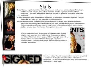
This document discusses the conventions used in magazine design and evaluates how the author applied conventions in their own magazine design project. Key points include:
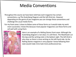
- Popular magazines follow certain conventions like the Gutenberg diagram and masthead placement that increase sales and professional appearance.
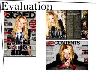
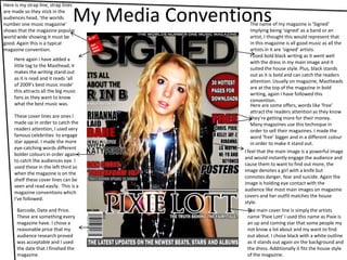
- The author's magazine cover and layout mimics conventions from Rolling Stone magazine to appear more professional, including placement of cover lines and masthead.
- Interior pages also apply conventions like use of images, pull quotes, consistent branding, and layout structures to engage readers and maintain cohesion.
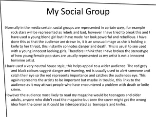
- The author evaluates how their cover image challenges stereotypes while still applying a neutral color scheme to appeal broadly. They also consider the target readership and how the cover