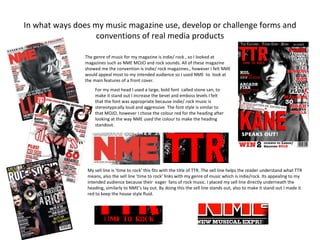
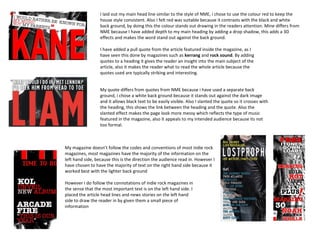
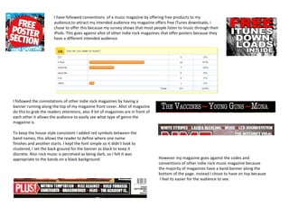
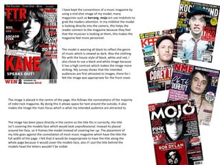
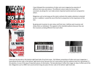
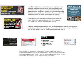
The document summarizes how a music magazine cover and content pages were designed to follow conventions of real music magazines like NME and MOJO, while also innovating in some ways. Key points:
- The cover uses a large bold font for the masthead, pull quotes, and varied font sizes/colors like NME. However, it places the banner across the top rather than bottom.
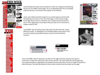
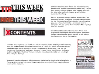
- Content pages follow NME's layout with a band index, subtitles in boxes, and repeating the magazine title. But it uses one large central image rather than many small ones.
- Formal elements like "This Week" were included to appeal to older student readers, going against conventions.
- The
