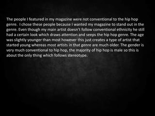
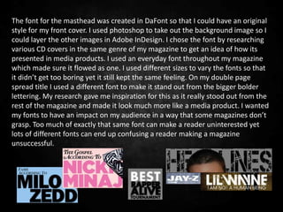
Model Attribute Check Company Auto PropertyCeline George
In Odoo, the multi-company feature allows you to manage multiple companies within a single Odoo database instance. Each company can have its own configurations while still sharing common resources such as products, customers, and suppliers.
Unit 8 - Information and Communication Technology (Paper I).pdfThiyagu K
This slides describes the basic concepts of ICT, basics of Email, Emerging Technology and Digital Initiatives in Education. This presentations aligns with the UGC Paper I syllabus.
Synthetic Fiber Construction in lab .pptxPavel ( NSTU)
Synthetic fiber production is a fascinating and complex field that blends chemistry, engineering, and environmental science. By understanding these aspects, students can gain a comprehensive view of synthetic fiber production, its impact on society and the environment, and the potential for future innovations. Synthetic fibers play a crucial role in modern society, impacting various aspects of daily life, industry, and the environment. ynthetic fibers are integral to modern life, offering a range of benefits from cost-effectiveness and versatility to innovative applications and performance characteristics. While they pose environmental challenges, ongoing research and development aim to create more sustainable and eco-friendly alternatives. Understanding the importance of synthetic fibers helps in appreciating their role in the economy, industry, and daily life, while also emphasizing the need for sustainable practices and innovation.
The French Revolution, which began in 1789, was a period of radical social and political upheaval in France. It marked the decline of absolute monarchies, the rise of secular and democratic republics, and the eventual rise of Napoleon Bonaparte. This revolutionary period is crucial in understanding the transition from feudalism to modernity in Europe.
For more information, visit-www.vavaclasses.com
The Roman Empire A Historical Colossus.pdfkaushalkr1407
The Roman Empire, a vast and enduring power, stands as one of history's most remarkable civilizations, leaving an indelible imprint on the world. It emerged from the Roman Republic, transitioning into an imperial powerhouse under the leadership of Augustus Caesar in 27 BCE. This transformation marked the beginning of an era defined by unprecedented territorial expansion, architectural marvels, and profound cultural influence.
The empire's roots lie in the city of Rome, founded, according to legend, by Romulus in 753 BCE. Over centuries, Rome evolved from a small settlement to a formidable republic, characterized by a complex political system with elected officials and checks on power. However, internal strife, class conflicts, and military ambitions paved the way for the end of the Republic. Julius Caesar’s dictatorship and subsequent assassination in 44 BCE created a power vacuum, leading to a civil war. Octavian, later Augustus, emerged victorious, heralding the Roman Empire’s birth.
Under Augustus, the empire experienced the Pax Romana, a 200-year period of relative peace and stability. Augustus reformed the military, established efficient administrative systems, and initiated grand construction projects. The empire's borders expanded, encompassing territories from Britain to Egypt and from Spain to the Euphrates. Roman legions, renowned for their discipline and engineering prowess, secured and maintained these vast territories, building roads, fortifications, and cities that facilitated control and integration.
The Roman Empire’s society was hierarchical, with a rigid class system. At the top were the patricians, wealthy elites who held significant political power. Below them were the plebeians, free citizens with limited political influence, and the vast numbers of slaves who formed the backbone of the economy. The family unit was central, governed by the paterfamilias, the male head who held absolute authority.
Culturally, the Romans were eclectic, absorbing and adapting elements from the civilizations they encountered, particularly the Greeks. Roman art, literature, and philosophy reflected this synthesis, creating a rich cultural tapestry. Latin, the Roman language, became the lingua franca of the Western world, influencing numerous modern languages.
Roman architecture and engineering achievements were monumental. They perfected the arch, vault, and dome, constructing enduring structures like the Colosseum, Pantheon, and aqueducts. These engineering marvels not only showcased Roman ingenuity but also served practical purposes, from public entertainment to water supply.
Ethnobotany and Ethnopharmacology:
Ethnobotany in herbal drug evaluation,
Impact of Ethnobotany in traditional medicine,
New development in herbals,
Bio-prospecting tools for drug discovery,
Role of Ethnopharmacology in drug evaluation,
Reverse Pharmacology.
2. Question One: In what way does your media product use,
develop or challenge forms and conventions of real media
products?
The masthead of my magazine ‘Headlines’ defines the stereotype of real media
products. It has similar characteristics to magazines like ‘Vibe’. I chose to
interpret this as I thought it reflected the genre and age criteria well. Similarly
the title of my contents page also reflects the targeted genre (hip-hop) and age
criteria (15-25). However placing the title in the top right hand corner the way I
have does not seem to follow conventions, as both ‘Q’ and ‘Rwd’ didn't do so.
On the other hand my double page spread (DPS) title follows conventional
patterns. By placing it on the left in bold lettering it grabs the eye of the reader
which is what most DPS do. Double Page Spreads from magazines like ‘Vibe’
have influenced my own through the different types of fonts and size.
3. The decision of my location was easy as I knew that I wanted to cut out the
background on Photoshop, using a room in my house with a plain white wall
reflected light while also not distracting away from the model. I took most of my
images in the same room so that the lighting didn’t differ in any way, apart from
the image on my contents page with the mask. This was done in the studio and
used for my photography a-level coursework which I thought also would work
well for this coursework. This reflected the genre of my magazine because most
images in hip-hop magazines have a plain background so that the focus is on the
artist. This is what I tried to do with my photographs so that I could follow
conventions successfully. For my front cover I used a low angle to create a sense
of importance. On my contents page I used a the same angle throughout as I
thought this would be more conventional but used different distances. The
image of ‘Milo Zedd’ displays cockiness, and the image of the mask shows a girly
side to hip-hop.
4. The costume of my main shoot consist of sun glasses, a ski jacket and a tag
necklace. These represented my artist because they create a sense of
masculinity. They reflected hip-hop been cause most artist in that genre wear
glasses and big jackets where ever they go. It was important to identify this in
my images as it is one of the main subjects that is brought up in the media. For
these images I followed conventions heavily. On the other hand the image of the
mask does not follow conventions because it is too girly and unrealistic,
however this is what makes artists like Nicki Minaj stand out so well.
5. The people I featured in my magazine were not conventional to the hip hop
genre. I chose these people because I wanted my magazine to stand out in the
genre. Even though my main artist doesn’t follow conventional ethnicity he still
had a certain look which draws attention and seeps the hip hop genre. The age
was slightly younger than most however this just creates a type of artist that
started young whereas most artists in that genre are much older. The gender is
very much conventional to hip hop, the majority of hip hop is male so this is
about the only thing which follows stereotype.
6. The font for the masthead was created in DaFont so that I could have an original
style for my front cover. I used photoshop to take out the background image so I
could layer the other images in Adobe InDesign. I chose the font by researching
various CD covers in the same genre of my magazine to get an idea of how its
presented in media products. I used an everyday font throughout my magazine
which made sure it flowed as one. I used different sizes to vary the fonts so that
it didn’t get too boring yet it still kept the same feeling. On my double page
spread title I used a different font to make it stand out from the bigger bolder
lettering. My research gave me inspiration for this as it really stood out from the
rest of the magazine and made it look much more like a media product. I wanted
my fonts to have an impact on my audience in a way that some magazines don’t
grasp. Too much of exactly that same font can make a reader uninterested yet
lots of different fonts can end up confusing a reader making a magazine
unsuccessful.
7. My written content used an informal style of language, I didn’t use slang or un-
necessary punctuation because my audience wouldn't appreciate that. Even
though my magazine is aimed at the hip-hop genre which is famous for phrases
and sayings, I wanted it to be accepted by a wider audience that may want to
experience the hip hop genre and I also wanted my target audience to be able to
read my magazine without getting distracted by slang which may not appeal to
them. ‘Rwd’ magazine uses this type of writing, as it appeals to a variety of
people.
8. My front cover follows conventions more than any other page of my magazine. It
has a low angle image with convention props and clothing, The balance of image
and test on this page is un-proportional, as the picture takes up the whole page
and the text is only in little chunks. This is a conventional approach to a front
cover which is similar to a very high percentage of magazines. For example the
magazine ‘Vibe’ takes this approach in creating a front cover.
The contents page follows conventions in some aspects however not in some.
For example the text to image ratio is very high, but the title isn’t very
conventional at all. Depending on the magazine the text and pictures vary in
percentage each. I felt like my contents page needed more information than
images so I included more text to make it look more professional.
My double page spread follows conventions nicely as it includes a big image and
an article. I’ve used this idea from the magazine ‘Vibe’ where Nicki Minaj
featured as the artist. I tried to use this idea in my own way so that it follows
conventions. Overall I believe that I have mostly followed conventions so that
my media production looks more professional. I wanted to give my audience a
magazine that both gives something new while also following the most
important conventions for a magazine. I thought it was important to make my
magazine behave like a real one so that it would appeal to audience’s
expectations. The conventions of my magazine really create a sense of the hip
hop genre.
9. Question Two: How does your media product represent
particular social groups?
http://www.youtube.com/watch?v=IF9c_xOP3rY&feature=youtu.be
Follow link to view my answer
10. Question Three: What kind of media institution might
distribute your media product and why?
To distribute my magazine I would pick Future PLC publishers as they already
publish magazines like ‘Classic Rock’ and ‘Metal Hammer’. Even though these
magazines are based solely around the rock genre, I believe that my magazine
could make an influential difference in their market. Bringing in a different
audience would help them to widen their market.
11. My target audience is 15-25 year old males and females. However I think that
my magazine will appeal to males more as it is dominated mostly by this gender.
I think that many male magazine are based around things that are not related to
music which means that there is possibly a gap in the market for my magazine.
As my magazine is aimed at the mass market it would be possible to distribute it
worldwide which would emphasis the hip-hop genre rather than the stereotype.
As Future PLC has a lot of experience distributing music magazines, it means
that they would be very good at distributing mine, even if it isn’t the same
genre. If Future was to distribute my magazine it would bring a whole other
genre to their portfolio. This would mean that they could then set up other
products and/or gigs to fulfil needs of hip-hop lovers as well as rock lovers. Even
though my magazine could offer so much to a distributer I think that a magazine
publisher like IPC Media wouldn’t because they do not publish any music
magazines. They seem to only stick to women and hobby magazines. This means
that my magazine wouldn’t have a place in their portfolio, it would be out of
place and they wouldn’t have any knowledge of the best way to distribute it.
12. Question Four: Who would be the audience for your
media product?
The core buyer of my magazine will most likely be young adults. This is because
they will still be into the informal text yet be intrigued by the hip hop genre.
The percentage of male to female would favour males as I believe this gender
will have much more in common with my artists. I think that my magazine will
appeal to most ethnicities and between the ages 15-25. Even though my
questionnaire focused more on females I believe that this didn’t effect the
production of my magazine.
13. The results from ‘Find your Tribe’ website showed that ‘Townies’ are the type of
people that would be most interested in my magazines. This is because they
listen to music like hip-hop and rap.
14. My audience are most likely to be lovers of free time, they prefer to relax and
chill rather than use out of work/school hours playing football or golf. Even
though they are quite laid back they prefer to have the latest gadgets be that
mobile phones or the next laptop. Their mobile phone of choice would be a
blackberry as this is one of the latest phones.
Brands like Nike and River Island, some may stereotype that brands like Nike are
associated with ‘chavs’ however many people wear Nike trainers and apparel.
They spend money in places like Starbucks and shop in places like Sainsbury's.
Their music taste doesn’t effect the shops they go to as they are just average
people. Comedy, action and horror movies are their preferred choice when
visiting the cinema, which in some cases is quite often depending on their
disposable income. As most of their favourite artists are American they don't get
to see live music often. It is rather important to them to buy the latest things
and know the latest gossip before anyone else. All of this is important to my
magazine because I have aimed to include all of this in it.
15. My magazine is aimed at a variety of socio-economic groups. As I have aimed to
establish a respected version of hip-hop, I believe that my audience belongs to
the groups: C1, C2 and D. This is because they are still intellectuals as they have
good jobs and pay bills, yet they aren't the top ranking. I believe that my
magazine will appeal to these people as they are the stereotype of hip-hop.
If I were to psychographicly profile my audience I would put them under both
aspirer’s and mainstreamers. This is because they want to be seen as having the
latest clothes and mobile phones but also cant be seen as different from their
peers. I have used this information to ‘strike a cord’, with such things as
exclusive interviews and brand adverts in my flat plan. This will appeal to these
types of people because they seek to fit in, yet still have everything new. My
magazine has used all of this to make them feel in control of what they are
reading.
16. Question Five: How did you attract/address your
audience?
http://www.xtranormal.com/watch/13309113/g321-media-coursework-evaluation-
question-5
Click link to
watch part of
my answer to
question five.
17. My audience
feedback shows a
variety of criticisms
and positives. I
decided that some of
the feedback didn’t fit
in with my research
and would possible
look out of place. But
it was said that my
magazine represents
my genre well.
My audience feedback has shown that the colour
scheme works well for the genre I am targeting.
However some criticisms say that parts of my front
cover do not follow conventions. I did try to correct
this but found that it didn’t look right changing the
sizes of font.
18. Question Six: What have you learnt about technologies
from the process of constructing this product?
Evaluation
Research Planning Production
Presentation
Internet PowerPoint InDesign PowerPoint
PowerPoint Digital Cameras Photoshop Internet
Word slideshare wix MovieStorm
slideshare DaFont Xtranormal
wix Internet slideshare
wix wix
19. Research
My main technology that I used for research was the internet. I used this for
pictures and information from various sites. Using a range of websites made it
easier to establish a variety of images and magazine cover, contents and double
spread pages. Using google to firstly search things I wanted I then used any
website that came up to eventually get what I needed for my research. Using
google has made me realise that you have to be specific when searching for
various things. This has made me wiser when ‘googling’ something. I also used
Microsoft PowerPoint to put together my research in an effective way. I then
uploaded this onto slideshare which is an internet site that lets you upload
PowerPoint presentations online. Using PowerPoint was quite easy for me as I
use it a lot in my spare time. I also used PowerPoint to create my audience
questionnaire as I thought this would be far easier than using a word document,
I found that it was in fact much easier as I could place text and images where I
liked rather than following the rules of a word page. I then uploaded all of my
research onto wix.com where I have uploaded all of my coursework. This
website is very easy to use but it can get complicated when trying to make more
pages which I found out when creating my research page. However it proves
effective in presenting my coursework.
back
20. Planning
While planning my magazine I used plenty of different technologies. For
example digital cameras and dafont.com. Firstly I had to take images myself on a
digital camera for my main images in my magazine. This involved me using a
Nikon Digital SLR camera. I then uploaded the photos from the SD card onto my
computer. This was very easy as I do photography A Level. I made a PowerPoint
presentation of my planning as I thought this would look much neater than how
I uploaded all of my research onto slideshare.com. When copying the images
onto my PowerPoint I had to crop some so that they fit well on the page. I then
used dafont.com to produce a masthead for my front cover. This website is very
good when looking for a different kind of font. After some more research using
the internet I found a masthead that would work well for my genre. Putting all of
this on a presentation worked very well and looks tidy too.
back
21. Production
For the production of my magazine I only mainly used two technologies. These
were InDesign and Photoshop. InDesign was the main software that I used to
actually create my pages whereas Photoshop was just used to crop, edit and cut
out my images so they worked well on the page. I first used Photoshop to edit
the image on my front cover, I changed the light and changed the contrast which
was easy as I do this all the time in photography. Then I had to cut out my artist
so that I could add a background behind him. I used the lasso tool to do this
which made it much easier to cut him out. Then behind him I wanted a
background colour so using the paint bucket I changed it. This was all relatively
easy. I then placed this image to InDesign, moving it around I found the place
that it would fit best then moved onto the masthead. I needed to take away the
background so that when I put it on my front cover there wouldn't be a white
box around the writing. To do this I opened Photoshop. I had to double click on
the layer and press OK to get rid of the lock key. After this I used the magic wand
stick and clicked on the white. This formed marching ants around the lettering.
Pressing backspace cleared the white background and left me with a checked
grey and white one. After saving as a psd file, I could place the header into
InDesign without a white background.
next
22. I also had to cut out my artist again using the same technique so that I could
place him in front of the masthead. Then using InDesign I could complete my
front cover without photoshop, I just used their own text for tag lines and all of
their software to create the front cover.
back
23. Evaluation Presentation
My evaluation presentation has used a variety of different technologies. Firstly I
have used PowerPoint to create a flowing evaluation. I have also used the
internet to review over my wix.com website so that I can take images from their
and use them again as example for my evaluation. I have used two kinds of
software called moviestorm and xtranormal which lets me create moving,
talking avatars which explain my evaluation in a much more creative way. When
I have finished, I will upload this presentation onto slideshare so that I can then
post a link onto my wix.com website so then it is accessible to everyone. Overall
creating my presentation has been relatively easy, and I’m sure uploading it will
be as I have done it before. I have learnt a lot through out my evaluation which
has been useful when answering further questions.
24. Question Seven: Looking back at your preliminary task,
what do you feel you have learnt in the progression from
it to a full product?
At the beginning of my preliminary task I was lost as to what to do for that only. I
didn’t realise the work and effort I had to put in to achieve an actual product.
Since then I feel like I have learnt a lot, I believe that it has not only shaped my
final magazine but also made me better at researching and using the software
we did to make the magazine. I have found that my knowledge on conventions
of magazines has become wider which helped me a lot in the production stage. I
used conventions like skylines and drops cap. I think these types of features
have made my magazine look more professional which I wouldn’t have achieved
before. I found that it was very easy to get used to InDesign, although it was
hard to begin with, while producing my preliminary task, I could work much
better with it while producing the real thing. I think that the preliminary task
was a good way to introduce me to the software we would be using. However
with Photoshop I already had a good understanding of changing contrast etc., so
I only really needed to develop my skills in cutting out an image and adding a
background.
25. As I do photography A level I found it easy to capture the shots I wanted for my
magazine. I didn’t necessarily need to improve these skills because I already had
them to complete that task. This is the same for location and camera angles
however the use of mise en scene was much easier with my knowledge of media
and what would work well for the magazine. I think that my preliminary task
helped me do this because it gave me a quick insight of what works well for a
magazine. While evaluating other peoples magazines I have become more
critical of my own work. I think this is a good thing because it lets me develop
my skills further to eventually get a higher grade. This critical skill was not so
apparent in my preliminary task which looking back I see how different both my
magazines are and why this is. I think it is because I used far more inspiration
from research for my actual magazine whereas for the preliminary one I didn’t
really like any magazine in my research. I think that this really helped me to
think of some good ideas that I would like to interpret in my own way and
include in my final magazine.