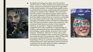
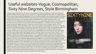
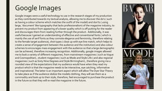
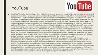
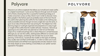
Google images, YouTube, and various fashion/lifestyle magazine websites were used during the research, planning, and construction stages of a student magazine project. Google images provided inspiration for fonts, layouts, and photography styles. YouTube offered research on representations of women in media as well as skills tutorials. Popular magazines like Vogue and regional titles informed the design and content to make the student magazine feel professional and relevant to the target audience in Leicester. Various technologies were leveraged to create a high quality product that could attract readers and build an audience over time.
The document discusses how audience research influenced decisions made during the research, planning and construction stages of a fashion magazine product. Key areas discussed include:
- Clothing styles, prices, and color scheme were influenced by surveys and focus groups to appeal to the target audience's preferences.
- Presentation of models moved away from stereotypes to include more "natural" body types based on feedback that audiences wanted to see a diversity of women represented.
- Inclusion of celebrity endorsements and trends was added in response to audience interest in following famous styles.
- Testing of the magazine logo and masthead with others showed a preference for a professional white design with subtle enhancements to ensure it stood out clearly.
The document discusses the respondent's choice to create a regional fashion magazine for their A2 Media coursework. They chose this project because they have experience with print media from previous coursework and enjoy working in this area. They will create the first 4 magazine pages, a billboard ad, and 2 website pages. The target audience will be women ages 18-25 in the Leicester area. Inspiration will come from magazines like Vogue and Look as well as local publications and fashion blogs. Materials will primarily come from the respondent's wardrobe and friends to keep costs low.
The web page layout follows conventional design principles with the masthead at the top to signify the institution's importance. Categories are listed horizontally below for easy navigation. However, featured sections below are not clearly separated, making the page appear cluttered and overwhelming. While image-heavy, this appeals to younger audiences, but may seem too immature for some readers seeking more detailed content. Specific regional focus could engage local audiences and boost community involvement.
- Paint.NET is a free graphics editing program for Microsoft Windows that allows for advanced editing tools to create contemporary looking products.
- It can be used to design magazine pages and billboards to maintain brand identity across products and make the brand more recognizable.
- Advanced tools like layers, selection tools, and importing fonts allow for professional looking products and help avoid restarting work due to mistakes.
- Tutorial videos demonstrate how to use tools for magazine layout like sizing images correctly, placing elements, and creating shadows to make images pop.
- While some tools like gradients and effects can make pages more interesting, others like paint brushes would make the magazine appear unprofessional.
- Practice editing a sample magazine page
The document discusses the layout and design elements of a hyperlinked webpage. It notes that the top of the page separates typography from images and features to guide readers. Labels are stretched across the top third to inform readers of content and ensure the right target audience of professionals in Surrey, Hertfordshire and London outskirts engages. The organized layout appeals to older audiences familiar with structured documents, while images of varying sizes maintain creativity. The banner at the top includes hyperlinks to guide readers and support their intellectual needs. It uses a conventional monochrome color scheme and capital letters to look professional and suit the elder audience. The search box is placed conventionally to facilitate a smooth navigation. The large logo signifies the institution to become
Pink, grey, and white will be the main colors used in the magazine. Pink signifies femininity and is a conventional color for women's magazines. Grey is a modern color that makes the magazine seem on-trend. White allows the content to be clearly readable. A minor amount of royal blue may be used to represent the city of Leicester. Color combinations need to accurately represent the magazine's focus on women's fashion to avoid being misleading to readers.
How did you use media technologies in the constuction,research, planning and ...chloecotterill1
The document discusses various media technologies used during the research, planning, construction and evaluation stages of a media production project. It describes search engines, websites, presentation software, word processing programs, online surveys and social media that were used at different stages of the project. Specifically, it provides details on how Firefox, Google Images, YouTube, clothing websites, survey monkey, Instagram and Facebook were utilized to research trends, gather audience insights, plan content and promote the work. The technologies allowed the student to efficiently research industry conventions, target audience preferences and transfer skills from previous courses to create a professional quality multi-platform media project.
How did you use media technologies in the construction,research, planning and...chloecotterill1
The document discusses various media technologies used in the planning, research, construction, and evaluation of a media production project. Specifically, it details how the author used search engines like Google and Firefox, websites like Vogue and Cosmopolitan for inspiration, Google Images for research, YouTube to learn skills and showcase progress, clothing websites to understand trends, and WGSN to discover latest trends and forecasting. The author found these technologies helpful for gathering information, learning skills, and making the production look professional to attract an audience.
The document discusses how the author attracted and addressed their target audience of 16-24 year olds for their indie music magazine "Original". Key points:
- Models and artists featured were within the target age range to be relevant.
- Page design was simple and basic to appeal to the target audience and indie genre.
- Images of the featured artist created a personal bond and engaged the audience visually.
- Styling and appearances of models conformed to typical indie styles to attract fans of the genre.
- Font, layout, colors and visual elements on the cover were designed to stand out and attract attention on store shelves.
- Language, tone and content were crafted to effectively engage and
The document discusses questions about how the media product uses or challenges conventions of real products, how it represents a social group, what type of institution may distribute it, who the target audience is, and how the audience was attracted. The respondent learned about different technologies used in the construction process like PowerPoint, Word, and Photoshop. Some uploading sites caused issues but also helped the respondent learn. Looking back, the preliminary task lacked creativity but research and planning helped learning about the magazine industry.
The document summarizes the planned resources and equipment that will be used in a fashion magazine production. A car will be used to access rural photography locations. A Nikon D810 camera with 36.3 megapixels will be used to take high-quality professional photos. A tripod may be used for some shots but could make images look too perfect. An iPhone will be used to record behind-the-scenes vlogs. Natural lighting and an umbrella will be used for outdoor shoots. A laptop and photo editing software will be used to design the magazine and billboard. Various fonts and layers in design software will be leveraged to make the publications eye-catching.
1. The document discusses the progression of the candidate's skills and understanding in designing a music magazine from their preliminary task to the full product. In the preliminary task, the candidate showed a lack of knowledge about audience preferences and conventions of real magazines. However, through research and taking feedback, the candidate learned effective design techniques like those used in Q Magazine for layout, colors, and image placement.
2. Key skills learned were using Photoshop tools like layers, rasterizing shapes, and the magic wand tool. Following conventions from Q Magazine helped the candidate create a magazine with a sense of style that would appeal to audiences.
3. Taking audience feedback through research was crucial for the candidate to understand what makes the "
The document summarizes a student's media evaluation of a magazine they created called "Chart Music Magazine". The student chose to target 12-20 year olds interested in chart music. They conducted research on existing magazines and used conventions from magazines like Q and RWD. The student created covers, spreads, and content using techniques and colors they learned would attract their target audience. They feel the preliminary task helped them learn skills for the full product and receive feedback to improve.
The document discusses various aspects of the student's magazine product. It explains that conventional elements like a splash image and "exclusive" text were used on the cover to attract readers. Unconventionally, only article names and page numbers are included on the contents page rather than descriptions. The intended audience is identified as middle-class 15-24 year olds interested in indie music. Features like bright colors, photos, and informal language were used to appeal to this audience. The learning process for constructing the magazine is discussed, highlighting the importance of research, planning, and using software like Photoshop and Blogger.
The document discusses the student's media product, which is a magazine. It summarizes how the student used conventions from real magazines in their product, such as columns, page numbers, and a consistent color scheme. The student also challenged some conventions, like having a semi-close up model on the cover rather than a close up. The document discusses the target audience as older teenage girls and how the student addressed this audience through fashionable modeling, competitions, and language appropriate to the age group. Finally, it reflects on what was learned through creating the media product, such as editing techniques, technologies used, and how to develop an initial idea into a more polished final product.
The document discusses how the media product uses, develops, and challenges conventions of real media. It begins by using typical conventions like a large title, eye-catching image, and overlapping headings on the front cover. It also includes a freebie and follows conventions to appear professional. The document then discusses how it challenges conventions by taking inspiration from fashion magazines for the contents page layout. It also tries to incorporate audience wants based on feedback rather than just following conventions.
The document discusses the techniques used in creating a magazine cover and spreads. It describes using conventions like a masthead and incentives to attract readers. Different social groups are represented through the cover stars. The magazine would be distributed by a large company like IPC Media and aimed at teens and young adults interested in pop and rock music. Bright colors, exclusives, competitions and idol images are used to attract this audience. The creator has learned many new software and design skills through constructing the magazine, such as using Photoshop and Quark.
This project involved creating a magazine and social media campaign to promote food tourism in York aimed at young adults aged 18-24. Extensive research was conducted including a survey of the target audience to understand their interests.
The final magazine featured reviews of trendy restaurants and cafes, information on nightlife and study spots, and deals to appeal to students. Bold colors and 90s design aesthetics were used throughout to engage the target audience.
Feedback from peers was positive, noting the visually appealing design complemented the informative text. Incorporating student interests like study spots and discounts demonstrated an understanding of the audience. The project was largely successful in promoting York as an appealing city for food and lifestyle beyond its history.
The student chose Bauer Media Group to distribute their alternative rock magazine because Bauer has experience successfully publishing similar music magazines like Kerrang!. While the magazines being too similar could cannibalize sales, Bauer's large revenues and ownership of smaller companies provide opportunities to advertise the magazine across multiple platforms to reach more potential readers. The target audience for the magazine is teenagers aged 13-19, who listen to alternative rock. To attract this audience, the magazine uses bold colors and fonts on the cover and makes the content accessible online and on mobile devices, in addition to a print magazine.
The document discusses how the media product represents particular social groups. It summarizes that the product targeted and appealed to females aged 12-18 by focusing on pop music genre. Research on reader profiles of this group helped understand their music interests to tailor the magazine's content. As a 18-year-old female, the author was also able to represent the target audience's views and interests. Producing a monthly magazine required keeping content current to represent the target audience's stereotypes of being media-driven and reliant on internet/technology trends.
How did you attract/address your audience? The main ideas I have to attract the audience, is through TV/radio ads, billboards, preview ads before a film and making sure the magazine is marketed at a reasonable range.
1) The document is a task evaluation for a media product created by Alice Brown.
2) Alice based her magazine on other simple, modern style magazines using minimal text and nude colors.
3) The magazine represents higher social groups and younger music fans but does not challenge conventions of real magazines.
The document discusses how the media product uses conventions of real media. It uses a clear color scheme and house style to familiarize audiences with the brand. Shot types like medium close-ups on the cover are commonly used in magazines like VIBE. The masthead and barcode also use conventions seen in traditional magazines.
The document then discusses who the target audience is. The audience represents social groups C2-E and ages 16-28, who are fans of hip-hop/rap music.
It also discusses how the product would attract its audience. Features like bright colors, shots of young models, and star marketing techniques make the magazine appealing. The language and themes also reflect the working class target demographic.
The document discusses the conventions used in the student's media magazine product. It summarizes that the magazine uses conventions such as having the masthead partially hidden, a banner displaying the band name and cover article, and a top strap highlighting interior articles. It also includes an editor's note, article listings with images, half page images with accompanying text, and pull quotes. The target audience is described as people in their late teens to mid-20s who enjoy alternative or rock music. The student learned about various technologies used in creating the magazine, including photography, scanning, and utilizing different software programs.
The magazine is called Glory and is aimed at women ages 18-40. It will focus on fashion advice and tips to help readers achieve a unique look and reputation. The student has experience making magazines in Photoshop and knows how to organize content and include elements that appeal to audiences. The concept is a typical fashion magazine that provides fashion advice and product promotions to help readers stand out. It will include a front cover and double page spread demonstrating common magazine elements to engage readers in the topic of fashion.
What have you learned from your audience feedbacksofiahowarth22
The document discusses the author's research into their target audience for a magazine product. They conducted various tasks to understand their audience, including gathering feedback on initial ideas, interviewing a member of their target demographic, creating surveys, and developing reader profiles. Through these research activities, the author gained valuable insights into their audience's interests, influences, and what elements would appeal to them. They were able to apply this audience feedback to further develop and refine their magazine concept to more specifically target the interests of their intended readers.
- The document discusses how the media product uses conventions from real magazines, such as photography style, page layouts, and design elements. It aims to emulate these conventions to seem like a realistic magazine.
- Some conventions were developed further, like maintaining a focus on one artist across pages for continuity. Other conventions were challenged, like only featuring one band instead of multiple.
- The document discusses how the media product represents the alt-rock scene and its intended audience of young, fashionable music fans with disposable income through its chaotic layout and designs.
1. The document discusses a lifestyle magazine project called Sublime Pakistan. It uses conventions like colorful covers and mastheads to attract audiences.
2. The magazine would be distributed both physically at stores and online to reach a wider audience. Interactivity online allows two-way communication.
3. The author's production skills developed through extensive research, learning photo editing tools in Photoshop, and practicing photography techniques to capture the desired images.
Hyper Influencer Marketing is the most complete and up-to-date training guide about Influencer Marketing and what it takes to be the next Super Influencer!
Here is a quick glance of what they'll learn"
How to leverage TikTok, Instagram & Youtube for profits
- How to set up your profile the RIGHT way!
- How to build your strategy for maximum profits!
- How to make brands beg YOU for promotions!
- How to build a loyal audience that will follow you for life!
- The dirty-little-secrets other Influencers are ignorant about!
- And much much more... A Complete, step-by-step training!
Brands Go Visual: Marketing in the Age of the ImageMWWPR
Pinterest is the third most popular social site in the world. Instagram has 40 million users worldwide and generates more than 575 likes per second. Infographics are shared 832 percent more often than articles. What’s driving our appetite for visual content and what does it mean for brands?
The document discusses the planning and production process for a student-created magazine. It covers choosing inspiration from Classic Rock magazine, designing the front cover and contents page with photos edited in Photoshop, planning the photography for a double-page spread interview, and selecting Bauer Media as a potential publisher given their experience distributing similar music magazines. The student learned new Photoshop and design skills throughout the process of constructing their media product.
The document is a media studies coursework evaluation for a magazine product. It summarizes how the magazine challenges conventions by having a dominant front cover photo rather than title. It represents teenage girls interested in indie music through photos of the target age group. The magazine would be distributed in indie music shops, online, and clothing stores to reach its target audience. Creating the magazine taught the student to use new technologies like Blogger and how to better manage time for such projects.
- The student created an indie/pop music magazine for a school assignment that challenged conventions by being made by a 17-year-old with limited resources and experience. Creating the magazine required planning the name, content, design, and obtaining original photos.
- The target audience for the magazine was 17-30 year olds interested in the growing "indie" social group trend, allowing for a wider potential audience. The magazine's design, colors, and content aimed to visually appeal to and represent this audience.
- Using various software like Photoshop, the student blended fonts, colors, and photography in their magazine design to attract their target audience in an unconventional way, while keeping the language accessible.
The document contains responses to 7 questions about a media production project. For question 1, the response discusses how the magazine develops conventions of real media through its limited color palette, shot types, masthead placement, and inclusion of barcodes. For question 2, the response explains that the magazine represents working class audiences who enjoy rap/hip-hop music. For question 3, the response argues that InterMedia Partners would be a suitable distributor since they already distribute a similar magazine and the magazine offers ticket giveaways.
The document contains responses to 7 questions about a media production project. For question 1, the response discusses how the magazine develops conventions of real media through its limited color palette, shot types, masthead placement, and inclusion of barcodes. For question 2, the response explains that the magazine represents working class audiences who enjoy rap/hip hop music. It also notes some negative stereotypes the clothing could invoke. For question 3, the response argues that a company called InterMedia Partners would be a good fit to distribute the magazine since they already distribute a similar publication and the magazine offers ticket giveaways.
The document discusses the layout and design of a hyperlinked website page. It analyzes various design elements including the banner, logo, labels, and advertisements. The banner includes hyperlinks to guide readers and create a sense of community. The large logo signifies the institution's brand and the region it represents. Labels list topics to interest different audiences while advertisements target middle-aged and elderly readers with events like ballroom dancing. Color schemes, fonts, and placements of elements aim to appeal to both older and younger readers while maintaining a sophisticated, organized style.
The document discusses the design elements that will be used for the magazine "CRASH" including:
- The masthead will be the largest text to signify its importance and help the name gain recognition. It will be in a sans-serif font to look more visual and appeal to the target audience.
- The date, price, and cover lines are designed to attract readers by showing relevant content and being affordable. Images will feature male artists to follow rock conventions and build fan bases.
- Elements like the pull quote, plug, and banner are strategically placed and designed to draw attention and build excitement around exclusive news, competitions, and information.
- Consistent colors, fonts, logo placement, and
Survey Monkey and Social Media Responses From Questionnairechloecotterill1
This document contains the responses to a survey about music magazine preferences. Some key findings include:
- Women were more likely to participate in the survey than men, so the magazine will include quizzes and competitions to engage female readers.
- Most respondents were students aged 15-19, so the magazine will target this demographic with informal language, images, and distractions from schoolwork.
- Readers preferred to see features on musicians' tattoos, instruments, and exclusive interviews.
- The majority said they would pay between £1-1.99 for the magazine.
- Many were inspired to learn an instrument like guitar after listening to music, so lessons on playing different instruments will be included each issue
The document provides a detailed analysis and critique of a student-created magazine cover. Some key points:
- The student cover uses an effective color palette, layout, masthead, feature headline, plug, pull quotes, cover lines, and main image to target young female readers.
- The analysis critiques some minor weaknesses like unclear masthead text and placement of some elements.
- It also notes conventions the summarizer will apply to their own rock music magazine cover, like using iconic symbols, catchy language, and exclusive interviews to build audience interest.
1) Genre theory categorizes styles of music based on conventions and similarities. Institutions then promote genres to attract certain audiences. Rock music emerged in the 1960s inspired by bands like the Beatles and featured experimentation with electric guitars.
2) The presentation will focus on representing the conventions of rock music in a print publication. Common rock conventions include tattoos, piercings, electric guitars, drum kits, and the rock hand gesture. Music videos typically feature the band, close-ups of instruments, and are often filmed at night with dark lighting.
3) While early rock was associated with rebellion and drug use, leading to bans of some songs, many modern rock artists choose to promote a clean image
The document discusses genre theory and conventions in rock music. It provides examples of common conventions in rock music videos and live performances that help define the genre, such as:
- Dark clothing and makeup to represent lyrics about love, drugs, and rebellion.
- Use of electric guitars and drums as signature instruments. Guitar solos showcase talent.
- Filming at night or in darkness to create a rebellious feeling. Close-ups of faces and instruments help audiences connect with artists.
- The famous rock hand symbol helps audiences instantly associate an image with the genre.
The document argues these conventions satisfy audience expectations and allow rock music to build popularity by fulfilling the needs of its target demographic: 16
Walmart Business+ and Spark Good for Nonprofits.pdfTechSoup
"Learn about all the ways Walmart supports nonprofit organizations.
You will hear from Liz Willett, the Head of Nonprofits, and hear about what Walmart is doing to help nonprofits, including Walmart Business and Spark Good. Walmart Business+ is a new offer for nonprofits that offers discounts and also streamlines nonprofits order and expense tracking, saving time and money.
The webinar may also give some examples on how nonprofits can best leverage Walmart Business+.
The event will cover the following::
Walmart Business + (https://business.walmart.com/plus) is a new shopping experience for nonprofits, schools, and local business customers that connects an exclusive online shopping experience to stores. Benefits include free delivery and shipping, a 'Spend Analytics” feature, special discounts, deals and tax-exempt shopping.
Special TechSoup offer for a free 180 days membership, and up to $150 in discounts on eligible orders.
Spark Good (walmart.com/sparkgood) is a charitable platform that enables nonprofits to receive donations directly from customers and associates.
Answers about how you can do more with Walmart!"
Strategies for Effective Upskilling is a presentation by Chinwendu Peace in a Your Skill Boost Masterclass organisation by the Excellence Foundation for South Sudan on 08th and 09th June 2024 from 1 PM to 3 PM on each day.
The simplified electron and muon model, Oscillating Spacetime: The Foundation...RitikBhardwaj56
Discover the Simplified Electron and Muon Model: A New Wave-Based Approach to Understanding Particles delves into a groundbreaking theory that presents electrons and muons as rotating soliton waves within oscillating spacetime. Geared towards students, researchers, and science buffs, this book breaks down complex ideas into simple explanations. It covers topics such as electron waves, temporal dynamics, and the implications of this model on particle physics. With clear illustrations and easy-to-follow explanations, readers will gain a new outlook on the universe's fundamental nature.
How to Build a Module in Odoo 17 Using the Scaffold MethodCeline George
Odoo provides an option for creating a module by using a single line command. By using this command the user can make a whole structure of a module. It is very easy for a beginner to make a module. There is no need to make each file manually. This slide will show how to create a module using the scaffold method.
Executive Directors Chat Leveraging AI for Diversity, Equity, and InclusionTechSoup
Let’s explore the intersection of technology and equity in the final session of our DEI series. Discover how AI tools, like ChatGPT, can be used to support and enhance your nonprofit's DEI initiatives. Participants will gain insights into practical AI applications and get tips for leveraging technology to advance their DEI goals.
How to Add Chatter in the odoo 17 ERP ModuleCeline George
In Odoo, the chatter is like a chat tool that helps you work together on records. You can leave notes and track things, making it easier to talk with your team and partners. Inside chatter, all communication history, activity, and changes will be displayed.
हिंदी वर्णमाला पीपीटी, hindi alphabet PPT presentation, hindi varnamala PPT, Hindi Varnamala pdf, हिंदी स्वर, हिंदी व्यंजन, sikhiye hindi varnmala, dr. mulla adam ali, hindi language and literature, hindi alphabet with drawing, hindi alphabet pdf, hindi varnamala for childrens, hindi language, hindi varnamala practice for kids, https://www.drmullaadamali.com
LAND USE LAND COVER AND NDVI OF MIRZAPUR DISTRICT, UPRAHUL
This Dissertation explores the particular circumstances of Mirzapur, a region located in the
core of India. Mirzapur, with its varied terrains and abundant biodiversity, offers an optimal
environment for investigating the changes in vegetation cover dynamics. Our study utilizes
advanced technologies such as GIS (Geographic Information Systems) and Remote sensing to
analyze the transformations that have taken place over the course of a decade.
The complex relationship between human activities and the environment has been the focus
of extensive research and worry. As the global community grapples with swift urbanization,
population expansion, and economic progress, the effects on natural ecosystems are becoming
more evident. A crucial element of this impact is the alteration of vegetation cover, which plays a
significant role in maintaining the ecological equilibrium of our planet.Land serves as the foundation for all human activities and provides the necessary materials for
these activities. As the most crucial natural resource, its utilization by humans results in different
'Land uses,' which are determined by both human activities and the physical characteristics of the
land.
The utilization of land is impacted by human needs and environmental factors. In countries
like India, rapid population growth and the emphasis on extensive resource exploitation can lead
to significant land degradation, adversely affecting the region's land cover.
Therefore, human intervention has significantly influenced land use patterns over many
centuries, evolving its structure over time and space. In the present era, these changes have
accelerated due to factors such as agriculture and urbanization. Information regarding land use and
cover is essential for various planning and management tasks related to the Earth's surface,
providing crucial environmental data for scientific, resource management, policy purposes, and
diverse human activities.
Accurate understanding of land use and cover is imperative for the development planning
of any area. Consequently, a wide range of professionals, including earth system scientists, land
and water managers, and urban planners, are interested in obtaining data on land use and cover
changes, conversion trends, and other related patterns. The spatial dimensions of land use and
cover support policymakers and scientists in making well-informed decisions, as alterations in
these patterns indicate shifts in economic and social conditions. Monitoring such changes with the
help of Advanced technologies like Remote Sensing and Geographic Information Systems is
crucial for coordinated efforts across different administrative levels. Advanced technologies like
Remote Sensing and Geographic Information Systems
9
Changes in vegetation cover refer to variations in the distribution, composition, and overall
structure of plant communities across different temporal and spatial scales. These changes can
occur natural.
This slide is special for master students (MIBS & MIFB) in UUM. Also useful for readers who are interested in the topic of contemporary Islamic banking.
2. ■ As digital technology has taken over the world in
which we live in, it has created more opportunities for
niche, unknown businesses to become recognisable
in the media industry. It is argued that greater access
to professional cameras, social media and marketing
software is created a PULL MEDIA.This is the idea
that the audience are free to choose what is seen in
the media opposed to PUSH MEDIA which is the idea
that the media content that we consume is controlled
by mainstream products by huge corporations. For
example, pull media content includes an independent
film ‘The Hunt for Gollum’ which was created by only
using hand held devices and also in the magazine
industry, an example is ‘Pigeons and Peacocks’
magazine which was created by London College of
Fashion, demonstrating how the availability of these
technologies creates greater diversity in the media
industry. Therefore, with this in mind, I have used
numerous technologies when constructing, planning
and researching for my production. Many of the skills
have been transferred from AS, for example, my
knowledge of how to use Paint.net and presentation
software however I have also learnt how to construct
a website from scratch which has been challenge in
attempting to this new technology.
3. Search Engines
■ During my research period, I used these two major search engines that allowed me to access the internet.
Firstly, internet explorer was used at college and Firefox was used at home and I would argue that Firefox
allowed me to be more productive because the software was quicker compared to Internet Explorer which is
often slower to use.Additionally, at college ‘Internet Explorer’ is the only accessible search engine however
due to age constrictions of particular students, a lot of information and sites are blocked. Hence, this gave
me limited information so I completely a majority of my planning at home via Firefox. However, arguably
both sites were crucial as they gave me access to reliable sources and websites that allowed me to gain a
crucial understanding of the conventions of fashion and lifestyle magazines. For example, through looking at
images of other regional magazines such as ‘Dluxe’ to gain an insight into how to make my product look
exclusive through conveying that it is regional.Additionally, at home I could access clothing websites in order
to research about the latest trends to ensure that my product was relevant.This is especially important to
allowThe Uses and GratificationsTheory to take place as individuals can build personal identity through
feeling confident that they are wearing current trends, thus, boosting their self esteem, fulfilling Maslow’s
Hierarchy of Needs. Another way that the Uses and Gratifications theory can take place is because search
engines allow the audience to be informed and they can use this information to discuss an article within my
magazine/ website which means that the audiences personal identity ( another aim of the uses and
gratifications theory) can be fulfilled as they will appear superior due to knowing the latest knowledge of
trends and popular culture in Leicester.
4. Useful websites-Vogue, Cosmopolitan,
Sixty Nine Degrees, Style Birmingham
■ In order to gain inspiration on the genre and conventional layouts of fashion and lifestyle websites, I
used the websites above to get an idea of what the magazines looked like but also the website layout
which would create greater knowledge on how to produce a website- thus making it appear of a higher
quality to the audienceAdditionally, the websites would reveal the kind of features that the websites
would include so it gave me inspiration which would allow me to make my product look more
professional, for example narrative features which are a unique selling point as they will create a sense
of mystery over a person or an event which draws the audience in. I decided to look atVogue and
Grazia as they are popular women’s magazines and are known to be of a higher quality ( due to
featuring designer, high end clothing) thus, it gave me a greater understanding over how to make the
product look prestige and allow the audience to respect the institution.Also, this will attract audiences
who are ‘aspirers’ to use Rubicam andYoung’s term as members of my audience will fit into this
category as they are young so may not have a lot of disposable income but they are still materialistic
and seek to buy fashionable clothing and high end makeup to prove some element of wealth. This is
because it allowsThe Uses andGratificationsTheory to take place as the reader will gain personal
identity as by reading a higher quality product, it would allow the reader to gain personal identity and
also meet Maslow’s Hierarchy of Needs as they will feel a sense of importance when reading a prestige
product. However, I also looked at regional magazine websites such as Sixty Nine Degrees and Style
Birmingham in order to give me inspiration through focusing on local events and also Birmingham Style
had ‘Hey Birmingham’ in the subscription box to convey the region but also create a welcoming
atmosphere, thus, this is how I can make the product feel regional and exclusive to the people that live
in Leicester.Therefore, I looked at how they promoted local events and this would influence social
solidarity as part ofThe Uses andGratifications by bringing the people of Leicester together through
allowing them to relate through popular culture. I have then used the words ‘Leicester’s no1 trend
magazine’ and related to bars, events and locations in Leicester to make it informative to the audience
that this relates to Leicester, to give the product that collective feel.
5. Google Images
Google images were a useful technology to use in the research stages of my production
as they contributed towards my textual analysis, allowing me to discover the do’s ( such
as having a colour scheme which matches the outfit of the model) and don’ts ( using
large, ‘document’ like typography that lacks professionalism) of the magazine industry, to
prevent my product from appearing of a lower quality which is off putting for the reader
and discourages them from reading further through the product. Additionally, it was
useful because I gained an understanding of effective and conventional fonts ( which is
mainly the use of serif fonts as they connote elegance and femininity, therefore relating
to the female target audience), shot types ( close up with eye line match, which helps to
create a sense of engagement between the audience and the institution) and also colour
schemes to encourages mass engagement with the audience so that a large demographic
can be achieved, therefore increasing recognition. Additionally, google images allowed
me to look a variety of different magazines, from mainstream magazines ( such asVogue
and Cosmopolitan) , student magazines ( such as Mode and Style Life ) and also regional
magazines ( such as Sixty Nine Degrees and Style Birmingham) , therefore giving me a
rounded view of the expectations that my audience would have when they read my
product which is that the magazine needs to be interactive, eye catching, informative
and inspirational. The latter is an important aspect which will allowThe Dyer StarTheory
to take place as if the audience idolize the models clothing, they will see them as a
commodity and look up to their style, therefore, feel encouraged to purchase the product
in the future so that they will re-read the magazine in the future.
6. YouTube
■ I usedYouTube in the planning stages of my production in order to gain some research on the representation of women and
also cohesive marketing campaigns- allowing me to understand how to make my product look desirable through marketing
and promotion. I firstly wanted to research the video 'SuperVenus' which I had previously seen on Facebook and it is an
indictment of the presentation of women in the media, criticizing how they are molded to fit a certain stereotype- one that
is impossible. For example, the common ideology is that women should be slim, have the perfect hair, bosom, wear lots of
makeup, be tanned and have long flowing hair- however to achieve this look is only available for a few, not the ordinary
audience. Therefore, by finding this and placing it on my blog, it inspired me to use 'natural' looking models to prevent the
reader from feeling under pressure to look a particular way as this can be detrimental on their hierarchy of needs, as their
emotional needs are eradicated due to a reduction in self-esteem. Feminists would support this view as it undermines the
patriachal expectations of women to simply be sexual objects, therefore it shows a strive towards equality. Postmodernists
would also support the view that women should express being diverse as it supports the view that we all have free will to
define who we are what we want to be, thus, it can lead to the uses and gratifications theory being achieved as if different
kinds of women are promoted, the audience gains personal identity due to being empowered.
that Additionally,YouTube was used both to upload recent updates of my progressed which made me appear more
personable but also for educational purposes, for example, to research skills on how to use particular software. This was
extremely important as it made my time management a lot easier but also allowed me to use the skills to make the end
product look more realistic and professional. This was extremely important in allowing my product to gain a positive two
step flow effect as when the product looks of a higher quality, it is more likely to get a well-respected reputation and this will
be shared with their friends, thus, encouraging people to participate. I think if my product was successful, in the future,
YouTube could be another way for the audience to connect to the institution, through watching ‘behind the scenes’ videos
of photo-shoots in order to produce interactivity and greater engagement with the audience.
7. Clothing websites
■ Bellow are some of the clothing and beauty websites that I looked at to gain inspiration on the latest trends and popular beauty products. I chose to
look at these brands because they are suitable to my ‘20 something’ target audience due to being focused around popular cultures and inspired by
celebrities. For example, Missguided is very glamorous and the buyers choose a lot of club wear, thus, it is relatable to the outgoing lifestyles of my
demographic. I was aware that these were appropriate brands through my audience research and also through word of mouth contact with people of
this age group, therefore it makes it more reliable.
8. Clothing websites
Using clothing websites in the research process of my production was effective
because it allowed me to get an idea of what kinds of clothing is the most
popular for my target audience and this would allow me to understand the types
of styles, cuts, fabrics and colours which would attract my audience and make
them more likely to purchase the products.This is because it will allow the Dyer
StarTheory to take place as individuals will see someone wearing a particular
product and idolize their look, thus, repurchasing each magazine to see what the
latest look is.This consumer loyalty is what will allow my product to secure a fan
base and appear established in the industry.
Another important aspect of looking at clothing websites is that I can get an idea
of the price that the audience are willing to pay for clothing and this allowed me
to cater clothing prices to my audiences needs.This will support their financial
needs within Maslow’s Hierarchy of Needs by making products affordable to the
audience.This would perhaps lead to social solidarity as part of the Uses and
GratificationsTheory as people can participate in the popular culture of the
latest trends and looks, thus preventing social exclusion. Marxists will be in
favour of this as there is no financial barrier that oppresses and restricts those of
a lower income.
9. WGSN- ( World
global style
network)
WGSN is a website that specializes in fashion and style and is a great source to discover the latest fashion events,
news and trends. As this is all available on one site, I used it to discover current trends but also trend forecasting for
the spring season as this made my product look ahead of the game due to being aware of future styles.This is
effective to the fashion pack as these members of my audience will want to stand out, becoming trend setters rather
than a trend follower, therefore, by researching this site, it will allow my audience to gain personal identity as part of
the Uses and GratificationsTheory due to being able to prepare for next season which will make them feel a sense of
importance. Arguably, as the website provides the reader with information on the latest fashions which could allow
the two step flow effect to take place as the site is essentially the opinion leader, therefore, through making my
product informative and trust worthy through promoting relevant clothing to the season, the two step flow effect can
take place, attracting a mass audience as people share it with their friends.
Additionally,WGSN allowed me to gain inspiration on fashion based events that will lead to interactivity, for example,
when I saw images of London Fashion Week, it inspired me to showcase ‘Leicester FashionWeek’ to allow fashion
lovers to integrate with others who have similar interests.Thus, my institution will be popular as it is community
based and specific to people in the Leicester region.
10. Presentation software
PowToon
I decided to use PowToon to present some of
my research and planning. I was aware of how
to use it as it was used in my production during
AS however as it can be slow, I only used it to
present visual research and planning such as
the cast or costumes because this research
could be more simplistic to read on PowToon
and also interactive due to slideshow motion.
PowToon was an effective way to make my
blog look more engaging due to the music that
can be inserted into a slideshow and makes it
feel more like a video opposed to a boring,
ordinary slideshow. Although this was effective,
visual and eye catching, I only used it on
numerous occasions as the slides are only 20
seconds long ( which is not enough time to read
a slide with lots of content) so it could limit
understanding, therefore, I adapted other
methods to present my research and planning.
Blogger
Every major process of my journey in
producing my magazine and ancillary
products has been posted on Blogger
which is important to connote that my
research and finding are valid which not
only symbolizes originality but also makes
my product(s) appear more reliable. I have
used the blogger presentation its self, for
example, to post recent updates and this
often reveals my own personality which is
effective as it is more inviting and relaxed
but this is often boring and creates a
sameness.Therefore, to prevent
repetition, I have embedded different
links to connote variety and to make it
appear more exciting. However, what was
extremely important when using blogger
is that the embedded posts fitted the
proportions of the blog, this had to be
changed at first because they exceeded
the length however this was important as
my posts appear more neat and efficient.
Prezi
Prezi is a presentation software which
allows you present your work as a journey
set on a particular theme. In my
production Prezi was effective when I
wanted to present detailed work in a less
conventional way, for example, when
presenting my textual analysis.This way, I
could make it legible and clear to connote
my understanding of the task whilst
making it more visual and entertaining.
One way that this made this effective is
through embeddingYouTube clips to
support my research which not only
shows a different viewing experience for
the reader but it also backs up my
research to make it more reliable and
persuasive. However, this was limiting
when using the convergence of Prezi and
YouTube at college because many
YouTube videos are blocked, thus,
limiting my access.Therefore, this is why
a lot of my research and planning took
place at home as I could work more
efficiently without any errors or
inconveniences.
11. Presentation software
Another form of presentation software that I
used was ‘emaze’ which is a PowerPoint
software however it differs from Microsoft
PowerPoint because there is greater
visualisations due to the unique transitions
between each slide, as if taken from the eyes
of a viewer scanning around a room, thus, it
creates this idea of involving the reader in the
media industry. Likewise to the other
PowerPoint software used in my production,
this was used for detailed work to show it in
an easy and simple format so that it is legible.
I could also addYouTube clips and individuals
designs and it is another way to make my
blog look more eye catching due to the
variety of different software used.
Microsoft PowerPoint although may be a basic presentation software
was important in every element of my coursework, to present clear and
informed progress throughout my production. One benefit of using
PowerPoint is that everybody is familiar with this presentation software
so it means that interactivity will be easier and prevent frustration and
confusion. However, one thing that prevented PowerPoint from being
completely engaging is that the transitions do not work when a
PowerPoint is uploaded on blogger as it must be placed onto SlideShare
first, therefore, this is why using triangulation of different presentation
methods creates a variety of different platforms for individuals to
contact with.This could be beneficial as it could educate the audience on
different methods of presenting work, therefore, reaching the aim of
informing the audience as part of the Uses and Gratifications Theory.
12. MicrosoftWord
MicrosoftWord is a platform where you can produce documents,
reports and any content in written format. For my production, this
was important and used continuously, for example, in my research it
was used to type up my transcript from my focus group, therefore it
was easily legible and clear and the numerous choices of colours
allowed me to highlight different individual responses which made it
more informative, allowing the Uses and GratificationsTheory to be
achieved as the aim of being educated is reached. I then used Zoho,
an online website to allow my transcript to be put onto blogger.
Another use of Microsoft word was to copy, paste, crop and save
screen shots as there is no other way of securing them in your own
documents, therefore, this was useful in the construction to show
evidence of my progress through screen shots which conveys that my
products are authentic and valid, again making my institution more
trust worthy to the reader- leading to a well respected reputation.
13. Survey Monkey
Survey Monkey was the perfect website to gain reliable and representative audience
research, I used this website to find research in my production last year however I did
not get many responses as I shared it via email and therefore, it only accessed people
of a small social group which is not valid to represent a wholesome argument.
Therefore, this year I shared the link to members of my target audience ( 18-25 and
asked women to participate as this is what my products aim at) via email, twitter and
Facebook and gained a much larger response rate which demonstrates that my
understanding of how to encourage the audience to engage allowed me research to be
more representative and trust worthy. Thus, by using this questionnaire platform, it
allowed me to gain research on audience preferences on lifestyle, clothing and even
their price range to make the products specific to the majority of interests.This means
that the audience are more likely to purchase the product as it will be more relatable to
their needs, which is to follow fashion, explore the nightlife scene and to socialise with
peers. I found that Survey Monkey helped me to think of a pricing strategy which
would both provide profits for the institution but also be affordable. Conventionally
regional magazines are free however as the audience expressed that they would spend
£2 ( the majority vote) I changed my plan as this also made the product appear more
luxurious which is again an attractive selling point. However, survey monkey was
useful as I was able to ask both open and closed questions which meant that simple,
straight forward questions could be easily analysed but the option of open questions
and comments allowed me to find reasons behind the audiences answers. I decided to
use survey monkey instead of a paper questionnaire for multiple reasons, for example,
firstly printing costs act as a barrier and it is also difficult to distribute a paper
questionnaire, therefore it means that only a small sample size can be reached which
makes the product less representative. However, by making the survey accessible
online it is suitable to young people who are technologically active and therefore are
more likely to get involved, it also connotes that my institution is modern through
using technologies on web 2.0.
14. Social Media
Social media is a crucial part of our everyday lives, a place to
find the latest news and connect with friends. For my target
audience (18 to mid 20’s) they are constantly using this, in any
moment of passing boredom as a way to fulfil their needs of
boredom and asThe Uses and GratificationsTheory
demonstrates- allowing the audience to ‘escape’ from ordinary
lives.This is arguably a positive and a negative. Nevertheless, in
my production social media was used continuously, for
example, I used Misguided’s Instagram to gain inspiration on
the mode of address they use to engage with the reader- the
use of slang created a relaxed tone, hence, this inspired me to
create a casual atmosphere in my production.Additionally, as
mentioned on the previous slide, Facebook andTwitter were
important in distributing my survey to wide demographic, to
secure a reliable response rate to make the research more
representative of the interests of my target audience.
15. Acer Laptop
The Acer laptop was used at every stage of my production and this was used to
access the internet, present my work and also use Paint.net which was
unavailable on most laptops in my college.This laptop is my own laptop and
this was again a benefit as I could save my work securely without the threat of
losing it due to the interaction of other students, therefore, it was a more
reliable source. However, again like last year, I found that the continuous use of
different software slowed down my laptop, meaning that very often it would
crash and I would lose my work and have to start again.Therefore, I need to
ensure that I am always backing up my work on another device to prevent
wasting time in my production. Although I did use the Apple Mac’s that were
available at my college, I found them more difficult and awkward to use for
numerous reasons. For example, I am not a Mac user myself so it was very
fiddly which made the process of small tasks much longer and also as the Mac
was old, it was less responsive and would often take a while to load content,
therefore, Mac’s were often used for smaller tasks that would require less use. I
used camera of this continuously to discuss final plans and I felt that this was
more effective than presenting it in a digital presentation method as I could
explain in a personable way which perhaps gives the choices greater meaning.
Additionally, I felt by using the camera I could elaborate more which is
important to back up my choices and decisions.
16. Nikon D810 Camera
iPhone 5c
In myAS production, I used this Nikon D810 camera and a phone camera however you could clearly see the distinction of
quality which made my product less continuous and some elements appeared less professional ( for example the image on
the double page spread in myAS production). However, in my A2 production, I used this camera for all of the shots in my
magazine as these are large images that needed to be of a good quality in order to promote professionalism.This image
was suitable to pick up the detail of the clothing and the makeup- something that all cameras do not show so it allows the
audience to get a clear and precise look at the model and her look.This allowsThe Dyer StarTheory to take place as the
audience are more likely to see the star as an ideology if the image is clear. Also, if the model is clear in an image, it helps
with familiarity and recognition of the brand face. Additionally, the use of a high quality camera gives the institution a
prestige reputation due to being advanced in technology- this also means that the institution appears more established
and therefore trust worthy. The camera was especially helpful when taking images of objects for my website and for my
contents page as occasionally the lighting was dark but the use of flash preventing the images from appearing dull and of
a poorer quality which is off putting for the audience.The only inconvenience of using this camera is that it had to be hired
from the schools media department and therefore could not be used freely, therefore, this is why occasionally I had to use
alternatives such as the iPhone 5c.
The iPhone 5c was used when the Nikon D810 camera could not be accessed and although the camera is of a much lower
quality (640 pixels by 1136 pixels ). I used this to take photos of the manequin for my website and also to video an
interview with a brand specialist at a high street shop and although the images are not as precise, the manequin images
are a long shot and therefore it is less recognisable than a close up shot which should make every feature clear, therefore,
when used in moderation, it does not eradicate the proffesional reputation of my product. However, one issue is that
when recording my interview, it was wobbly as I did not have a tri-pod, therefore, it made it of a poorer quality and less
precise, therefore, in the future I would ensure that the camera is stablized in order for the interview to appear more
prestige.The use of smart phones for some of my images could encourage interactivity as younger people may test their
own photography skills through using hand held mobile devices which influences pull media as the audience have greater
control over the content that they view in the media.
17. Polyvore
Polyvore is an online scrapbook that allows you to build and create outfits
on a digital mood board. I came across Polyvore through word of mouth
with a friend, showing how this is a powerful marketing strategy as it
makes consumers curious so they check it out in order to discover more.
Many people in the fashion pack are probably aware of this but I found
this useful when planning the outfits for the models as the clothing was
easily accessible and even though not every single item was the same, it
gave me an idea of the look that I was aiming for.This helped me in the
planning stage as I could get organised and prepared as it is easy to get
an insight of the outfits that the models will wear. However, I did end up
opposing to one outfit which was planned as it did not suit the body
shape of my model and perhaps this is where Polyvore is at fault because
although you can see the outfits, clothing looks different on women with
different body shapes, something I did not take into account when
planning. In the future, I would ask the models on the types of clothing
they usually wear and feel comfortable in, in order to make sure it suits
individual tastes and will feel more appropriate and also research more
into body shapes as some clothing is more likely to suit ‘petite’ women
opposed to ‘hourglass’.
18. Facebook Messenger
BBCWeather
Facebook messenger is media conglomerate of Facebook and this is what
allows you to chat and connect with friends. I managed to use this in the
planning stages of my production in order to contact a model to be part of
my production and plan the dates of the photoshoot.Without this, it would
have been difficult to contact and organize with the model and therefore I
would not have been able to have the look that I wanted, for example, the
model herself and the autumnal weather conditions.
Another important technology that was used in the planning stages of my
production was the use of BBC weather, to plan and predict the weather of
the date that was planned with my model Kaitlyn. Planning the weather was
extremely important as the photoshoot was intended to be outdoors so if it
was extreme weather conditions such as rain, it would have been impossible
for the photoshoot to go forward and would have possibly caused practical
problems such as damage to the camera, therefore, this is why it was
important to forecast the weather to prevent any inconveniences that could
put my production back weeks!
19. Gmail
■ Gmail is an online emailing software and it allowed you to contact others
through messages and unlike Facebook, you can message anyone ( as long as
you know their email address). As many institutions show their email address on
the ‘contact’ hyperlink of their page it means that this is accessible to people
that want to find out information ( like myself). I used Gmail to contact Style
Birmingham, a regional magazine based in Birmingham and I emailed them
asking for advice on how to make my product catered to my Leicester audience
and how to become successful. Not only is this beneficial as it allows me to gain
expertise advise but it also means that I have made a crucial link to a
neighbouring magazine which makes the product feel more established and in
the future, this could perhaps lead to a convergence, for example, Birmingham
Style and Grace Magazine £2, like how Heat magazine and Closer do these deals
for example, Buy one get 1 free.Therefore, it would attract a wider
demographic and allow my institution to become more recognisable and
popular.
20. Font Space
■ Font Space allowed me to use and find a variety of unique fonts to use in
my production and appear fresh. I found that from my research of
looking at existing media products, such fonts contrast from the boring
standard ‘comic sans’ or ‘arial’ as this would not be effective and make
my products feel more like a document opposed ( which is usually seen
in products that attract an older generation) to a visual masterpiece as
this would not reach the aim of being entertained as part of the Uses
and Gratifications Theory as there would be nothing new that makes it
seem more exciting.Therefore, I founded my masthead via font space,
allowing me to use a masthead that was conventional to the fashion
industry and make my products feel more realistic to the audience. As I
needed my font to be black instead of white, it was easy to change the
colour so that it suited my colour palette so this made it specific to my
product so it appears more original ( and therefore of a higher quality)
but also it remained of a good quality- making it clear to the audience so
it is more likely to be remembered. However, I tried not to overuse font
space as some of the fonts are very elaborate and it could make the
products look too embellished and therefore lacking the maturity that
my 18- 20 something target audience desire as this is associated with
children's magazines to make it look varied and upheld their short
attentions spans however for adults, a more formal use of fonts is
needed.
21. Bar Code Creator
■ Every product that is for sale must have a bar code on it, although
this is certainly something that we never look at in detail, I still
wanted to create my own bar code so that my product looked
original and authentic and therefore must trust worthy to the
audience. Of course I could have copied and pasted the bar code
from google images however I felt that this was not creative and
lacked the individuality that a new magazine requires in order to
be respected by the audience.Therefore, I used a website called
Bar Codes Inc
(https://www.barcodesinc.com/generator/index.php) to achieve
this.This allowed me to create a bar code that does not fraud any
other company and this makes it feel like a realistic product for
sale.
22. Paint.net
■ Paint.net was the most important software used in the
construction of my magazine and billboard. I used it to
edit my pictures through changing the brightness,
sharpness and also the filtration of the pictures and this
allowed the images to look polished and neat, to appear
more professional to the target audience. Additionally,
this was a lot simpler to use than PhotoShop so it was
less time consuming however I do think that PhotoShop
is more precise in their editing so in the future, I would
perhaps find ways that PhotoShop was more accessible
to make my images look more prestige. I also used this
software to construct my pages, through creating
magazine canvases and layering each image, this made
it easy to remove unwanted items without ruining the
entire look of the product, therefore, this awareness of
using layers allowed me to remain organised. As I used
this software last year in my AS production, I felt much
more confident with the navigation of the software
which meant that ( in my opinion) my production skills
have improved due to understanding the proportions,
colours and fonts that are suitable for magazines.
23. PHOTO SHOP
Photo Shop is a photo editing software and is used by
many professional institutions. In my production, this is
my preferred use of photo editing software however as it
is not free, it made it less accessible to me.Therefore, I
tried a ‘free trial’ which was supposedly for 30 days
however this was false advertisement as after my first
trial, it told me that my trial was over!This meant that I
could not access the software anymore which is why I
used Paint.net as this is free and constantly accessible.
However, I found that the practice within one trial was
useful in building my photo editing practice as these skills
were transferred onto Paint.net which uses similar ( but
not as advanced) technology.