1. In what ways does your media
product use, develop or challenge
forms and conventions of real
media products?
2. The Title of the Magazine
I decided to name the magazine RIOT! Because it is short and
therefore memorable, yet also effective because it is powerful
and represents something of the rock genre which is to act
without control and be able to express themselves. Examples of
other short rock music magazines are Q, and NME. I also
decided to include an exclamation mark to emphasize the
power behind rock music, and example of a magazine which
has also done this is, KERRANG! I positioned the name in the
top left hand corner so that it is the first thing the buyer will see
on the page, I also made it the largest font on the page,
capitalised it and had a red outer glow so that it stands out on
the page as it is the most important piece of information on the
cover. The colour makes it the first thing the reader will see, this
is similar to the Q magazine on the right.
My front cover has its name in the top left hand corner, ‘Country Chords.’ It’s bold and in
a large font to show it’s an important feature on the page. This title is specific to the type
of music that the magazine is representing. It is eye catching to the audience and lets
them know what type of music will be inside. The second largest text on the cover is the
name of the artist who features in it, ‘Danielle Fowler.’ This follows the typical
conventions of a real media product, for example, in ‘Q’ magazine, the name is in the top
left hand corner and ‘Lily Allen’ is in a large font going spaced across the cover. This
shows that it’s the main story of the magazine. Another convention I have used is the
three main colours of text, (a colour scheme,) I have chosen red, black and white. ‘Q’ use
red, black and white which are stereotypical of rock music magazines.
3. Mise-en-scene of Images
Similar to the photo shoot of Cheryl
Cole in Q magazine I got my model
to do a variety of poses and
positions, some close up and some
further away. She is very
photogenic and was able to adapt
to the rock star look easily. I
decided to have her sticking her
tongue out as it represents rock
and the enthusiasm rock stars have
towards their image and sound. The
colours featured in each image are
all the colour scheme s of the
magazine, red, black and white. I
will discuss this in the next slide...
4. Costumes and Props
• The model wears a black leather jacket which is a stereotypical colour and style that this particular social
group may wear. I also thought that the make up choice was important as it also reflected her style. I
therefore wanted her to wear red lipstick as it is bold and daring which portrays her personality as a rock
star. The colour red also ties in with the colour scheme of the magazine as another colour is red.
• I asked her to wear dark eye make up and make her eyes stand out which will attract the audience as she
will be looking directly at them. Dark eye make up is also a stereotypical fashion trend within the
rock/indie social groups.
5. Title Font and Style
I selected the font named 'defused' for the name of the
magazine as I thought it was clear in comparison to a lot of the
other fonts which will stand out and make it easy to read when
a person is looking for a magazine to buy. It has the rock style
and image that portrays the genre of rock.
The font used the
conventions as other
magazines use fonts
of a similar style and
that are edgy, for
example...
6. Like this NME front cover my
Written Content and Layout – Front Cover magazine has all the text aligned
• The written content uses/follows conventions of real media products ... on the left hand side. The text
includes the articles inside and
also which artists are featured.
The banner at the top displays a This shows the audience what
statement which would give credibility to type of music is in the magazine.
the magazine and shows that it is popular It also has a ‘competition’
amongst the public and therefore would ‘balloon’ near the name of the
encourage them to purchase it because magazine so it is one of the first
they know and trust that they will enjoy things the buyer will see. This
it. This is an example from Q magazine. factor will encourage people to
buy the magazine because they
Magazines often include circles would like to win the experience
which text inside them so that the in the ‘balloon.’ Also included in
audience are drawn to it as it both magazines are a barcode,
stands out. In my magazine I have the price, the date of release and
included a competition within the the number of the issue.
circle as this is also a persuasive I have developed the feature of a
feature that magazines use to gain banner along the top of the
buyers. This is an example from Q magazine.
magazine.
I have lined up names of well known bands
that the audience would be interested in,
this gives the magazine credibility as it
shows that it know what type of music the
audience want to here about and
therefore will persuade people to buy the
magazine. This is also from Q magazine.
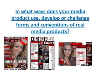
7. Written Content and Layout – Contents Page
• My contents page follows the conventions of a typical musical
magazine by having the title of the page, ‘Contents,’ in the top left
hand corner. It is also the biggest font used on the page; the name
of the magazine, the date and the website is included in both
contents pages.
• I have listed the features and articles down the left hand side in
numerical order with corresponding page numbers. Each section
includes different subheadings, the subheadings, ‘Features,’ and
‘Every Issue/Every Month,’ are also shown on the contents page of
‘Q.’ Both magazines also split the information under different
subheadings.
• The images I have used are related to my magazine as they have the
rock theme. I have also used two main images like ‘Q.’
• Other convention I have used is the, ‘Editors Letter,’ and, ‘Subscribe’
feature, which is common are a common feature in many magazines.
The Subscribe section has its own section on the page so that the it
can be easily seen by the reader to show them how easy it is to
subscribe and why it would be an advantage to them. This is to
persuade the audience to sign up.
8. Written Content and Layout – Double Page Spread
•I have included a introductory paragraph to introduce
the artist and what will be in the interview which will
make the reader want to read on.
• I have also used quotes that stand out from the text that
are memorable and inspiring/interesting which may grab
the audiences attention and persuade them to read it.
•I also used the slogan RIOT! LOVES, the word love shows
that the magazine recommend this artist and the readers
want advice which they can trust which is what the
magazine gives.
•Inserting coloured text boxes not only
livens up the page but it also helps the
reader to notice some important features
the artist may be talking about, or even
some interesting facts about them that will
be entertaining. If the reader is entertained
by the information they will most likely
want to purchase the magazine again.
9. Music Genre and how your magazine represents it
My music magazine represents the genre of rock in all aspects
previously mentioned and also strongly in these three ways:
1. The colours red, black and white are typical colours in rock
magazines.
2. The clothing the model is dressed in, for example, a red leather
jacket, is an example of what this social group may wear.
3. The pose that the model is doing, (with her tongue out,) shows the
stereotype that rock is rebellious.