Drafting
Textual
Analysis
Front Cover
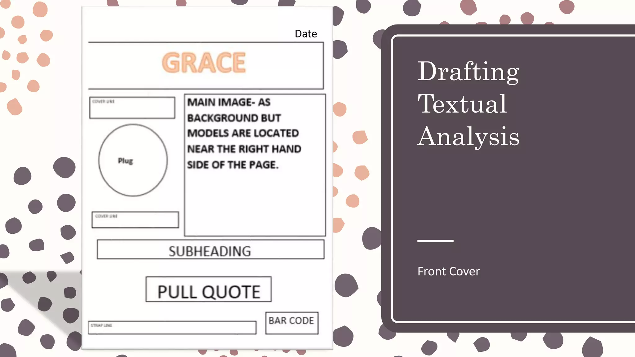
Date
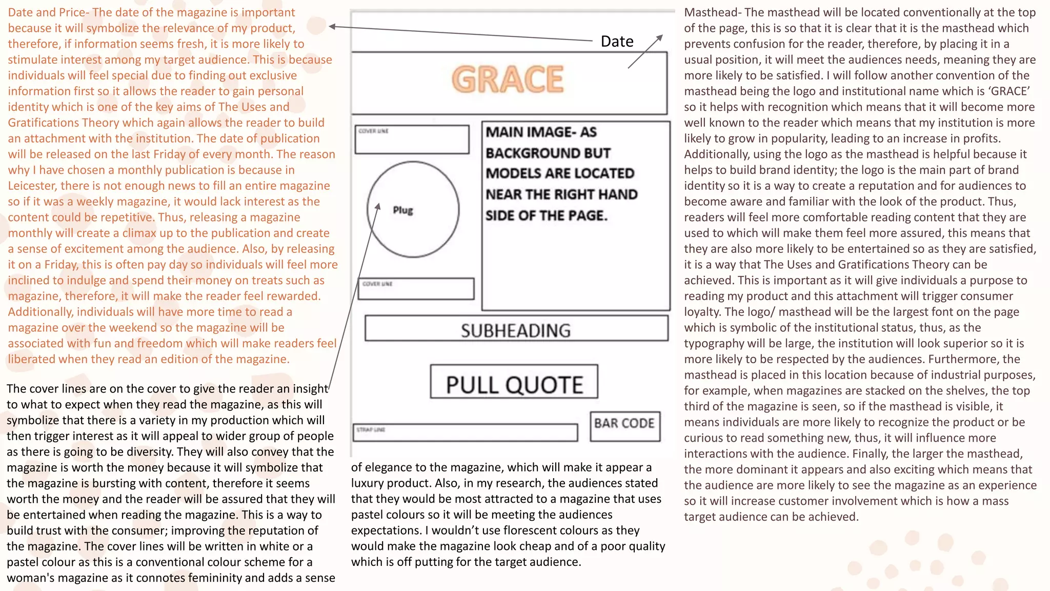
Date
Masthead- The masthead will be located conventionally at the top
of the page, this is so that it is clear that it is the masthead which
prevents confusion for the reader, therefore, by placing it in a
usual position, it will meet the audiences needs, meaning they are
more likely to be satisfied. I will follow another convention of the
masthead being the logo and institutional name which is ‘GRACE’
so it helps with recognition which means that it will become more
well known to the reader which means that my institution is more
likely to grow in popularity, leading to an increase in profits.
Additionally, using the logo as the masthead is helpful because it
helps to build brand identity; the logo is the main part of brand
identity so it is a way to create a reputation and for audiences to
become aware and familiar with the look of the product. Thus,
readers will feel more comfortable reading content that they are
used to which will make them feel more assured, this means that
they are also more likely to be entertained so as they are satisfied,
it is a way that The Uses and Gratifications Theory can be
achieved. This is important as it will give individuals a purpose to
reading my product and this attachment will trigger consumer
loyalty. The logo/ masthead will be the largest font on the page
which is symbolic of the institutional status, thus, as the
typography will be large, the institution will look superior so it is
more likely to be respected by the audiences. Furthermore, the
masthead is placed in this location because of industrial purposes,
for example, when magazines are stacked on the shelves, the top
third of the magazine is seen, so if the masthead is visible, it
means individuals are more likely to recognize the product or be
curious to read something new, thus, it will influence more
interactions with the audience. Finally, the larger the masthead,
the more dominant it appears and also exciting which means that
the audience are more likely to see the magazine as an experience
so it will increase customer involvement which is how a mass
target audience can be achieved.
Date and Price- The date of the magazine is important
because it will symbolize the relevance of my product,
therefore, if information seems fresh, it is more likely to
stimulate interest among my target audience. This is because
individuals will feel special due to finding out exclusive
information first so it allows the reader to gain personal
identity which is one of the key aims of The Uses and
Gratifications Theory which again allows the reader to build
an attachment with the institution. The date of publication
will be released on the last Friday of every month. The reason
why I have chosen a monthly publication is because in
Leicester, there is not enough news to fill an entire magazine
so if it was a weekly magazine, it would lack interest as the
content could be repetitive. Thus, releasing a magazine
monthly will create a climax up to the publication and create
a sense of excitement among the audience. Also, by releasing
it on a Friday, this is often pay day so individuals will feel more
inclined to indulge and spend their money on treats such as
magazine, therefore, it will make the reader feel rewarded.
Additionally, individuals will have more time to read a
magazine over the weekend so the magazine will be
associated with fun and freedom which will make readers feel
liberated when they read an edition of the magazine.
The cover lines are on the cover to give the reader an insight
to what to expect when they read the magazine, as this will
symbolize that there is a variety in my production which will
then trigger interest as it will appeal to wider group of people
as there is going to be diversity. They will also convey that the
magazine is worth the money because it will symbolize that
the magazine is bursting with content, therefore it seems
worth the money and the reader will be assured that they will
be entertained when reading the magazine. This is a way to
build trust with the consumer; improving the reputation of
the magazine. The cover lines will be written in white or a
pastel colour as this is a conventional colour scheme for a
woman's magazine as it connotes femininity and adds a sense
of elegance to the magazine, which will make it appear a
luxury product. Also, in my research, the audiences stated
that they would be most attracted to a magazine that uses
pastel colours so it will be meeting the audiences
expectations. I wouldn’t use florescent colours as they
would make the magazine look cheap and of a poor quality
which is off putting for the target audience.
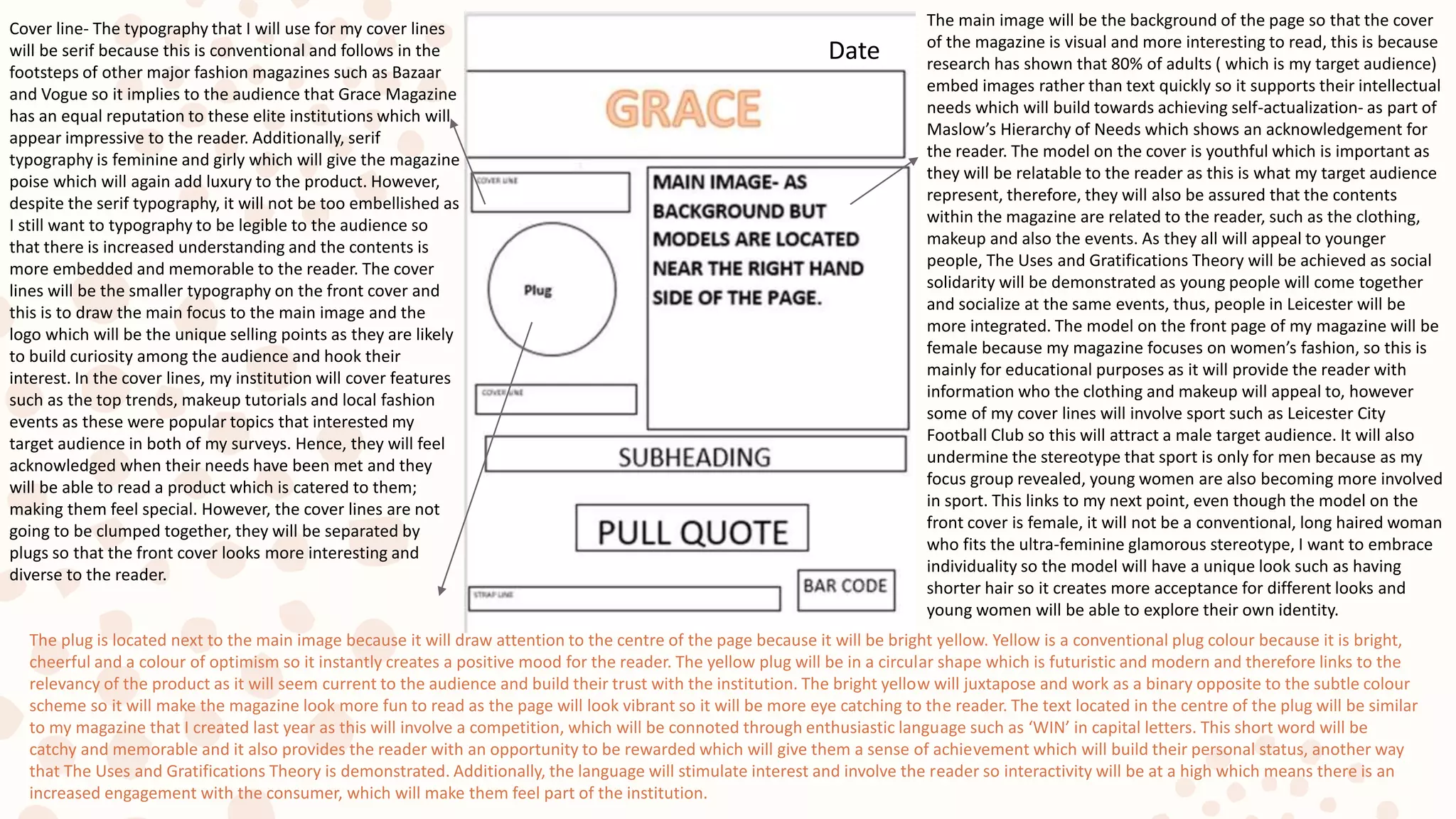
Cover line- The typography that I will use for my cover lines
will be serif because this is conventional and follows in the
footsteps of other major fashion magazines such as Bazaar
and Vogue so it implies to the audience that Grace Magazine
has an equal reputation to these elite institutions which will
appear impressive to the reader. Additionally, serif
typography is feminine and girly which will give the magazine
poise which will again add luxury to the product. However,
despite the serif typography, it will not be too embellished as
I still want to typography to be legible to the audience so
that there is increased understanding and the contents is
more embedded and memorable to the reader. The cover
lines will be the smaller typography on the front cover and
this is to draw the main focus to the main image and the
logo which will be the unique selling points as they are likely
to build curiosity among the audience and hook their
interest. In the cover lines, my institution will cover features
such as the top trends, makeup tutorials and local fashion
events as these were popular topics that interested my
target audience in both of my surveys. Hence, they will feel
acknowledged when their needs have been met and they
will be able to read a product which is catered to them;
making them feel special. However, the cover lines are not
going to be clumped together, they will be separated by
plugs so that the front cover looks more interesting and
diverse to the reader.
The plug is located next to the main image because it will draw attention to the centre of the page because it will be bright yellow. Yellow is a conventional plug colour because it is bright,
cheerful and a colour of optimism so it instantly creates a positive mood for the reader. The yellow plug will be in a circular shape which is futuristic and modern and therefore links to the
relevancy of the product as it will seem current to the audience and build their trust with the institution. The bright yellow will juxtapose and work as a binary opposite to the subtle colour
scheme so it will make the magazine look more fun to read as the page will look vibrant so it will be more eye catching to the reader. The text located in the centre of the plug will be similar
to my magazine that I created last year as this will involve a competition, which will be connoted through enthusiastic language such as ‘WIN’ in capital letters. This short word will be
catchy and memorable and it also provides the reader with an opportunity to be rewarded which will give them a sense of achievement which will build their personal status, another way
that The Uses and Gratifications Theory is demonstrated. Additionally, the language will stimulate interest and involve the reader so interactivity will be at a high which means there is an
increased engagement with the consumer, which will make them feel part of the institution.
Date
The main image will be the background of the page so that the cover
of the magazine is visual and more interesting to read, this is because
research has shown that 80% of adults ( which is my target audience)
embed images rather than text quickly so it supports their intellectual
needs which will build towards achieving self-actualization- as part of
Maslow’s Hierarchy of Needs which shows an acknowledgement for
the reader. The model on the cover is youthful which is important as
they will be relatable to the reader as this is what my target audience
represent, therefore, they will also be assured that the contents
within the magazine are related to the reader, such as the clothing,
makeup and also the events. As they all will appeal to younger
people, The Uses and Gratifications Theory will be achieved as social
solidarity will be demonstrated as young people will come together
and socialize at the same events, thus, people in Leicester will be
more integrated. The model on the front page of my magazine will be
female because my magazine focuses on women’s fashion, so this is
mainly for educational purposes as it will provide the reader with
information who the clothing and makeup will appeal to, however
some of my cover lines will involve sport such as Leicester City
Football Club so this will attract a male target audience. It will also
undermine the stereotype that sport is only for men because as my
focus group revealed, young women are also becoming more involved
in sport. This links to my next point, even though the model on the
front cover is female, it will not be a conventional, long haired woman
who fits the ultra-feminine glamorous stereotype, I want to embrace
individuality so the model will have a unique look such as having
shorter hair so it creates more acceptance for different looks and
young women will be able to explore their own identity.
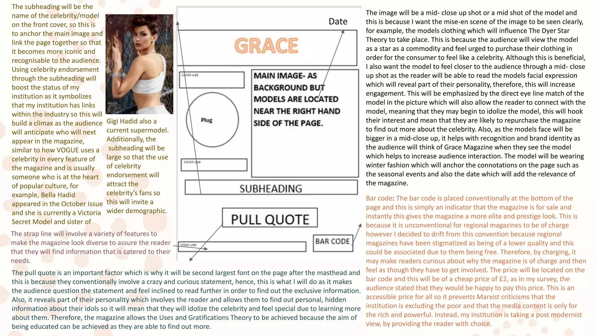
The image will be a mid- close up shot or a mid shot of the model and
this is because I want the mise-en scene of the image to be seen clearly,
for example, the models clothing which will influence The Dyer Star
Theory to take place. This is because the audience will view the model
as a star as a commodity and feel urged to purchase their clothing in
order for the consumer to feel like a celebrity. Although this is beneficial,
I also want the model to feel closer to the audience through a mid- close
up shot as the reader will be able to read the models facial expression
which will reveal part of their personality, therefore, this will increase
engagement. This will be emphasized by the direct eye line match of the
model in the picture which will also allow the reader to connect with the
model, meaning that they may begin to idolize the model, this will hook
their interest and mean that they are likely to repurchase the magazine
to find out more about the celebrity. Also, as the models face will be
bigger in a mid-close up, it helps with recognition and brand identity as
the audience will think of Grace Magazine when they see the model
which helps to increase audience interaction. The model will be wearing
winter fashion which will anchor the connotations on the page such as
the seasonal events and also the date which will add the relevance of
the magazine.
Bar code: The bar code is placed conventionally at the bottom of the
page and this is simply an indicator that the magazine is for sale and
instantly this gives the magazine a more elite and prestige look. This is
because it is unconventional for regional magazines to be of charge
however I decided to drift from this convention because regional
magazines have been stigmatized as being of a lower quality and this
could be associated due to them being free. Therefore, by charging, it
may make readers curious about why the magazine is of charge and then
feel as though they have to get involved. The price will be located on the
bar code and this will be of a cheap price of £2, as in my survey, the
audience stated that they would be happy to pay this price. This is an
accessible price for all so it prevents Marxist criticisms that the
institution is excluding the poor and that the media content is only for
the rich and powerful. Instead, my institution is taking a post modernist
view, by providing the reader with choice.
Date
The subheading will be the
name of the celebrity/model
on the front cover, so this is
to anchor the main image and
link the page together so that
it becomes more iconic and
recognisable to the audience.
Using celebrity endorsement
through the subheading will
boost the status of my
institution as it symbolizes
that my institution has links
within the industry so this will
build a climax as the audience
will anticipate who will next
appear in the magazine,
similar to how VOGUE uses a
celebrity in every feature of
the magazine and is usually
someone who is at the heart
of popular culture, for
example, Bella Hadid
appeared in the October issue
and she is currently a Victoria
Secret Model and sister of
Gigi Hadid also a
current supermodel.
Additionally, the
subheading will be
large so that the use
of celebrity
endorsement will
attract the
celebrity’s fans so
this will invite a
wider demographic.
The pull quote is an important factor which is why it will be second largest font on the page after the masthead and
this is because they conventionally involve a crazy and curious statement, hence, this is what I will do as it makes
the audience question the statement and feel inclined to read further in order to find out the exclusive information.
Also, it reveals part of their personality which involves the reader and allows them to find out personal, hidden
information about their idols so it will mean that they will idolize the celebrity and feel special due to learning more
about them. Therefore, the magazine allows the Uses and Gratifications Theory to be achieved because the aim of
being educated can be achieved as they are able to find out more.
The strap line will involve a variety of features to
make the magazine look diverse to assure the reader
that they will find information that is catered to their
needs.
Drafting
Textual
Analysis
Contents Page
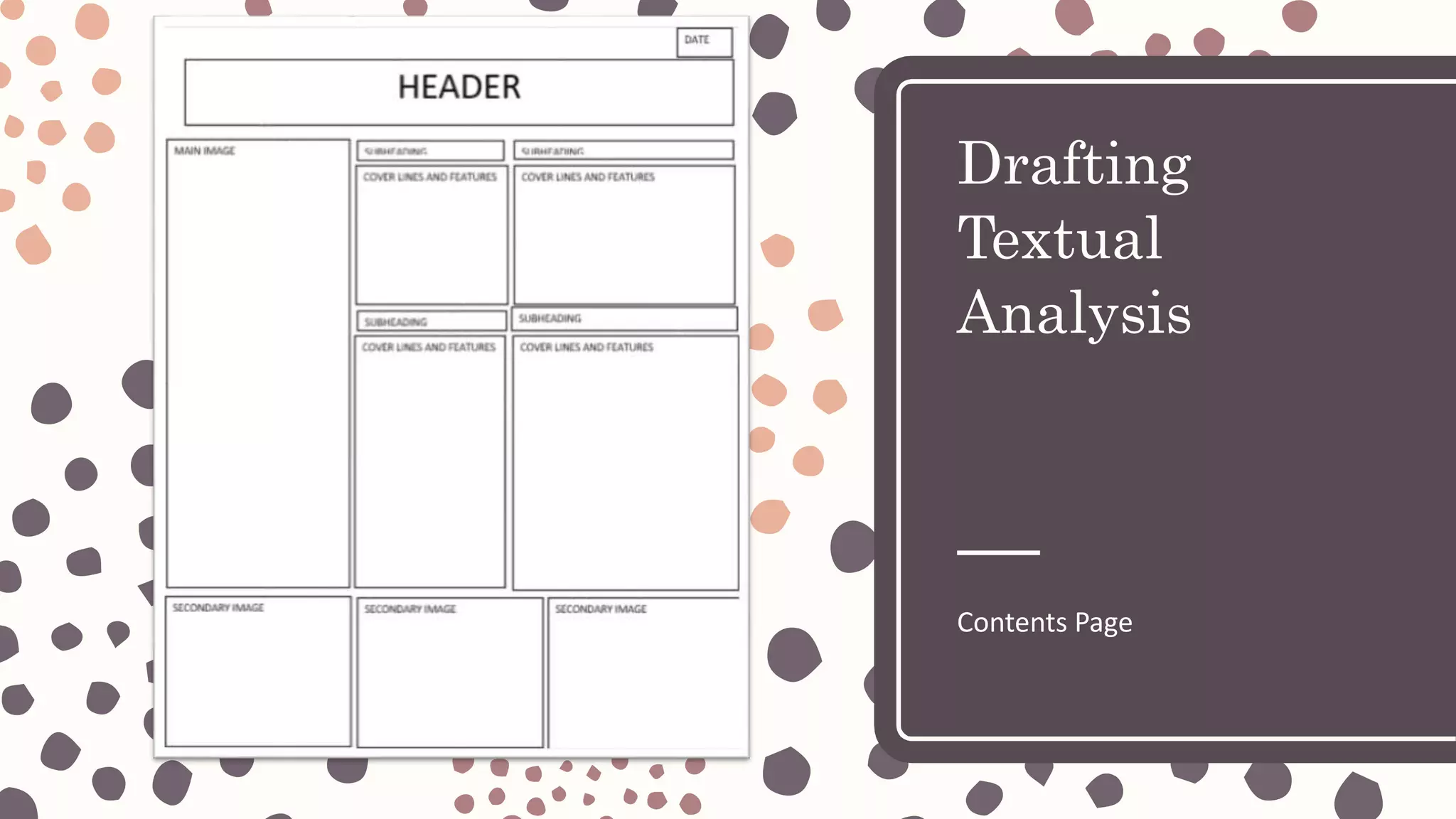
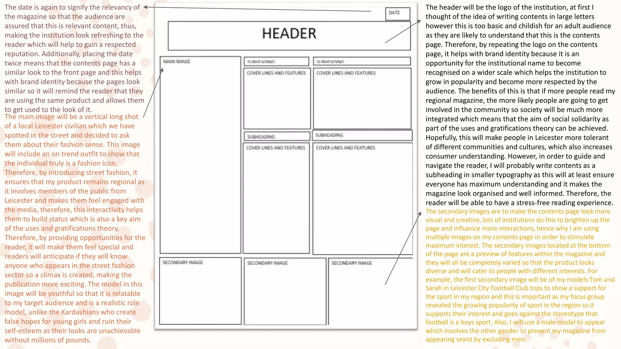
The header will be the logo of the institution, at first I
thought of the idea of writing contents in large letters
however this is too basic and childish for an adult audience
as they are likely to understand that this is the contents
page. Therefore, by repeating the logo on the contents
page, it helps with brand identity because it is an
opportunity for the institutional name to become
recognised on a wider scale which helps the institution to
grow in popularity and become more respected by the
audience. The benefits of this is that if more people read my
regional magazine, the more likely people are going to get
involved in the community so society will be much more
integrated which means that the aim of social solidarity as
part of the uses and gratifications theory can be achieved.
Hopefully, this will make people in Leicester more tolerant
of different communities and cultures, which also increases
consumer understanding. However, in order to guide and
navigate the reader, I will probably write contents as a
subheading in smaller typography as this will at least ensure
everyone has maximum understanding and it makes the
magazine look organised and well informed. Therefore, the
reader will be able to have a stress-free reading experience.
The date is again to signify the relevancy of
the magazine so that the audience are
assured that this is relevant content, thus,
making the institution look refreshing to the
reader which will help to gain a respected
reputation. Additionally, placing the date
twice means that the contents page has a
similar look to the front page and this helps
with brand identity because the pages look
similar so it will remind the reader that they
are using the same product and allows them
to get used to the look of it.
The main image will be a vertical long shot
of a local Leicester civilian which we have
spotted in the street and decided to ask
them about their fashion sense. This image
will include an on trend outfit to show that
the individual truly is a fashion icon.
Therefore, by introducing street fashion, it
ensures that my product remains regional as
it involves members of the public from
Leicester and makes them feel engaged with
the media, therefore, this interactivity helps
them to build status which is also a key aim
of the uses and gratifications theory.
Therefore, by providing opportunities for the
reader, it will make them feel special and
readers will anticipate if they will know
anyone who appears in the street fashion
sector so a climax is created, making the
publication more exciting. The model in this
image will be youthful so that it is relatable
to my target audience and is a realistic role
model, unlike the Kardashians who create
false hopes for young girls and ruin their
self-esteem as their looks are unachievable
without millions of pounds.
The secondary images are to make the contents page look more
visual and creative, lots of institutions do this to brighten up the
page and influence more interactions, hence why I am using
multiple images on my contents page in order to stimulate
maximum interest. The secondary images located at the bottom
of the page are a preview of features within the magazine and
they will all be completely varied so that the product looks
diverse and will cater to people with different interests. For
example, the first secondary image will be of my models Tom and
Sarah in Leicester City Football Club tops to show a support for
the sport in my region and this is important as my focus group
revealed the growing popularity of sport in the region so it
supports their interest and goes against the stereotype that
football is a boys sport. Also, I will use a male model to appear
which involves the other gender to prevent my magazine from
appearing sexist by excluding men.
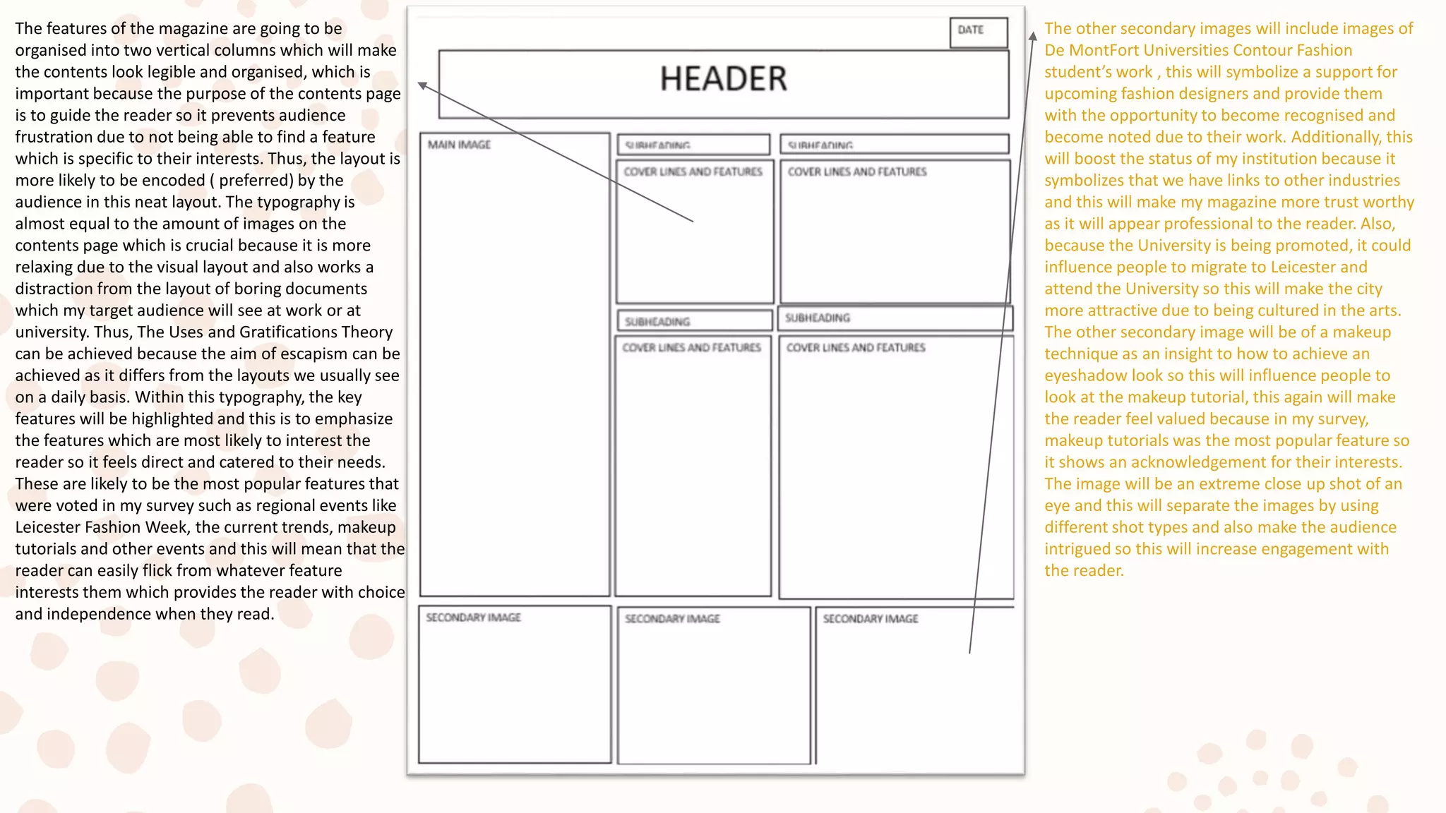
The other secondary images will include images of
De MontFort Universities Contour Fashion
student’s work , this will symbolize a support for
upcoming fashion designers and provide them
with the opportunity to become recognised and
become noted due to their work. Additionally, this
will boost the status of my institution because it
symbolizes that we have links to other industries
and this will make my magazine more trust worthy
as it will appear professional to the reader. Also,
because the University is being promoted, it could
influence people to migrate to Leicester and
attend the University so this will make the city
more attractive due to being cultured in the arts.
The other secondary image will be of a makeup
technique as an insight to how to achieve an
eyeshadow look so this will influence people to
look at the makeup tutorial, this again will make
the reader feel valued because in my survey,
makeup tutorials was the most popular feature so
it shows an acknowledgement for their interests.
The image will be an extreme close up shot of an
eye and this will separate the images by using
different shot types and also make the audience
intrigued so this will increase engagement with
the reader.
The features of the magazine are going to be
organised into two vertical columns which will make
the contents look legible and organised, which is
important because the purpose of the contents page
is to guide the reader so it prevents audience
frustration due to not being able to find a feature
which is specific to their interests. Thus, the layout is
more likely to be encoded ( preferred) by the
audience in this neat layout. The typography is
almost equal to the amount of images on the
contents page which is crucial because it is more
relaxing due to the visual layout and also works a
distraction from the layout of boring documents
which my target audience will see at work or at
university. Thus, The Uses and Gratifications Theory
can be achieved because the aim of escapism can be
achieved as it differs from the layouts we usually see
on a daily basis. Within this typography, the key
features will be highlighted and this is to emphasize
the features which are most likely to interest the
reader so it feels direct and catered to their needs.
These are likely to be the most popular features that
were voted in my survey such as regional events like
Leicester Fashion Week, the current trends, makeup
tutorials and other events and this will mean that the
reader can easily flick from whatever feature
interests them which provides the reader with choice
and independence when they read.
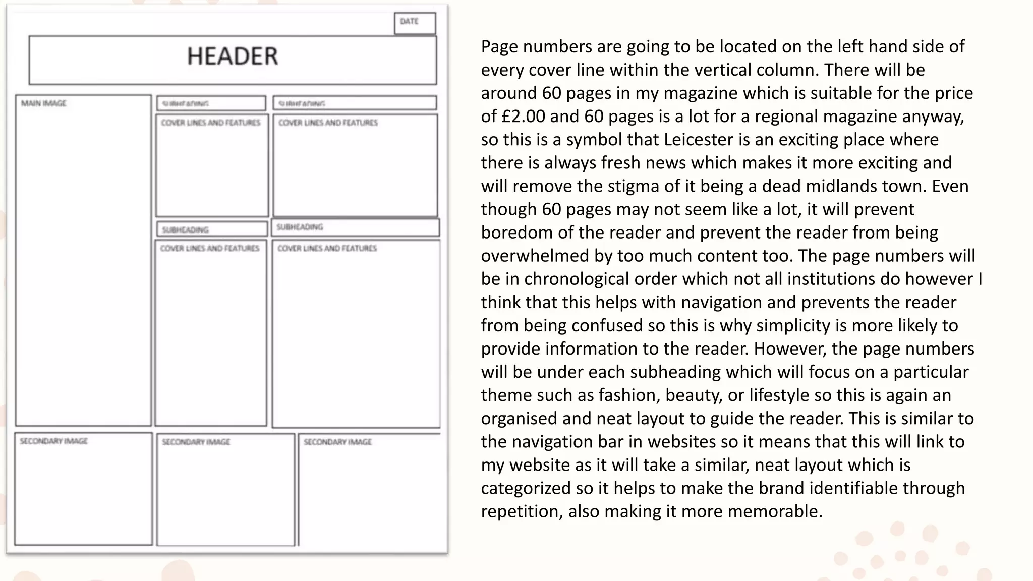
Page numbers are going to be located on the left hand side of
every cover line within the vertical column. There will be
around 60 pages in my magazine which is suitable for the price
of £2.00 and 60 pages is a lot for a regional magazine anyway,
so this is a symbol that Leicester is an exciting place where
there is always fresh news which makes it more exciting and
will remove the stigma of it being a dead midlands town. Even
though 60 pages may not seem like a lot, it will prevent
boredom of the reader and prevent the reader from being
overwhelmed by too much content too. The page numbers will
be in chronological order which not all institutions do however I
think that this helps with navigation and prevents the reader
from being confused so this is why simplicity is more likely to
provide information to the reader. However, the page numbers
will be under each subheading which will focus on a particular
theme such as fashion, beauty, or lifestyle so this is again an
organised and neat layout to guide the reader. This is similar to
the navigation bar in websites so it means that this will link to
my website as it will take a similar, neat layout which is
categorized so it helps to make the brand identifiable through
repetition, also making it more memorable.
Drafting
Textual
Analysis
Double Page Spread
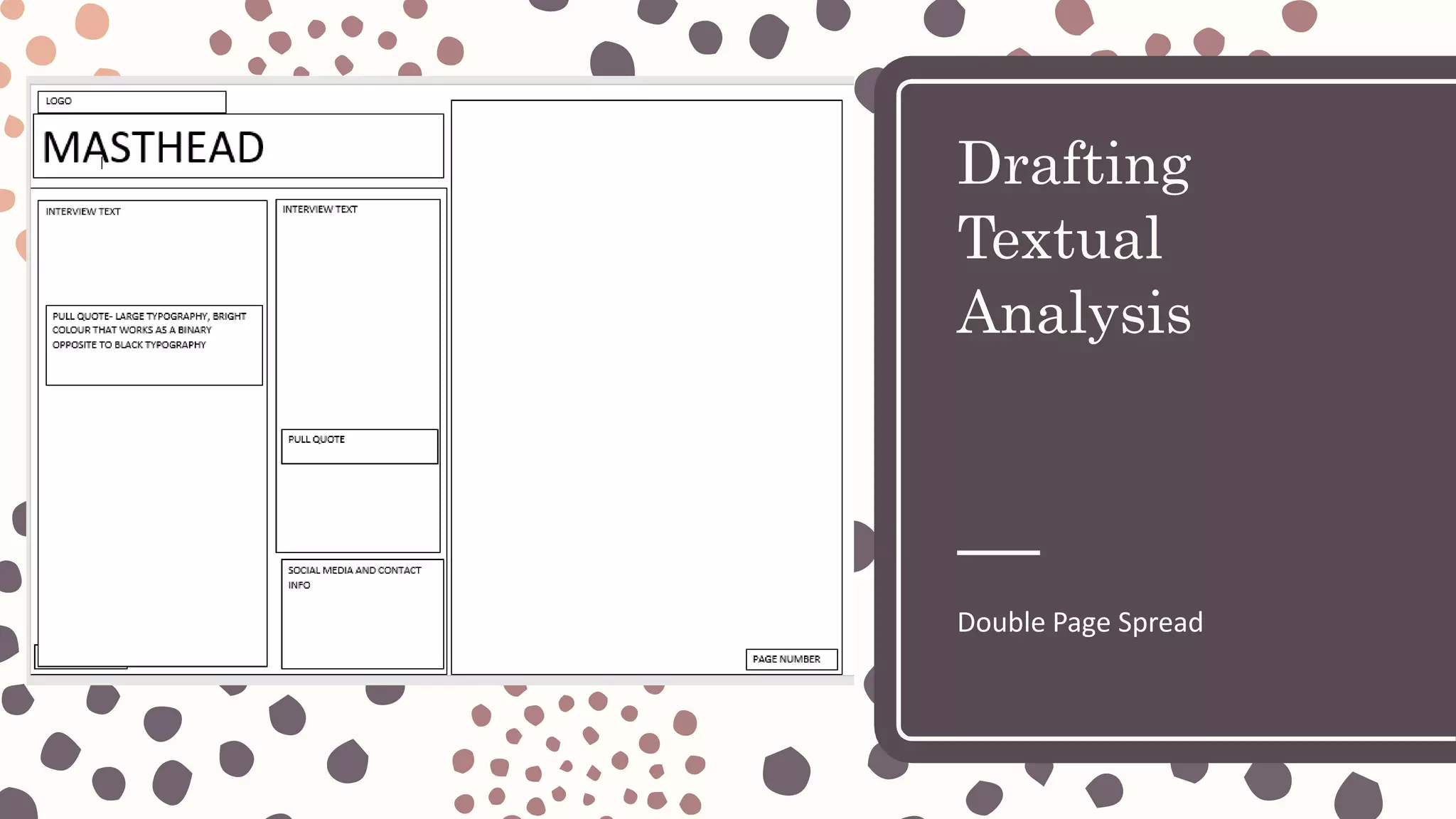
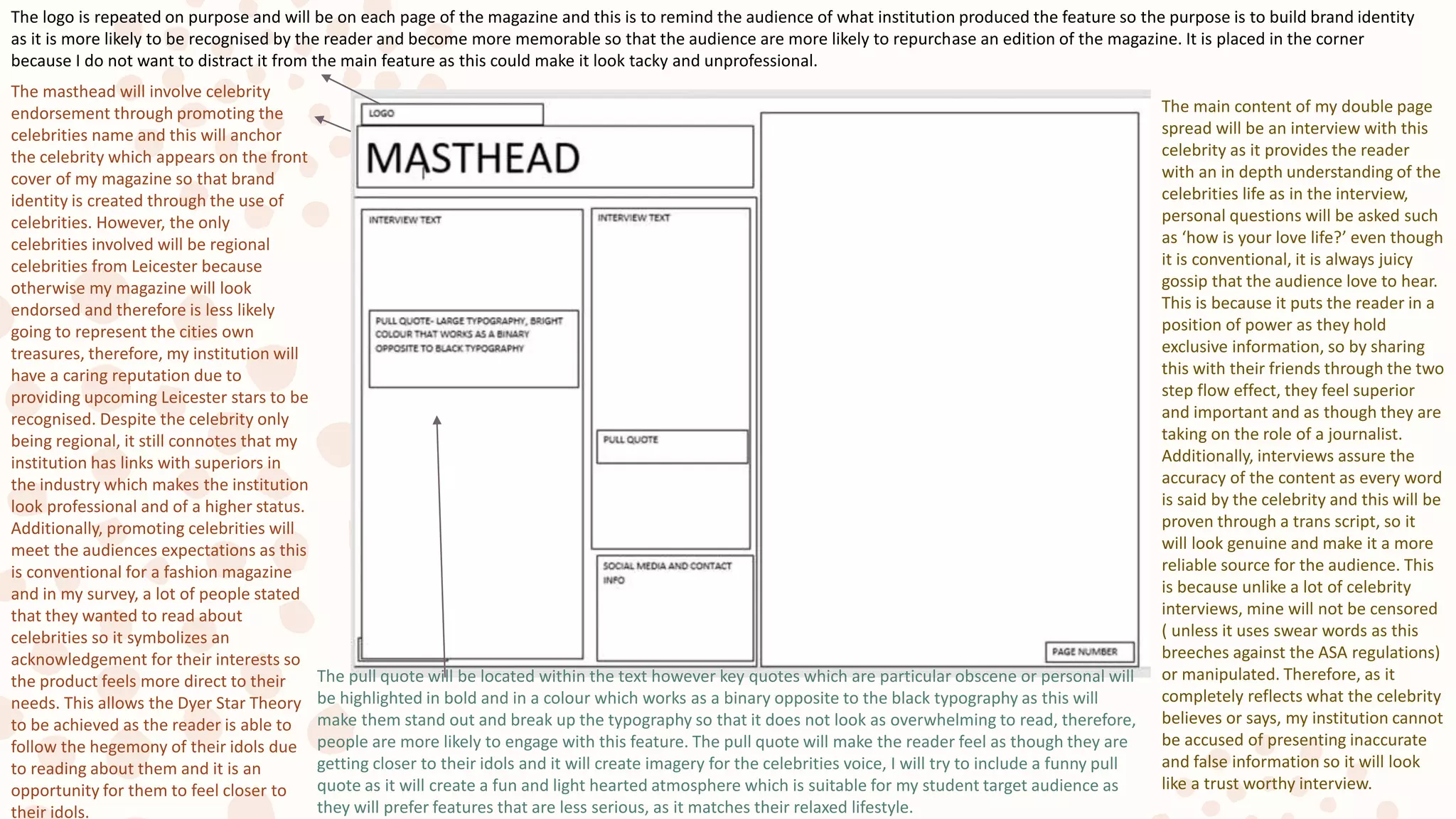
The logo is repeated on purpose and will be on each page of the magazine and this is to remind the audience of what institution produced the feature so the purpose is to build brand identity
as it is more likely to be recognised by the reader and become more memorable so that the audience are more likely to repurchase an edition of the magazine. It is placed in the corner
because I do not want to distract it from the main feature as this could make it look tacky and unprofessional.
The masthead will involve celebrity
endorsement through promoting the
celebrities name and this will anchor
the celebrity which appears on the front
cover of my magazine so that brand
identity is created through the use of
celebrities. However, the only
celebrities involved will be regional
celebrities from Leicester because
otherwise my magazine will look
endorsed and therefore is less likely
going to represent the cities own
treasures, therefore, my institution will
have a caring reputation due to
providing upcoming Leicester stars to be
recognised. Despite the celebrity only
being regional, it still connotes that my
institution has links with superiors in
the industry which makes the institution
look professional and of a higher status.
Additionally, promoting celebrities will
meet the audiences expectations as this
is conventional for a fashion magazine
and in my survey, a lot of people stated
that they wanted to read about
celebrities so it symbolizes an
acknowledgement for their interests so
the product feels more direct to their
needs. This allows the Dyer Star Theory
to be achieved as the reader is able to
follow the hegemony of their idols due
to reading about them and it is an
opportunity for them to feel closer to
their idols.
The main content of my double page
spread will be an interview with this
celebrity as it provides the reader
with an in depth understanding of the
celebrities life as in the interview,
personal questions will be asked such
as ‘how is your love life?’ even though
it is conventional, it is always juicy
gossip that the audience love to hear.
This is because it puts the reader in a
position of power as they hold
exclusive information, so by sharing
this with their friends through the two
step flow effect, they feel superior
and important and as though they are
taking on the role of a journalist.
Additionally, interviews assure the
accuracy of the content as every word
is said by the celebrity and this will be
proven through a trans script, so it
will look genuine and make it a more
reliable source for the audience. This
is because unlike a lot of celebrity
interviews, mine will not be censored
( unless it uses swear words as this
breeches against the ASA regulations)
or manipulated. Therefore, as it
completely reflects what the celebrity
believes or says, my institution cannot
be accused of presenting inaccurate
and false information so it will look
like a trust worthy interview.
The pull quote will be located within the text however key quotes which are particular obscene or personal will
be highlighted in bold and in a colour which works as a binary opposite to the black typography as this will
make them stand out and break up the typography so that it does not look as overwhelming to read, therefore,
people are more likely to engage with this feature. The pull quote will make the reader feel as though they are
getting closer to their idols and it will create imagery for the celebrities voice, I will try to include a funny pull
quote as it will create a fun and light hearted atmosphere which is suitable for my student target audience as
they will prefer features that are less serious, as it matches their relaxed lifestyle.
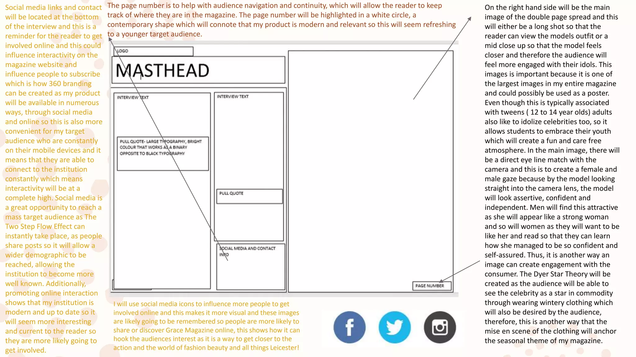
On the right hand side will be the main
image of the double page spread and this
will either be a long shot so that the
reader can view the models outfit or a
mid close up so that the model feels
closer and therefore the audience will
feel more engaged with their idols. This
images is important because it is one of
the largest images in my entire magazine
and could possibly be used as a poster.
Even though this is typically associated
with tweens ( 12 to 14 year olds) adults
also like to idolize celebrities too, so it
allows students to embrace their youth
which will create a fun and care free
atmosphere. In the main image, there will
be a direct eye line match with the
camera and this is to create a female and
male gaze because by the model looking
straight into the camera lens, the model
will look assertive, confident and
independent. Men will find this attractive
as she will appear like a strong woman
and so will women as they will want to be
like her and read so that they can learn
how she managed to be so confident and
self-assured. Thus, it is another way an
image can create engagement with the
consumer. The Dyer Star Theory will be
created as the audience will be able to
see the celebrity as a star in commodity
through wearing wintery clothing which
will also be desired by the audience,
therefore, this is another way that the
mise en scene of the clothing will anchor
the seasonal theme of my magazine.
The page number is to help with audience navigation and continuity, which will allow the reader to keep
track of where they are in the magazine. The page number will be highlighted in a white circle, a
contemporary shape which will connote that my product is modern and relevant so this will seem refreshing
to a younger target audience.
Social media links and contact
will be located at the bottom
of the interview and this is a
reminder for the reader to get
involved online and this could
influence interactivity on the
magazine website and
influence people to subscribe
which is how 360 branding
can be created as my product
will be available in numerous
ways, through social media
and online so this is also more
convenient for my target
audience who are constantly
on their mobile devices and it
means that they are able to
connect to the institution
constantly which means
interactivity will be at a
complete high. Social media is
a great opportunity to reach a
mass target audience as The
Two Step Flow Effect can
instantly take place, as people
share posts so it will allow a
wider demographic to be
reached, allowing the
institution to become more
well known. Additionally,
promoting online interaction
shows that my institution is
modern and up to date so it
will seem more interesting
and current to the reader so
they are more likely going to
get involved.
I will use social media icons to influence more people to get
involved online and this makes it more visual and these images
are likely going to be remembered so people are more likely to
share or discover Grace Magazine online, this shows how it can
hook the audiences interest as it is a way to get closer to the
action and the world of fashion beauty and all things Leicester!

Drafting Textual Analysis

  • 1.
  • 2.
    Date Masthead- The mastheadwill be located conventionally at the top of the page, this is so that it is clear that it is the masthead which prevents confusion for the reader, therefore, by placing it in a usual position, it will meet the audiences needs, meaning they are more likely to be satisfied. I will follow another convention of the masthead being the logo and institutional name which is ‘GRACE’ so it helps with recognition which means that it will become more well known to the reader which means that my institution is more likely to grow in popularity, leading to an increase in profits. Additionally, using the logo as the masthead is helpful because it helps to build brand identity; the logo is the main part of brand identity so it is a way to create a reputation and for audiences to become aware and familiar with the look of the product. Thus, readers will feel more comfortable reading content that they are used to which will make them feel more assured, this means that they are also more likely to be entertained so as they are satisfied, it is a way that The Uses and Gratifications Theory can be achieved. This is important as it will give individuals a purpose to reading my product and this attachment will trigger consumer loyalty. The logo/ masthead will be the largest font on the page which is symbolic of the institutional status, thus, as the typography will be large, the institution will look superior so it is more likely to be respected by the audiences. Furthermore, the masthead is placed in this location because of industrial purposes, for example, when magazines are stacked on the shelves, the top third of the magazine is seen, so if the masthead is visible, it means individuals are more likely to recognize the product or be curious to read something new, thus, it will influence more interactions with the audience. Finally, the larger the masthead, the more dominant it appears and also exciting which means that the audience are more likely to see the magazine as an experience so it will increase customer involvement which is how a mass target audience can be achieved. Date and Price- The date of the magazine is important because it will symbolize the relevance of my product, therefore, if information seems fresh, it is more likely to stimulate interest among my target audience. This is because individuals will feel special due to finding out exclusive information first so it allows the reader to gain personal identity which is one of the key aims of The Uses and Gratifications Theory which again allows the reader to build an attachment with the institution. The date of publication will be released on the last Friday of every month. The reason why I have chosen a monthly publication is because in Leicester, there is not enough news to fill an entire magazine so if it was a weekly magazine, it would lack interest as the content could be repetitive. Thus, releasing a magazine monthly will create a climax up to the publication and create a sense of excitement among the audience. Also, by releasing it on a Friday, this is often pay day so individuals will feel more inclined to indulge and spend their money on treats such as magazine, therefore, it will make the reader feel rewarded. Additionally, individuals will have more time to read a magazine over the weekend so the magazine will be associated with fun and freedom which will make readers feel liberated when they read an edition of the magazine. The cover lines are on the cover to give the reader an insight to what to expect when they read the magazine, as this will symbolize that there is a variety in my production which will then trigger interest as it will appeal to wider group of people as there is going to be diversity. They will also convey that the magazine is worth the money because it will symbolize that the magazine is bursting with content, therefore it seems worth the money and the reader will be assured that they will be entertained when reading the magazine. This is a way to build trust with the consumer; improving the reputation of the magazine. The cover lines will be written in white or a pastel colour as this is a conventional colour scheme for a woman's magazine as it connotes femininity and adds a sense of elegance to the magazine, which will make it appear a luxury product. Also, in my research, the audiences stated that they would be most attracted to a magazine that uses pastel colours so it will be meeting the audiences expectations. I wouldn’t use florescent colours as they would make the magazine look cheap and of a poor quality which is off putting for the target audience.
  • 3.
    Cover line- Thetypography that I will use for my cover lines will be serif because this is conventional and follows in the footsteps of other major fashion magazines such as Bazaar and Vogue so it implies to the audience that Grace Magazine has an equal reputation to these elite institutions which will appear impressive to the reader. Additionally, serif typography is feminine and girly which will give the magazine poise which will again add luxury to the product. However, despite the serif typography, it will not be too embellished as I still want to typography to be legible to the audience so that there is increased understanding and the contents is more embedded and memorable to the reader. The cover lines will be the smaller typography on the front cover and this is to draw the main focus to the main image and the logo which will be the unique selling points as they are likely to build curiosity among the audience and hook their interest. In the cover lines, my institution will cover features such as the top trends, makeup tutorials and local fashion events as these were popular topics that interested my target audience in both of my surveys. Hence, they will feel acknowledged when their needs have been met and they will be able to read a product which is catered to them; making them feel special. However, the cover lines are not going to be clumped together, they will be separated by plugs so that the front cover looks more interesting and diverse to the reader. The plug is located next to the main image because it will draw attention to the centre of the page because it will be bright yellow. Yellow is a conventional plug colour because it is bright, cheerful and a colour of optimism so it instantly creates a positive mood for the reader. The yellow plug will be in a circular shape which is futuristic and modern and therefore links to the relevancy of the product as it will seem current to the audience and build their trust with the institution. The bright yellow will juxtapose and work as a binary opposite to the subtle colour scheme so it will make the magazine look more fun to read as the page will look vibrant so it will be more eye catching to the reader. The text located in the centre of the plug will be similar to my magazine that I created last year as this will involve a competition, which will be connoted through enthusiastic language such as ‘WIN’ in capital letters. This short word will be catchy and memorable and it also provides the reader with an opportunity to be rewarded which will give them a sense of achievement which will build their personal status, another way that The Uses and Gratifications Theory is demonstrated. Additionally, the language will stimulate interest and involve the reader so interactivity will be at a high which means there is an increased engagement with the consumer, which will make them feel part of the institution. Date The main image will be the background of the page so that the cover of the magazine is visual and more interesting to read, this is because research has shown that 80% of adults ( which is my target audience) embed images rather than text quickly so it supports their intellectual needs which will build towards achieving self-actualization- as part of Maslow’s Hierarchy of Needs which shows an acknowledgement for the reader. The model on the cover is youthful which is important as they will be relatable to the reader as this is what my target audience represent, therefore, they will also be assured that the contents within the magazine are related to the reader, such as the clothing, makeup and also the events. As they all will appeal to younger people, The Uses and Gratifications Theory will be achieved as social solidarity will be demonstrated as young people will come together and socialize at the same events, thus, people in Leicester will be more integrated. The model on the front page of my magazine will be female because my magazine focuses on women’s fashion, so this is mainly for educational purposes as it will provide the reader with information who the clothing and makeup will appeal to, however some of my cover lines will involve sport such as Leicester City Football Club so this will attract a male target audience. It will also undermine the stereotype that sport is only for men because as my focus group revealed, young women are also becoming more involved in sport. This links to my next point, even though the model on the front cover is female, it will not be a conventional, long haired woman who fits the ultra-feminine glamorous stereotype, I want to embrace individuality so the model will have a unique look such as having shorter hair so it creates more acceptance for different looks and young women will be able to explore their own identity.
  • 4.
    The image willbe a mid- close up shot or a mid shot of the model and this is because I want the mise-en scene of the image to be seen clearly, for example, the models clothing which will influence The Dyer Star Theory to take place. This is because the audience will view the model as a star as a commodity and feel urged to purchase their clothing in order for the consumer to feel like a celebrity. Although this is beneficial, I also want the model to feel closer to the audience through a mid- close up shot as the reader will be able to read the models facial expression which will reveal part of their personality, therefore, this will increase engagement. This will be emphasized by the direct eye line match of the model in the picture which will also allow the reader to connect with the model, meaning that they may begin to idolize the model, this will hook their interest and mean that they are likely to repurchase the magazine to find out more about the celebrity. Also, as the models face will be bigger in a mid-close up, it helps with recognition and brand identity as the audience will think of Grace Magazine when they see the model which helps to increase audience interaction. The model will be wearing winter fashion which will anchor the connotations on the page such as the seasonal events and also the date which will add the relevance of the magazine. Bar code: The bar code is placed conventionally at the bottom of the page and this is simply an indicator that the magazine is for sale and instantly this gives the magazine a more elite and prestige look. This is because it is unconventional for regional magazines to be of charge however I decided to drift from this convention because regional magazines have been stigmatized as being of a lower quality and this could be associated due to them being free. Therefore, by charging, it may make readers curious about why the magazine is of charge and then feel as though they have to get involved. The price will be located on the bar code and this will be of a cheap price of £2, as in my survey, the audience stated that they would be happy to pay this price. This is an accessible price for all so it prevents Marxist criticisms that the institution is excluding the poor and that the media content is only for the rich and powerful. Instead, my institution is taking a post modernist view, by providing the reader with choice. Date The subheading will be the name of the celebrity/model on the front cover, so this is to anchor the main image and link the page together so that it becomes more iconic and recognisable to the audience. Using celebrity endorsement through the subheading will boost the status of my institution as it symbolizes that my institution has links within the industry so this will build a climax as the audience will anticipate who will next appear in the magazine, similar to how VOGUE uses a celebrity in every feature of the magazine and is usually someone who is at the heart of popular culture, for example, Bella Hadid appeared in the October issue and she is currently a Victoria Secret Model and sister of Gigi Hadid also a current supermodel. Additionally, the subheading will be large so that the use of celebrity endorsement will attract the celebrity’s fans so this will invite a wider demographic. The pull quote is an important factor which is why it will be second largest font on the page after the masthead and this is because they conventionally involve a crazy and curious statement, hence, this is what I will do as it makes the audience question the statement and feel inclined to read further in order to find out the exclusive information. Also, it reveals part of their personality which involves the reader and allows them to find out personal, hidden information about their idols so it will mean that they will idolize the celebrity and feel special due to learning more about them. Therefore, the magazine allows the Uses and Gratifications Theory to be achieved because the aim of being educated can be achieved as they are able to find out more. The strap line will involve a variety of features to make the magazine look diverse to assure the reader that they will find information that is catered to their needs.
  • 5.
  • 6.
    The header willbe the logo of the institution, at first I thought of the idea of writing contents in large letters however this is too basic and childish for an adult audience as they are likely to understand that this is the contents page. Therefore, by repeating the logo on the contents page, it helps with brand identity because it is an opportunity for the institutional name to become recognised on a wider scale which helps the institution to grow in popularity and become more respected by the audience. The benefits of this is that if more people read my regional magazine, the more likely people are going to get involved in the community so society will be much more integrated which means that the aim of social solidarity as part of the uses and gratifications theory can be achieved. Hopefully, this will make people in Leicester more tolerant of different communities and cultures, which also increases consumer understanding. However, in order to guide and navigate the reader, I will probably write contents as a subheading in smaller typography as this will at least ensure everyone has maximum understanding and it makes the magazine look organised and well informed. Therefore, the reader will be able to have a stress-free reading experience. The date is again to signify the relevancy of the magazine so that the audience are assured that this is relevant content, thus, making the institution look refreshing to the reader which will help to gain a respected reputation. Additionally, placing the date twice means that the contents page has a similar look to the front page and this helps with brand identity because the pages look similar so it will remind the reader that they are using the same product and allows them to get used to the look of it. The main image will be a vertical long shot of a local Leicester civilian which we have spotted in the street and decided to ask them about their fashion sense. This image will include an on trend outfit to show that the individual truly is a fashion icon. Therefore, by introducing street fashion, it ensures that my product remains regional as it involves members of the public from Leicester and makes them feel engaged with the media, therefore, this interactivity helps them to build status which is also a key aim of the uses and gratifications theory. Therefore, by providing opportunities for the reader, it will make them feel special and readers will anticipate if they will know anyone who appears in the street fashion sector so a climax is created, making the publication more exciting. The model in this image will be youthful so that it is relatable to my target audience and is a realistic role model, unlike the Kardashians who create false hopes for young girls and ruin their self-esteem as their looks are unachievable without millions of pounds. The secondary images are to make the contents page look more visual and creative, lots of institutions do this to brighten up the page and influence more interactions, hence why I am using multiple images on my contents page in order to stimulate maximum interest. The secondary images located at the bottom of the page are a preview of features within the magazine and they will all be completely varied so that the product looks diverse and will cater to people with different interests. For example, the first secondary image will be of my models Tom and Sarah in Leicester City Football Club tops to show a support for the sport in my region and this is important as my focus group revealed the growing popularity of sport in the region so it supports their interest and goes against the stereotype that football is a boys sport. Also, I will use a male model to appear which involves the other gender to prevent my magazine from appearing sexist by excluding men.
  • 7.
    The other secondaryimages will include images of De MontFort Universities Contour Fashion student’s work , this will symbolize a support for upcoming fashion designers and provide them with the opportunity to become recognised and become noted due to their work. Additionally, this will boost the status of my institution because it symbolizes that we have links to other industries and this will make my magazine more trust worthy as it will appear professional to the reader. Also, because the University is being promoted, it could influence people to migrate to Leicester and attend the University so this will make the city more attractive due to being cultured in the arts. The other secondary image will be of a makeup technique as an insight to how to achieve an eyeshadow look so this will influence people to look at the makeup tutorial, this again will make the reader feel valued because in my survey, makeup tutorials was the most popular feature so it shows an acknowledgement for their interests. The image will be an extreme close up shot of an eye and this will separate the images by using different shot types and also make the audience intrigued so this will increase engagement with the reader. The features of the magazine are going to be organised into two vertical columns which will make the contents look legible and organised, which is important because the purpose of the contents page is to guide the reader so it prevents audience frustration due to not being able to find a feature which is specific to their interests. Thus, the layout is more likely to be encoded ( preferred) by the audience in this neat layout. The typography is almost equal to the amount of images on the contents page which is crucial because it is more relaxing due to the visual layout and also works a distraction from the layout of boring documents which my target audience will see at work or at university. Thus, The Uses and Gratifications Theory can be achieved because the aim of escapism can be achieved as it differs from the layouts we usually see on a daily basis. Within this typography, the key features will be highlighted and this is to emphasize the features which are most likely to interest the reader so it feels direct and catered to their needs. These are likely to be the most popular features that were voted in my survey such as regional events like Leicester Fashion Week, the current trends, makeup tutorials and other events and this will mean that the reader can easily flick from whatever feature interests them which provides the reader with choice and independence when they read.
  • 8.
    Page numbers aregoing to be located on the left hand side of every cover line within the vertical column. There will be around 60 pages in my magazine which is suitable for the price of £2.00 and 60 pages is a lot for a regional magazine anyway, so this is a symbol that Leicester is an exciting place where there is always fresh news which makes it more exciting and will remove the stigma of it being a dead midlands town. Even though 60 pages may not seem like a lot, it will prevent boredom of the reader and prevent the reader from being overwhelmed by too much content too. The page numbers will be in chronological order which not all institutions do however I think that this helps with navigation and prevents the reader from being confused so this is why simplicity is more likely to provide information to the reader. However, the page numbers will be under each subheading which will focus on a particular theme such as fashion, beauty, or lifestyle so this is again an organised and neat layout to guide the reader. This is similar to the navigation bar in websites so it means that this will link to my website as it will take a similar, neat layout which is categorized so it helps to make the brand identifiable through repetition, also making it more memorable.
  • 9.
  • 10.
    The logo isrepeated on purpose and will be on each page of the magazine and this is to remind the audience of what institution produced the feature so the purpose is to build brand identity as it is more likely to be recognised by the reader and become more memorable so that the audience are more likely to repurchase an edition of the magazine. It is placed in the corner because I do not want to distract it from the main feature as this could make it look tacky and unprofessional. The masthead will involve celebrity endorsement through promoting the celebrities name and this will anchor the celebrity which appears on the front cover of my magazine so that brand identity is created through the use of celebrities. However, the only celebrities involved will be regional celebrities from Leicester because otherwise my magazine will look endorsed and therefore is less likely going to represent the cities own treasures, therefore, my institution will have a caring reputation due to providing upcoming Leicester stars to be recognised. Despite the celebrity only being regional, it still connotes that my institution has links with superiors in the industry which makes the institution look professional and of a higher status. Additionally, promoting celebrities will meet the audiences expectations as this is conventional for a fashion magazine and in my survey, a lot of people stated that they wanted to read about celebrities so it symbolizes an acknowledgement for their interests so the product feels more direct to their needs. This allows the Dyer Star Theory to be achieved as the reader is able to follow the hegemony of their idols due to reading about them and it is an opportunity for them to feel closer to their idols. The main content of my double page spread will be an interview with this celebrity as it provides the reader with an in depth understanding of the celebrities life as in the interview, personal questions will be asked such as ‘how is your love life?’ even though it is conventional, it is always juicy gossip that the audience love to hear. This is because it puts the reader in a position of power as they hold exclusive information, so by sharing this with their friends through the two step flow effect, they feel superior and important and as though they are taking on the role of a journalist. Additionally, interviews assure the accuracy of the content as every word is said by the celebrity and this will be proven through a trans script, so it will look genuine and make it a more reliable source for the audience. This is because unlike a lot of celebrity interviews, mine will not be censored ( unless it uses swear words as this breeches against the ASA regulations) or manipulated. Therefore, as it completely reflects what the celebrity believes or says, my institution cannot be accused of presenting inaccurate and false information so it will look like a trust worthy interview. The pull quote will be located within the text however key quotes which are particular obscene or personal will be highlighted in bold and in a colour which works as a binary opposite to the black typography as this will make them stand out and break up the typography so that it does not look as overwhelming to read, therefore, people are more likely to engage with this feature. The pull quote will make the reader feel as though they are getting closer to their idols and it will create imagery for the celebrities voice, I will try to include a funny pull quote as it will create a fun and light hearted atmosphere which is suitable for my student target audience as they will prefer features that are less serious, as it matches their relaxed lifestyle.
  • 11.
    On the righthand side will be the main image of the double page spread and this will either be a long shot so that the reader can view the models outfit or a mid close up so that the model feels closer and therefore the audience will feel more engaged with their idols. This images is important because it is one of the largest images in my entire magazine and could possibly be used as a poster. Even though this is typically associated with tweens ( 12 to 14 year olds) adults also like to idolize celebrities too, so it allows students to embrace their youth which will create a fun and care free atmosphere. In the main image, there will be a direct eye line match with the camera and this is to create a female and male gaze because by the model looking straight into the camera lens, the model will look assertive, confident and independent. Men will find this attractive as she will appear like a strong woman and so will women as they will want to be like her and read so that they can learn how she managed to be so confident and self-assured. Thus, it is another way an image can create engagement with the consumer. The Dyer Star Theory will be created as the audience will be able to see the celebrity as a star in commodity through wearing wintery clothing which will also be desired by the audience, therefore, this is another way that the mise en scene of the clothing will anchor the seasonal theme of my magazine. The page number is to help with audience navigation and continuity, which will allow the reader to keep track of where they are in the magazine. The page number will be highlighted in a white circle, a contemporary shape which will connote that my product is modern and relevant so this will seem refreshing to a younger target audience. Social media links and contact will be located at the bottom of the interview and this is a reminder for the reader to get involved online and this could influence interactivity on the magazine website and influence people to subscribe which is how 360 branding can be created as my product will be available in numerous ways, through social media and online so this is also more convenient for my target audience who are constantly on their mobile devices and it means that they are able to connect to the institution constantly which means interactivity will be at a complete high. Social media is a great opportunity to reach a mass target audience as The Two Step Flow Effect can instantly take place, as people share posts so it will allow a wider demographic to be reached, allowing the institution to become more well known. Additionally, promoting online interaction shows that my institution is modern and up to date so it will seem more interesting and current to the reader so they are more likely going to get involved. I will use social media icons to influence more people to get involved online and this makes it more visual and these images are likely going to be remembered so people are more likely to share or discover Grace Magazine online, this shows how it can hook the audiences interest as it is a way to get closer to the action and the world of fashion beauty and all things Leicester!