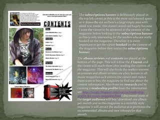
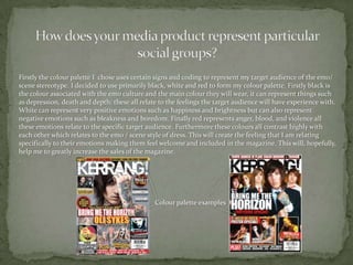
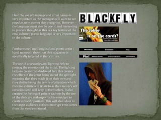
The document summarizes how the magazine uses conventions of real magazines. It discusses design elements like the cover image establishing artist importance, coverlines attracting attention, and flash words hooking readers. Interior elements discussed include the masthead, menu strips advertising exclusives, headline placement, and inset images promoting content. The document also addresses representing the target audience through the black, white, and red color palette symbolizing emotions relevant to the emo/scene subculture.


