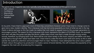
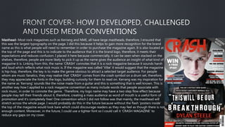
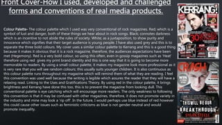
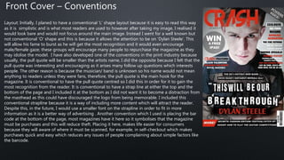
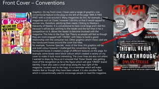
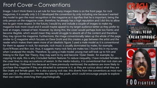
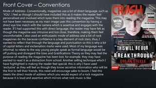
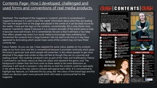
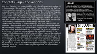
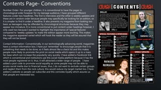
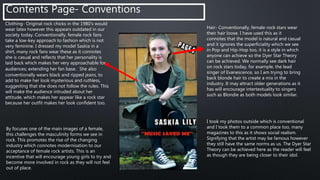
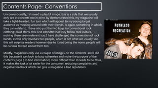
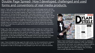
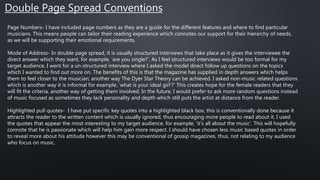
1. Hoop Cola – Window to the Hooptymistic World
https://www.youtube.com/watch?v=OHOiW3uD5Oo
2. Nokia Poland – Nokia Interactive Billboard
http://vimeo.com/36187516
3. Getin Bank – Interactive Bus Shelter
https://www.youtube.com/watch?v=sACplWrTn6c
https://www.youtube.com/watch?v=Kq7VtPgpKFk
4. Pepsi Max - Unbelievable Bus Shelter
https://www.youtube.com/watch?v=Go9rf9GmYpM
5. Roadshow Films - Into The Storm
https://www.youtube.com/watch?v=NnuUzYcUNvE
6. REDOUTE – Live Weather Billboard
https://www.youtube.com/watch?v=rA4GF5a3xHE
7. Beck’s – Music Poster
https://www.youtube.com/watch?v=gclJe_kSnd4
8. Apotek - Make your hair come alive
http://vimeo.com/87648696
9. McDonald’s - Save the Sundae Cone
https://www.youtube.com/watch?v=9G-DZx8hu4U
10. SNCF - Europe. It's Just Next Door
https://www.youtube.com/watch?v=GGW6Rm437tE
11. British Airways - #lookup
https://www.youtube.com/watch?v=GtJx_pZjvzc
12. MINI – The Salute
https://www.youtube.com/watch?v=e5bEB0tmMQI#
13. Hyundai – Times Square Billboard Racing Game
https://www.youtube.com/watch?v=awd-vORN7dQ
14. Disney – Augmented Reality in Times Square
https://www.youtube.com/watch?v=DRRu5dKRfTU
This is a sample Website proposal that anyone can use for sending it to client. The context for this sample website was an airline client that wanted a new mini-site developed for their Chinese market. Please feel free to reach out for more information by emailing us at: info@digitaljungle.agency
How to Make Awesome SlideShares: Tips & TricksSlideShare
Turbocharge your online presence with SlideShare. We provide the best tips and tricks for succeeding on SlideShare. Get ideas for what to upload, tips for designing your deck and more.
A Strategic Approach: GenAI in EducationPeter Windle
Artificial Intelligence (AI) technologies such as Generative AI, Image Generators and Large Language Models have had a dramatic impact on teaching, learning and assessment over the past 18 months. The most immediate threat AI posed was to Academic Integrity with Higher Education Institutes (HEIs) focusing their efforts on combating the use of GenAI in assessment. Guidelines were developed for staff and students, policies put in place too. Innovative educators have forged paths in the use of Generative AI for teaching, learning and assessments leading to pockets of transformation springing up across HEIs, often with little or no top-down guidance, support or direction.
This Gasta posits a strategic approach to integrating AI into HEIs to prepare staff, students and the curriculum for an evolving world and workplace. We will highlight the advantages of working with these technologies beyond the realm of teaching, learning and assessment by considering prompt engineering skills, industry impact, curriculum changes, and the need for staff upskilling. In contrast, not engaging strategically with Generative AI poses risks, including falling behind peers, missed opportunities and failing to ensure our graduates remain employable. The rapid evolution of AI technologies necessitates a proactive and strategic approach if we are to remain relevant.
How to Make a Field invisible in Odoo 17Celine George
It is possible to hide or invisible some fields in odoo. Commonly using “invisible” attribute in the field definition to invisible the fields. This slide will show how to make a field invisible in odoo 17.
Embracing GenAI - A Strategic ImperativePeter Windle
Artificial Intelligence (AI) technologies such as Generative AI, Image Generators and Large Language Models have had a dramatic impact on teaching, learning and assessment over the past 18 months. The most immediate threat AI posed was to Academic Integrity with Higher Education Institutes (HEIs) focusing their efforts on combating the use of GenAI in assessment. Guidelines were developed for staff and students, policies put in place too. Innovative educators have forged paths in the use of Generative AI for teaching, learning and assessments leading to pockets of transformation springing up across HEIs, often with little or no top-down guidance, support or direction.
This Gasta posits a strategic approach to integrating AI into HEIs to prepare staff, students and the curriculum for an evolving world and workplace. We will highlight the advantages of working with these technologies beyond the realm of teaching, learning and assessment by considering prompt engineering skills, industry impact, curriculum changes, and the need for staff upskilling. In contrast, not engaging strategically with Generative AI poses risks, including falling behind peers, missed opportunities and failing to ensure our graduates remain employable. The rapid evolution of AI technologies necessitates a proactive and strategic approach if we are to remain relevant.
Palestine last event orientationfvgnh .pptxRaedMohamed3
An EFL lesson about the current events in Palestine. It is intended to be for intermediate students who wish to increase their listening skills through a short lesson in power point.
2024.06.01 Introducing a competency framework for languag learning materials ...Sandy Millin
http://sandymillin.wordpress.com/iateflwebinar2024
Published classroom materials form the basis of syllabuses, drive teacher professional development, and have a potentially huge influence on learners, teachers and education systems. All teachers also create their own materials, whether a few sentences on a blackboard, a highly-structured fully-realised online course, or anything in between. Despite this, the knowledge and skills needed to create effective language learning materials are rarely part of teacher training, and are mostly learnt by trial and error.
Knowledge and skills frameworks, generally called competency frameworks, for ELT teachers, trainers and managers have existed for a few years now. However, until I created one for my MA dissertation, there wasn’t one drawing together what we need to know and do to be able to effectively produce language learning materials.
This webinar will introduce you to my framework, highlighting the key competencies I identified from my research. It will also show how anybody involved in language teaching (any language, not just English!), teacher training, managing schools or developing language learning materials can benefit from using the framework.
Introduction to AI for Nonprofits with Tapp NetworkTechSoup
Dive into the world of AI! Experts Jon Hill and Tareq Monaur will guide you through AI's role in enhancing nonprofit websites and basic marketing strategies, making it easy to understand and apply.
The French Revolution, which began in 1789, was a period of radical social and political upheaval in France. It marked the decline of absolute monarchies, the rise of secular and democratic republics, and the eventual rise of Napoleon Bonaparte. This revolutionary period is crucial in understanding the transition from feudalism to modernity in Europe.
For more information, visit-www.vavaclasses.com
Synthetic Fiber Construction in lab .pptxPavel ( NSTU)
Synthetic fiber production is a fascinating and complex field that blends chemistry, engineering, and environmental science. By understanding these aspects, students can gain a comprehensive view of synthetic fiber production, its impact on society and the environment, and the potential for future innovations. Synthetic fibers play a crucial role in modern society, impacting various aspects of daily life, industry, and the environment. ynthetic fibers are integral to modern life, offering a range of benefits from cost-effectiveness and versatility to innovative applications and performance characteristics. While they pose environmental challenges, ongoing research and development aim to create more sustainable and eco-friendly alternatives. Understanding the importance of synthetic fibers helps in appreciating their role in the economy, industry, and daily life, while also emphasizing the need for sustainable practices and innovation.
Biological screening of herbal drugs: Introduction and Need for
Phyto-Pharmacological Screening, New Strategies for evaluating
Natural Products, In vitro evaluation techniques for Antioxidants, Antimicrobial and Anticancer drugs. In vivo evaluation techniques
for Anti-inflammatory, Antiulcer, Anticancer, Wound healing, Antidiabetic, Hepatoprotective, Cardio protective, Diuretics and
Antifertility, Toxicity studies as per OECD guidelines
2. The genre of my magazine was rock, typically some of the key conventions of this genre include:
• Dark colours
• Confidence
• Masculinity
• Tattoos/Style
• Rebellion
In my print, I have tried to approach most of these key conventions however some I have tried to change some to
give rock a new, modern identity. This is because rock has lost some popularity as most of what we see in the top
charts is dance and pop so this has made me realise that rock needs to appeal more to the younger generation to
encourage a revival. The reason for this is because rock music represents the talent of PLAYING music, for example,
rock stars will play the guitar and play the drums, unlike many music now that is made through mixing certain
sounds, therefore, by bringing back rock, there will be a lot more variety in the music industry and fellow rock fans
would feel as though their needs have been met. I have tried to make the front cover bold and catchy as this is what
catches the audiences attention and encourages them to read. Therefore, I have attempted the same colour palette
of dark colours throughout my production to create a sense of brand identity, this will increase the popularity of my
magazine; the main aim of producing this magazine.
Introduction
3. Masthead- Most rock magazines such as Kerrang and NME, all have large mastheads, therefore, I ensured that
this was the largest typography on the page. I did this because it helps to gain more recognition for the brand
name as this is what people will need to remember in order to purchase the magazine again. It is also located at
the top of the page and this is to indicate to the audience that it is the brand logo, therefore, it meets their
expectations and reduces confusion. I placed it here because commercially, it can be seen when stacked on the
shelves, therefore, people are more likely to pick it up as the name gives the audience an insight of what kind of
magazine it is. Linking from this, the name ‘CRASH’ connotes that it is a rock magazine because it sounds harsh
and loud which reflects what rock music is. If the magazine was called ‘Vibe’ it would suggest that the magazine
is hip-hop, therefore, the key is to make the genre obvious to attract a selected target audience. For people
whom are music fanatics, they may realise that ‘CRASH’ comes from the crash symbol on a drum set, therefore,
they may appreciate the hints in the logo, building curiosity for them to read on. Kerrang was my inspiration for
the name as ‘Kerrang’ sounds like the noise made from a guitar and this is something that is well known. This is
another way how I applied to a rock magazine convention as many include words that people associate with
rock music, in order to connote the genre. Therefore, my logo name may have a two step flow effect because
people may tell their friends about it, therefore, creating a mass audience as word of mouth is a useful form of
promotion and it’s completely free! One convention which I did not follow was that mainly, the masthead will
stretch across the whole page. I would probably do this in the future because without the flash ‘posters inside’
the top of the magazine would look bare which could discourage readers as they may feel as though there is not
enough content. Moreover, in the future, I could use a tighter font so I could call it ‘CRASH MAGAZINE’ to
reduce any gaps on my cover.
4. Front Cover-How I used, developed and challenged
forms and conventions of real media products.
Colour Palette- The colour palette which I used was very conventional of rock magazines. Red; which is a
symbol of lust and danger, both of these things we hear about in rock songs. Black; connotes darkness
which is an incentive to not abide the rules of society. White; as a juxtaposition, to show purity and
innocence which signifies that their target audience is young people. I have also used grey and this is to
separate the three bold colours. My cover uses a similar colour palette to Kerrang and this is a good thing
because it makes it obvious that it is a rock magazine, therefore, the audiences expectations have been
met (Hegemony). Red is a very bold colour, so using this often, even in gossip magazines such as ‘Heat’
therefore using red gives my print brand identity and this is one way that it is going to become more
memorable to readers. By using a small colour palette, it makes my magazine look more professional as it
is very rare that you will see random colours; this usually suits younger children. It is also continuous as
this colour palette runs throughout my magazine which will remind them of what they are reading. I feel
this convention was used well because the writing is legible which assures the reader that they will have a
relaxing read. Linking to the Uses and Gratifications Theory. By using red in the colour palette, it brings
brightness and Kerrang have done this too, this is to prevent the magazine from looking dull. This
conventional palette is eye catching which will encourage more readers. The only weakness to following
this convention is that it may be confused with other magazines, therefore, it does not promote variety in
the industry and mine may look a ‘rip off’. In the future, I would perhaps use blue instead of red however
this could cause other issues such as feministic criticisms as blue is not gender neutral and would
promote inequality.
5. Layout: Initially, I planed to have a conventional ‘L’ shape layout because it is easy to read this way
as it is simplistic and is what most readers are used to however after taking my image, I realised it
would look bare and would not focus around the main image. Instead I went for a well known but
not conventional ‘O’ shape and this is because it allows the attention to be on ‘Dylan Steele’. This
will allow his fame to burst as he will get the most recognition and it would even encourage
male/female gaze; these groups will encourage many people to repurchase the magazine as they
may idolise the model. I have also developed one of the conventions in the print industry because
usually, the pull quote will be smaller than the artists name, I did the opposite because I felt that the
pull quote was interesting and encouraging as it arises many follow up questions which interests
people. The other reason is because the musician/ band is unknown so his name would not mean
anything to readers unless they were fans, therefore, the pull quote is the main hook for the
magazine. It is conventional to have the pull quote centred so I did this in order for it to gain the
most recognition from the reader. It is conventional to have a strap line at either the top and the
bottom of the page and I included it at the bottom as I did not want it to become a distraction from
the masthead as this could have discouraged the logo from being memorable. I included this
conventional strapline because it is a way of including more content which will attract the reader.
Despite this, in the future, I would use a smaller font on the strapline in order to fit in more
information as it is a better way of advertising . Another convention which I used is placing the bar
code at the bottom of the page, most magazines have it here so it symbolises that the magazine
must be purchases and this will reduce theft. Placing it here, makes life easier for consumers
because they will aware of where it must be scanned, for example, in self-checkout which makes
purchases quick and easy which reduces any issues of people complaining about simple factors like
the barcode.
Front Cover – Conventions
6. Graphics- On my front cover, I have used a range of graphics, one
conventional feature is the plug on the left of the page ‘WIN A FREE
IPAD’ with a circle around it. Many magazines do this, for example, gossip
magazines such as Closer, however I did this so that it would appeal to
women too, therefore, satisfying their needs ( linking to Maslow’s
Hierarchy of Needs). It is conventional to have circle large and I did this
because it will be eye catching to the reader and the fact that it has a
competition on it, allows the reader to become involved with the
magazine. This links to the Dyer Star Theory as people will feel as though
they are more engaged with ‘CRASH’, with helps to build a good
relationship with the consumer too. Other graphics which I have used are
the translucent boxes around the cover line titles,
for example, ‘Summer Specials’, most of the time, this graphics will be
one bold colour however I challenged the convention by using
translucent boxes it created a range of different textures on the page, for
example, some boxes were block colours which created a variety on my
cover to make it look more interesting. The cover lines are also not where
I wanted to draw my focus so it ensured that ‘Dylan Steele’ was getting
most of the recognition as he is the figure whom will give ‘CRASH’ brand
identity. I have also used a small strap along the top right of the
magazine, located next to the logo, it is a reminder which will make
readers feel as though they have been valued, it is also another flash
which is conventionally used to encourage people to read the magazine.
Front Cover – Conventions
7. Image- I don’t think there is a set rule for how many images there is on the front page, for rock
magazines, it is usually only 1-3. I developed the convention by only including one because I wanted
the model to gain the most recognition in the magazine as it signifies that he is important, being the
only person on the magazine cover, therefore, he already has a high reputation and I did this to allow
him to gain more respect. In the future, I would try and include a couple of images to make my
magazine look more visual and it would maybe appeal to my target audience better as they prefer to
look at images, instead of text. However, by doing this, the cover would perhaps look too frantic and
become illegible, which would mean they would struggle to absorb all of the content and therefore
they may ignore the magazine. Furthermore, the image conventionally takes up the whole of the page,
similar to Q magazine which focuses on Dave Grohl and this creates a gap between the artist and the
reader which makes them seem more of an idealistic figure. I used a male model as it is conventional
for them to appear in rock, for example, rock music is usually dominated by males, for example,
Guns’N’Roses and Bon Jovi, thus, it suggests many rock fans are males too. I found this in my survey
when I analysed the results. Therefore, by using a male model, young man will look up to him and
linking to the Dyer Star Theory, they may want to try and become ‘Dylan Steele’, for example, by
copying his style, this is why I included fashion features To reduce inequality, I have included females in
the cover lines to stop accusations of sexism. In the media industry, it is conventional that rock stars are
good looking, I followed this because as I have previously mentioned, the audience are more likely to
purchase the magazine if they are attracted to someone in it, as they are curious about what they are
like (male and female gaze). He is also a young rock star, this diverts from the conventions as most rock
stars are 25+, therefore, it connotes the talent in the youth, which could encourage people to explore
their own talents; stretching them psychologically.
8. Mode of Address- Conventionally, magazines use a lot of direct language, such as
‘YOU’, I feel as though I should have included this as it makes the reader feel
personalised and involved which lures them into reading the magazine. This may
not have been necessary as my main image uses this convention by having a
direct eye line match with the camera which is assertive and engages with the
reader. If I had supported this with direct language, the reader may have felt as
though the magazine was intrusive and too close, therefore, making them feel
uncomfortable. I also used an enthusiastic mode of address and a lot of rock
magazines do this because confidence is a key element of rock stars, thus, I
wanted to reflect that through the language and punctuation so this is why a lot
of capital letters and exclamation marks were used. Most of my language was
informal, to relate to the way young people speak as formal language would be
off putting and disregard the Uses and Gratifications Theory as they may feel the
purpose of reading the magazine has been lost, for example, they may have
wanted to read it as a distraction from school. Another selling technique which I
have highlighted is making the reader feel special, this is why I have used
‘exclusive’ as they will feel as though they know secretive information who will be
the first to tell their friends, this need will encourage sales to boom. I feel this
meets the direct mode of address which you would expect of a rock magazine
because it is loud and assertive which mirrors what rock music is like.
9. Contents Page- How I developed, challenged and
used forms and conventions of real media products.
Colour Palette- As you can see, I have adapted the same colour palette on my contents
page as my front cover and this is conventional because it promotes continuity which gives
the brand a particular look which people will remember. It also allows people to get more
attached if the pages look similar as they will feel as though they are on a journey and
reading a book- this could be someone’s aim as part of the ‘Uses and Gratifications Theory’.
I continued to use these colours as they are classic and represent the genre; rock. The
background is darker than the front cover as there needs to be some distinction as
otherwise it will result in boredom. I also did this so that the contents could be read easily
in the white font as the two colours contrast well against each other. It is conventional to
highlight key features, so I followed this by using red- the colour of the brand logo and this
makes our decision seem more personal which will create a communal feel for the
magazine.
Masthead- The masthead of the magazine is ‘contents’ and this is conventional in
magazines because it is used to give the reader information about what they are reading.
This was the largest font on the page and placed in the centre so it can be easily found by
the reader. I have put the logo on the contents, conventionally, this is only shown once
however I wanted to repeat it because it is a constant reminder of the brand name to help
it become more well-known. If it is remembered, the aim is that it will have a Two-Step
Flow effect, people may share it on social media to encourage mass marketing too.
Sometimes the contents font is large however I did not want to do this as it may have
appeared to dominating which would mean some of the content may not have fitted
correctly too.
10. Contents Page- Conventions
Note from the Editor- It is conventional for most informal magazines to include this
in their magazine, I did not initially plan to do this however from my first draft, my
contents page look incomplete. I am glad that I included this in my contents page
because it adds a personal touch to the magazine and does not alienate the people
whom edit the magazine, thus, it shows a lot of engagement with the reader. I have
also used a lot of friendly and relaxed language, this made it relatable to young
readers, for example ‘It’s summer finally!’ as young people will share this feeling of
relief, thus, there will be a consensus with the target audience which will influence
Social Solidarity ( Uses and Gratifications Theory). The editors note is
conventionally very inviting so instead of calling it ’note from the editor’ which is
very aloof, I put the title as ‘Hello!’ which is more engaging, this will make readers
feel more valued. I have also included an image of myself, this is to make the note
feel more realistic and it builds a picture in their head. The picture is in black and
white, to add a vintage feel which emphasizes the personable elements in my
magazine. My facial expression is a half-smile as this looks mature and professional
so that I meet the readers expectations of what an editor would look like. It is also
conventional for the editor to include their own signature, instead of this, I used a
hand writing font to make the note seem informal however I should have inserted
my own signature to follow the convention as it is part of my personality. Despite
this, there could be issues attached involving people forging my signature, thus, it
is not very secure and I would have to use ‘public signature’ not my real one for
protection purposes.
11. Contents Page- Conventions
Number Order- For younger children, it is conventional to have the pages in
chronological order however for my teenage audience, I have grouped different
features under two headlines. The first is interviews and the other is weekly updates and
these are in random order because people may specifically be looking for an edition, so
it is simpler to find it under a headline. It also prevents my magazine from looking too
basic as teenagers may be offended by chronological structures because they may
appear too immature. It is more conventional to put content under headings however, I
only used two because I wanted to highlight the importance of ‘special features’
compared to ‘weekly updates 'to make the edition appear more exciting. This makes
the magazine appeared varied which will hook the reader as they will be assured that
they will not be bored.
Contact Information- Conventionally, in our technologically advancing world, magazines
have a contact information box. I have put ‘remember’ to encourage people that it is
something that needs to be done, so it feels almost like a check list and this makes
people more likely to promote the print on social media which opens it up to a mass
fan base which can increase the popularity very quickly. I have added a Facebook link
which is conventional and institutions use this social media platform because it has the
most people registered on it, thus, it will attracted a wider range of people. I have
added a post code to promote social equality as some people may not be able to
access social media due to financial issues, thus, I do not want to exclude certain groups
and neglect them from the rock culture, this would reduce my target market too. I have
added a website so people can subscribe and this connotes loyalty which assures us
that people are interested too.
12. Hair- Conventionally, female rock stars wear
their hair loose. I have used this as it
connotes that the model is natural and casual
and it ignores the superficiality which we see
in Pop and Hip-Hop too, it is a style in which
anyone can achieve so the Dyer Star Theory
can be achieved. We normally see dark hair
on rock stars today, for example, the lead
singer of Evanescence, so I am trying to bring
back blonde hair to create a mix in the
industry. It may attract older generations as it
has will encourage intertextuality to singers
such as Blondie as both models look similar.
Contents Page- Conventions
Clothing- Original rock chicks in the 1980’s would
wear latex however this appears outdated in our
society today. Conventionally, female rock fans
take a low-key approach to fashion which is not
very feminine. I dressed my model Saskia in a
shirt, many rock fans wear these as it connotes
she is casual and reflects that her personality is
laid back which makes her very approachable for
audiences; extending her fan base. She also
conventionally wears black and ripped jeans, to
add to make her look mysterious and ruthless,
suggesting that she does not follow the rules. This
will make the audience intruded about her
attitude, which makes her appear like a rock star
because her outfit makes her look confident too.
I took my photos outside which is conventional
and I took them to a common place too, many
magazines to this as it shows social realism.
Signifying that the artist may be famous however
they still have the same norms as us. The Dyer Star
Theory can be achieved here as the reader will feel
as though they are being closer to their idol.
By focuses one of the main images of a female,
this challenges the masculinity forms we see in
rock. This promotes the rise of the changing
industry which connotes modernisation to our
acceptance of female rock artists. This is an
incentive that will encourage young girls to try and
become more involved in rock as they will not feel
out of place.
13. Unconventionally, I showed a playful image, this is a side that we usually
only see at concerts not in print. By demonstrated this, my magazine will
take a light-hearted, fun turn which will appeal to my young target
audience as messing around with their friends, is again, something in which
they can relate to. I have also put the two boys in conventional rock
clothing: plaid shirts, this is to connote that they follow rock culture,
making them seem relevant too. I have challenged the convention of rock
bands, as this only involves two people, which is not what we usually see,
this will surprise readers however due to it not being the norm, people will
be curious to read about them too.
Mostly, magazines only use a couple of images on the contents and I did
this because it can look to busy otherwise and make the purpose of the
contents page ( to find information) more difficult than it needs to be, thus,
it makes the task a lot easier for the consumer, reducing complaints and
negative feedback which can give a magazine a bad reputation.
14. Double Page Spread- How I developed, challenged and used
forms and conventions of real media products.
Layout- I have used a conventionally basic layout for my double page spread, with the
image on the left and the content on the right however I included the pull quote on the
image because it ties the pages together to make it look complete and together. The
main reason for having the poster on the left- hand side is because it can be used for
commercial reasons due to the male/female gaze, for example teenagers may rip off the
page and stick it to their bedroom wall. This will also have a two-step flow effect if their
peers also see it, therefore, encouraging more fans. It is also conventional to have 3
columns of text, this tricks the reader into thinking the artist has said more than they
actually have, as 2 minutes is not a very long time. If it is full of content the consumer
will feel as though they are getting their moneys worth which will boost the reputation
of my magazine.
Image- Very often, the image on a double page spread is a close up or medium close
up however I did not follow this as I took a shot of ‘Dylan Steele’ from this angle so it
would not connote variety and this would not satisfy the reader. I took a medium long
shot, so you could see him playing the guitar, it is conventional for them to have a
natural pose, so this demonstrates that. The benefits of this is that the artists connotes
his passion which allows the reader understand him more and this may hook their
attention.
Logo- I have included the logo again the right corner. It is not conventional to repeat it
as much as I have throughout my three pages however the aim is to get the name
recognised in order to encourage as many people to join the rock culture as possible.
Again, I have included dark colours through his clothing to
continue the rock symbol of darkness as this will indicate a
house style for rock music. He is wearing a different outfit to
the front cover and many magazines do this because it
makes him appear as more of a celebrity, thus, he will be
more socially desirable due to his diversity.
15. Double Page Spread Conventions
Page Numbers- I have included page numbers as they are a guide for the different features and where to find particular
musicians. This means people can tailor their reading experience which connotes our support for their hierarchy of needs,
as we will be supporting their emotional requirements.
Mode of Address- In double page spread, it is usually structured interviews that take place as it gives the interviewee the
direct answer which they want, for example, ‘are you single?’. As I feel structured interviews would be too formal for my
target audience, I went for a un-structured interview where I asked the model direct follow up questions on the topics
which I wanted to find out more on. The benefits of this is that the magazine has supplied in depth answers which helps
them to feel closer to the musician; another way The Dyer Star Theory can be achieved. I asked non-music related questions
which is another way it is informal for example, ‘what is your ideal girl’?’ This creates hope for the female readers that they
will fit the criteria, another way of getting them involved. In the future, I would prefer to ask more random questions instead
of music focused as sometimes they lack personality and depth which still puts the artist at distance from the reader.
Highlighted pull quotes- I have put specific key quotes into a highlighted black box, this is conventionally done because it
attracts the reader to the written content which is usually ignored, thus encouraging more people to read about it. I used
the quotes that appear the most interesting to my target audience, for example, ‘it’s all about the music’. This will hopefully
connote that he is passionate which will help him gain more respect. I should have chosen less music based quotes in order
to reveal more about his attitude however this may be conventional of gossip magazines, thus, not relating to my audience
who focus on music.