Study Guide Test 2 (Visual Elements and Design Principles)
•Download as PPTX, PDF•
10 likes•3,499 views


Recommended
More Related Content
What's hot
What's hot (20)
Viewers also liked
Viewers also liked (19)
Similar to Study Guide Test 2 (Visual Elements and Design Principles)
Similar to Study Guide Test 2 (Visual Elements and Design Principles) (20)
More from Jacques de Beaufort
More from Jacques de Beaufort (20)
Study Guide Test 2 (Visual Elements and Design Principles)
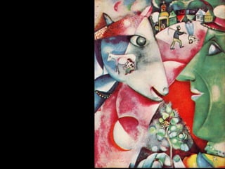
- 2. Marc Chagall. I AND THE VILLAGE.
- 4. M.C. Escher. SKY AND WATER I.
- 6. Alberto Giacometti. MAN POINTING.
- 8. POND IN A GARDEN. Tomb of Nebamun, Egypt.
- 10. Asher Brown Durand. KINDRED SPIRITS.
- 12. Shen Zhou. POET ON A MOUNTAIN TOP.
- 14. Sassetta. THE MEETING OF SAINT ANTHONY AND SAINT PAUL.
- 16. James Whistler. NOCTURNE: BLUE AND GOLD-(OLD BATTERSEA BRIDGE).
- 18. Meret Oppenheim. OBJECT (DEJEUNER EN FOURRURE).
- 20. Jacob Lawrence. GOING HOME.
- 22. Pieter de Hooch. INTERIOR OF A DUTCH HOUSE.
- 24. Nicolas Poussin. THE HOLY FAMILY ON THE STEPS.
- 26. Edgar Degas. JOCKEYS BEFORE THE RACE.
- 30. Raphael. MADONNA OF THE CHAIR.
- 34. Jose Clemente Orozco. ZAPATISTAS.
- 38. ROETTGEN PIETA.
- 40. Actual
- 41. Implied
- 42. Line in Two-dimensional Art
- 44. IMPLIED LINE A series of points that the eye recognizes as a line; a perceived line where areas of contrasting color or texture meet.
- 45. An actual line or implied line that defines the outer limits of a three dimensional object or two-dimensional shape; used synonymously with “outline”.
- 46. CONTOUR LINE An actual line or implied line that defines the outer limits of a three dimensional object or two-dimensional shape; used synonymously with “outline”.
- 47. Line that conveys the energy of the artist’s hand as it moves across the drawing surface.
- 48. GESTURAL LINE Line that conveys the energy of the artist’s hand as it moves across the drawing surface.
- 51. Positive and Negative Shape
- 52. Amorphous Shape
- 55. Positive and Negative Shape
- 56. Amorphous Shape
- 58. POSITIVE SHAPE A dominant shape on a ground.
- 59. A shape “left over” or around a dominant shape.
- 60. NEGATIVE SHAPE A shape “left over” or around a dominant shape.
- 61. A shape on a background.
- 62. FIGURE A shape on a background.
- 63. A background on which marks, shapes, or figures are placed.
- 64. GROUND A background on which marks, shapes, or figures are placed.
- 66. Volume: the measurable area that an object occupies
- 68. Volume: the measurable area that an object occupies
- 70. MASS An actual or illusory three-dimensional bulk.
- 71. The measurable area that an object occupies-its height, width, and depth.
- 72. VOLUME The measurable area that an object occupies-its height, width, and depth.
- 75. Interior Spaces
- 77. In the Round
- 78. In Relief
- 80. SPACE An expanse of three-dimensionality in which objects and events occur.
- 82. Foreground, middle ground, and background
- 83. Size
- 84. Overlap
- 85. Transparency
- 87. ILLUSIONAL SPACE The appearance of depth, height, and width on a two-dimensional surface.
- 88. The illusion of space on planar surfaces, created by techniques for representing three dimensions on a two-dimensional surface.
- 89. PERSPECTIVE The illusion of space on planar surfaces, created by techniques for representing three dimensions on a two-dimensional surface.
- 95. Bird’s-eye view
- 96. Worm’s-eye view
- 97. Foreshortening
- 100. LINEAR PERSPECTIVE A system of rendering the appearance of three dimensions on a two-dimensional plane by making objects appear smaller as they recede and by making parallel lines converge in the distance at a vanishing point on a horizon line.
- 101. Where converging lines drawn in linear perspective seem to disappear into a distant dot on the horizon line.
- 102. VANISHING POINT Where converging lines drawn in linear perspective seem to disappear into a distant dot on the horizon line.
- 103. Lines or edges in a picture that lead the viewer’s eyes to the vanishing points in an illusional three-dimensional space.
- 104. ORTHOGONAL LINES Lines or edges in a picture that lead the viewer’s eyes to the vanishing points in an illusional three-dimensional space.
- 105. A means of rendering three-dimensional objects without reliance on vanishing points or converging lines; scale of objects remains the same regardless of the distance from the foreground and background.
- 106. ISOMETRIC PERSPECTIVE A means of rendering three-dimensional objects without reliance on vanishing points or converging lines; scale of objects remains the same regardless of the distance from the foreground and background.
- 107. The technique of representing dimensional space by making objects close to the viewer appear crisp and vibrant and making them fuzzy and less intense in color and tone as they recede.
- 108. ATMOSPHERIC (AERIAL) PERSPECTIVE The technique of representing dimensional space by making objects close to the viewer appear crisp and vibrant and making them fuzzy and less intense in color and tone as they recede.
- 110. Implied Time
- 112. KINETIC ART Artifacts that are designed to move.
- 114. Shadow
- 116. VALUE The relative degree of light or dark.
- 117. The degree of value difference in an image; high contrast is a wide separation between dark and light; low contrast is a narrow range of values in an image.
- 118. CONTRAST The degree of value difference in an image; high contrast is a wide separation between dark and light; low contrast is a narrow range of values in an image.
- 119. A name of a color family or an area on the color wheel.
- 120. HUE A name of a color family or an area on the color wheel.
- 121. The mixing of pigments and dyes so that all colors of light except the color are absorbed (subtracted).
- 122. SUBTRACTIVE COLOR PROCESS The mixing of pigments and dyes so that all colors of light except the color are absorbed (subtracted).
- 123. The mixing of colored lights so that they shine on a surface, they combine (add) to make other colors.
- 124. ADDITIVE COLOR PROCESS The mixing of colored lights so that they shine on a surface, they combine (add) to make other colors.
- 125. In a color system, the basic colors that cannot be broken down into other colors and that can be combined to create other colors.
- 126. PRIMARY COLORS In a color system, the basic colors that cannot be broken down into other colors and that can be combined to create other colors.
- 127. The product of mixing two primary colors.
- 128. SECONDARY COLORS The product of mixing two primary colors.
- 129. The products of mixing a primary and secondary color.
- 130. TERTIARY COLORS The products of mixing a primary and secondary color.
- 131. Used synonymously with value. In a scale of values, high-key colors are lighter than colors in the middle of the scale; low-key colors are darker than the colors in the middle of the scale.
- 132. KEY Used synonymously with value. In a scale of values, high-key colors are lighter than colors in the middle of the scale; low-key colors are darker than the colors in the middle of the scale.
- 133. A color that has white added to it.
- 134. TINT A color that has white added to it.
- 135. A color that has black added to it.
- 136. SHADE A color that has black added to it.
- 137. The strength or weakness of a color.
- 138. INTENSITY, SATURATION The strength or weakness of a color.
- 139. A color that has gray added to it.
- 140. TONE A color that has gray added to it.
- 141. Placement of different colors in such a way that the human eye mixes them to form new colors.
- 142. OPTICAL COLOR MIXING Placement of different colors in such a way that the human eye mixes them to form new colors.
- 144. Triads, Tetrads, and Hexads
- 145. Warm and Cool Colors
- 146. Earth Tones
- 148. MONOCHROMATIC COLOR SCHEME Variations in color based on one hue.
- 149. Variations in color between hues adjacent to one another on the color wheel.
- 150. ANALOGOUS COLOR SCHEME Variations in color between hues adjacent to one another on the color wheel.
- 151. Variations in color based on colors opposite each other on the color wheel.
- 152. COMPLIMENTARY COLOR SCHEME Variations in color based on colors opposite each other on the color wheel.
- 153. An effect achieved by placing highly contrasting colors (complements), values, and intensities next to each other.
- 154. SIMULTANEOUS CONTRAST An effect achieved by placing highly contrasting colors (complements), values, and intensities next to each other.
- 155. Three colors that are equidistant from one another (form an equilateral triangle) on the color wheel.
- 156. TRIAD Three colors that are equidistant from one another (form an equilateral triangle) on the color wheel.
- 157. Four colors that are equidistant from one another (form a square or rectangle) on the color wheel.
- 158. TETRAD Four colors that are equidistant from one another (form a square or rectangle) on the color wheel.
- 160. Implied Texture
- 161. Visual texture: an illusion of tactile qualities
- 164. Ancient Greeks: harmony, symmetry, and organization
- 165. David Hume: uniformity, variety, clarity of expression, and brilliance of color
- 167. What elements to use
- 168. How to organize them
- 169. What effect is achieved
- 171. Strengthening or weakening through repetition
- 172. Possibility of work that is monotonous or chaotic
- 173. Reinforcing or diluting expressive idea
- 175. What elements did the artist use most and least?
- 176. How did the artist organize those elements?
- 177. How does the artist get and hold your attention?
- 178. Where does the artist direct your attention within the work?
- 180. DESIGN PRINCIPLES Compositional means by which artists arrange design elements for effective visual expression.
- 181. The feeling that a composition holds together well visually and is designed to be experienced as a whole.
- 182. UNITY The feeling that a composition holds together well visually and is designed to be experienced as a whole.
- 183. Visual diversity to avoid an unintended monotonous composition and to hold the viewer’s interest.
- 184. VARIETY Visual diversity to avoid an unintended monotonous composition and to hold the viewer’s interest.
- 185. An equilibrium of weight and force; distribution of weight enabling someone or something to remain upright and steady.
- 186. BALANCE An equilibrium of weight and force; distribution of weight enabling someone or something to remain upright and steady.
- 187. Visual or actual equilibrium that is almost but not exactly symmetrical.
- 188. ASYMMETRICAL BALANCE Visual or actual equilibrium that is almost but not exactly symmetrical.
- 189. Visual or actual equilibrium of visual elements in size, shape, and placement.
- 190. SYMMETRICAL BALANCE Visual or actual equilibrium of visual elements in size, shape, and placement.
- 191. Equilibrium achieved by elements emanating from a point, usually the center, in a composition.
- 192. RADIAL BALANCE Equilibrium achieved by elements emanating from a point, usually the center, in a composition.
- 193. Arrangement of elements that can move the viewer’s eye in, around, or through a work of art.
- 194. DIRECTIONAL FORCE Arrangement of elements that can move the viewer’s eye in, around, or through a work of art.
- 195. EMPHASIS Arrangement of elements of art to make some areas the primary focus of a viewer’s attention.
- 196. EMPHASIS Arrangement of elements of art to make some areas the primary focus of a viewer’s attention.
- 197. Arrangement of elements of art to make some areas the primary focus of a viewer’s attention.
- 198. SUBORDINATION Arrangement of elements of art to make some areas the primary focus of a viewer’s attention.
- 199. Use of any element or object more than once in an artifact in order to structure a viewer’s experience of that work.
- 200. REPETITION Use of any element or object more than once in an artifact in order to structure a viewer’s experience of that work.
- 201. A systematic repetition of an element in a work.
- 202. PATTERN A systematic repetition of an element in a work.
- 203. RHYTHM The movement, fluctuation, or variation marked by a regular recurrence of related elements.
- 204. RHYTHM The movement, fluctuation, or variation marked by a regular recurrence of related elements.
- 206. Playing with Scale
- 207. Searching for Perfection in Proportion
- 210. SCALE The comparative size of an elements of art or object in relation to other elements or objects and normative conventions.
- 211. The relationship of the sizes of parts to each other and to the whole.
- 212. PROPORTION The relationship of the sizes of parts to each other and to the whole.