SlideShare a Scribd company logo
1 of 63
Elements and Principles of Design
Ar Suvarna Deshpande/Lele
Elements and Principles of Design
 The Elements of Design are the language of the visual arts.

This introduction focuses on the elements that are most relevant to
two-dimensional (flat) art works. Other elements include point,
motion and elements related to three-dimensional art such as mass
and volume.

Line      path of a point
Shape     perceivable area
Value     relative light and darkness
Color     color theory basics
Space     (2D) height, width and the illusion of depth
Texture actual or simulated tactile quality
Shape - perceivable area. Shapes can be created by line, or by color and
value changes which define their edges. As with line, the decisions you make
concerning shape are important.

The shapes of the objects that you create or place in your images are
positive shapes. The spaces around these shapes are the negative
spaces. It is just as important to be attentive to the negative space as the
positive shapes.
Value - relative light and darkness. The overall lightness and lack
of contrast in the left image conveys a sense of spirituality and harmony
between the tree and the circular sky.
Line - the path of a point.


Although the subject matter is the same in all three works, the differences
in line quality have created works with very different impact. How you use
line is one of the most important decisions to be made in creating a work of
art
Space - height and width. A monitor display has two actual dimensions -
height and width. In addition, an artist can create an illusion of depth, using
overlapping, diminishing scale, atmospheric perspective, vertical placement,
warm and cool colors, diagonals and linear perspective.
Texture - surface quality. We experience actual texture when we
touch objects and feel their roughness, smoothness or patterns, which
we can simulate or imply in digital imagery.
Principles of Design
Scale>overall size>Proportion>relative size within
the work
Unity-repetition> rhythm > pattern .>Unity
Balance>equalizing the visual weight of elements
Direction>visual path
Emphasis>focal point
Proportion - relative size of objects within the work of art. In his painting of
bedroom (left), Rene Magritte has created a surreal situation simply by
manipulating the proportions of common objects. There are no clues that tell
us if we are in a normal-sized room or a dollhouse. In the other painting,
Andrew Wyeth has used the proportion very differently - the small
farmhouse against the largeness of the field created a sense of isolation.
Color - basic color theory. We response to color on many levels. Color can be
used simply to describe an object. It can also be used emotional (blue for sadness or
spiritually, red for angry), symbolically (associated with a flag's color, corporation logo
or sports team) and psychologically
Scale - overall size. Much of the impact of
 monumental artwork such as Mount
 Rushmore is its sheer size.


Scale, alone, can change the meaning of a work of art.
Balance - equalizing the visual weight of elements. The cross on
the left is symmetrically (formally) balanced - one half mirrors the other. Religious
and significant objects are often given a symmetrical balance.

The painting by Mary Cassatt, (on the right) depicts an ordinary moment.
Appropriately, it is asymmetrically balanced. The two women on one side are balanced
by the large silver service and fireplace on the other -with the area of highest value
contrast
Direction and Emphasis. Direction is the visual path our eye will follow.
Emphasis refers to the object or element which first catches our attention
Space: Indicators of depth on a flat
surface
Overlapping
Diminishing scale
Atmospheric perspective
Vertical placement
Color (warm/cool, intensity)
Diagonals
Overlapping - when objects
 partially overlap other objects, we
 perceive them as closer than the
 covered objects. Overlapping
 "overrules" the other indicators of
 depth - we know that the smaller
 pyramids are closer because they
 overlap the larger pyramids.
 Overlapping most clearly
 establishes proximity.


Atmospheric perspective - close
objects have greater intensity of color,
detail and value contrast.
Diminishing scale -
the largest statue
appears closest and
the smallest appears
further away
Vertical placement - we perceive
objects that are placed lower in the
image as closer to us, and objects that
are placed higher as being further away.
The boat placed lowest in this work by
Japanese artist,


Diagonals and Linear
perspective - we perceive diagonal
lines as receding into the distance.
The diagonal lines in this painting of
a bridge create a extraordinary sense
of depth.
Color - we perceive warm
colors (red, orange and
yellow) as closer than cool
colors (green, blue, violet).
Psychologically, the red and
yellow objects in both works
appear to be in the
foreground, while the cool-
colored backgrounds
recede.
Unity-Variety. Repetition of visual elements such as shapes or colors create
a rhythm and pattern in an artwork - creating a sense of harmony and unity that
pulls the picture together
Pigment Color - (paint)
                                             reflected light
                                             Pigment color is created when a
                                             pigment absorb certain light
                                             wavelengths and reflects others. For
                                             example, a blue shirt absorbs all
                                             wavelengths except blue, which is
                                             reflected. The color wheel based on
                                             the three primary colors: red, yellow
                                             and blue, was developed in 1666 by
                                             Sir Isaac Newton.

Primary pigment colors - red, yellow and blue are the primary colors. All other
colors are derived from these three hues.
Secondary pigment colors - green, orange and purple are created by mixing
the primary colors.
Tertiary colors - yellow-orange, red-orange, red-purple, blue-purple, blue-green
and yellow-green are the colors created by mixing the secondary colors.
HSB (Hue, Saturation and Brightness) - color can be defined by its hue
  (wavelength), saturation (chroma, purity or intensity) and
                          brightness (value)
 Hue - is the color's name (orange, blue, etc.). It is located on the color wheel -
                  expressed as a degree between 0° and 360°.
 Saturation - is the purity of the color. Saturation is the amount of gray in
   proportion to the hue - measured from 0% (gray) to 100% (fully saturated).
Brightness - is the relative lightness or darkness of the color -measured from 0%
                            (black) to 100% (white).
What is color theory?
                              Color Theory is a set of principles used
                              to create harmonious color combinations.
                              Color relationships can be visually represented with a
                              color wheel — the color spectrum wrapped onto a
                                                     circle.

  The color wheel is a visual representation of color theory:


According to color theory, harmonious color combinations use any two colors
opposite each other on the color wheel, any three colors equally spaced around the
color wheel forming a triangle, or any four colors forming a rectangle (actually, two
pairs of colors opposite each other). The harmonious color combinations
are called color schemes – sometimes the term 'color harmonies'
is also used. Color schemes remain harmonious regardless of the rotation angle.
Monochromatic Color Scheme
 The monochromatic color scheme uses
  variations in lightness and saturation of a single
    color. This scheme looks clean and elegant.
Monochromatic colors go well together, producing
 a soothing effect. The monochromatic scheme is
very easy on the eyes, especially with blue or green
                         hues.


     Analogous Color Scheme
The analogous color scheme uses colors
that are adjacent to each other on the color wheel.
One color is used as a dominant color while others
  are used to enrich the scheme. The analogous
scheme is similar to the monochromatic, but offers
                   more nuances.
Complementary Color Scheme
 The complementary color scheme consists of
  two colors that are opposite each other on the color
 wheel. This scheme looks best when you place a warm
color against a cool color, for example, red versus green-
     blue. This scheme is intrinsically high-contrast.


 Split Complementary Color Scheme
The split complementary scheme is a variation
 of the standard complementary scheme. It uses a color
and the two colors adjacent to its complementary. This
provides high contrast without the strong tension of the
                complementary scheme.
Triadic Color Scheme
   The triadic color scheme uses three colors
 equally spaced around the color wheel. This scheme is
  popular among artists because it offers strong visual
  contrast while retaining harmony and color richness.
    The triadic scheme is not as contrasting as the
 complementary scheme, but it looks more balanced and
                       harmonious.


Tetradic (Double Complementary) Color
                 Scheme
  The tetradic (double complementary)
  scheme is the most varied because it uses two
   complementary color pairs. This scheme is hard to
harmonize; if all four hues are used in equal amounts, the
 scheme may look unbalanced, so you should choose a
      color to be dominant or subdue the colors.
LINES
                      Lines used to
  Horizontal          follow the edges of
                      forms are called
 lines are calm and
        quiet,        contour
                      drawings

                      Drawings which
vertical lines        seem to depict
suggest more of a     more movement
potential for         than actual
movement              outline are
                      called
                      gesture
diagonal lines        drawings
strongly suggest
movement
Shape
     shape is an enclosed object.
    Shapes can be created by line,
    or by color and value changes
             which define
         Volume and Mass
     Shape is considered to be a
    two-dimensional element, while
      three-dimensional elements
         have volume or mass.
       Therefore, a painting has
     shapes, while a sculpture has
           volume and mass.
       Positive/Negative shapes
  In a picture, the shapes that the artist has
 placed are considered the positive shapes.
    The spaces around the shapes are the
   negative spaces. It is just as important to
consider the negative space in a picture as the
                 positive shapes.
Value
Value refers to the relative lightness or darkness of
 a certain area. Value can be used for emphasis.
Variations in value are used to create a focal point
            for the design of a picture
Illusion of Space and Depth
                 Size & Vertical Location
    Since objects in our environment look smaller when they
    are farther away, the easiest way to show depth is to vary
     the size of objects, with closer objects being larger and
                more distant objects being smaller.
                          Overlapping
           When objects are partially obscured by other
           objects in front of them, we perceive them as
             further back than the covering objects.

      Detail (Aerial or Atmospheric
      Perspective)
     Atmospheric perspective uses color and value
     contrasts to show depth. Objects which are further
     away generally have less distinct contrast - they
     may fade into the background or become indistinct
     dark areas.
LINEAR PERSPECTIVE
is based on the idea that all lines will converge on a common
point on the horizon called the vanishing point. You have observed
linear perspective when you notice that the lines on the highway appear to
meet at a point in the distance. Artists use linear perspective to create a
focal point for a picture
MOVEMENT

                                       Multiple
Anticipated Movement                   Image


                                       Optical
                                       Movement
    Fuzzy Outlines


                       Optical Illusions
RHYTHM AND MOVEMENT
Rhythm refers to the way your eye moves throughout a picture. Some
                   pictures move you throughout
BALANCE
  To understand balance, think of the balance beam. When objects are of equal
 weight, they are in balance. If you have several small items on one side, they can be
balanced by a large object on the other side. Visual balance works in much the same
   way. It can be affected not only by the size of objects, but also their value (ie.
                     lightness or darkness, termed visual weight).


                                        SYMMETRICAL/FORMAL
                                                   BALANCE
                                   Symmetrical balance is mirror image balance. If
                                 you draw a line down the center of the page, all the
                                  objects on one side of the screen are mirrored on
                                  the other side (they may not be identical objects,
                                 but they are similar in terms of numbers of objects,
                                              colors and other elements.
ASSYMMETRICAL BALANCE
  Asymmetrical balance occurs when several smaller items on one side are
balanced by a large item on the other side, or smaller items are placed further
 away from the center of the screen than larger items. One darker item may
                need to be balanced by several lighter items.
EMPHASIS
              Ways to Create a Focal Point


  by color       by Placement                 by value


                  by texture                 by Isolation
by Contrast
The principles of good design are the tools used by an artist or
desinger to create an effective composition or design. The
principles are: balance, movement, repetition, emphasis,
simplicity, contrast, proportion, space, and unity.
Symmetrical balance
                                                               is when the weight is
                                                               equally distributed
                                                               on both sides of the
                                                               central axis.
                                                               Symmetry is the
                                                               simplest and most
                                                               obvious type of
                                                               balance. It creates a
                                                               secure, safe feeling
To balance a composition is to distribute its parts in such and a sense of
a way that the viewer is satisfied that the piece is not about solidity.
to pull itself over
Asymmetrical Balance
                           Asymmetrical balance is when both sides
                           of the central axis are not identical, yet
                           appear to leave the same visual weight. It
                           is a "felt" equilibrium or balance between
                           the parts of a composition rather than
                           actual.


Examples of The Effective Use Of
Balance


Radial Balance Horizontal Balance       Vertical Balance
Movement in Repetition
and Rhythm
The use of repetition to create
movement occurs when elements
which have something in common
are repeated regularly or
irregularly sometimes
creating a visual rhythm.
Emphasis is the stressing of a particular area of
focus rather than the presentation of a maze of
details of equal importance.

emphasis is by creating center of interest, a.k.a. a focal
point. A focal point is an area where the eye tends to
center
The most common ways of creating contrast are by creating
differences in:
   • size        • shape
   • value       • 'alignment
   • color       • direction
   • type        • movement
   • texture
Contrast in art and design occurs when two related elements are
different. The greater the difference the greater the contrast. Contrast
adds variety to the total design and creates unity. It is what draws the
viewer's eye into the painting and helps to guide the viewer around the art
piece
The Principle of Proportion
 Proportion in art is the comparative harmonious relationship between two or
 more elements in a composition with respect to size, color, quantity, degree,
                             setting, etc.; i.e. ratio.


    Equal division creats monotony


Unequal divisions create lack of harmony.
Shape of one part should fit the shape of its adjoining elements


         Good Harmony                Lack of harmony
Space in art refers to the distance or area between, around,
above, below, or within shapes and forms found within a
composition
ways space is used in art composition. These are:
Positive space
Negative space
•


Two-dimensional space
•


Three-dimensional space
•


•
Deep Space
When used effectively all of these tools to create the illusion of three-dimensional space
will create a sense of what is referred to as "deep space" within your painting. In deep
space there are three terms used to describe depth:
Foreground is the area of a painting that visually appears closest to the viewer. It is
often located on a lower plane or bottom of the canvas.
•


Middle ground is space that makes up the distance between the foreground and
background of a painting. There is no specific measurement for what the limits are.
•


Typically it is located somewhere on the middle plane of the canvas.
Background is the area of a painting that visually appears to be far away in the
distance at or near the horizon. It is usually located on a higher plane of the canvas.
•
Changing Size and Placement


Linear Perspective
Unity is the hallmark of a good
design. It's the final result in a
composition when all the
design elements work
harmoniously together giving
the viewer a satisfying sense of
belonging and relationship.
Hue and Value
                          Deep Space


Atmospheric Perspective
DISTORTION
B — Foreground Background Relationships
(Large and Small Objects).
We know that to our eyes nearby objects appear larger
than faraway objects. For example a Ponderosa Pine tree appears
gigantic when we stand right in front of us but seem to shrink to the size
of a large match stick when viewed from several miles away. Placing such
a tree in the foreground of a photograph, or just part of the trunk of the
tree, and then placing another similar tree in the background will
definitely give the viewer a clear indication of distance.
Various principles like parallelism,
focal point, radiation, distortion, play
of background foreground, rhythm &
repetition are the basis for each
composition.
THANK YOU
Ar Suvarna Deshpande Lele

More Related Content

What's hot

Basics of Colour Theory & Psychology
Basics of Colour Theory &  Psychology  Basics of Colour Theory &  Psychology
Basics of Colour Theory & Psychology SSudhaVelan
 
Graphic Design Elements and Principles - Tips and inspiration
Graphic Design Elements and Principles - Tips and inspirationGraphic Design Elements and Principles - Tips and inspiration
Graphic Design Elements and Principles - Tips and inspirationShahria Hossain
 
Color theory - Graphic Design
Color theory - Graphic DesignColor theory - Graphic Design
Color theory - Graphic DesignAbanoub Hanna
 
Design Principle: Balance
Design Principle: BalanceDesign Principle: Balance
Design Principle: Balancechu_pochi
 
Design elements and principles
Design elements and principlesDesign elements and principles
Design elements and principlesMaged A. Morsy
 
color-theory for beginners
color-theory for beginnerscolor-theory for beginners
color-theory for beginnersDipjoy Routh
 
Perspective
PerspectivePerspective
Perspectivej Nourry
 
Elements and principles of design
Elements and principles of designElements and principles of design
Elements and principles of designRoshanTy
 
Fundamental graphic design by rayn howayek
Fundamental graphic design by rayn howayekFundamental graphic design by rayn howayek
Fundamental graphic design by rayn howayekRayn HOWAYEK
 
The principles of design 1
The principles of design 1The principles of design 1
The principles of design 1Carla Hinds
 

What's hot (20)

Color theory
Color theoryColor theory
Color theory
 
Basics of Colour Theory & Psychology
Basics of Colour Theory &  Psychology  Basics of Colour Theory &  Psychology
Basics of Colour Theory & Psychology
 
Graphic Design Elements and Principles - Tips and inspiration
Graphic Design Elements and Principles - Tips and inspirationGraphic Design Elements and Principles - Tips and inspiration
Graphic Design Elements and Principles - Tips and inspiration
 
Color theory - Graphic Design
Color theory - Graphic DesignColor theory - Graphic Design
Color theory - Graphic Design
 
Design Principle: Balance
Design Principle: BalanceDesign Principle: Balance
Design Principle: Balance
 
Principles Of Design 1
Principles Of  Design 1Principles Of  Design 1
Principles Of Design 1
 
Design elements and principles
Design elements and principlesDesign elements and principles
Design elements and principles
 
Colour Theory
Colour TheoryColour Theory
Colour Theory
 
Color Theory
Color TheoryColor Theory
Color Theory
 
Color schemes ppt
Color schemes pptColor schemes ppt
Color schemes ppt
 
Principles Of Design
Principles Of DesignPrinciples Of Design
Principles Of Design
 
color-theory for beginners
color-theory for beginnerscolor-theory for beginners
color-theory for beginners
 
Perspective
PerspectivePerspective
Perspective
 
Color wheel
Color wheelColor wheel
Color wheel
 
Elements of design
Elements of designElements of design
Elements of design
 
Principles of Design
Principles of DesignPrinciples of Design
Principles of Design
 
Elements and principles of design
Elements and principles of designElements and principles of design
Elements and principles of design
 
Fundamental graphic design by rayn howayek
Fundamental graphic design by rayn howayekFundamental graphic design by rayn howayek
Fundamental graphic design by rayn howayek
 
Color Wheel
Color WheelColor Wheel
Color Wheel
 
The principles of design 1
The principles of design 1The principles of design 1
The principles of design 1
 

Viewers also liked

Lecture 5 - Colours and Materials - Commercial-Institutional Interiors VDIS10009
Lecture 5 - Colours and Materials - Commercial-Institutional Interiors VDIS10009Lecture 5 - Colours and Materials - Commercial-Institutional Interiors VDIS10009
Lecture 5 - Colours and Materials - Commercial-Institutional Interiors VDIS10009Virtu Institute
 
Bedroom Interior Design Ideas with Colours & Pictures
Bedroom Interior Design Ideas with Colours & PicturesBedroom Interior Design Ideas with Colours & Pictures
Bedroom Interior Design Ideas with Colours & PicturesSamantha Chung Designs
 
Element of design texture
Element of design   textureElement of design   texture
Element of design textureMau Palm
 
Lighting & colour in interior
Lighting & colour in interiorLighting & colour in interior
Lighting & colour in interiorHimanshu Saxena
 
Principles of Interior Design
Principles of Interior DesignPrinciples of Interior Design
Principles of Interior DesignSumit Ranjan
 

Viewers also liked (9)

Lecture 5 - Colours and Materials - Commercial-Institutional Interiors VDIS10009
Lecture 5 - Colours and Materials - Commercial-Institutional Interiors VDIS10009Lecture 5 - Colours and Materials - Commercial-Institutional Interiors VDIS10009
Lecture 5 - Colours and Materials - Commercial-Institutional Interiors VDIS10009
 
Colours For Interior Decoration
Colours For Interior DecorationColours For Interior Decoration
Colours For Interior Decoration
 
Colour
ColourColour
Colour
 
Psychology of Colours
Psychology of ColoursPsychology of Colours
Psychology of Colours
 
Bedroom Interior Design Ideas with Colours & Pictures
Bedroom Interior Design Ideas with Colours & PicturesBedroom Interior Design Ideas with Colours & Pictures
Bedroom Interior Design Ideas with Colours & Pictures
 
Element of design texture
Element of design   textureElement of design   texture
Element of design texture
 
Lighting & colour in interior
Lighting & colour in interiorLighting & colour in interior
Lighting & colour in interior
 
Elements of Design
Elements of DesignElements of Design
Elements of Design
 
Principles of Interior Design
Principles of Interior DesignPrinciples of Interior Design
Principles of Interior Design
 

Similar to Principals and elements of design.

Similar to Principals and elements of design. (20)

Color theory
Color theoryColor theory
Color theory
 
Design Element 4 - Color
Design Element 4 - ColorDesign Element 4 - Color
Design Element 4 - Color
 
colour theory ppt- animated ppt
colour theory ppt- animated pptcolour theory ppt- animated ppt
colour theory ppt- animated ppt
 
Lesson 10 a understanding color
Lesson 10 a understanding colorLesson 10 a understanding color
Lesson 10 a understanding color
 
Colour theory II
Colour theory IIColour theory II
Colour theory II
 
Color and value
Color and value Color and value
Color and value
 
Elements intro-color
Elements intro-colorElements intro-color
Elements intro-color
 
Colour Theory.pptx
Colour Theory.pptxColour Theory.pptx
Colour Theory.pptx
 
color theory 1.pptx
color theory 1.pptxcolor theory 1.pptx
color theory 1.pptx
 
Colour
Colour Colour
Colour
 
color scheme
color schemecolor scheme
color scheme
 
ColourART106.pptx
ColourART106.pptxColourART106.pptx
ColourART106.pptx
 
Color terms
Color termsColor terms
Color terms
 
CONTEMPORARY ARTS LESSON 1.pptx
CONTEMPORARY ARTS LESSON 1.pptxCONTEMPORARY ARTS LESSON 1.pptx
CONTEMPORARY ARTS LESSON 1.pptx
 
CONTEMPORARY ARTS LESSON 1.pptx
CONTEMPORARY ARTS LESSON 1.pptxCONTEMPORARY ARTS LESSON 1.pptx
CONTEMPORARY ARTS LESSON 1.pptx
 
CONTEMPORARY ARTS LESSON 1.pptx
CONTEMPORARY ARTS LESSON 1.pptxCONTEMPORARY ARTS LESSON 1.pptx
CONTEMPORARY ARTS LESSON 1.pptx
 
CONTEMPORARY-ARTS-LESSON-1.pptx
CONTEMPORARY-ARTS-LESSON-1.pptxCONTEMPORARY-ARTS-LESSON-1.pptx
CONTEMPORARY-ARTS-LESSON-1.pptx
 
Color Theory
Color TheoryColor Theory
Color Theory
 
ColorsTheory
ColorsTheoryColorsTheory
ColorsTheory
 
Kinnari (COLOR THEORY).pptx
Kinnari (COLOR THEORY).pptxKinnari (COLOR THEORY).pptx
Kinnari (COLOR THEORY).pptx
 

More from Director-Navnirman Bahu-Uddeshiya Mahila Sanstha,Suvarna Lele Architects.

More from Director-Navnirman Bahu-Uddeshiya Mahila Sanstha,Suvarna Lele Architects. (20)

Shangrila da rasa,Sentosa,Singapore
Shangrila da rasa,Sentosa,SingaporeShangrila da rasa,Sentosa,Singapore
Shangrila da rasa,Sentosa,Singapore
 
Nasik as a city with Cultural Aesthetics
Nasik as a city with Cultural AestheticsNasik as a city with Cultural Aesthetics
Nasik as a city with Cultural Aesthetics
 
Elevations ,Sections,Plans,Models,Rendering
Elevations ,Sections,Plans,Models,Rendering Elevations ,Sections,Plans,Models,Rendering
Elevations ,Sections,Plans,Models,Rendering
 
Conceptual sketches for Design
Conceptual sketches for DesignConceptual sketches for Design
Conceptual sketches for Design
 
National Institute Of Fashion Technology(NIFT)-Delhi,Mumbai,Chennai
National Institute Of Fashion Technology(NIFT)-Delhi,Mumbai,ChennaiNational Institute Of Fashion Technology(NIFT)-Delhi,Mumbai,Chennai
National Institute Of Fashion Technology(NIFT)-Delhi,Mumbai,Chennai
 
Residential interiors-Ar Suvarna Lele
Residential interiors-Ar Suvarna LeleResidential interiors-Ar Suvarna Lele
Residential interiors-Ar Suvarna Lele
 
Eco School Design- Ar.Suvarna lele
Eco School Design- Ar.Suvarna leleEco School Design- Ar.Suvarna lele
Eco School Design- Ar.Suvarna lele
 
Affordable housing Patana 10-03-2012-Presentation by Ar.Pramod Chaugule.
Affordable housing Patana 10-03-2012-Presentation by Ar.Pramod Chaugule.Affordable housing Patana 10-03-2012-Presentation by Ar.Pramod Chaugule.
Affordable housing Patana 10-03-2012-Presentation by Ar.Pramod Chaugule.
 
Paris - the international city -Architecture and Planning
Paris - the international city -Architecture and PlanningParis - the international city -Architecture and Planning
Paris - the international city -Architecture and Planning
 
Sustainable Architecture and Sustainable Cities
Sustainable Architecture and Sustainable CitiesSustainable Architecture and Sustainable Cities
Sustainable Architecture and Sustainable Cities
 
Digital technology 1
Digital technology 1Digital technology 1
Digital technology 1
 
Stone as a building material.
Stone as a building material.Stone as a building material.
Stone as a building material.
 
Kiosks Design
Kiosks  DesignKiosks  Design
Kiosks Design
 
Eco resorts-Indian Context
Eco resorts-Indian ContextEco resorts-Indian Context
Eco resorts-Indian Context
 
Vernacular arch and its adaptation in modern construction.
Vernacular arch and its adaptation in modern construction.Vernacular arch and its adaptation in modern construction.
Vernacular arch and its adaptation in modern construction.
 
Landscape Architecture Greening the areas with respect to neighbourhood planning
Landscape Architecture Greening the areas with respect to neighbourhood planningLandscape Architecture Greening the areas with respect to neighbourhood planning
Landscape Architecture Greening the areas with respect to neighbourhood planning
 
Community Participation In Cost Effective Housing.
Community  Participation In Cost Effective Housing. Community  Participation In Cost Effective Housing.
Community Participation In Cost Effective Housing.
 
Laurie baker
Laurie bakerLaurie baker
Laurie baker
 
Auroville Architecture
Auroville ArchitectureAuroville Architecture
Auroville Architecture
 
Landscaping maya ubud resort ,indonesia
Landscaping maya ubud resort ,indonesiaLandscaping maya ubud resort ,indonesia
Landscaping maya ubud resort ,indonesia
 

Recently uploaded

How to Be Famous in your Field just visit our Site
How to Be Famous in your Field just visit our SiteHow to Be Famous in your Field just visit our Site
How to Be Famous in your Field just visit our Sitegalleryaagency
 
Top 10 Modern Web Design Trends for 2025
Top 10 Modern Web Design Trends for 2025Top 10 Modern Web Design Trends for 2025
Top 10 Modern Web Design Trends for 2025Rndexperts
 
'CASE STUDY OF INDIRA PARYAVARAN BHAVAN DELHI ,
'CASE STUDY OF INDIRA PARYAVARAN BHAVAN DELHI ,'CASE STUDY OF INDIRA PARYAVARAN BHAVAN DELHI ,
'CASE STUDY OF INDIRA PARYAVARAN BHAVAN DELHI ,Aginakm1
 
Call Girls in Okhla Delhi 💯Call Us 🔝8264348440🔝
Call Girls in Okhla Delhi 💯Call Us 🔝8264348440🔝Call Girls in Okhla Delhi 💯Call Us 🔝8264348440🔝
Call Girls in Okhla Delhi 💯Call Us 🔝8264348440🔝soniya singh
 
昆士兰大学毕业证(UQ毕业证)#文凭成绩单#真实留信学历认证永久存档
昆士兰大学毕业证(UQ毕业证)#文凭成绩单#真实留信学历认证永久存档昆士兰大学毕业证(UQ毕业证)#文凭成绩单#真实留信学历认证永久存档
昆士兰大学毕业证(UQ毕业证)#文凭成绩单#真实留信学历认证永久存档208367051
 
原版美国亚利桑那州立大学毕业证成绩单pdf电子版制作修改#毕业文凭制作#回国入职#diploma#degree
原版美国亚利桑那州立大学毕业证成绩单pdf电子版制作修改#毕业文凭制作#回国入职#diploma#degree原版美国亚利桑那州立大学毕业证成绩单pdf电子版制作修改#毕业文凭制作#回国入职#diploma#degree
原版美国亚利桑那州立大学毕业证成绩单pdf电子版制作修改#毕业文凭制作#回国入职#diploma#degreeyuu sss
 
FiveHypotheses_UIDMasterclass_18April2024.pdf
FiveHypotheses_UIDMasterclass_18April2024.pdfFiveHypotheses_UIDMasterclass_18April2024.pdf
FiveHypotheses_UIDMasterclass_18April2024.pdfShivakumar Viswanathan
 
办理学位证(TheAuckland证书)新西兰奥克兰大学毕业证成绩单原版一比一
办理学位证(TheAuckland证书)新西兰奥克兰大学毕业证成绩单原版一比一办理学位证(TheAuckland证书)新西兰奥克兰大学毕业证成绩单原版一比一
办理学位证(TheAuckland证书)新西兰奥克兰大学毕业证成绩单原版一比一Fi L
 
CREATING A POSITIVE SCHOOL CULTURE CHAPTER 10
CREATING A POSITIVE SCHOOL CULTURE CHAPTER 10CREATING A POSITIVE SCHOOL CULTURE CHAPTER 10
CREATING A POSITIVE SCHOOL CULTURE CHAPTER 10uasjlagroup
 
group_15_empirya_p1projectIndustrial.pdf
group_15_empirya_p1projectIndustrial.pdfgroup_15_empirya_p1projectIndustrial.pdf
group_15_empirya_p1projectIndustrial.pdfneelspinoy
 
Abu Dhabi Call Girls O58993O4O2 Call Girls in Abu Dhabi`
Abu Dhabi Call Girls O58993O4O2 Call Girls in Abu Dhabi`Abu Dhabi Call Girls O58993O4O2 Call Girls in Abu Dhabi`
Abu Dhabi Call Girls O58993O4O2 Call Girls in Abu Dhabi`dajasot375
 
Design Portfolio - 2024 - William Vickery
Design Portfolio - 2024 - William VickeryDesign Portfolio - 2024 - William Vickery
Design Portfolio - 2024 - William VickeryWilliamVickery6
 
Call In girls Bhikaji Cama Place 🔝 ⇛8377877756 FULL Enjoy Delhi NCR
Call In girls Bhikaji Cama Place 🔝 ⇛8377877756 FULL Enjoy Delhi NCRCall In girls Bhikaji Cama Place 🔝 ⇛8377877756 FULL Enjoy Delhi NCR
Call In girls Bhikaji Cama Place 🔝 ⇛8377877756 FULL Enjoy Delhi NCRdollysharma2066
 
Call Girls Meghani Nagar 7397865700 Independent Call Girls
Call Girls Meghani Nagar 7397865700  Independent Call GirlsCall Girls Meghani Nagar 7397865700  Independent Call Girls
Call Girls Meghani Nagar 7397865700 Independent Call Girlsssuser7cb4ff
 
在线办理ohio毕业证俄亥俄大学毕业证成绩单留信学历认证
在线办理ohio毕业证俄亥俄大学毕业证成绩单留信学历认证在线办理ohio毕业证俄亥俄大学毕业证成绩单留信学历认证
在线办理ohio毕业证俄亥俄大学毕业证成绩单留信学历认证nhjeo1gg
 
原版1:1定制堪培拉大学毕业证(UC毕业证)#文凭成绩单#真实留信学历认证永久存档
原版1:1定制堪培拉大学毕业证(UC毕业证)#文凭成绩单#真实留信学历认证永久存档原版1:1定制堪培拉大学毕业证(UC毕业证)#文凭成绩单#真实留信学历认证永久存档
原版1:1定制堪培拉大学毕业证(UC毕业证)#文凭成绩单#真实留信学历认证永久存档208367051
 
PORTAFOLIO 2024_ ANASTASIYA KUDINOVA
PORTAFOLIO   2024_  ANASTASIYA  KUDINOVAPORTAFOLIO   2024_  ANASTASIYA  KUDINOVA
PORTAFOLIO 2024_ ANASTASIYA KUDINOVAAnastasiya Kudinova
 
西北大学毕业证学位证成绩单-怎么样办伪造
西北大学毕业证学位证成绩单-怎么样办伪造西北大学毕业证学位证成绩单-怎么样办伪造
西北大学毕业证学位证成绩单-怎么样办伪造kbdhl05e
 
Call Girls in Ashok Nagar Delhi ✡️9711147426✡️ Escorts Service
Call Girls in Ashok Nagar Delhi ✡️9711147426✡️ Escorts ServiceCall Girls in Ashok Nagar Delhi ✡️9711147426✡️ Escorts Service
Call Girls in Ashok Nagar Delhi ✡️9711147426✡️ Escorts Servicejennyeacort
 
办理学位证(NUS证书)新加坡国立大学毕业证成绩单原版一比一
办理学位证(NUS证书)新加坡国立大学毕业证成绩单原版一比一办理学位证(NUS证书)新加坡国立大学毕业证成绩单原版一比一
办理学位证(NUS证书)新加坡国立大学毕业证成绩单原版一比一Fi L
 

Recently uploaded (20)

How to Be Famous in your Field just visit our Site
How to Be Famous in your Field just visit our SiteHow to Be Famous in your Field just visit our Site
How to Be Famous in your Field just visit our Site
 
Top 10 Modern Web Design Trends for 2025
Top 10 Modern Web Design Trends for 2025Top 10 Modern Web Design Trends for 2025
Top 10 Modern Web Design Trends for 2025
 
'CASE STUDY OF INDIRA PARYAVARAN BHAVAN DELHI ,
'CASE STUDY OF INDIRA PARYAVARAN BHAVAN DELHI ,'CASE STUDY OF INDIRA PARYAVARAN BHAVAN DELHI ,
'CASE STUDY OF INDIRA PARYAVARAN BHAVAN DELHI ,
 
Call Girls in Okhla Delhi 💯Call Us 🔝8264348440🔝
Call Girls in Okhla Delhi 💯Call Us 🔝8264348440🔝Call Girls in Okhla Delhi 💯Call Us 🔝8264348440🔝
Call Girls in Okhla Delhi 💯Call Us 🔝8264348440🔝
 
昆士兰大学毕业证(UQ毕业证)#文凭成绩单#真实留信学历认证永久存档
昆士兰大学毕业证(UQ毕业证)#文凭成绩单#真实留信学历认证永久存档昆士兰大学毕业证(UQ毕业证)#文凭成绩单#真实留信学历认证永久存档
昆士兰大学毕业证(UQ毕业证)#文凭成绩单#真实留信学历认证永久存档
 
原版美国亚利桑那州立大学毕业证成绩单pdf电子版制作修改#毕业文凭制作#回国入职#diploma#degree
原版美国亚利桑那州立大学毕业证成绩单pdf电子版制作修改#毕业文凭制作#回国入职#diploma#degree原版美国亚利桑那州立大学毕业证成绩单pdf电子版制作修改#毕业文凭制作#回国入职#diploma#degree
原版美国亚利桑那州立大学毕业证成绩单pdf电子版制作修改#毕业文凭制作#回国入职#diploma#degree
 
FiveHypotheses_UIDMasterclass_18April2024.pdf
FiveHypotheses_UIDMasterclass_18April2024.pdfFiveHypotheses_UIDMasterclass_18April2024.pdf
FiveHypotheses_UIDMasterclass_18April2024.pdf
 
办理学位证(TheAuckland证书)新西兰奥克兰大学毕业证成绩单原版一比一
办理学位证(TheAuckland证书)新西兰奥克兰大学毕业证成绩单原版一比一办理学位证(TheAuckland证书)新西兰奥克兰大学毕业证成绩单原版一比一
办理学位证(TheAuckland证书)新西兰奥克兰大学毕业证成绩单原版一比一
 
CREATING A POSITIVE SCHOOL CULTURE CHAPTER 10
CREATING A POSITIVE SCHOOL CULTURE CHAPTER 10CREATING A POSITIVE SCHOOL CULTURE CHAPTER 10
CREATING A POSITIVE SCHOOL CULTURE CHAPTER 10
 
group_15_empirya_p1projectIndustrial.pdf
group_15_empirya_p1projectIndustrial.pdfgroup_15_empirya_p1projectIndustrial.pdf
group_15_empirya_p1projectIndustrial.pdf
 
Abu Dhabi Call Girls O58993O4O2 Call Girls in Abu Dhabi`
Abu Dhabi Call Girls O58993O4O2 Call Girls in Abu Dhabi`Abu Dhabi Call Girls O58993O4O2 Call Girls in Abu Dhabi`
Abu Dhabi Call Girls O58993O4O2 Call Girls in Abu Dhabi`
 
Design Portfolio - 2024 - William Vickery
Design Portfolio - 2024 - William VickeryDesign Portfolio - 2024 - William Vickery
Design Portfolio - 2024 - William Vickery
 
Call In girls Bhikaji Cama Place 🔝 ⇛8377877756 FULL Enjoy Delhi NCR
Call In girls Bhikaji Cama Place 🔝 ⇛8377877756 FULL Enjoy Delhi NCRCall In girls Bhikaji Cama Place 🔝 ⇛8377877756 FULL Enjoy Delhi NCR
Call In girls Bhikaji Cama Place 🔝 ⇛8377877756 FULL Enjoy Delhi NCR
 
Call Girls Meghani Nagar 7397865700 Independent Call Girls
Call Girls Meghani Nagar 7397865700  Independent Call GirlsCall Girls Meghani Nagar 7397865700  Independent Call Girls
Call Girls Meghani Nagar 7397865700 Independent Call Girls
 
在线办理ohio毕业证俄亥俄大学毕业证成绩单留信学历认证
在线办理ohio毕业证俄亥俄大学毕业证成绩单留信学历认证在线办理ohio毕业证俄亥俄大学毕业证成绩单留信学历认证
在线办理ohio毕业证俄亥俄大学毕业证成绩单留信学历认证
 
原版1:1定制堪培拉大学毕业证(UC毕业证)#文凭成绩单#真实留信学历认证永久存档
原版1:1定制堪培拉大学毕业证(UC毕业证)#文凭成绩单#真实留信学历认证永久存档原版1:1定制堪培拉大学毕业证(UC毕业证)#文凭成绩单#真实留信学历认证永久存档
原版1:1定制堪培拉大学毕业证(UC毕业证)#文凭成绩单#真实留信学历认证永久存档
 
PORTAFOLIO 2024_ ANASTASIYA KUDINOVA
PORTAFOLIO   2024_  ANASTASIYA  KUDINOVAPORTAFOLIO   2024_  ANASTASIYA  KUDINOVA
PORTAFOLIO 2024_ ANASTASIYA KUDINOVA
 
西北大学毕业证学位证成绩单-怎么样办伪造
西北大学毕业证学位证成绩单-怎么样办伪造西北大学毕业证学位证成绩单-怎么样办伪造
西北大学毕业证学位证成绩单-怎么样办伪造
 
Call Girls in Ashok Nagar Delhi ✡️9711147426✡️ Escorts Service
Call Girls in Ashok Nagar Delhi ✡️9711147426✡️ Escorts ServiceCall Girls in Ashok Nagar Delhi ✡️9711147426✡️ Escorts Service
Call Girls in Ashok Nagar Delhi ✡️9711147426✡️ Escorts Service
 
办理学位证(NUS证书)新加坡国立大学毕业证成绩单原版一比一
办理学位证(NUS证书)新加坡国立大学毕业证成绩单原版一比一办理学位证(NUS证书)新加坡国立大学毕业证成绩单原版一比一
办理学位证(NUS证书)新加坡国立大学毕业证成绩单原版一比一
 

Principals and elements of design.

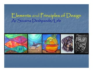
  • 1. Elements and Principles of Design Ar Suvarna Deshpande/Lele
  • 2. Elements and Principles of Design The Elements of Design are the language of the visual arts. This introduction focuses on the elements that are most relevant to two-dimensional (flat) art works. Other elements include point, motion and elements related to three-dimensional art such as mass and volume. Line path of a point Shape perceivable area Value relative light and darkness Color color theory basics Space (2D) height, width and the illusion of depth Texture actual or simulated tactile quality
  • 3. Shape - perceivable area. Shapes can be created by line, or by color and value changes which define their edges. As with line, the decisions you make concerning shape are important. The shapes of the objects that you create or place in your images are positive shapes. The spaces around these shapes are the negative spaces. It is just as important to be attentive to the negative space as the positive shapes.
  • 4. Value - relative light and darkness. The overall lightness and lack of contrast in the left image conveys a sense of spirituality and harmony between the tree and the circular sky.
  • 5. Line - the path of a point. Although the subject matter is the same in all three works, the differences in line quality have created works with very different impact. How you use line is one of the most important decisions to be made in creating a work of art
  • 6. Space - height and width. A monitor display has two actual dimensions - height and width. In addition, an artist can create an illusion of depth, using overlapping, diminishing scale, atmospheric perspective, vertical placement, warm and cool colors, diagonals and linear perspective.
  • 7. Texture - surface quality. We experience actual texture when we touch objects and feel their roughness, smoothness or patterns, which we can simulate or imply in digital imagery.
  • 8. Principles of Design Scale>overall size>Proportion>relative size within the work Unity-repetition> rhythm > pattern .>Unity Balance>equalizing the visual weight of elements Direction>visual path Emphasis>focal point
  • 9. Proportion - relative size of objects within the work of art. In his painting of bedroom (left), Rene Magritte has created a surreal situation simply by manipulating the proportions of common objects. There are no clues that tell us if we are in a normal-sized room or a dollhouse. In the other painting, Andrew Wyeth has used the proportion very differently - the small farmhouse against the largeness of the field created a sense of isolation.
  • 10. Color - basic color theory. We response to color on many levels. Color can be used simply to describe an object. It can also be used emotional (blue for sadness or spiritually, red for angry), symbolically (associated with a flag's color, corporation logo or sports team) and psychologically
  • 11. Scale - overall size. Much of the impact of monumental artwork such as Mount Rushmore is its sheer size. Scale, alone, can change the meaning of a work of art.
  • 12. Balance - equalizing the visual weight of elements. The cross on the left is symmetrically (formally) balanced - one half mirrors the other. Religious and significant objects are often given a symmetrical balance. The painting by Mary Cassatt, (on the right) depicts an ordinary moment. Appropriately, it is asymmetrically balanced. The two women on one side are balanced by the large silver service and fireplace on the other -with the area of highest value contrast
  • 13. Direction and Emphasis. Direction is the visual path our eye will follow. Emphasis refers to the object or element which first catches our attention
  • 14. Space: Indicators of depth on a flat surface Overlapping Diminishing scale Atmospheric perspective Vertical placement Color (warm/cool, intensity) Diagonals
  • 15. Overlapping - when objects partially overlap other objects, we perceive them as closer than the covered objects. Overlapping "overrules" the other indicators of depth - we know that the smaller pyramids are closer because they overlap the larger pyramids. Overlapping most clearly establishes proximity. Atmospheric perspective - close objects have greater intensity of color, detail and value contrast.
  • 16. Diminishing scale - the largest statue appears closest and the smallest appears further away
  • 17. Vertical placement - we perceive objects that are placed lower in the image as closer to us, and objects that are placed higher as being further away. The boat placed lowest in this work by Japanese artist, Diagonals and Linear perspective - we perceive diagonal lines as receding into the distance. The diagonal lines in this painting of a bridge create a extraordinary sense of depth.
  • 18. Color - we perceive warm colors (red, orange and yellow) as closer than cool colors (green, blue, violet). Psychologically, the red and yellow objects in both works appear to be in the foreground, while the cool- colored backgrounds recede.
  • 19. Unity-Variety. Repetition of visual elements such as shapes or colors create a rhythm and pattern in an artwork - creating a sense of harmony and unity that pulls the picture together
  • 20. Pigment Color - (paint) reflected light Pigment color is created when a pigment absorb certain light wavelengths and reflects others. For example, a blue shirt absorbs all wavelengths except blue, which is reflected. The color wheel based on the three primary colors: red, yellow and blue, was developed in 1666 by Sir Isaac Newton. Primary pigment colors - red, yellow and blue are the primary colors. All other colors are derived from these three hues. Secondary pigment colors - green, orange and purple are created by mixing the primary colors. Tertiary colors - yellow-orange, red-orange, red-purple, blue-purple, blue-green and yellow-green are the colors created by mixing the secondary colors.
  • 21. HSB (Hue, Saturation and Brightness) - color can be defined by its hue (wavelength), saturation (chroma, purity or intensity) and brightness (value) Hue - is the color's name (orange, blue, etc.). It is located on the color wheel - expressed as a degree between 0° and 360°. Saturation - is the purity of the color. Saturation is the amount of gray in proportion to the hue - measured from 0% (gray) to 100% (fully saturated). Brightness - is the relative lightness or darkness of the color -measured from 0% (black) to 100% (white).
  • 22. What is color theory? Color Theory is a set of principles used to create harmonious color combinations. Color relationships can be visually represented with a color wheel — the color spectrum wrapped onto a circle. The color wheel is a visual representation of color theory: According to color theory, harmonious color combinations use any two colors opposite each other on the color wheel, any three colors equally spaced around the color wheel forming a triangle, or any four colors forming a rectangle (actually, two pairs of colors opposite each other). The harmonious color combinations are called color schemes – sometimes the term 'color harmonies' is also used. Color schemes remain harmonious regardless of the rotation angle.
  • 23. Monochromatic Color Scheme The monochromatic color scheme uses variations in lightness and saturation of a single color. This scheme looks clean and elegant. Monochromatic colors go well together, producing a soothing effect. The monochromatic scheme is very easy on the eyes, especially with blue or green hues. Analogous Color Scheme The analogous color scheme uses colors that are adjacent to each other on the color wheel. One color is used as a dominant color while others are used to enrich the scheme. The analogous scheme is similar to the monochromatic, but offers more nuances.
  • 24. Complementary Color Scheme The complementary color scheme consists of two colors that are opposite each other on the color wheel. This scheme looks best when you place a warm color against a cool color, for example, red versus green- blue. This scheme is intrinsically high-contrast. Split Complementary Color Scheme The split complementary scheme is a variation of the standard complementary scheme. It uses a color and the two colors adjacent to its complementary. This provides high contrast without the strong tension of the complementary scheme.
  • 25. Triadic Color Scheme The triadic color scheme uses three colors equally spaced around the color wheel. This scheme is popular among artists because it offers strong visual contrast while retaining harmony and color richness. The triadic scheme is not as contrasting as the complementary scheme, but it looks more balanced and harmonious. Tetradic (Double Complementary) Color Scheme The tetradic (double complementary) scheme is the most varied because it uses two complementary color pairs. This scheme is hard to harmonize; if all four hues are used in equal amounts, the scheme may look unbalanced, so you should choose a color to be dominant or subdue the colors.
  • 26. LINES Lines used to Horizontal follow the edges of forms are called lines are calm and quiet, contour drawings Drawings which vertical lines seem to depict suggest more of a more movement potential for than actual movement outline are called gesture diagonal lines drawings strongly suggest movement
  • 27. Shape shape is an enclosed object. Shapes can be created by line, or by color and value changes which define Volume and Mass Shape is considered to be a two-dimensional element, while three-dimensional elements have volume or mass. Therefore, a painting has shapes, while a sculpture has volume and mass. Positive/Negative shapes In a picture, the shapes that the artist has placed are considered the positive shapes. The spaces around the shapes are the negative spaces. It is just as important to consider the negative space in a picture as the positive shapes.
  • 28. Value Value refers to the relative lightness or darkness of a certain area. Value can be used for emphasis. Variations in value are used to create a focal point for the design of a picture
  • 29. Illusion of Space and Depth Size & Vertical Location Since objects in our environment look smaller when they are farther away, the easiest way to show depth is to vary the size of objects, with closer objects being larger and more distant objects being smaller. Overlapping When objects are partially obscured by other objects in front of them, we perceive them as further back than the covering objects. Detail (Aerial or Atmospheric Perspective) Atmospheric perspective uses color and value contrasts to show depth. Objects which are further away generally have less distinct contrast - they may fade into the background or become indistinct dark areas.
  • 30. LINEAR PERSPECTIVE is based on the idea that all lines will converge on a common point on the horizon called the vanishing point. You have observed linear perspective when you notice that the lines on the highway appear to meet at a point in the distance. Artists use linear perspective to create a focal point for a picture
  • 31. MOVEMENT Multiple Anticipated Movement Image Optical Movement Fuzzy Outlines Optical Illusions
  • 32. RHYTHM AND MOVEMENT Rhythm refers to the way your eye moves throughout a picture. Some pictures move you throughout
  • 33. BALANCE To understand balance, think of the balance beam. When objects are of equal weight, they are in balance. If you have several small items on one side, they can be balanced by a large object on the other side. Visual balance works in much the same way. It can be affected not only by the size of objects, but also their value (ie. lightness or darkness, termed visual weight). SYMMETRICAL/FORMAL BALANCE Symmetrical balance is mirror image balance. If you draw a line down the center of the page, all the objects on one side of the screen are mirrored on the other side (they may not be identical objects, but they are similar in terms of numbers of objects, colors and other elements.
  • 34. ASSYMMETRICAL BALANCE Asymmetrical balance occurs when several smaller items on one side are balanced by a large item on the other side, or smaller items are placed further away from the center of the screen than larger items. One darker item may need to be balanced by several lighter items.
  • 35. EMPHASIS Ways to Create a Focal Point by color by Placement by value by texture by Isolation by Contrast
  • 36. The principles of good design are the tools used by an artist or desinger to create an effective composition or design. The principles are: balance, movement, repetition, emphasis, simplicity, contrast, proportion, space, and unity.
  • 37. Symmetrical balance is when the weight is equally distributed on both sides of the central axis. Symmetry is the simplest and most obvious type of balance. It creates a secure, safe feeling To balance a composition is to distribute its parts in such and a sense of a way that the viewer is satisfied that the piece is not about solidity. to pull itself over
  • 38. Asymmetrical Balance Asymmetrical balance is when both sides of the central axis are not identical, yet appear to leave the same visual weight. It is a "felt" equilibrium or balance between the parts of a composition rather than actual. Examples of The Effective Use Of Balance Radial Balance Horizontal Balance Vertical Balance
  • 39. Movement in Repetition and Rhythm The use of repetition to create movement occurs when elements which have something in common are repeated regularly or irregularly sometimes creating a visual rhythm.
  • 40. Emphasis is the stressing of a particular area of focus rather than the presentation of a maze of details of equal importance. emphasis is by creating center of interest, a.k.a. a focal point. A focal point is an area where the eye tends to center
  • 41. The most common ways of creating contrast are by creating differences in: • size • shape • value • 'alignment • color • direction • type • movement • texture
  • 42. Contrast in art and design occurs when two related elements are different. The greater the difference the greater the contrast. Contrast adds variety to the total design and creates unity. It is what draws the viewer's eye into the painting and helps to guide the viewer around the art piece
  • 43. The Principle of Proportion Proportion in art is the comparative harmonious relationship between two or more elements in a composition with respect to size, color, quantity, degree, setting, etc.; i.e. ratio. Equal division creats monotony Unequal divisions create lack of harmony.
  • 44. Shape of one part should fit the shape of its adjoining elements Good Harmony Lack of harmony
  • 45. Space in art refers to the distance or area between, around, above, below, or within shapes and forms found within a composition ways space is used in art composition. These are: Positive space Negative space • Two-dimensional space • Three-dimensional space • •
  • 46. Deep Space When used effectively all of these tools to create the illusion of three-dimensional space will create a sense of what is referred to as "deep space" within your painting. In deep space there are three terms used to describe depth: Foreground is the area of a painting that visually appears closest to the viewer. It is often located on a lower plane or bottom of the canvas. • Middle ground is space that makes up the distance between the foreground and background of a painting. There is no specific measurement for what the limits are. • Typically it is located somewhere on the middle plane of the canvas. Background is the area of a painting that visually appears to be far away in the distance at or near the horizon. It is usually located on a higher plane of the canvas. •
  • 47. Changing Size and Placement Linear Perspective
  • 48. Unity is the hallmark of a good design. It's the final result in a composition when all the design elements work harmoniously together giving the viewer a satisfying sense of belonging and relationship.
  • 49. Hue and Value Deep Space Atmospheric Perspective
  • 51.
  • 52. B — Foreground Background Relationships (Large and Small Objects). We know that to our eyes nearby objects appear larger than faraway objects. For example a Ponderosa Pine tree appears gigantic when we stand right in front of us but seem to shrink to the size of a large match stick when viewed from several miles away. Placing such a tree in the foreground of a photograph, or just part of the trunk of the tree, and then placing another similar tree in the background will definitely give the viewer a clear indication of distance.
  • 53. Various principles like parallelism, focal point, radiation, distortion, play of background foreground, rhythm & repetition are the basis for each composition.
  • 54.
  • 55.
  • 56.
  • 57.
  • 58.
  • 59.
  • 60.
  • 61.
  • 62.
  • 63. THANK YOU Ar Suvarna Deshpande Lele