This document provides an overview of key formal elements in visual arts, including line, light and value, color, texture and pattern, shape and volume, space, and time and motion. It discusses how line quality can express emotion and how directional lines can suggest movement. Light and value create the illusion of three-dimensionality through techniques like chiaroscuro. Color is described in terms of hue, value, intensity, and color harmonies. Texture can be either actual or visual, while shape and volume refer to two and three-dimensional forms respectively. Various perspective techniques are used to create the illusion of space.
Art, and especially visual arts, is the topic that requires both background knowledge and imagination. Most teachers are afraid of it, the same as most students are bored with it. However, with the concept maps and cause-and-effect sentences it may become a source of fun in the English classroom. So, to make teaching of art more effective, I suggest a couple of ideas, which will also be the key points for the workshop:
1) Basic history of art - it gives us not just facts but useful vocabulary for describing works of art.
2) Elements of design and what they mean.
3) How to describe a picture or a photograph.
All elements of art are important for an artist. You don’t have to use all elements, however, at least one or two elements are used in a certain piece of art.
Elements & Principles of Art Through PhotographyMs. Ross
Using photographs and infographics to explore the main elements and principles of art. Adapted partly from the work of:
Mrs. Moncure @moncurephoto.weebly.com
Ms. Rosania-Harvie @www.nhvweb.net
There are literally millions of colors, but they can be divided into just a few color families.
And every color can be described in terms of having three main attributes: hue, saturation and brightness.
How to Create Map Views in the Odoo 17 ERPCeline George
The map views are useful for providing a geographical representation of data. They allow users to visualize and analyze the data in a more intuitive manner.
Students, digital devices and success - Andreas Schleicher - 27 May 2024..pptxEduSkills OECD
Andreas Schleicher presents at the OECD webinar ‘Digital devices in schools: detrimental distraction or secret to success?’ on 27 May 2024. The presentation was based on findings from PISA 2022 results and the webinar helped launch the PISA in Focus ‘Managing screen time: How to protect and equip students against distraction’ https://www.oecd-ilibrary.org/education/managing-screen-time_7c225af4-en and the OECD Education Policy Perspective ‘Students, digital devices and success’ can be found here - https://oe.cd/il/5yV
Palestine last event orientationfvgnh .pptxRaedMohamed3
An EFL lesson about the current events in Palestine. It is intended to be for intermediate students who wish to increase their listening skills through a short lesson in power point.
Synthetic Fiber Construction in lab .pptxPavel ( NSTU)
Synthetic fiber production is a fascinating and complex field that blends chemistry, engineering, and environmental science. By understanding these aspects, students can gain a comprehensive view of synthetic fiber production, its impact on society and the environment, and the potential for future innovations. Synthetic fibers play a crucial role in modern society, impacting various aspects of daily life, industry, and the environment. ynthetic fibers are integral to modern life, offering a range of benefits from cost-effectiveness and versatility to innovative applications and performance characteristics. While they pose environmental challenges, ongoing research and development aim to create more sustainable and eco-friendly alternatives. Understanding the importance of synthetic fibers helps in appreciating their role in the economy, industry, and daily life, while also emphasizing the need for sustainable practices and innovation.
Ethnobotany and Ethnopharmacology:
Ethnobotany in herbal drug evaluation,
Impact of Ethnobotany in traditional medicine,
New development in herbals,
Bio-prospecting tools for drug discovery,
Role of Ethnopharmacology in drug evaluation,
Reverse Pharmacology.
The Roman Empire A Historical Colossus.pdfkaushalkr1407
The Roman Empire, a vast and enduring power, stands as one of history's most remarkable civilizations, leaving an indelible imprint on the world. It emerged from the Roman Republic, transitioning into an imperial powerhouse under the leadership of Augustus Caesar in 27 BCE. This transformation marked the beginning of an era defined by unprecedented territorial expansion, architectural marvels, and profound cultural influence.
The empire's roots lie in the city of Rome, founded, according to legend, by Romulus in 753 BCE. Over centuries, Rome evolved from a small settlement to a formidable republic, characterized by a complex political system with elected officials and checks on power. However, internal strife, class conflicts, and military ambitions paved the way for the end of the Republic. Julius Caesar’s dictatorship and subsequent assassination in 44 BCE created a power vacuum, leading to a civil war. Octavian, later Augustus, emerged victorious, heralding the Roman Empire’s birth.
Under Augustus, the empire experienced the Pax Romana, a 200-year period of relative peace and stability. Augustus reformed the military, established efficient administrative systems, and initiated grand construction projects. The empire's borders expanded, encompassing territories from Britain to Egypt and from Spain to the Euphrates. Roman legions, renowned for their discipline and engineering prowess, secured and maintained these vast territories, building roads, fortifications, and cities that facilitated control and integration.
The Roman Empire’s society was hierarchical, with a rigid class system. At the top were the patricians, wealthy elites who held significant political power. Below them were the plebeians, free citizens with limited political influence, and the vast numbers of slaves who formed the backbone of the economy. The family unit was central, governed by the paterfamilias, the male head who held absolute authority.
Culturally, the Romans were eclectic, absorbing and adapting elements from the civilizations they encountered, particularly the Greeks. Roman art, literature, and philosophy reflected this synthesis, creating a rich cultural tapestry. Latin, the Roman language, became the lingua franca of the Western world, influencing numerous modern languages.
Roman architecture and engineering achievements were monumental. They perfected the arch, vault, and dome, constructing enduring structures like the Colosseum, Pantheon, and aqueducts. These engineering marvels not only showcased Roman ingenuity but also served practical purposes, from public entertainment to water supply.
Unit 8 - Information and Communication Technology (Paper I).pdfThiyagu K
This slides describes the basic concepts of ICT, basics of Email, Emerging Technology and Digital Initiatives in Education. This presentations aligns with the UGC Paper I syllabus.
We all have good and bad thoughts from time to time and situation to situation. We are bombarded daily with spiraling thoughts(both negative and positive) creating all-consuming feel , making us difficult to manage with associated suffering. Good thoughts are like our Mob Signal (Positive thought) amidst noise(negative thought) in the atmosphere. Negative thoughts like noise outweigh positive thoughts. These thoughts often create unwanted confusion, trouble, stress and frustration in our mind as well as chaos in our physical world. Negative thoughts are also known as “distorted thinking”.
Basic phrases for greeting and assisting costumers
Mfv intro 4
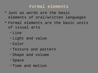
1. Formal elements
• Just as words are the basic
elements of oral/written languages
• Formal elements are the basic units
of visual arts
– Line
– Light and value
– Color
– Texture and pattern
– Shape and volume
– Space
– Time and motion
2. Line a moving point having length and no
width.
In art, a line usually has length and width,
but length is more important.
• Actual line—they physically exist
and can be broad, thin, straight,
jagged
• Implied lines—do not physically
exist, yet they seem quite real
to viewers—dotted line,
unconnected parts
6. Note the line quality:
Thick strokes—bottom of hem
Wispy lines—beard
Crisp lines—sword blade
Utagawa Kunishada, Shoki the Demon Queller, c. 1849-1853. Woodblock print
7. Line quality can
express a range of
emotions. Contrast the
thick, angular lines
of Shoki with the
thin, playful lines of
Klee.
Also the arrangement
of lines can seem
organized or
disorderly. Klee’s
lines seem arranged
whimsically.
Paul Klee. They’re Biting, 1920. Drawing and oil on paper
8.
9. Line that depict three-dimensional objects:
• Outline—follows the outer edges of the
silhouette of a three-dimensional for with
uniform line thickness. Outlines flatten a
three-dimensional form into a two-dimensional
shape.
• Contour lines—mark the outer edges of a three-dimensional
object—with varying line thickness
and some internal detail.
• Cross-contours—repeated lines that go around an
object and express its three-dimensionality
• Hatching—lines that product tones or values
(different areas of gray)
• Cross-hatching—parallel ines in superimposed
layers
10. • In art, a directional line is a one
dimensional line that is used to show
direction. Lines help to express view points
to someone looking at images. Horizontal
lines give a sense of calm and rest, while
diagonal lines express energy and
movement.
11. "Directional Lines”
Directional lines are very precise. They are
not "free" like expressive lines…but
calculated constant, and even.
12. to suggest direction and movement:
• horizontal lines tend to communicate suggest
stability and calm, vertical lines suggest
strength and authority (architecture), and
diagonal lines tend to represent movement.
These characteristics can all be seen in
Botticelli's Birth of Venus.
13.
14. Lines—firm carve out figures (from rigid horizontal and vertical trees)
Lines—zephyrs—straight breath—curved drapery (imply movement)
Lines—implied—compositional (overall triangle)
15. Jacob Lawrence, Harriet Tubman Series. 1939–40 . Panel #4
On a hot summer day about 1820, a group of slave children were tumbling in the sandy soil
in the state of Maryland - and among them was one, Harriet Tubman
17. Light and value
• In art and architecture, light
might be an actual element. In
buildings, the control of light
is an essential design element.
18. Bruce Nauman. (American, born 1941). Human/Need/Desire. 1983. Neon tubing
and wire with glass tubing suspension frames, 7' 10 3/8" x 70 1/2" x 25 3/4"
Nauman believes that
language is "a very
powerful tool"; he was
inspired to use neon
tubing because of the
convincing messages and
hypnotic aura of neon
advertisements. Ironicly,
he uses this flashing
commercial medium—with
all its wires exposed—to
address fundamental
elements of human
experience.
19. Light and Value
• Most art does not emit or
manipulate light but relects
ambient light (the light all
around us)
• In two-dimensional art artist
use value to represent the
various levels of light that
reflect off of objects.
20. • Value (or tone) is one step on
a gradation from light and dark
• Achromatic value scale—the
extremes are white and black
(grey in between)
• Chromatic value scale—different
values of color
• Shading (modeling) manipulate
gradations in values to create
the appearance of natural light
on objects
• Chiaroscuro—light-dark
gradation that can depict
21. Achromatic value scale,
showing only black, white,
and gray tones.
Chromatic value scale,
showing various values of
red.
Values can create the
illusion of volume.
Light and Value
22. Chiaroscuro—use of various tones
(black, white, grays) to create the
illusion of volume
Rosso Fiorentino, Recumbent Female Nude Figure Asleep, 1530
23. A range of values can express
emotion.
Kunishada’s print carries a
strong emotional charge.
While Fiorentino’s nude may lull
the viewer.
Utagawa Kunishada, Shoki the Demon Queller, c. 1849-1853. Woodblock print
24. Sculpture and architecture have value difference because of
the many angles at which light hits and refects off their
three-dimensional surfaces.
Nevelson’s sculpture is painted black, but the light bouncing
off of various surfaces appears as gray or as black.
Louise Nevelson, Mirror-Shadow VII, 1985, wood painted black, 9'
9" x 11' 7" x 1' 9"
25. Examining Color
• Consider the various concepts and
properties of color—hue, value and
intensity
26. • Hue it the pure state of color in the spectrum
an is that color’s name, such as red, blue,
yellow, green violet and orange.
27. Hue: This is what we usually mean when we ask "what color
is that?" The property of color that we are actually asking
about is "hue". For example, when we talk about colors that
are red, yellow, green, and blue, we are talking about hue.
Different hues are caused by different wavelengths of light.
Therefore, this aspect of color is usually easy to recognize.
Hue Contrast - strikingly different hues
Hue Constancy - different colors, same hue (blue)
Value in color is the lightness and darkness within a hue
28. Value: When we describe a color as "light" or "dark", we are discussing its value
or "brightness". This property of color tells us how light or dark a color is based on
how close it is to white. For instance, canary yellow would be considered lighter
than navy blue which in turn is lighter than black. Therefore, the value of canary
yellow is higher than navy blue and black.
Low value—same brightness level
Contrast of value—grayscale, no chroma
Contrast of value—stark differences in
brightness
29. Tints, Tones and Shades:
• These terms are often used inappropriately
but they describe fairly simple color
concepts. The important thing to
remember is how the color varies from its
original hue. If white is added to a color,
the lighter version is called a "tint". If the
color is made darker by adding black, the
result is called a "shade". And if gray is
added, each gradation gives you a different
"tone."
30. • Tints (adding white to a pure hue)
• Shades (adding black to a pure hue)
• Tones (adding gray to a pure hue)
31. • Intensity/Saturation—tells us how a
color looks under certain lighting
conditions. For instance, a room painted a
solid color will appear different at night than
in daylight. Over the course of the day,
although the color is the same, the
saturation changes.
• Be careful not to think about
SATURATION in terms of light and dark
but rather in terms of pale or weak and
pure or strong.
32. Gainsborough, M/M Andrews
Most saturated color—blue
satin dress, modified with
tints and shades
Warm—foreground greens
Cool—distant blue-grey
greens
Local colors—the colors we
normally find in the objects
around us.
33. Primary Colors (R/Y/B): For paints and pigments, the primary colors are red, yellow
and blue
RED, YELLOW, BLUE:
Thought of as the “original” colors
since they are the starting point
for all other colors and cannot be
recreated by the mixing of any
others. They are thought to be
exuberant, decorative and
decisive.
For light-emitting media, the
primary colors are red, blue,
green
34. It is from the blending of the
primary colors that secondary
colors are born.
There are three secondary
colors.
Red + yellow = orange
Blue + yellow = green
Blue + red = purple
SECONDARY COLORS
35. TERTIARY COLORS
Tertiary colors come to life when
primary and secondary combine.
There are six:
Red-orange
Yellow-orange
Yellow-green
Blue-green
Blue-violet
Violet-red
36. ADDITIVE COLOR SYSTEM—applies to light-emitting media, the primary colors
are red, blue, green
If we are working on a
computer, the colors we see
on the screen are created
with light using the additive
color method.
Additive color mixing begins
with black and ends with
white; as more color is
added, the result is lighter
and tends to white
37. When we mix colors
using paint we are
using the subtractive
color method.
Subtractive color
mixing means that
one begins with white
and ends with black;
as one adds color, the
result gets darker.
38. primary colors (red, yellow, and blue)
are those that cannot be produced by
mixing two other colors together
secondary colors (violet, orange, and
green) are those that are produced
when two primaries are mixed
analogous colors are those that are next
to each other on the color wheel and
share similar wavelenghts
41. Complementary colors are opposites of each other and,
when mixed, give a dull result.
Red and green are complementary colors.
Complementary color…make both hues appear more intense
43. COMPLEMENTARY VERSUS ANALOGOUS COLORS
• complementary colors
are opposite each
other on the color
wheel and
dramatically different
in wavelength
• Analogous colors
are next to each
other on the color
wheel and similar in
appearance
•
44. Analogous color harmonies are often found in nature because natural elements
often feature colors that are close to each other. It is also a visually pleasing
harmony.
45. LOCAL VERSUS OPTICAL COLOR
• local color is the color that an object has in
normal light
• optical color is color produced through our
visual perception
46. Haystack at Sunset Near Giverny
Clause Monet. oil on canvas, 1891 (Impressionism)
a great example of optical color
48. The Night Cafe
by Vincent Van Gogh, oil
on canvas
1888 (Post Impressionism)
• Expressive use of color (non-realistic)
• Harsh palette (a place where one can ruin oneself)
• Red (walls) green (ceiling) clash
• Billiard table and floor (contain red and green) marry the two
• Lamp light—agitated swirls of local color—psychological
brillance/agitation.
49. Color Properties in Various Media
Paint Light-Emitting
Media
Commercial
Printing or
Computer
Printer
Color System subtractive additive subtractive
Effects of
Environmental
Light Levels
more room light, the
brighter the colors
less room light, the
brighter the colors
more room light, the
brighter the colors
Primary Colors blue, red, yellow red, green, blue CMYK
Secondary Colors purple, green, orange yellow, cyan, magenta red, blue, green
Complementaries blue – orange
red – green
yellow – purple
red – cyan
green – magenta
blue – yellow
cyan – red
magenta – green
yellow – blue
Mixture of all
Primaries
gray or dull neutral white black
52. Explore Texture and Pattern
• Texture refers to the surface
characteristics, and may be tactile or visual.
• Pattern is the regular repetition of a visual
form.
• Describe both the texture and pattern
displayed in the 6th century mosaic below.
53. Texture
• ACTUAL TEXTURE is tactile it is more
than visual information
• VISUAL TEXTURE is the illusion of texture
– trompe l'oeil is a method of art that is intended
to create a realistic illusion of texture and
depth in a work of art. The term means "fool
the eye" in French.
54. Tactile texture
• Lion Capital from
Asoka pillar
• Sarnath, India
• ca. 250 BCE
• Culture:
Buddhist/Indian
55. Detail of Deesis Mosaic in
Hagia Sophia. Believed to be
1185-1204. Mosaic tile.
Each mosaic piece reflects
ambient light in a slightly
different direction.
Visual texture is illusionary.
56. James Rosenquist
Gift Wrapped Doll IV
1992
VISUAL TEXTURE
• Simulates texture of cellophane
• Transparent wrap reflect light, tearing across the innocent
face like white-hot rods
• Doll—haunting and sinister
• Commentary—ideal of beauty—blue eyed blonde
57. Considering Shape and Volume
• Shape refers to two-dimensional art,
and volume refers to three-dimensional
works.
• Shape and volume may have simulated
reality, may be abstracted or invented.
58. Examining Space
• Space refers to the actual space in which a work of
art exists, or an illusion of space created.
• An illusion of space (depth) may be created by
shading, overlapping, and atmospheric or linear
perspective.
• Artists may also use isometric, oblique, and mid-point
perspective.
63. • 1. Turn your paper horizontal ("landscape"
orientation)
•
1. Turn your paper horizontal ("landscape" orientation)
64. • 2. Line the end of your ruler up with the side
of your page.
• Be sure the ruler is straight and flush with the
edge of the page or everything will be
crooked!
65. • 3. Draw a horizontal line one or two
inches down from top of the page. This is
your horizon line.
•
66. • 4. Draw a dot in the middle of your
horizon line. This is your vanishing point.
67. • 5. Now draw a square or rectangle in the
right or left bottom area of your page.
68. • 6. Now connect three corners of your
rectangle or square to the vanishing point.
These are orthogonals.
69. • 7. Draw a horizontal line between the top
two orthogonals where you want your form
to end.
70. • 8. Draw a vertical line down from the
horizontal line to complete the side.
75. Albrecht Durer,
The Adoration of the Magi (1511) woodcut
• Follow converging
parallel lines to
vanishing point
• This woodcut is
an exercise in
one-point
perspective
76. linear perspective is a
mathematical system for
organizing space in a
convincing way.
It is used in Piranesi's
Drawbridge drawing
77. Durer, Artist drawing a model in foreshortening through
a frame using a grid system, woodcut (crosshatching)
Foreshortened: the size of an object's dimensions along the
line of sight are relatively shorter than dimensions across
the line of sight
78. • ATMOSPHERIC
(AERIAL)
PERSPECTIVE is a
convention of art
that was invented by
Leonardo da Vinci
for creating an
illusion of depth by
incorporating the
natural effects of
atmosphere.
80. Time and Motion
• ACTUAL MOTION is
live movement. A
work of kinetic art
like Alexander
Calder's Untitled
mobile in the East
Wing of the National
Gallery of Art in
Washington D.C.
displays actual motion
when we see it in
person.
81. THE ILLUSION OF MOTION
• is what we experience when we see a
movie or series of shapes that note a
passage of time. A movie is a series of still
frames that do not contain actual motion,
but when shown in a time sequence, create
an illusion of motion.
82. IMPLIED MOTION AND TIME
is a non-moving image that
shows movement through the
attributes present in the
image.
Good examples of this are
found in Bernini's Apollo and
Daphne
Apollo and Daphne. Gianlorenzo Bernini, marble sculpture, 1622-24 (Baroque)
83. Examining Time and Motion
• Consider how time and motion may be
incorporated in visual art, usually
understood as static, by examining
issues of Marcel Duchamp’s Nude
Descending a Staircase.
84. Fig. 2.25 Marcel Duchamp.
Nude Descending a Staircase
(No. 2), 1912. Oil on canvas, 57
7/8” X 35 1/8”. Philadelphia
Museum of Art, Philadelphia.
87. Fig. 2.26 Cai Guo-Qiang. Black
Rainbow: Explosion Project for
Valencia, Spain. 2005.
Omens for international unease—
frightening—but also attract with
their power and beauty.
89. Exploring Balance and Rhythm
• Balance may be symmetrical, asymmetrical or
radial. What type of balance is used in the Angkor
Wat temple in Cambodia (Fig. 2-30)?
• Rhythm is the regular repetition of the elements
in a composition. It may be regular, alternating,
or eccentric.
• How is the concept of rhythm addressed in the
bas-relief from Angkor Wat (Fig. 2-31)?
96. General precepts about asymmetrical or
informal balance:
• A large form is visually heavier than a smaller form
• A dark-value form is visually heavier than a light-value
form of the same size
• A textured form is visually heavier than a smooth form
of the same size
• A complex form is visually heavier than a simple form
of the same size
• Two or more small forms can balance a larger one
• A smaller dark form can balance a larger light one
97. Miro, Birth of the World
(1925) MoMA
[asymmetrical and balanced]
98. Helen M. Turner (1858-1958), Morning News, 1915
[well-placed touches of color …overall visual balance]
110. Proportion and Scale
Emphasis, Unity and Variety
• How do the use and manipulation of proportion and
scale alter our response to the Claes Oldenburg
binoculars?
• Emphasis is the creation of focal points.
• Unity is the quality of overall cohesion within a
work of art.
• Variety is the element of difference in a work of art.
• Examine how the principles of emphasis, unity and
variety are used in works of art.
126. Alice Neel. The Family
(John Gruen, Jane Wilson,
and Julia). 1970
• What is not
idealized?
127. Structural Systems in Architecture
• Traditional building methods
– Load-bearing construction
– Post and lintel construction
– Wood frame construction
– Arches, Vaulting, Domes
• Recent Methods and Materials
– Steel Frame construction
– Reinforced concrete
– Suspension and tensile construction
128. Compare load-bearing
with post and lintel
construction:
Fig. 2.33 El Castillo, Chichen
Itza, Mexico. See the elevated
view in the textbook.
Fig. 2.35 Mnesicles. The
Temple of Athena Nike and
the Proplylaea. 437-432
BCE. Athens.
139. Examine the
issues of steel
frame construction.
Fig. 2.41 The Seagram
Building. 1954-1958.
New York City.
140. Consider the
issues of truss and
geodesic
construction.
Fig. 2.42 Truss (A)
and Geodesic
Dome (B)
Structural
Systems.
Editor's Notes
Words relating to human want light up in a pulsing cycle, continually evoking and replacing meaning. By offering words and taking them away, this work disrupts viewers' habits of perception. Nauman believes that language is "a very powerful tool"; he was inspired to use neon tubing because of the convincing messages and hypnotic aura of neon advertisements. Here, with irony, the artist uses this flashing commercial medium—with all its wires exposed—to address fundamental elements of human experience.
Chiaroscuro—use of various tones (black, white, grays) to create the illusion of volume
Most saturated color—blue satin dress, modified with tints and shades
Warm—foreground greens
Cool—distant blue-grey greens
Local colors are the colore we normally find in the objects around us.
Visual Texture
Unidealized…enlarged heads, elongated fingers and calves, outsized feet…glaring obstacles to realistic representation