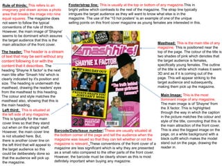
Rule of thirds; This refers to an 
imaginary grid drawn across a photo 
area that breaks the image into nine 
equal squares. The magazine does 
not seem to follow the typical 
conventions of the rule of thirds. 
However, the main image of 'Shayne' 
seems to be dominant which assures 
the target audience that this is the 
main attraction of the front cover. Masthead; This is the main title of any 
magazine. This is positioned near the 
top of the page. The colour of the title is 
two shades of pink which denotes that 
the target audience is females, 
specifically young females. The outline 
of the title is white which makes it seem 
3D and as if it is coming out of the 
page. This will appear striking to the 
target audience and subsequently, 
making them pick up the magazine. 
Main Image; This is the most 
dominant image of any magazine. 
The main image is of 'Shayne' from 
the X factor. This is highlighted 
through the way in which the caption 
in the picture matches the colour and 
style of the title, connoting that this is 
the main attraction of the front cover. 
This is also the biggest image on the 
page, on a white background with a 
black outfit which makes the model 
stand out on the page, drawing the 
reader in. 
The header; The header is a stream 
of text that may be sent without any 
content following it or with the 
content that it describes. The 
heading 'Shayne X factor' is the next 
main title after 'Smash hits' which is 
clearly indicated by it's position and 
size. The heading is underneath the 
masthead, drawing the readers' eyes 
from the masthead to this heading. 
The colour and style matches the 
masthead also, showing that this is 
the main heading. 
Left third; This is situated at 
the left side of any magazine. 
This is typically for the main 
cover lines so that they stand 
out when on the shops' shelf. 
However, the main cover line 
is not situated here. But, 
there is another cover line on 
the left third that will appeal to 
the target audience so this 
could be deliberately done so 
that the audience will pick up 
the magazine. 
Footer/strap line; This is usually at the top or bottom of any magazine.This in 
bright yellow which contrasts to the rest of the magazine. The strap line typically 
intrigues the target audience as they will want to know what else is in the 
magazine. The use of the '10 hot posters' is an example of one of the unique 
selling points on this front cover magazine as young females are interested in this. 
Barcode/Date/Issue number; These are usually situated at 
the bottom corner of the page and tell the audience when the 
magazine was issued so that they can tell whether or not the 
magazine is relevant. These conventions of the front cover of a 
magazine are less significant which is why they are presented 
as a small ratio compared to the other parts of the front cover. 
However, the barcode must be clearly shown as this is most 
definitely important when buying any magazine.

Smash hits front cover analysis edited version

  • 1.
    Rule of thirds;This refers to an imaginary grid drawn across a photo area that breaks the image into nine equal squares. The magazine does not seem to follow the typical conventions of the rule of thirds. However, the main image of 'Shayne' seems to be dominant which assures the target audience that this is the main attraction of the front cover. Masthead; This is the main title of any magazine. This is positioned near the top of the page. The colour of the title is two shades of pink which denotes that the target audience is females, specifically young females. The outline of the title is white which makes it seem 3D and as if it is coming out of the page. This will appear striking to the target audience and subsequently, making them pick up the magazine. Main Image; This is the most dominant image of any magazine. The main image is of 'Shayne' from the X factor. This is highlighted through the way in which the caption in the picture matches the colour and style of the title, connoting that this is the main attraction of the front cover. This is also the biggest image on the page, on a white background with a black outfit which makes the model stand out on the page, drawing the reader in. The header; The header is a stream of text that may be sent without any content following it or with the content that it describes. The heading 'Shayne X factor' is the next main title after 'Smash hits' which is clearly indicated by it's position and size. The heading is underneath the masthead, drawing the readers' eyes from the masthead to this heading. The colour and style matches the masthead also, showing that this is the main heading. Left third; This is situated at the left side of any magazine. This is typically for the main cover lines so that they stand out when on the shops' shelf. However, the main cover line is not situated here. But, there is another cover line on the left third that will appeal to the target audience so this could be deliberately done so that the audience will pick up the magazine. Footer/strap line; This is usually at the top or bottom of any magazine.This in bright yellow which contrasts to the rest of the magazine. The strap line typically intrigues the target audience as they will want to know what else is in the magazine. The use of the '10 hot posters' is an example of one of the unique selling points on this front cover magazine as young females are interested in this. Barcode/Date/Issue number; These are usually situated at the bottom corner of the page and tell the audience when the magazine was issued so that they can tell whether or not the magazine is relevant. These conventions of the front cover of a magazine are less significant which is why they are presented as a small ratio compared to the other parts of the front cover. However, the barcode must be clearly shown as this is most definitely important when buying any magazine.