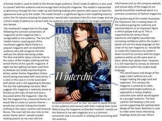
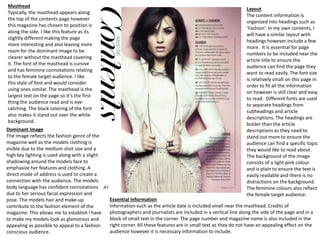
A female model is used to relate to the female target audience. Direct mode of address is also used
to connect with the audience and encourage them to buy the magazine. The model is represented
as glamorous through her hair, make-up and clothing making other women who aspire to have this
appearance look up to the model. The model herself is a significant figure in the modelling industry
and in the TV industry showing her popularity. I would take inspiration from this main image and use
a direct mode of address to connect with my audience and a female model as my target audience is
also female.
Information such as the company website
and release date of the magazine are
placed around the masthead which is a
common convention of fashion magazines.
The positioning of the models head gives
the impression she is looking down on
the audience giving her authority and
representing her as an important figure
in which people look up to. This is
supported by her serious facial
expression and slightly squinted eyes
connoting confidence within the model. I
would not use this body language on the
cover of my own magazine as I would like
to create the impression my model is
down to earth to connect with the target
audience and be on the same level as
them rather than above them. However,
it is still important to convey an element
of confidence within the models body
language.
The overall layout and design of the
page is plain without any sub-
images making the page neat and
organised. This conveys the
magazine is aimed at an older,
sophisticated target audience as
opposed to a messy, brightly
coloured cover which would appeal
to a younger audience. The font
used for the heading is thin and
cursive supporting the sophisticated
design of the cover. Bold text is used
to make some more interesting
headings stand out over others.
Personal pronouns such as ‘you’ are used to speak directly
to the audience and connect with them making them more
likely to buy the magazine as they feel involved. I would use
this feature in my own magazine as it is a common
convention and is successful in relating and connecting with
the audience.
The blue and white colour scheme links to
the colour of the models clothing and the
winter theme of this specific magazine. A
slight low key lighting has been used here
as shadows are visible representing the
darker, winter theme. Regardless of blue
mainly being associated with masculinity, it
is clear in this case it is to be associated
with winter and is still appealing to females.
The fact the subheading mentions ‘Men’
suggests this magazine is solemnly aimed at
females as the topic of men and love is
discussed within the magazine. I like the
fact the magazine has a seasonal theme as I
would like to create an autumn theme. I
would also consider linking the models
clothing to the colour scheme and seasonal
theme. The main sell line also links to the
winter theme which I would consider
relating autumn to my main sell line.
The masthead is largest text on the page
following the common conventions of
magazines so the magazine title is
recognisable to the audience. The fact the
models head is covering part of the
masthead suggests Marie Claire is a
popular magazine with an established
audience who will recognise the title
without the whole text being visible.
Masthead
Typically, the masthead appears along
the top of the contents page however
this magazine has chosen to position is
along the side. I like this feature as its
slightly different making the page
more interesting and also leaving more
room for the dominant image to be
clearer without the masthead covering
it. The font of the masthead is cursive
and has feminine connotations relating
to the female target audience. I like
this style of font and would consider
using ones similar. The masthead is the
largest text on the page so it’s the first
thing the audience read and is eye-
catching. The black coloring of the font
also makes it stand out over the white
background.
Layout
The content information is
organized into headings such as
‘Fashion’. In my own contents, I
will have a similar layout with
headings however include a few
more. It is essential for page
numbers to be included near the
article title to ensure the
audience can find the page they
want to read easily. The font size
is relatively small on this page in
order to fit all the information
on however is still clear and easy
to read. Different fonts are used
to separate headings from
subheadings and article
descriptions. The headings are
bolder than the article
descriptions as they need to
stand out more to ensure the
audience can find a specific topic
they would like to read about.
The background of the image
consists of a light pink colour
and is plain to ensure the text is
easily readable and there is no
distractions on the background.
The feminine colours also reflect
the female target audience.
Essential Information
Information such as the article date is included small near the masthead. Credits of
photographers and journalists are included in a vertical line along the side of the page and in a
block of small text in the corner. The page number and magazine name is also included in the
right corner. All these features are in small text as they do not have an appealing effect on the
audience however it is necessary information to include.
Dominant Image
The image reflects the fashion genre of the
magazine well as the models clothing is
visible due to the medium shot size and a
high key lighting is used along with a slight
shadowing around the models face to
emphasize her features and clothing. A
direct mode of address is used to create a
connection with the audience. The models
body language has confident connotations
due to her serious facial expression and
pose. The models hair and make-up
contribute to the fashion element of the
magazine. This allows me to establish I have
to make my models look as glamorous and
appealing as possible to appeal to a fashion
conscious audience.
Front cover decon.

Front cover decon.

  • 1.
    A female modelis used to relate to the female target audience. Direct mode of address is also used to connect with the audience and encourage them to buy the magazine. The model is represented as glamorous through her hair, make-up and clothing making other women who aspire to have this appearance look up to the model. The model herself is a significant figure in the modelling industry and in the TV industry showing her popularity. I would take inspiration from this main image and use a direct mode of address to connect with my audience and a female model as my target audience is also female. Information such as the company website and release date of the magazine are placed around the masthead which is a common convention of fashion magazines. The positioning of the models head gives the impression she is looking down on the audience giving her authority and representing her as an important figure in which people look up to. This is supported by her serious facial expression and slightly squinted eyes connoting confidence within the model. I would not use this body language on the cover of my own magazine as I would like to create the impression my model is down to earth to connect with the target audience and be on the same level as them rather than above them. However, it is still important to convey an element of confidence within the models body language. The overall layout and design of the page is plain without any sub- images making the page neat and organised. This conveys the magazine is aimed at an older, sophisticated target audience as opposed to a messy, brightly coloured cover which would appeal to a younger audience. The font used for the heading is thin and cursive supporting the sophisticated design of the cover. Bold text is used to make some more interesting headings stand out over others. Personal pronouns such as ‘you’ are used to speak directly to the audience and connect with them making them more likely to buy the magazine as they feel involved. I would use this feature in my own magazine as it is a common convention and is successful in relating and connecting with the audience. The blue and white colour scheme links to the colour of the models clothing and the winter theme of this specific magazine. A slight low key lighting has been used here as shadows are visible representing the darker, winter theme. Regardless of blue mainly being associated with masculinity, it is clear in this case it is to be associated with winter and is still appealing to females. The fact the subheading mentions ‘Men’ suggests this magazine is solemnly aimed at females as the topic of men and love is discussed within the magazine. I like the fact the magazine has a seasonal theme as I would like to create an autumn theme. I would also consider linking the models clothing to the colour scheme and seasonal theme. The main sell line also links to the winter theme which I would consider relating autumn to my main sell line. The masthead is largest text on the page following the common conventions of magazines so the magazine title is recognisable to the audience. The fact the models head is covering part of the masthead suggests Marie Claire is a popular magazine with an established audience who will recognise the title without the whole text being visible.
  • 2.
    Masthead Typically, the mastheadappears along the top of the contents page however this magazine has chosen to position is along the side. I like this feature as its slightly different making the page more interesting and also leaving more room for the dominant image to be clearer without the masthead covering it. The font of the masthead is cursive and has feminine connotations relating to the female target audience. I like this style of font and would consider using ones similar. The masthead is the largest text on the page so it’s the first thing the audience read and is eye- catching. The black coloring of the font also makes it stand out over the white background. Layout The content information is organized into headings such as ‘Fashion’. In my own contents, I will have a similar layout with headings however include a few more. It is essential for page numbers to be included near the article title to ensure the audience can find the page they want to read easily. The font size is relatively small on this page in order to fit all the information on however is still clear and easy to read. Different fonts are used to separate headings from subheadings and article descriptions. The headings are bolder than the article descriptions as they need to stand out more to ensure the audience can find a specific topic they would like to read about. The background of the image consists of a light pink colour and is plain to ensure the text is easily readable and there is no distractions on the background. The feminine colours also reflect the female target audience. Essential Information Information such as the article date is included small near the masthead. Credits of photographers and journalists are included in a vertical line along the side of the page and in a block of small text in the corner. The page number and magazine name is also included in the right corner. All these features are in small text as they do not have an appealing effect on the audience however it is necessary information to include. Dominant Image The image reflects the fashion genre of the magazine well as the models clothing is visible due to the medium shot size and a high key lighting is used along with a slight shadowing around the models face to emphasize her features and clothing. A direct mode of address is used to create a connection with the audience. The models body language has confident connotations due to her serious facial expression and pose. The models hair and make-up contribute to the fashion element of the magazine. This allows me to establish I have to make my models look as glamorous and appealing as possible to appeal to a fashion conscious audience.