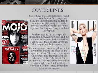
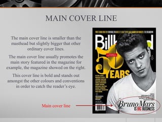
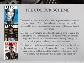
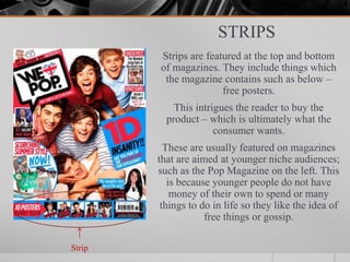
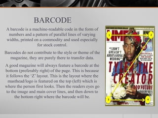
COVER PAGES
THE IMPORTANCE OF A FRONT COVER
The front cover of any magazine is the most crucial part of selling it;
because if the audience doesn’t like the design, it will not get sold.
Effectively, the front cover determines whether the brand succeeds whilst
also presenting the publications character and content.
Also each issue of the magazine needs to be recognisable to the brand,
regardless of the theme. For example, the magazine may be having a
special edition such as ‘25 Year Anniversary’ and have a unique design,
but the audience need to be able to recognise it and pick it out amongst
many other magazines on the shelf.
Furthermore, the theme will change with each issue (whether it be
weekly, monthly or annually). The celebrity on the front will vary, as
well as the colour theme. However the magazine must remain
recognisable to the audience, whilst being interesting at the same time.
THE MAIN IMAGE
An image based front cover is the most common approach to magazine
cover design. This image should be displayed as the background of the
magazine but the person featuring on it should be centred so that cover
lines and tag lines can be displayed on each side.
The person/sometimes a few people would be shown waist up, making
eye contact with the camera (so that the audience feels connected to
them) and preferably smiling. This image should also be of high quality
so it makes the magazine look professional. And official.
The person featuring on the front cover will usually have an article
dedicated to them inside the magazine, which may encourage fans of the
celebrity to purchase it. This means the magazine also appeals to a larger
audience.
THE MASTHEAD
Magazines are consumer good and like any consumer good they are brands and
represent a certain company. The masthead of the magazine is considered their logo
and plays the role of making the magazine recognisable to the selected audience.
The masthead should capture the publications content, character and attitude whilst
remaining versatile so that it can be used on other occasions.
The masthead of any magazine is on the top third of the page because in the UK,
magazines are displayed in shops so the left third of the magazine is shown. This is
why ‘Q’ magazine has their logo at the top left. However in the USA they are
presented in a waterfall display so the top third is the most visible. This gives the
reader a brief view of what the magazine will be like.
Music Magazine masthead’s are all unique and no two are the same, this is because
different magazines appeal to different audiences which is why they are all designed
differently.
Also the masthead short be short and catchy, this makes it easy to remember and
recognise. It will stand out at the most important thing on the front page as it is a one
word title.
SELL/TAG LINE
The sell or tag lines are usually displayed above or below the masthead.
They give the reader a brief view of what the issue will feature and this
promotes the magazine by advertising the exclusive article the magazine
includes.
Usually sell lines include exciting vocabulary such as ‘Exclusive’ and
‘Special Edition’ and ‘Free’ or ‘Best ever’. This makes the reader feel
like they need to buy it or they’re missing out.
Also by using sell lines at the top it makes it the first thing the reader will
see, which will make their first impression either positive or negative.
Furthermore this powerful statement will be clear immediately as
marketing research suggests that an average person spend 3-4 seconds on
average glancing at cover pages. This means the sell line should be
perfect and encourage the reader to purchase the product straight away.
COVER LINES
Cover lines are short statements found
on the outer thirds of the magazine.
They are short because the editors do
not want to give away too much
information about what is inside the
magazine, but they need to give a brief
description.
Readers need to instantly spot the
interaction between the words and the
pictures so they can decide whether
what they are looking at is something
that they would be interested in.
Some magazine covers only have a few
cover lines to keep the focus on the
image, but others fill every empty space
with cover lines. It depends on the
character of the publication for
example, a Rock Magazine front cover
is jam-packed with information
However a fashion magazine tends to
focus on the images.
MAIN COVER LINE
The main cover line is smaller than the
masthead but slightly bigger that other
ordinary cover lines.
The main cover line usually promotes the
main story featured in the magazine for
example, the magazine showed on the right.
This cover line is bold and stands out
amongst the other colours and conventions
in order to catch the reader’s eye.
Main cover line
THE COLOUR SCHEME
The colour scheme is one of the most important conventions of
the front cover. The colour scheme on a magazine has the
potential to make the magazine look more professional than it
is or cheap.
Also the colour scheme helps to add a certain type of genre and
atmosphere that the magazine is trying to portray. In a music
magazine, the colour scheme is used to portray the type of
musical genre, and targets the niche audience.
The fonts need to be a certain colour as to fit in with the colour
on the main image. Also colours need to create contrast on the
page as this would demand the attention of the reader as it
would stand out amongst other magazines on the shelf.
STRIPS
Strips are featured at the top and bottom
of magazines. They include things which
the magazine contains such as below –
free posters.
This intrigues the reader to buy the
product – which is ultimately what the
consumer wants.
These are usually featured on magazines
that are aimed at younger niche audiences;
such as the Pop Magazine on the left. This
is because younger people do not have
money of their own to spend or many
things to do in life so they like the idea of
free things or gossip.
Strip
BARCODE
A barcode is a machine-readable code in the form of
numbers and a pattern of parallel lines of varying
widths, printed on a commodity and used especially
for stock control.
Barcodes do not contribute to the style or theme of the
magazine, they are purely there to transfer data.
A good magazine will always feature a barcode at the
bottom (preferably right) of the page. This is because
it follows the ‘Z’ layout. This is the layout where the
masthead/logo is featured on the top (left) which is
where the person first looks. Then the readers eyes go
to the image and main cover lines, and then down to
the bottom right where the barcode will be.

Cover pages

  • 1.
  • 2.
    THE IMPORTANCE OFA FRONT COVER The front cover of any magazine is the most crucial part of selling it; because if the audience doesn’t like the design, it will not get sold. Effectively, the front cover determines whether the brand succeeds whilst also presenting the publications character and content. Also each issue of the magazine needs to be recognisable to the brand, regardless of the theme. For example, the magazine may be having a special edition such as ‘25 Year Anniversary’ and have a unique design, but the audience need to be able to recognise it and pick it out amongst many other magazines on the shelf. Furthermore, the theme will change with each issue (whether it be weekly, monthly or annually). The celebrity on the front will vary, as well as the colour theme. However the magazine must remain recognisable to the audience, whilst being interesting at the same time.
  • 3.
    THE MAIN IMAGE Animage based front cover is the most common approach to magazine cover design. This image should be displayed as the background of the magazine but the person featuring on it should be centred so that cover lines and tag lines can be displayed on each side. The person/sometimes a few people would be shown waist up, making eye contact with the camera (so that the audience feels connected to them) and preferably smiling. This image should also be of high quality so it makes the magazine look professional. And official. The person featuring on the front cover will usually have an article dedicated to them inside the magazine, which may encourage fans of the celebrity to purchase it. This means the magazine also appeals to a larger audience.
  • 4.
    THE MASTHEAD Magazines areconsumer good and like any consumer good they are brands and represent a certain company. The masthead of the magazine is considered their logo and plays the role of making the magazine recognisable to the selected audience. The masthead should capture the publications content, character and attitude whilst remaining versatile so that it can be used on other occasions. The masthead of any magazine is on the top third of the page because in the UK, magazines are displayed in shops so the left third of the magazine is shown. This is why ‘Q’ magazine has their logo at the top left. However in the USA they are presented in a waterfall display so the top third is the most visible. This gives the reader a brief view of what the magazine will be like. Music Magazine masthead’s are all unique and no two are the same, this is because different magazines appeal to different audiences which is why they are all designed differently. Also the masthead short be short and catchy, this makes it easy to remember and recognise. It will stand out at the most important thing on the front page as it is a one word title.
  • 5.
    SELL/TAG LINE The sellor tag lines are usually displayed above or below the masthead. They give the reader a brief view of what the issue will feature and this promotes the magazine by advertising the exclusive article the magazine includes. Usually sell lines include exciting vocabulary such as ‘Exclusive’ and ‘Special Edition’ and ‘Free’ or ‘Best ever’. This makes the reader feel like they need to buy it or they’re missing out. Also by using sell lines at the top it makes it the first thing the reader will see, which will make their first impression either positive or negative. Furthermore this powerful statement will be clear immediately as marketing research suggests that an average person spend 3-4 seconds on average glancing at cover pages. This means the sell line should be perfect and encourage the reader to purchase the product straight away.
  • 6.
    COVER LINES Cover linesare short statements found on the outer thirds of the magazine. They are short because the editors do not want to give away too much information about what is inside the magazine, but they need to give a brief description. Readers need to instantly spot the interaction between the words and the pictures so they can decide whether what they are looking at is something that they would be interested in. Some magazine covers only have a few cover lines to keep the focus on the image, but others fill every empty space with cover lines. It depends on the character of the publication for example, a Rock Magazine front cover is jam-packed with information However a fashion magazine tends to focus on the images.
  • 7.
    MAIN COVER LINE Themain cover line is smaller than the masthead but slightly bigger that other ordinary cover lines. The main cover line usually promotes the main story featured in the magazine for example, the magazine showed on the right. This cover line is bold and stands out amongst the other colours and conventions in order to catch the reader’s eye. Main cover line
  • 8.
    THE COLOUR SCHEME Thecolour scheme is one of the most important conventions of the front cover. The colour scheme on a magazine has the potential to make the magazine look more professional than it is or cheap. Also the colour scheme helps to add a certain type of genre and atmosphere that the magazine is trying to portray. In a music magazine, the colour scheme is used to portray the type of musical genre, and targets the niche audience. The fonts need to be a certain colour as to fit in with the colour on the main image. Also colours need to create contrast on the page as this would demand the attention of the reader as it would stand out amongst other magazines on the shelf.
  • 9.
    STRIPS Strips are featuredat the top and bottom of magazines. They include things which the magazine contains such as below – free posters. This intrigues the reader to buy the product – which is ultimately what the consumer wants. These are usually featured on magazines that are aimed at younger niche audiences; such as the Pop Magazine on the left. This is because younger people do not have money of their own to spend or many things to do in life so they like the idea of free things or gossip. Strip
  • 10.
    BARCODE A barcode isa machine-readable code in the form of numbers and a pattern of parallel lines of varying widths, printed on a commodity and used especially for stock control. Barcodes do not contribute to the style or theme of the magazine, they are purely there to transfer data. A good magazine will always feature a barcode at the bottom (preferably right) of the page. This is because it follows the ‘Z’ layout. This is the layout where the masthead/logo is featured on the top (left) which is where the person first looks. Then the readers eyes go to the image and main cover lines, and then down to the bottom right where the barcode will be.