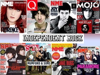
2. The masthead is
in the right hand
corner and
matches the bold
font and colour.
A graphic is
featured which
gives a hint of
something that
may be interesting
All of the group have an
angle of gaze in order
to interact and attract
the audience. Although
the front man of the
band is wearing aviator
glasses and the rest of
the members are
featured within the
background.
The text which gives the
reader an idea of the
contents of the magazine
is laid out across the
bottom half of the page
due to it being a group
shot. Therefore, the
planning and layout of
the text would have to be
thought carefully.
Incentives are
featured within the
magazine cover
such as “win Smith
Reissues Box sets”.
The two colours which
are featured for the
font is red and whit
The name of the
band is sprawled
across the bottom
half of the page.
The colour of the
text coincides with
the colour of the
magazines name
which immediately
stands out.
3. An image of
the band is in
the centre of
the contents
page which
attracts
immediate
attention
The page
numbers and
articles are all
listed in order
down the left
hand side of
the magazine
in bold red.
The Arctic Monkeys
spread is the main
article which is
prioritised within
the contents and
provides a
paragraph hinting
what is to come.
The contents title
stands out against
the name of the
band as the font and
colour are exactly
the opposite, so it
works well together.
The articles are put
into categories and
the theme of the
front cover has
remained consistent
throughout the
entire magazine.
The texts are categorised
and also colour
coordinated. Page
numbers are red, The title
is in white with a black
background.
This is a graphic
which advertises
and promotes gigs
and provides a
schedule.