The document summarizes the layout and design elements of a double page magazine spread about a famous rock band. Key elements include:
- The band's name appears in a bold, blue font in the bottom right corner to identify the subject and draw in fans at a glance.
- A sub-headline above the main article teases that the information will be about the band's "new sound of sacrifice."
- Black and white colors and a single column layout imply a simple, mature style befitting the indie/rock genre.
- The dominant band photo is positioned low key but uses professional lighting to enhance the members' faces and attract both male and female readers.
- Informal language with
How to Make a Field invisible in Odoo 17Celine George
It is possible to hide or invisible some fields in odoo. Commonly using “invisible” attribute in the field definition to invisible the fields. This slide will show how to make a field invisible in odoo 17.
The Art Pastor's Guide to Sabbath | Steve ThomasonSteve Thomason
What is the purpose of the Sabbath Law in the Torah. It is interesting to compare how the context of the law shifts from Exodus to Deuteronomy. Who gets to rest, and why?
Instructions for Submissions thorugh G- Classroom.pptxJheel Barad
This presentation provides a briefing on how to upload submissions and documents in Google Classroom. It was prepared as part of an orientation for new Sainik School in-service teacher trainees. As a training officer, my goal is to ensure that you are comfortable and proficient with this essential tool for managing assignments and fostering student engagement.
How to Split Bills in the Odoo 17 POS ModuleCeline George
Bills have a main role in point of sale procedure. It will help to track sales, handling payments and giving receipts to customers. Bill splitting also has an important role in POS. For example, If some friends come together for dinner and if they want to divide the bill then it is possible by POS bill splitting. This slide will show how to split bills in odoo 17 POS.
We all have good and bad thoughts from time to time and situation to situation. We are bombarded daily with spiraling thoughts(both negative and positive) creating all-consuming feel , making us difficult to manage with associated suffering. Good thoughts are like our Mob Signal (Positive thought) amidst noise(negative thought) in the atmosphere. Negative thoughts like noise outweigh positive thoughts. These thoughts often create unwanted confusion, trouble, stress and frustration in our mind as well as chaos in our physical world. Negative thoughts are also known as “distorted thinking”.
Welcome to TechSoup New Member Orientation and Q&A (May 2024).pdfTechSoup
In this webinar you will learn how your organization can access TechSoup's wide variety of product discount and donation programs. From hardware to software, we'll give you a tour of the tools available to help your nonprofit with productivity, collaboration, financial management, donor tracking, security, and more.
Synthetic Fiber Construction in lab .pptxPavel ( NSTU)
Synthetic fiber production is a fascinating and complex field that blends chemistry, engineering, and environmental science. By understanding these aspects, students can gain a comprehensive view of synthetic fiber production, its impact on society and the environment, and the potential for future innovations. Synthetic fibers play a crucial role in modern society, impacting various aspects of daily life, industry, and the environment. ynthetic fibers are integral to modern life, offering a range of benefits from cost-effectiveness and versatility to innovative applications and performance characteristics. While they pose environmental challenges, ongoing research and development aim to create more sustainable and eco-friendly alternatives. Understanding the importance of synthetic fibers helps in appreciating their role in the economy, industry, and daily life, while also emphasizing the need for sustainable practices and innovation.
CLASS 11 CBSE B.St Project AIDS TO TRADE - INSURANCE
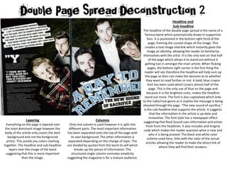
Dps 1
1. Headline and
Sub-headline
The headline of the double page spread is the name of a
famous band which automatically draws in supportive
fans. It is positioned in the bottom right third of the
page, framing the curved shape of the image. This
creates a text image interlink which instantly gives the
image an identity, allowing the reader to familiarize
themselves with the artist. It is the only text on that half
of the page which allows it to stand out without it
getting lost in amongst the main article. When flicking
pages, the bottom right corner is the first thing the
reader will see therefore the headline will help sum up
the page so then can make the decision as to whether
they want to read further or not. A bold, blue crayon
font has been used which covers almost half of the
page. This is the only use of blue on the page and
because it is the brightest color, makes the headline
stand out more. The font is also capitalized which links
to the indie/rock genre as it implies the message is being
shouted through the page. “The new sound of sacrifice,”
is the sub-headline that supports the article. It suggests
that the information in the article is up-date and
innovative. The font style has a newspaper effect
suggesting that Rock Sound uses information and artists
fresh from the headlines. It also includes and enigma
code which makes the reader question what is new and
why it is being praised. The black and white color
scheme used here, links with the color of the actual
articles allowing the reader to make the direct link of
where they will find their answers.
Layering
Everything on the page is layered over
the main dominant image however the
body of the article only covers the dark
background and not the foreground
artists. This avoids any colors clashing
together. The headline and sub-headline
layers over the image of the band
suggesting that this is more important
than the image.
Columns
Only one column is used however it is split into
different parts. The most important information
has been separated onto the top of the page with
its own background. The other information is
separated depending on the change of topic. The
are divided by quotes from the band its self which
breaks up the pieces of information. The
structured single column connotes simplicity
suggesting the magazine is for a mature audience.
2. Color Scheme
The predominant colors
of the page are black and
white which links directly
to the indie/rock genre
that is often associated
with darkness and uses
little color. The only color
is blue which suggests
that the article is mainly
aimed towards a male
audience.
Images
The dominant image is a photograph of the band “A
Day to Remember.” This is the only image that is used
on the page suggesting that it is just the band itself
that is important. The location of the image so low
key but high key professional lighting has been used
to enhance the band members faces. The images are
of males which could attract female attention
however the facial expressions are quite comical. This
could be so that the magazine can appeal to males
who don’t take things to seriously and just want to
read the article. The celebrity figures introduce the
idea of star power and increase the amount of
audience attention. The right hand side of the page is
image led and the left is text led. The page as a whole
is image led because it overlaps across the middle and
takes up the majority of the page. The image assumes
the point of view of the artists as if they are talking
directly to the audience. It uses direct address and
eye contact to make the audience feel involved and a
part of the bands story.
Language
The size of the font varies within the article. The main body of the article uses lowercase 11 size font. It includes a large bold
drop cap to clearly show the start of the main article. One of the key quotes that are from a specific and famous individual is
used in bigger lettering to stand out more. It uses a range of punctuation including exclamation marks, questions marks,
colons, commas and speech marks. Screamers such as “NOT THIS COOL!” and “FUCKED UP!” create a more intense and
dramatic atmosphere which makes the article seem more exciting and interesting. The language is mainly colloquial and uses
informal slang. For instance, the use of “okay” and “whatever you want” are very laid back phrases creating a relaxed tone.
Taboo slang words such as “fucked” are used which suggests it is aimed at a higher target audience. It also suggests the
theme of the article is more mature. Taboo language is very common in rock sounds therefore the article can reflect the
lyrics of songs that readers enjoy. Words such as “you” make the reader feel directly involved and part of the story. This
effect is supported with rhetorical questions such as “right” which allows the reader to process their own opinion instead of
just reading facts. Humor is used in the article for instance “considering the whole album is about sausage.” This can have
multiple meanings that only a mature reader would understand and find humorous. “Just like when you’re on the bus and
listening to tunes@ makes the magazine universal so that the reader can relate to the artists and the distance between
celebrities and the reader is shortened.