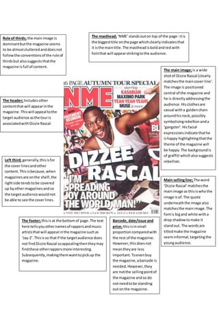
The masthead; ‘NME’ stands out on top of the page- it is 
the biggest title on the page which clearly indicates that 
it is the main title. The masthead is bold and red with 
font that will appear striking to the audience. 
The main image; is a wide 
shot of Dizzie Rascal (clearly 
matches the main cover line’. 
The image is positioned 
central of the magazine and 
he is directly addressing the 
audience. His clothes are 
casual with a golden chain 
around his neck, possibly 
symbolising rebellion and a 
‘gangster’. His facial 
expressions indicate that he 
is happy highlighting that the 
theme of the magazine will 
be happy. The background is 
of graffiti which also suggests 
rebellion. 
Barcode, date/issue and 
price; this is in small 
proportion compared with 
the rest of the magazine. 
However, this does not 
mean they are less 
important. To even buy 
the magazine, a barcode is 
needed. However, they 
are not the selling point of 
the magazine and so do 
not need to be standing 
out on the magazine. 
Rule of thirds; the main image is 
dominant but the magazine seems 
to be almost cluttered and does not 
follow the conventions of the rule of 
thirds but also suggests that the 
magazine is full of content. 
The header; Includes other 
content that will appear in the 
magazine. This will appeal to the 
target audience as the tour is 
associated with Dizzie Rascal. 
Left third; generally, this is for 
the cover lines and other 
content. This is because, when 
magazines are on the shelf, the 
right side tends to be covered 
up by other magazines and so 
the target audience would not 
be able to see the cover lines. 
Main selling line; The word 
‘Dizzie Rascal’ matches the 
main image as this is who the 
image is of. The quote 
underneath the image also 
matches the main image. The 
font is big and white with a 
drop shadow to make it 
stand out. The words are 
titled make the magazine 
seem informal, targeting the 
young audience. 
The footer; this is at the bottom of page. The text 
here tells you other names of rappers and music 
artists that will appear in the magazine such as 
‘Jay-Z’. This is so that if the target audience does 
not find Dizzie Rascal so appealing then they may 
find these other rappers more interesting. 
Subsequently, making them want to pick up the 
magazine.

Nme dizziee rascal-

  • 1.
    The masthead; ‘NME’stands out on top of the page- it is the biggest title on the page which clearly indicates that it is the main title. The masthead is bold and red with font that will appear striking to the audience. The main image; is a wide shot of Dizzie Rascal (clearly matches the main cover line’. The image is positioned central of the magazine and he is directly addressing the audience. His clothes are casual with a golden chain around his neck, possibly symbolising rebellion and a ‘gangster’. His facial expressions indicate that he is happy highlighting that the theme of the magazine will be happy. The background is of graffiti which also suggests rebellion. Barcode, date/issue and price; this is in small proportion compared with the rest of the magazine. However, this does not mean they are less important. To even buy the magazine, a barcode is needed. However, they are not the selling point of the magazine and so do not need to be standing out on the magazine. Rule of thirds; the main image is dominant but the magazine seems to be almost cluttered and does not follow the conventions of the rule of thirds but also suggests that the magazine is full of content. The header; Includes other content that will appear in the magazine. This will appeal to the target audience as the tour is associated with Dizzie Rascal. Left third; generally, this is for the cover lines and other content. This is because, when magazines are on the shelf, the right side tends to be covered up by other magazines and so the target audience would not be able to see the cover lines. Main selling line; The word ‘Dizzie Rascal’ matches the main image as this is who the image is of. The quote underneath the image also matches the main image. The font is big and white with a drop shadow to make it stand out. The words are titled make the magazine seem informal, targeting the young audience. The footer; this is at the bottom of page. The text here tells you other names of rappers and music artists that will appear in the magazine such as ‘Jay-Z’. This is so that if the target audience does not find Dizzie Rascal so appealing then they may find these other rappers more interesting. Subsequently, making them want to pick up the magazine.