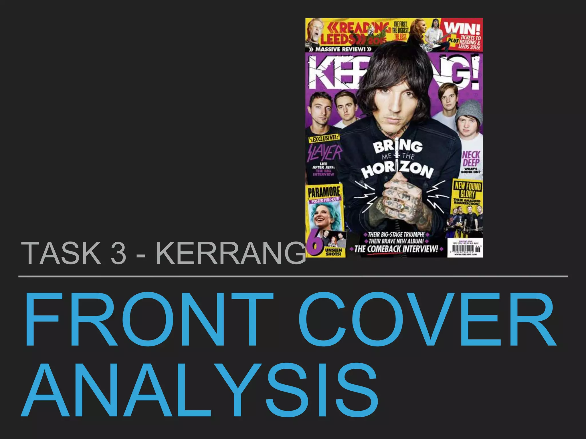
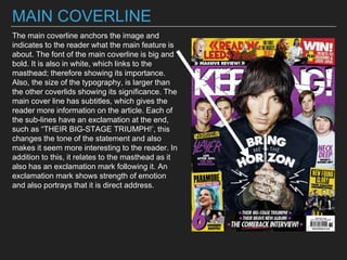
- The document analyzes the front cover of the magazine "KERRANG!"
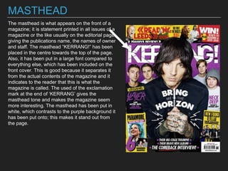
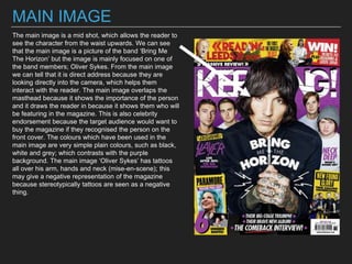
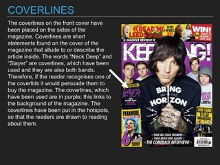
- The main elements analyzed include the masthead, main image of Oliver Sykes from Bring Me The Horizon, coverlines advertising bands Neck Deep and Slayer, and a main coverline about Bring Me The Horizon with subtitles.
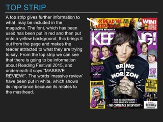
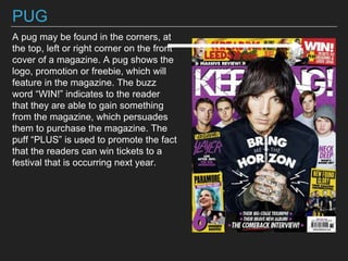
- Additional elements discussed are buzz words, barcode/price information, a color scheme of purple, white, black and yellow, and a top strip advertising a review of Reading Festival 2015.


![Location recce]](https://cdn.slidesharecdn.com/ss_thumbnails/locationrecce-161011164627-thumbnail.jpg?width=640&height=640&fit=bounds)


