
More Related Content
What's hot
What's hot (18)
Viewers also liked
Viewers also liked (20)
Similar to Smash hits linking the 3 parts of the magazine together.-
Similar to Smash hits linking the 3 parts of the magazine together.- (20)
More from asmediad14
More from asmediad14 (20)
Recently uploaded
Recently uploaded (20)
Smash hits linking the 3 parts of the magazine together.-
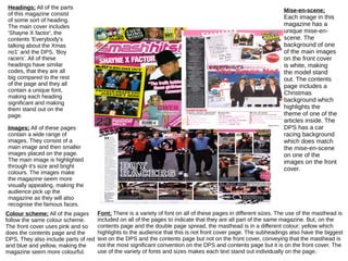
- 1. Headings; All of the parts of this magazine consist of some sort of heading. The main cover includes 'Shayne X factor', the contents 'Everybody's talking about the Xmas no1' and the DPS, 'Boy racers'. All of these headings have similar codes, that they are all big compared to the rest of the page and they all contain a unique font, making each heading significant and making them stand out on the page. Images; All of these pages contain a wide range of images. They consist of a main image and then smaller images placed on the page. The main image is highlighted through it's size and bright colours. The images make the magazine seem more visually appealing, making the audience pick up the magazine as they will also recognise the famous faces. Colour scheme; All of the pages follow the same colour scheme. The front cover uses pink and so does the contents page and the DPS. They also include parts of red and blue and yellow, making the magazine seem more colourful. Mise-en-scene; Each image in this magazine has a unique mise-en-scene. The background of one of the main images on the front cover is white, making the model stand out. The contents page includes a Christmas background which highlights the theme of one of the articles inside. The DPS has a car racing background which does match the mise-en-scene on one of the images on the front cover. Font; There is a variety of font on all of these pages in different sizes. The use of the masthead is included on all of the pages to indicate that they are all part of the same magazine. But, on the contents page and the double page spread, the masthead is in a different colour; yellow which highlights to the audience that this is not front cover page. The subheadings also have the biggest text on the DPS and the contents page but not on the front cover, conveying that the masthead is not the most significant convention on the DPS and contents page but it is on the front cover. The use of the variety of fonts and sizes makes each text stand out individually on the page.