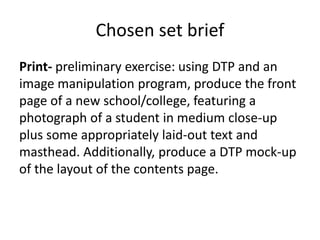
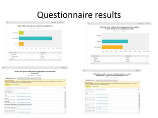
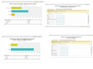
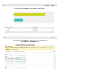
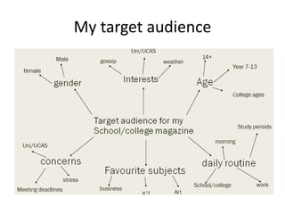
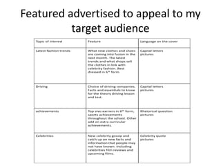
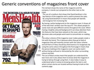
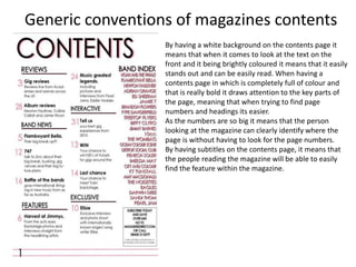
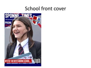
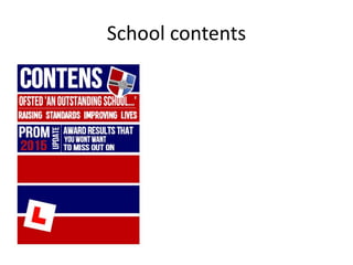
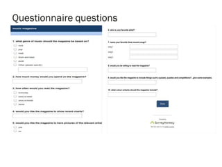
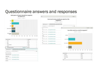
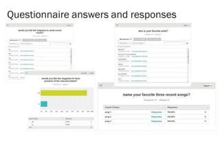
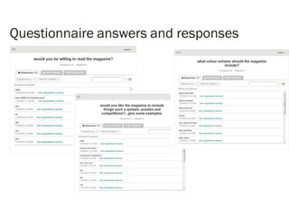
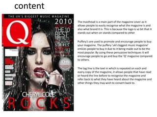
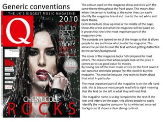
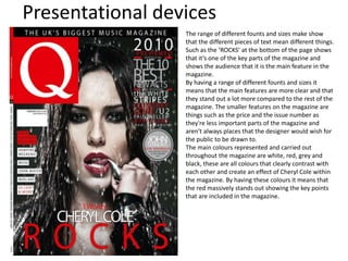
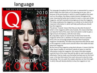
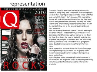
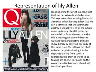
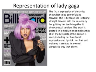
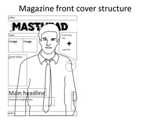
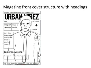
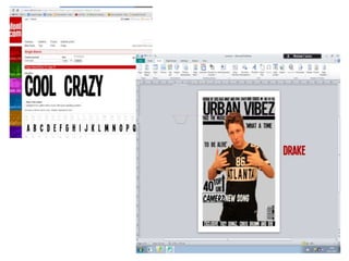
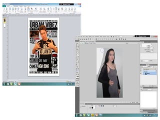
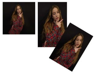
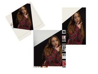
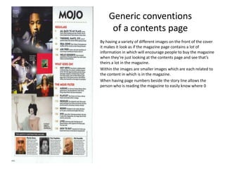
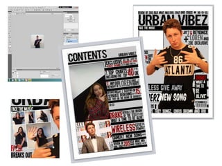
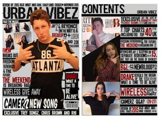
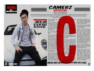
G321: Foundation Portfolio in
media
Farren Marlow
Candidate number: 2116
Centre number: 27258
Prelim task
Chosen set brief
Print- preliminary exercise: using DTP and an
image manipulation program, produce the front
page of a new school/college, featuring a
photograph of a student in medium close-up
plus some appropriately laid-out text and
masthead. Additionally, produce a DTP mock-up
of the layout of the contents page.
Prelim questionnaire
Questionnaire results
My target audience
Featured advertised to appeal to my
target audience
Topic of interest Feature Language on the cover
Latest fashion trends What new clothes and shoes
are coming into fusion in the
next month. The latest
trends and what shops sell
the clothes in link with
celebrity fashion. Best
dressed in 6th form.
Capital letters
pictures
Driving Choice of driving companies.
Facts and essentials to know
for the theory driving lesson
and test.
Capital letters
pictures
achievements Top vivo earners in 6th form,
sports achievements
throughout the school. Other
add on extra curricular
achievements.
Rhetorical question
pictures
Celebrities New celebrity gossip and
catch up on new facts and
information that people may
not have known. Including
celebrities film reviews and
upcoming films.
Celebrity quote
pictures
The red text shows the name of the magazine and the
company. It stands out compared to the other text on the
cover.
The use of a medium shot shows that David beckham is the
key feature of the magazine and is used to prevent the sales.
By using David beckham it means that people will identify
and recognise him increasing the
By having a white background on the magazine cover, it shows all
of the text that’s written over the top of it. This allows people to
easily read and spot different stories throughout the cover. When
having a brightly coloured background it can draw attention from
the features that have been placed on the cover, which may
decrease sales and people wont want to concentrate on reading
it.
The colour scheme of the magazine cover makes people create a
link with the brand. This is because when they go to look at
magazines they will instantly connect with the colour scheme
and will feel as if they should buy that brand as its recognised. By
using the same colours throughout the front page it means that
the person looking at the magazine cover can easily read it
without being confused or distracted by the other surrounding
colours and text.
The use of black arrows mean that people can understand the
text more and it also allows them to know what the magazine it
trying to betray through using them. It also makes it easy to
understand when it comes to knowing where the text is and
where certain stories are located without having to look on the
contents page.
Generic conventions of magazines front cover
Generic conventions of magazines contents
By having a white background on the contents page it
means that when it comes to look at the text on the
front and it being brightly coloured it means that it easily
stands out and can be easily read. When having a
contents page in which is completely full of colour and
that is really bold it draws attention to the key parts of
the page, meaning that when trying to find page
numbers and headings its easier.
As the numbers are so big it means that the person
looking at the magazine can clearly identify where the
page is without having to look for the page numbers.
By having subtitles on the contents page, it means that
the people reading the magazine will be able to easily
find the feature within the magazine.
Success criteria
• Need to have rhetorical/catchy questions, to engage the magazine
audience.
• Good colour scheme throughout the magazine making sure it the same
throughout.
• Consistent font throughout the magazine meaning that it all matches
with the rest of the magazine over all.
• Making sure its not too over crowded stick to four colours max
• Edited out the background accurately, making sure the photos of a good
quality allowing it to draw more attention and look professional
• The headings and titles stand out by using bold and strongly coloured
fonts.
• The lighting of the photo should be of a good standard meaning that
when looking at the photo the model stands out compared to the rest of
the magazine and the title on there.
• The heading should be the part of the magazine that stand out the most
so it must be bold and eye catching compared to the other titles on the
page.
Prelim task
School magazine cover
School front cover
School contents
Music magazine
Main coursework
content
The masthead is a main part of the magazine cover as it
allows people to easily recognise what the magazine is and
also what brand it is. This is because the logo is so bit that it
stands out when on stands compared to other
Puffery's are used to promote and encourage people to buy
your magazine. The puffery ‘uk’s biggest music magazine’
entices people to buy it due to it being made out to be the
most popular. By using these persuasive techniques it will
encourage people to go and buy the ‘Q’ magazine compared
to others.
The tag line is the text in which is repeated on each and
every copy of the magazine, it allows people that have read
or heard the line before to recognise the magazine and
refer back to what they have heard about the magazine and
other things they may wish to convert back to.
Generic conventions
Central medium close up shot in the middle of the page,
shows the artist and what the magazine will be based on.
It proves that she's the most important part of the
magazine cover.
The contents are layered on to of the image so that it allows
people to see and know what inside the magazine. This
allows the person to read the text without getting distracted
by the person/background.
The colours used on the magazine show and stick with the
same theme throughout the front cover. This means that
when the person is looking at the cover they can easily
identify the magazine brand and due to the red white and
black theme.
By having one of the main music artists on the front cover it
can convince and make people feel the need to buy the
magazine. This may be because they want to know about
that artist in particular
The cover of the magazine looks full compared to most
others. This means that when people look at the price it
comes across as good value for money.
The most important part of the magazine is on the left hand
side. this is because most people read left to right meaning
that the text on the left is what they will read first.
The magazine name is so big compared to the rest of the
text and letters on the page. this allows people to easily
identify the magazine company. As its white text on a red
background it shows a clear strong contrast.
Presentational devices
The range of different founts and sizes make show
that the different pieces of text mean different things.
Such as the ‘ROCKS’ at the bottom of the page shows
that it’s one of the key parts of the magazine and
shows the audience that it is the main feature in the
magazine.
By having a range of different founts and sizes it
means that the main features are more clear and that
they stand out a lot more compared to the rest of the
magazine. The smaller features on the magazine are
things such as the price and the issue number as
they're less important parts of the magazine and
aren't always places that the designer would wish for
the public to be drawn to.
The main colours represented and carried out
throughout the magazine are white, red, grey and
black, these are all colours that clearly contrast with
each other and create an effect of Cheryl Cole within
the magazine. By having these colours it means that
the red massively stands out showing the key points
that are included in the magazine.
language
The language throughout the front cover is represented in a way in
which makes the cover look as if its shouting out at you. this is
because of the punctuation in which is used throughout the cover
such as; the ellipse, the ellipse creates tension throughout the
cover meaning that what you’re about to read is a main part of the
magazine, and will massively encourage you to buy the magazine.
This helps emphasise the magazine as a whole as its clearly full of
important information in which will help justify why you should
buy the magazine.
The phrase ‘3 words' means that they can describe the best of
what's in the magazine within only 3 words, this means that they
can keep the front of the cover short and sweet in order to give a
high amount of emphasis, with the main story.
By using dates it gives an overall view of what time frame the
magazine will be set in, whether it’s the past, future or present
tense, this can encourage people decisions when buying the
magazine considerably. The dates may show that what will be read
in the magazine is really recent and will inform the reader the best
about the magazine.
By the front of the magazine using short phrases, it means that the
cover doesn’t waffle on and there’s plenty of space to read the
information inside the magazine, this means that when people
read the front of the cover they will be able to read it quickly and
effectively. They’ve made sure that what has been put on the front
cover is the key information from each story and is also the most
interesting. This is to catch the readers attention at their first sight
in which they will decide whether to buy the magazine or not.
representation
Costume: Cheryl is wearing a leather jacket which is
shown as being very ‘bad’. This means that when people
see that she's wearing all black they’ll be linked with that
idea and will feel as if she's changed. This means that
people will look at the magazine and feel like they need
to read it to get the latest on Cheryl and why she looks
so different. The leather jacket shows that she's in with
the trends linking her to the general public and what
they also wear.
Hair and make up: the make up that Cheryl is wearing in
the photo shows a wet styled look, it looks as if she's
been soaked and her make-up had started to run down
her face. This shows the type of ‘bad girl’ look that the
magazine are going for. It connects with the main story
allowing people to have a feel of what its going to be
about due to the representation of her on the front
cover.
Facial expression: by the artist on the front of the page
sticking her tongue out it makes the magazine seem
more interesting as the artist isn’t just staring with a
bland boring face.
Pose: the pose allows more people to be interested in
the artist and the magazine. This is due to the pose being
stimulating and different compared to other similar
products.
Representation of lily Allen
By positioning the artist in a long shot
it allows her whole body to be seen.
This represents her as being lively and
also sexy. When looking at her face we
can clearly see that she is trying to
portray a seductive feel. as the artists
make up is very bland it shows her
vulnerability. From the costume that
she is wearing we can tell that she
wants to look provocative and also
show dignity by covering her body at
the same time. This allows the photo
to be less explicit allowing it to be
displayed on the front cover. It
represents the artist as trying to be
teasing are daring. For props on the
cover the artist has been placed with
two black panthers.
The facial expression of the artist
shows her to be powerful and
forward. This is because she is staring
straight forward into the camera.by
her gritting her teeth together it
shows sexual tension. The artist is
photo'd in a medium shot means that
all of the key parts of the person is
seen, including her hair, facial
expression and lipstick. Her hair and
make up is created in a weird
unrealistic way that allows
Representation of lady gaga
Magazine front cover structure
Magazine front cover structure with headings
Generic conventions
of a contents page
By having a variety of different images on the front of the cover
it makes it look as if the magazine page contains a lot of
information in which will encourage people to buy the magazine
when they’re just looking at the contents page and see that’s
theirs a lot in the magazine.
Within the images are smaller images which are each related to
the content in which is in the magazine.
When having page numbers beside the story line allows the
person who is reading the magazine to easily know where 0
Tools
Coursework

Coursework

  • 1.
    G321: Foundation Portfolioin media Farren Marlow Candidate number: 2116 Centre number: 27258
  • 2.
  • 3.
    Chosen set brief Print-preliminary exercise: using DTP and an image manipulation program, produce the front page of a new school/college, featuring a photograph of a student in medium close-up plus some appropriately laid-out text and masthead. Additionally, produce a DTP mock-up of the layout of the contents page.
  • 4.
  • 5.
  • 8.
  • 9.
    Featured advertised toappeal to my target audience Topic of interest Feature Language on the cover Latest fashion trends What new clothes and shoes are coming into fusion in the next month. The latest trends and what shops sell the clothes in link with celebrity fashion. Best dressed in 6th form. Capital letters pictures Driving Choice of driving companies. Facts and essentials to know for the theory driving lesson and test. Capital letters pictures achievements Top vivo earners in 6th form, sports achievements throughout the school. Other add on extra curricular achievements. Rhetorical question pictures Celebrities New celebrity gossip and catch up on new facts and information that people may not have known. Including celebrities film reviews and upcoming films. Celebrity quote pictures
  • 10.
    The red textshows the name of the magazine and the company. It stands out compared to the other text on the cover. The use of a medium shot shows that David beckham is the key feature of the magazine and is used to prevent the sales. By using David beckham it means that people will identify and recognise him increasing the By having a white background on the magazine cover, it shows all of the text that’s written over the top of it. This allows people to easily read and spot different stories throughout the cover. When having a brightly coloured background it can draw attention from the features that have been placed on the cover, which may decrease sales and people wont want to concentrate on reading it. The colour scheme of the magazine cover makes people create a link with the brand. This is because when they go to look at magazines they will instantly connect with the colour scheme and will feel as if they should buy that brand as its recognised. By using the same colours throughout the front page it means that the person looking at the magazine cover can easily read it without being confused or distracted by the other surrounding colours and text. The use of black arrows mean that people can understand the text more and it also allows them to know what the magazine it trying to betray through using them. It also makes it easy to understand when it comes to knowing where the text is and where certain stories are located without having to look on the contents page. Generic conventions of magazines front cover
  • 11.
    Generic conventions ofmagazines contents By having a white background on the contents page it means that when it comes to look at the text on the front and it being brightly coloured it means that it easily stands out and can be easily read. When having a contents page in which is completely full of colour and that is really bold it draws attention to the key parts of the page, meaning that when trying to find page numbers and headings its easier. As the numbers are so big it means that the person looking at the magazine can clearly identify where the page is without having to look for the page numbers. By having subtitles on the contents page, it means that the people reading the magazine will be able to easily find the feature within the magazine.
  • 12.
    Success criteria • Needto have rhetorical/catchy questions, to engage the magazine audience. • Good colour scheme throughout the magazine making sure it the same throughout. • Consistent font throughout the magazine meaning that it all matches with the rest of the magazine over all. • Making sure its not too over crowded stick to four colours max • Edited out the background accurately, making sure the photos of a good quality allowing it to draw more attention and look professional • The headings and titles stand out by using bold and strongly coloured fonts. • The lighting of the photo should be of a good standard meaning that when looking at the photo the model stands out compared to the rest of the magazine and the title on there. • The heading should be the part of the magazine that stand out the most so it must be bold and eye catching compared to the other titles on the page.
  • 13.
  • 14.
  • 15.
  • 16.
  • 21.
    content The masthead isa main part of the magazine cover as it allows people to easily recognise what the magazine is and also what brand it is. This is because the logo is so bit that it stands out when on stands compared to other Puffery's are used to promote and encourage people to buy your magazine. The puffery ‘uk’s biggest music magazine’ entices people to buy it due to it being made out to be the most popular. By using these persuasive techniques it will encourage people to go and buy the ‘Q’ magazine compared to others. The tag line is the text in which is repeated on each and every copy of the magazine, it allows people that have read or heard the line before to recognise the magazine and refer back to what they have heard about the magazine and other things they may wish to convert back to.
  • 22.
    Generic conventions Central mediumclose up shot in the middle of the page, shows the artist and what the magazine will be based on. It proves that she's the most important part of the magazine cover. The contents are layered on to of the image so that it allows people to see and know what inside the magazine. This allows the person to read the text without getting distracted by the person/background. The colours used on the magazine show and stick with the same theme throughout the front cover. This means that when the person is looking at the cover they can easily identify the magazine brand and due to the red white and black theme. By having one of the main music artists on the front cover it can convince and make people feel the need to buy the magazine. This may be because they want to know about that artist in particular The cover of the magazine looks full compared to most others. This means that when people look at the price it comes across as good value for money. The most important part of the magazine is on the left hand side. this is because most people read left to right meaning that the text on the left is what they will read first. The magazine name is so big compared to the rest of the text and letters on the page. this allows people to easily identify the magazine company. As its white text on a red background it shows a clear strong contrast.
  • 23.
    Presentational devices The rangeof different founts and sizes make show that the different pieces of text mean different things. Such as the ‘ROCKS’ at the bottom of the page shows that it’s one of the key parts of the magazine and shows the audience that it is the main feature in the magazine. By having a range of different founts and sizes it means that the main features are more clear and that they stand out a lot more compared to the rest of the magazine. The smaller features on the magazine are things such as the price and the issue number as they're less important parts of the magazine and aren't always places that the designer would wish for the public to be drawn to. The main colours represented and carried out throughout the magazine are white, red, grey and black, these are all colours that clearly contrast with each other and create an effect of Cheryl Cole within the magazine. By having these colours it means that the red massively stands out showing the key points that are included in the magazine.
  • 24.
    language The language throughoutthe front cover is represented in a way in which makes the cover look as if its shouting out at you. this is because of the punctuation in which is used throughout the cover such as; the ellipse, the ellipse creates tension throughout the cover meaning that what you’re about to read is a main part of the magazine, and will massively encourage you to buy the magazine. This helps emphasise the magazine as a whole as its clearly full of important information in which will help justify why you should buy the magazine. The phrase ‘3 words' means that they can describe the best of what's in the magazine within only 3 words, this means that they can keep the front of the cover short and sweet in order to give a high amount of emphasis, with the main story. By using dates it gives an overall view of what time frame the magazine will be set in, whether it’s the past, future or present tense, this can encourage people decisions when buying the magazine considerably. The dates may show that what will be read in the magazine is really recent and will inform the reader the best about the magazine. By the front of the magazine using short phrases, it means that the cover doesn’t waffle on and there’s plenty of space to read the information inside the magazine, this means that when people read the front of the cover they will be able to read it quickly and effectively. They’ve made sure that what has been put on the front cover is the key information from each story and is also the most interesting. This is to catch the readers attention at their first sight in which they will decide whether to buy the magazine or not.
  • 25.
    representation Costume: Cheryl iswearing a leather jacket which is shown as being very ‘bad’. This means that when people see that she's wearing all black they’ll be linked with that idea and will feel as if she's changed. This means that people will look at the magazine and feel like they need to read it to get the latest on Cheryl and why she looks so different. The leather jacket shows that she's in with the trends linking her to the general public and what they also wear. Hair and make up: the make up that Cheryl is wearing in the photo shows a wet styled look, it looks as if she's been soaked and her make-up had started to run down her face. This shows the type of ‘bad girl’ look that the magazine are going for. It connects with the main story allowing people to have a feel of what its going to be about due to the representation of her on the front cover. Facial expression: by the artist on the front of the page sticking her tongue out it makes the magazine seem more interesting as the artist isn’t just staring with a bland boring face. Pose: the pose allows more people to be interested in the artist and the magazine. This is due to the pose being stimulating and different compared to other similar products.
  • 26.
    Representation of lilyAllen By positioning the artist in a long shot it allows her whole body to be seen. This represents her as being lively and also sexy. When looking at her face we can clearly see that she is trying to portray a seductive feel. as the artists make up is very bland it shows her vulnerability. From the costume that she is wearing we can tell that she wants to look provocative and also show dignity by covering her body at the same time. This allows the photo to be less explicit allowing it to be displayed on the front cover. It represents the artist as trying to be teasing are daring. For props on the cover the artist has been placed with two black panthers.
  • 27.
    The facial expressionof the artist shows her to be powerful and forward. This is because she is staring straight forward into the camera.by her gritting her teeth together it shows sexual tension. The artist is photo'd in a medium shot means that all of the key parts of the person is seen, including her hair, facial expression and lipstick. Her hair and make up is created in a weird unrealistic way that allows Representation of lady gaga
  • 29.
  • 30.
    Magazine front coverstructure with headings
  • 37.
    Generic conventions of acontents page By having a variety of different images on the front of the cover it makes it look as if the magazine page contains a lot of information in which will encourage people to buy the magazine when they’re just looking at the contents page and see that’s theirs a lot in the magazine. Within the images are smaller images which are each related to the content in which is in the magazine. When having page numbers beside the story line allows the person who is reading the magazine to easily know where 0
  • 42.