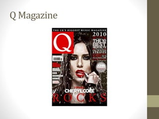
2. The Masthead on this particular magazine is a single letter,
‘Q’ this is because this is the publisher of this magazine. The
‘Q’ which is at the top left is very big in comparison to all the
other lettering that is included on this front cover. The
reason why I think the publisher has made the ‘Q’ like that is
because they want the audience to see what publisher it is
immediately
The barcode on magazines are usually
situated on either the bottom right hand
corner or left hand corner, but as you can see
with this magazine front cover, the barcode
is located beneath the large ‘Q’ logo.
Barcodes must be included on a magazine
front cover as it is illegal to not include one.
The main image on this front cover is a
medium close up of a female singer, as
previously mentioned, the colour scheme is
also used replicated in the image, the
female model stands out against the dark
background. The model is also looking at
the camera lens that has taken the image
of her, this makes it look like the model is
looking at us, this makes the magazine
cover even more effective.
3. There are multiple cover lines on this
particular magazine, the majority cover lines
are on the right side of the front cover. The
cover lines included on this magazine are also
included to give the audience an extra insight
on what this particular magazine includes
inside, this is another technique used to attract
consumers into buying a particular magazine.
when looking at the colours
used on this front cover, the
colours mainly used are black,
red and white, the white and
red stand out against the black
background making them a lot
more obvious and more
effective.