SlideShare a Scribd company logo
1 of 3
A skyline/ banner has been featured at the top of the magazine to make the
reader aware of the other content featured within the magazine as well as
the other main articles advertised.

The clear masthead links in this colour
scheme and the rest of the colour lines,
making the magazine appear more
professional.
Also the wording of ‘Mix Mag’ could be
referred to an informal type of British
magazine so attracting a teenage
audience.
The name of the artist acts as a
main subheading; his music relating to the
type of genre being discussed as well as
informing the reader Calvin Harris is likely
to be discussed.
Cover lines have been used in a slant
format to attract the reader into finding
out what else is in the magazine, the way
the text is positioned makes the magazine
appear more edgy and modern.

The use of the plus symbol gives the reader
the impression there's more to see in the
magazine, this allows the magazine to let its
readers know it has more to offer than
others of its genre.

The medium close up being featured behind
the title is the main focus of the magazine, as
well as it being positioned to the side so more
cover lines and information can fit onto the
page easily.
The costume of a plain white suit with dark
sunglasses makes the celebrity more
appropriate for the magazine, his body
blending in with the background and face
becoming more prominent. The yellow
t-shirt used also allows the body to stand out
against the white suit jacket, as this doesn't
match the theme of the front cover it equates
to the magazine standing out more.
The expression of the celebrity used gives the
magazine a more serious look, making the
magazine more professional.
Following this, the lighting used within the
image is bright making the celebrity more
bold with his features becoming more
clearer.
The main focus behind the magazines front
cover is Calvin Harris; this has been included
as his work is well known on a global scale,
making the magazine more likely to be sold as
the teenage age range will recognise it and be
more inclined into buying the magazine.

The background filler of the word
‘WIN’ entices the reader to read
about the competitions available in
the magazine.

The colours featured from the cover lines
match the theme presented on the front,
demonstrating the clear use of mis en scene
within the layout of the front cover.
The words used here have been formatted within brackets, this
is so that the information stands out and looks unique without
taking the main focus away from the celebrity and main
coverlines.

Price, date and barcode. Essential
conventions of a front cover
magazine.
A skyline has been inserted to the page to
make the reader aware of the content
featured as well as the main articles
within the magazine.

A puff has been used so that the information
stands out against the background and also
enlightens the reader of the free objects
featured in the magazine, persuading them
to buy it.

Pricing along with publisher featured
next to the masthead, essential
conventions of a magazine front
cover.
Main image used is a medium long
shot, it is placed in front of the title
which is found in most magazines so
the image appears as the main focus.
The costumes used of the band are all
dark and black, this makes them stand
out against the bright writing featured,
as well as it matching the serious
manner presented on their
expressions. Limited props have been
used apart from the use of sunglasses
on the far right artist. Though, they
are all looking in different directions
instead of focusing on the camera,
this is to make each member of the
band unique within their own
appearance on the magazine.
The location of the photo is placed
outside with mountains in the
background, this will make the lighting
appear more clear as well as well as it
making the magazine look more
professional from it not having a solid
plain colour as its background.

Coverlines are essential convention of a
front cover, this shows the audience what
the articles will be about, giving them an
idea as to whether they would like to read
it.
Each title has been used with a white
background filler, this is to the attract the
audiences eye into reading the content.

A quotation has been used from an
interview from the band being
discussed, this acts as a coverline as
well as making the reader more likely
to read more within the article.
The use of the quotation makes the
reader more likely to read this
interview as they want to know more
of the stories told by the band
featured within the magazine.
The white writing used on top of
the black costume of the band
stands out well and catches the
readers eye, without this the
information would be overlooked.

Barcode and date of magazine,
essential conventions of a magazine.

This banner featured at the bottom of the page allows the reader to
see the other bands and artists featured within the magazine, this
shows how the magazine covers a variety of music types, appealing to
as many people as possible.
The main image has been used on the
right hand side, taking up the majority
of the front cover. This expresses how
Adele is the main focus of the
magazine so fans of her music are
more likely to read the magazine as
well as discovering more of what’s
inside.
The facial expression and clothing of
the artist suggest that it’s a more
formal and dramatic magazine, the
use of direct eye contact with the
reader also makes them feel more
involved with the magazine, making
them more likely too read it.

The name of the magazine is displayed on a red
strip, making this recognisable to its target
audience as its unique and acts as a logo for
the magazine,; the simplistic title with its bold
background makes this eye catching to readers.
This puff or flasher has been used on the
magazine to catch the readers eye away from the
main image, it gives additional information that
the reader may not have noticed, the use of
‘300th issue’ makes the magazine sound more
alluring and important, making its target
audience more likely to read it.

A quote from an interview with the
main artist has been pulled out and
used to act as a coverline, this
intrigues the reader to find out what
the interview entiles and makes
them more likely to read it.

The coverlines are set in the bottom left
hand side of the page, the bold serif font
makes the reader spot the names of the
famous artists first which makes them
more inclined to find out more, the colour
scheme matches the over all layout within
the magazine, making it appear more
modern and professional.

The barcode, date and price have all been included on
the front of the magazine, essential for the conventions
of a front cover page.

A banner has been inserted to the
bottom of the page, this normally
tells the reader of other information
available in the magazine, this can
either be exclusive interviews with
artists or competitions available.

Main cover line, the name of the artist
Adele has been capitalised to show
how she is the main focus throughout
the magazine, this expresses how the
magazine will feature multiple
interviews, pictures and more about
the specified artist.

More Related Content

What's hot (16)

textual analysis
textual analysis textual analysis
textual analysis
 
Ciara contents page analysis
Ciara contents page analysisCiara contents page analysis
Ciara contents page analysis
 
KERRANG! - Front Cover
KERRANG! - Front CoverKERRANG! - Front Cover
KERRANG! - Front Cover
 
Contents Page 'Top Of The Pops'.
Contents Page 'Top Of The Pops'.Contents Page 'Top Of The Pops'.
Contents Page 'Top Of The Pops'.
 
Contents Page Analysis- We Love Pop
Contents Page Analysis- We Love PopContents Page Analysis- We Love Pop
Contents Page Analysis- We Love Pop
 
Mojo
MojoMojo
Mojo
 
Screenshots of front cover
Screenshots of front coverScreenshots of front cover
Screenshots of front cover
 
Magazinecontentsanalyses
MagazinecontentsanalysesMagazinecontentsanalyses
Magazinecontentsanalyses
 
How did you attract your audience
How did you attract your audienceHow did you attract your audience
How did you attract your audience
 
Focus group home magazine
Focus group home magazineFocus group home magazine
Focus group home magazine
 
Analysing Music Magazines
Analysing Music MagazinesAnalysing Music Magazines
Analysing Music Magazines
 
Analysing Music Magazine
Analysing Music MagazineAnalysing Music Magazine
Analysing Music Magazine
 
NME analysis
NME analysisNME analysis
NME analysis
 
Mojo analysis
Mojo analysisMojo analysis
Mojo analysis
 
Q1
Q1Q1
Q1
 
Nme front cover analysis
Nme front cover analysisNme front cover analysis
Nme front cover analysis
 

Viewers also liked

Recommendation Letter from Prudential
Recommendation Letter from PrudentialRecommendation Letter from Prudential
Recommendation Letter from Prudential
di wu
 
Khalid High Contribution Appreciation Letter
Khalid High Contribution Appreciation LetterKhalid High Contribution Appreciation Letter
Khalid High Contribution Appreciation Letter
Khaled Gomaa
 
Otto Dix - Der Krieg
Otto Dix - Der KriegOtto Dix - Der Krieg
Otto Dix - Der Krieg
L2550
 
Certificate from Prudential
Certificate from PrudentialCertificate from Prudential
Certificate from Prudential
di wu
 
26b58b2a-711a-4db0-aacd-35f168105392-150606005653-lva1-app6891
26b58b2a-711a-4db0-aacd-35f168105392-150606005653-lva1-app689126b58b2a-711a-4db0-aacd-35f168105392-150606005653-lva1-app6891
26b58b2a-711a-4db0-aacd-35f168105392-150606005653-lva1-app6891
Megan Yuan
 
Language processor implementation using python
Language processor implementation using pythonLanguage processor implementation using python
Language processor implementation using python
Viktor Pyskunov
 

Viewers also liked (20)

Recommendation Letter from Prudential
Recommendation Letter from PrudentialRecommendation Letter from Prudential
Recommendation Letter from Prudential
 
Arbol genealógico
Arbol genealógico Arbol genealógico
Arbol genealógico
 
PowerPoint Certificate
PowerPoint CertificatePowerPoint Certificate
PowerPoint Certificate
 
Khalid High Contribution Appreciation Letter
Khalid High Contribution Appreciation LetterKhalid High Contribution Appreciation Letter
Khalid High Contribution Appreciation Letter
 
Holanda - Espetacular!!!
Holanda - Espetacular!!!Holanda - Espetacular!!!
Holanda - Espetacular!!!
 
קו למושב, גיליון 809 - 14/11/13
קו למושב, גיליון 809 - 14/11/13קו למושב, גיליון 809 - 14/11/13
קו למושב, גיליון 809 - 14/11/13
 
22 01 2014- Entrega de Becas Pronabes
22 01 2014- Entrega de Becas Pronabes22 01 2014- Entrega de Becas Pronabes
22 01 2014- Entrega de Becas Pronabes
 
Otto Dix - Der Krieg
Otto Dix - Der KriegOtto Dix - Der Krieg
Otto Dix - Der Krieg
 
Certificate from Prudential
Certificate from PrudentialCertificate from Prudential
Certificate from Prudential
 
Cellular Respiration WebQuest
Cellular Respiration WebQuestCellular Respiration WebQuest
Cellular Respiration WebQuest
 
Svinbio tests
Svinbio testsSvinbio tests
Svinbio tests
 
f/21 Quarterly Q4|2013
f/21 Quarterly Q4|2013f/21 Quarterly Q4|2013
f/21 Quarterly Q4|2013
 
Kgrafft-Ñoqanchis
Kgrafft-ÑoqanchisKgrafft-Ñoqanchis
Kgrafft-Ñoqanchis
 
TradeSmart Case Studies
TradeSmart Case StudiesTradeSmart Case Studies
TradeSmart Case Studies
 
26b58b2a-711a-4db0-aacd-35f168105392-150606005653-lva1-app6891
26b58b2a-711a-4db0-aacd-35f168105392-150606005653-lva1-app689126b58b2a-711a-4db0-aacd-35f168105392-150606005653-lva1-app6891
26b58b2a-711a-4db0-aacd-35f168105392-150606005653-lva1-app6891
 
Actividad 1 e.a.m.c
Actividad 1 e.a.m.cActividad 1 e.a.m.c
Actividad 1 e.a.m.c
 
Subitizing ppt a
Subitizing ppt aSubitizing ppt a
Subitizing ppt a
 
Berkley House Apartments
Berkley House ApartmentsBerkley House Apartments
Berkley House Apartments
 
Language processor implementation using python
Language processor implementation using pythonLanguage processor implementation using python
Language processor implementation using python
 
Mensagem alusiva 77 anos da Casa Militar de Presidência da República
Mensagem alusiva 77 anos da Casa Militar de Presidência da RepúblicaMensagem alusiva 77 anos da Casa Militar de Presidência da República
Mensagem alusiva 77 anos da Casa Militar de Presidência da República
 

Similar to Analaysius of front cover

Analysis of professional magazine front covers
Analysis of professional magazine front coversAnalysis of professional magazine front covers
Analysis of professional magazine front covers
deemplemorar16
 
Final evaluation presentation
Final evaluation presentationFinal evaluation presentation
Final evaluation presentation
Alfieweston
 
Pop music magazine
Pop music magazinePop music magazine
Pop music magazine
Klarasa098
 
Analysis of magazines
Analysis of magazinesAnalysis of magazines
Analysis of magazines
asmediag13
 

Similar to Analaysius of front cover (20)

Deconstruction of magazines
Deconstruction of magazinesDeconstruction of magazines
Deconstruction of magazines
 
Analysis of professional magazine front covers
Analysis of professional magazine front coversAnalysis of professional magazine front covers
Analysis of professional magazine front covers
 
Magazine analysis
Magazine analysisMagazine analysis
Magazine analysis
 
Magazine analysis - Cover Pages
Magazine analysis - Cover PagesMagazine analysis - Cover Pages
Magazine analysis - Cover Pages
 
Market research
Market researchMarket research
Market research
 
Final Magazine Annotated
Final Magazine AnnotatedFinal Magazine Annotated
Final Magazine Annotated
 
The Music Magazine Industry
The Music Magazine IndustryThe Music Magazine Industry
The Music Magazine Industry
 
media studies Magazine cover analysis
media studies Magazine cover analysis media studies Magazine cover analysis
media studies Magazine cover analysis
 
Textual Analysis
Textual AnalysisTextual Analysis
Textual Analysis
 
Magazine research really official [recovered]
Magazine research really official [recovered]Magazine research really official [recovered]
Magazine research really official [recovered]
 
Magazine research really official [recovered]
Magazine research really official [recovered]Magazine research really official [recovered]
Magazine research really official [recovered]
 
Magazine Cover Analysis
Magazine Cover AnalysisMagazine Cover Analysis
Magazine Cover Analysis
 
Media evaluation
Media evaluationMedia evaluation
Media evaluation
 
Final evaluation presentation
Final evaluation presentationFinal evaluation presentation
Final evaluation presentation
 
Deconstruction 2
Deconstruction 2Deconstruction 2
Deconstruction 2
 
Pop music magazine
Pop music magazinePop music magazine
Pop music magazine
 
Magazine analysis
Magazine analysisMagazine analysis
Magazine analysis
 
Magazine analysis
Magazine analysisMagazine analysis
Magazine analysis
 
Analysis of magazines
Analysis of magazinesAnalysis of magazines
Analysis of magazines
 
MOJO
MOJOMOJO
MOJO
 

More from beth_media (7)

Genre analysis of documentaries.
Genre analysis of documentaries.Genre analysis of documentaries.
Genre analysis of documentaries.
 
Evaluation question 6
Evaluation question 6Evaluation question 6
Evaluation question 6
 
Audience feedback and conclusions from finished magazine pages.
Audience feedback and conclusions from finished magazine pages.Audience feedback and conclusions from finished magazine pages.
Audience feedback and conclusions from finished magazine pages.
 
Q4 AS MEDIA: who would be the audience for
Q4 AS MEDIA: who would be the audience forQ4 AS MEDIA: who would be the audience for
Q4 AS MEDIA: who would be the audience for
 
Front Cover Images
Front Cover ImagesFront Cover Images
Front Cover Images
 
Photos within magazine
Photos within magazinePhotos within magazine
Photos within magazine
 
Audience research results and conclusions_
Audience research results and conclusions_Audience research results and conclusions_
Audience research results and conclusions_
 

Analaysius of front cover

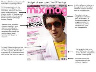
  • 1. A skyline/ banner has been featured at the top of the magazine to make the reader aware of the other content featured within the magazine as well as the other main articles advertised. The clear masthead links in this colour scheme and the rest of the colour lines, making the magazine appear more professional. Also the wording of ‘Mix Mag’ could be referred to an informal type of British magazine so attracting a teenage audience. The name of the artist acts as a main subheading; his music relating to the type of genre being discussed as well as informing the reader Calvin Harris is likely to be discussed. Cover lines have been used in a slant format to attract the reader into finding out what else is in the magazine, the way the text is positioned makes the magazine appear more edgy and modern. The use of the plus symbol gives the reader the impression there's more to see in the magazine, this allows the magazine to let its readers know it has more to offer than others of its genre. The medium close up being featured behind the title is the main focus of the magazine, as well as it being positioned to the side so more cover lines and information can fit onto the page easily. The costume of a plain white suit with dark sunglasses makes the celebrity more appropriate for the magazine, his body blending in with the background and face becoming more prominent. The yellow t-shirt used also allows the body to stand out against the white suit jacket, as this doesn't match the theme of the front cover it equates to the magazine standing out more. The expression of the celebrity used gives the magazine a more serious look, making the magazine more professional. Following this, the lighting used within the image is bright making the celebrity more bold with his features becoming more clearer. The main focus behind the magazines front cover is Calvin Harris; this has been included as his work is well known on a global scale, making the magazine more likely to be sold as the teenage age range will recognise it and be more inclined into buying the magazine. The background filler of the word ‘WIN’ entices the reader to read about the competitions available in the magazine. The colours featured from the cover lines match the theme presented on the front, demonstrating the clear use of mis en scene within the layout of the front cover. The words used here have been formatted within brackets, this is so that the information stands out and looks unique without taking the main focus away from the celebrity and main coverlines. Price, date and barcode. Essential conventions of a front cover magazine.
  • 2. A skyline has been inserted to the page to make the reader aware of the content featured as well as the main articles within the magazine. A puff has been used so that the information stands out against the background and also enlightens the reader of the free objects featured in the magazine, persuading them to buy it. Pricing along with publisher featured next to the masthead, essential conventions of a magazine front cover. Main image used is a medium long shot, it is placed in front of the title which is found in most magazines so the image appears as the main focus. The costumes used of the band are all dark and black, this makes them stand out against the bright writing featured, as well as it matching the serious manner presented on their expressions. Limited props have been used apart from the use of sunglasses on the far right artist. Though, they are all looking in different directions instead of focusing on the camera, this is to make each member of the band unique within their own appearance on the magazine. The location of the photo is placed outside with mountains in the background, this will make the lighting appear more clear as well as well as it making the magazine look more professional from it not having a solid plain colour as its background. Coverlines are essential convention of a front cover, this shows the audience what the articles will be about, giving them an idea as to whether they would like to read it. Each title has been used with a white background filler, this is to the attract the audiences eye into reading the content. A quotation has been used from an interview from the band being discussed, this acts as a coverline as well as making the reader more likely to read more within the article. The use of the quotation makes the reader more likely to read this interview as they want to know more of the stories told by the band featured within the magazine. The white writing used on top of the black costume of the band stands out well and catches the readers eye, without this the information would be overlooked. Barcode and date of magazine, essential conventions of a magazine. This banner featured at the bottom of the page allows the reader to see the other bands and artists featured within the magazine, this shows how the magazine covers a variety of music types, appealing to as many people as possible.
  • 3. The main image has been used on the right hand side, taking up the majority of the front cover. This expresses how Adele is the main focus of the magazine so fans of her music are more likely to read the magazine as well as discovering more of what’s inside. The facial expression and clothing of the artist suggest that it’s a more formal and dramatic magazine, the use of direct eye contact with the reader also makes them feel more involved with the magazine, making them more likely too read it. The name of the magazine is displayed on a red strip, making this recognisable to its target audience as its unique and acts as a logo for the magazine,; the simplistic title with its bold background makes this eye catching to readers. This puff or flasher has been used on the magazine to catch the readers eye away from the main image, it gives additional information that the reader may not have noticed, the use of ‘300th issue’ makes the magazine sound more alluring and important, making its target audience more likely to read it. A quote from an interview with the main artist has been pulled out and used to act as a coverline, this intrigues the reader to find out what the interview entiles and makes them more likely to read it. The coverlines are set in the bottom left hand side of the page, the bold serif font makes the reader spot the names of the famous artists first which makes them more inclined to find out more, the colour scheme matches the over all layout within the magazine, making it appear more modern and professional. The barcode, date and price have all been included on the front of the magazine, essential for the conventions of a front cover page. A banner has been inserted to the bottom of the page, this normally tells the reader of other information available in the magazine, this can either be exclusive interviews with artists or competitions available. Main cover line, the name of the artist Adele has been capitalised to show how she is the main focus throughout the magazine, this expresses how the magazine will feature multiple interviews, pictures and more about the specified artist.