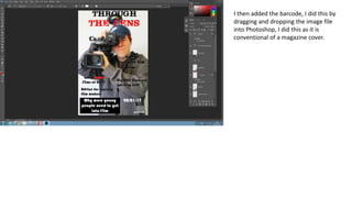
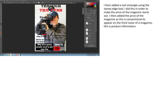
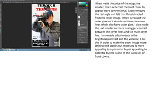
The document describes the process of designing a magazine cover in Photoshop. Key steps include:
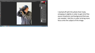
1. Editing the cover photo to focus on the subject.
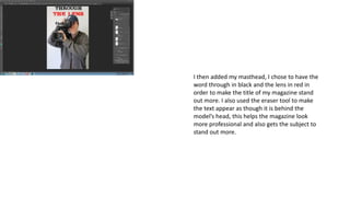
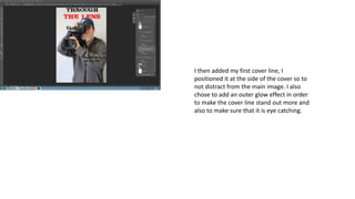
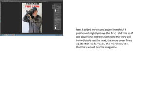
2. Adding design elements like the masthead, cover lines, date, and barcode in strategic positions to attract readers' attention.
3. Using effects like outer glow and varying colors/sizes to make certain elements like the main cover line and price stand out more.
4. Iteratively adjusting elements like brightness/contrast and text sizes to create an appealing and conventional design that will attract potential buyers.