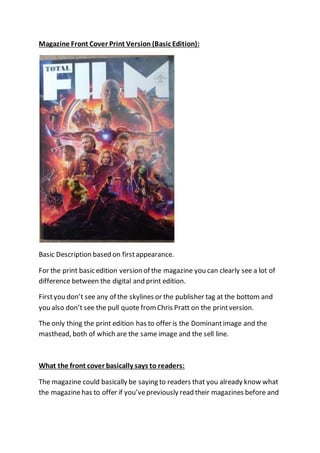
1. Magazine Front Cover Print Version (Basic Edition):
Basic Description based on firstappearance.
For the print basic edition version of the magazine you can clearly see a lot of
difference between the digital and print edition.
Firstyou don’t see any of the skylines or the publisher tag at the bottom and
you also don’t see the pull quote from Chris Pratt on the printversion.
The only thing the print edition has to offer is the Dominantimage and the
masthead, both of which are the same image and the sell line.
What the front cover basically says to readers:
The magazine could basically be saying to readers that you already know what
the magazinehas to offer if you’vepreviously read their magazines before and
2. they have a lot of confidence that justthe dominant image and masthead is all
they need to attract readers to buy their magazine.
Masthead:
For the masthead of the print edition is exactly the same as the digital version
except that the print version appears to take up more spaceof the print
edition to fit in the spacethat the skylinewould havetaken. But this is not the
case; if you compare the two frontcovers on wherethe masthead and the
dominant image have been placed you will see that they are placed in the
exact samepositions. The reason why the Masthead may seem bigger on the
print edition is becausefor the print edition the magazine is smaller on width
and height than the digital magazine is.
Pros of Print Magazine Front Cover:
Smaller ink costfor printing the magazine.
You can have it in person forever and collect it if you really wanted.
The front cover of the print magazine only wants to pull readers in from the
dominant image that it has to offer, the pull quote it uses with its issueof the
magazine and the masthead that it normally uses for its monthly issues.
For readers who don’t wantto focus or get distracted by words on the front
cover and only really wantto see one image and a shortamount of information
on the magazine and like to see the full image of the frontcover in all its glory
without getting distracted by text will enjoy this print edition as they don’t
have to worry aboutanything getting in the way of them from appreciating the
dominant image.
Cons of Print Magazine Front Cover:
The print edition’s frontcover doesn’tprovideany teasers or any information
at all that could pull readers in to buy the magazine.
3. The design for the print edition’s front cover is very basic and to simple to
attract readers.
Itdoesn’toffer any information on the publishers of the print edition and
doesn’toffer any information on the contents of the magazinethat they’re
trying to offer readers in hopes for them to wantto buy the magazine.
How this affects the readers:
The lack of information provided in this print edition can affect reads in many
different ways; it can either attract the readers to look through the magazine
to try and look for the information on their own or pull them into the mystery
of the magazine as they could enjoy the basic design and like finding
information inside the magazine as you’re“meant to” on their own without
distractions fromthe main cover image on the magazine. Itcould also attract
the younger audience who are justabout to start their teenage years or
younger as not many young people like to read large amounts of words,
especially the younger generation so justthe dominant image alone can attract
the younger generation to read the magazine.
The other way this could affect readers is by putting them off buying the
magazine as the magazinemight not either grab reader’s attention or interest
them as there is no information on the frontcover to interest them in reading
the magazine. Readers may want a little moreinformation on the front cover
to attract them or even interest them in to looking at the magazineor wantto
discover whatthe magazinehas to offer. So with the lack of information or
content on the frontcover, it could discouragepeople from reading the
magazine as they could even feel like if they don’toffer much content on the
frontcover of the magazinewhich is the most important partof the magazine
as it’s the firstthing readers will see and could possibly be the only reason they
pick up the magazine then they might just feel like they will put the same
amount of content on the inside of the magazine.