FULL ENJOY - 9953040155 Call Girls in Paschim Vihar | Delhi
Production process 2 fc.
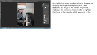
1. First I added the image into Photoshop by dragging and
dropping the image file and placing it in. I then
readjusted the image so the piano is very visible, I
made sure the piano was visible in order to highlight
the theme of the magazine which was music in film.
2. I then adjusted the brightness/contrast in
order to make the cover image stand out
more and make it appear bolder. By
adjusting this setting it makes the colours of
the model’s clothes stand out more and
makes the image more proffessional.
3. I then added in my masthead, I chose my
font as it is bold and stands out clearly. I
also think this font stands out and grabs
the attention of a potential buyer which
is one of the aims of a front cover of a
magazine. I chose to have ‘through’ in
red and ‘the lens’ in black in order to
make the masthead stand out clearly, a
bold and striking masthead is
conventional of a magazine cover.
4. I then added the image of the barcode in
order to make my magazine cover
conventional, I did this by dragging and
dropping the image file into Photoshop. I
placed it into the top right corner in order
to remain conventional.
5. I then added a red rectangle and black
price, I did this in order to make my
magazine cover conventional. The
rectangle was used in order to grab the
attention of a potential buyer and
make the price stand out more.
6. I then added my four cover lines. I positioned
them in pairs on either side of the cover, I
made sure to try and avoid placing the cover
lines on the piano in order to make the
image stand out more, making the theme
stand out more through the image. I chose
to use the outer glow effect for all of the
cover lines to make them all stand out more,
this is important for a magazine cover as the
information has to grab a potential buyer’s
attention.
7. I then added another red rectangle in order to
make the black main cover line stand out more.
The main cover line is in black in order to stand
out on the red rectangle, I also made use of the
outer glow effect, this makes it stand out more,
the main cover line must be the most striking as
it is meant to link to the theme of the magazine
issue. The text is also the second largest, next to
the masthead, this is conventional of a front
cover.
8. I then added in the camera lens image and
used the eraser tool to just include the lens
itself. I then moved the layer to make sure
that it was below the masthead layer, this
was in order to make the image appear
behind the masthead.
9. I then added the date, I did this in order to
make my magazine cover conventional. I also
added the outer glow effect in order to make
the date stand out more.
10. I then removed the red rectangle around the
price, I did this as I decided doing this would
make my magazine appear more professional. I
also made my text align to the right/left in
order to make my front cover appear
conventional. I also shrunk my cover lines in
order to fit within media conventions. After
some advice I adjusted my image in order to
have my cover image more centred, doing this
makes the cover more attention grabbing. I
then decided to redo my masthead so it would
appear as though it is in front of the model.