
Recommended
More Related Content
What's hot
What's hot (20)
Similar to Magazine Cover Final Design
Similar to Magazine Cover Final Design (20)
More from Emily Cooke
More from Emily Cooke (20)
Recently uploaded
Recently uploaded (20)
Magazine Cover Final Design
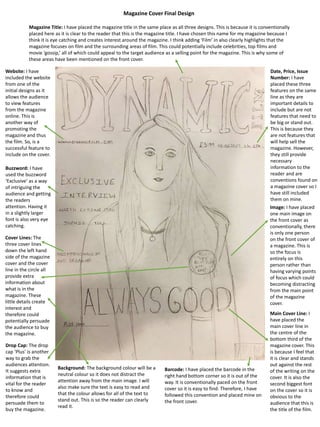
- 1. Magazine Cover Final Design Drop Cap: The drop cap ‘Plus’ is another way to grab the audiences attention. It suggests extra information that is vital for the reader to know and therefore could persuade them to buy the magazine. Cover Lines: The three cover lines down the left hand side of the magazine cover and the cover line in the circle all provide extra information about what is in the magazine. These little details create interest and therefore could potentially persuade the audience to buy the magazine. Buzzword: I have used the buzzword ‘Exclusive’ as a way of intriguing the audience and getting the readers attention. Having it in a slightly larger font is also very eye catching. Magazine Title: I have placed the magazine title in the same place as all three designs. This is because it is conventionally placed here as it is clear to the reader that this is the magazine title. I have chosen this name for my magazine because I think it is eye catching and creates interest around the magazine. I think adding ‘Film’ in also clearly highlights that the magazine focuses on film and the surrounding areas of film. This could potentially include celebrities, top films and movie ‘gossip,’ all of which could appeal to the target audience as a selling point for the magazine. This is why some of these areas have been mentioned on the front cover. Main Cover Line: I have placed the main cover line in the centre of the bottom third of the magazine cover. This is because I feel that it is clear and stands out against the rest of the writing on the cover. It is also the second biggest font on the cover so it is obvious to the audience that this is the title of the film. Date, Price, Issue Number: I have placed these three features on the same line as they are important details to include but are not features that need to be big or stand out. This is because they are not features that will help sell the magazine. However, they still provide necessary information to the reader and are conventions found on a magazine cover so I have still included them on mine. Image: I have placed one main image on the front cover as conventionally, there is only one person on the front cover of a magazine. This is so the focus is entirely on this person rather than having varying points of focus which could becoming distracting from the main point of the magazine cover. Barcode: I have placed the barcode in the right hand bottom corner so it is out of the way. It is conventionally paced on the front cover so it is easy to find. Therefore, I have followed this convention and placed mine on the front cover. Website: I have included the website from one of the initial designs as it allows the audience to view features from the magazine online. This is another way of promoting the magazine and thus the film. So, is a successful feature to include on the cover. Background: The background colour will be a neutral colour so it does not distract the attention away from the main image. I will also make sure the text is easy to read and that the colour allows for all of the text to stand out. This is so the reader can clearly read it.