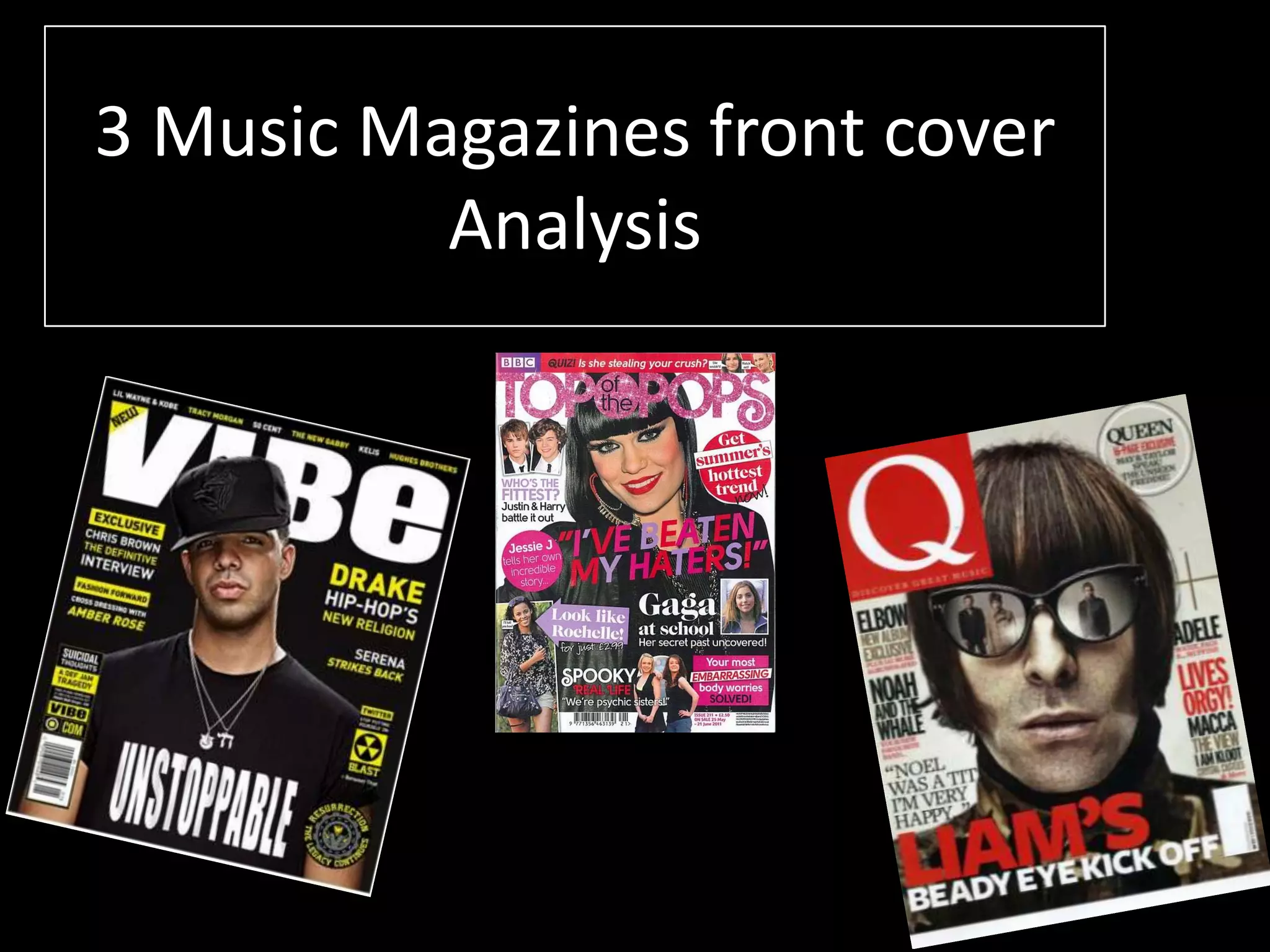
The document analyzes the design elements of 3 different music magazine covers.
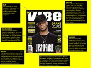
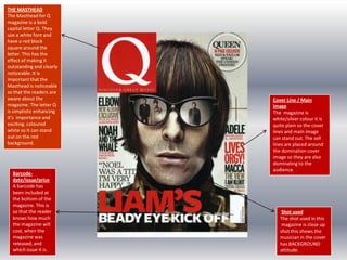
The first magazine features Drake on the cover to attract music fans. It uses a black, yellow, and white color scheme to connote danger and edge.
The second magazine, Q, stands out with a bold red letter Q masthead. It uses a close-up shot of a musician to depict an attitude of rebellion.
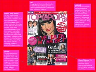
The third magazine aimed at teenage girls features a smiling photo of Jessie J. It uses pink and images of fashion/artists to appeal to its young target audience. Barcodes, mastheads, and cover lines are consistently used across the magazines following convention.


![Magazine research really official [recovered]](https://cdn.slidesharecdn.com/ss_thumbnails/magazineresearchreallyofficialrecovered-160222160255-thumbnail.jpg?width=640&height=640&fit=bounds)

![Magazine research really official [recovered]](https://cdn.slidesharecdn.com/ss_thumbnails/magazine-research-really-official-recovered-160211094822-thumbnail.jpg?width=640&height=640&fit=bounds)


