Download to read offline
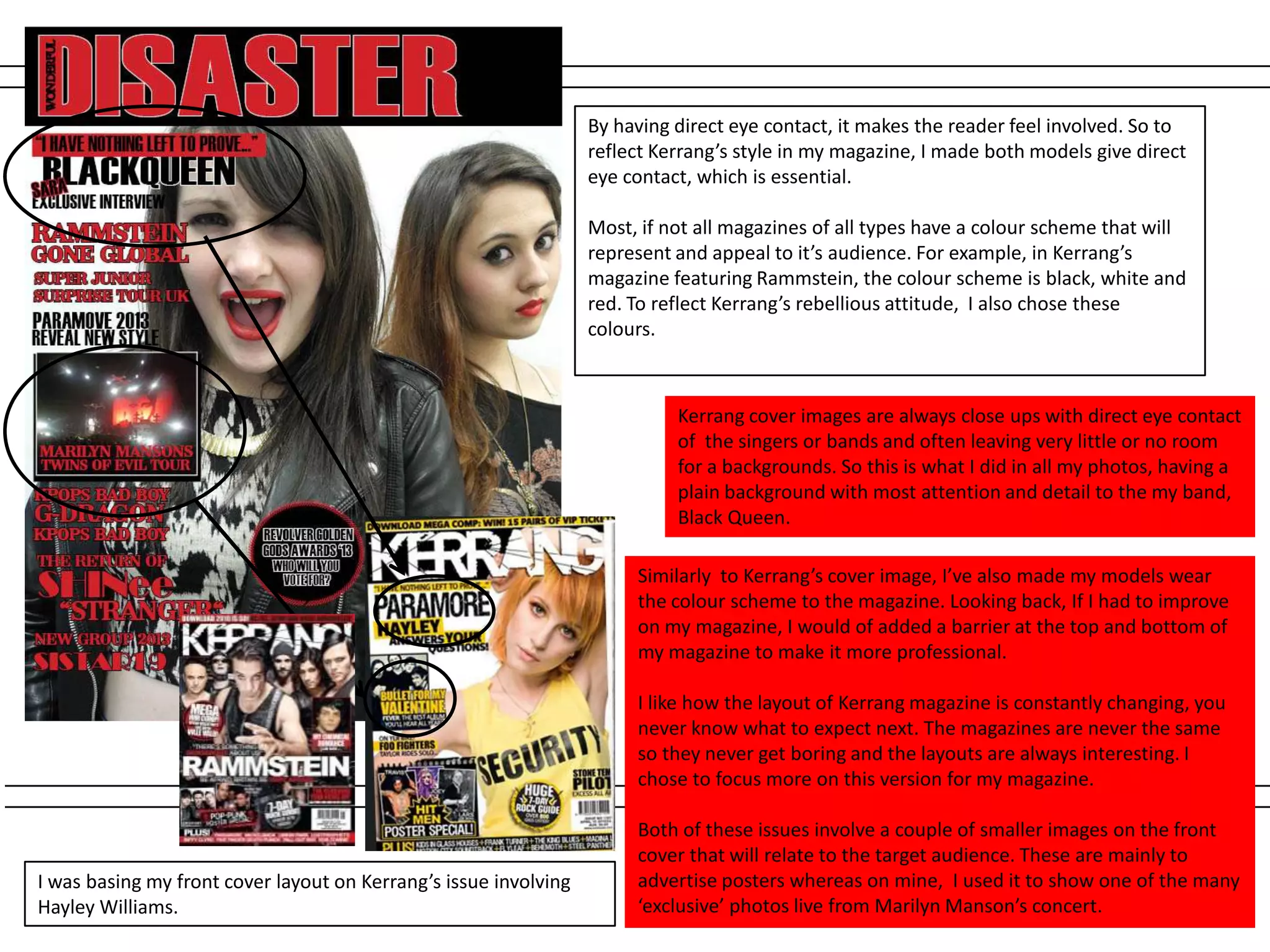
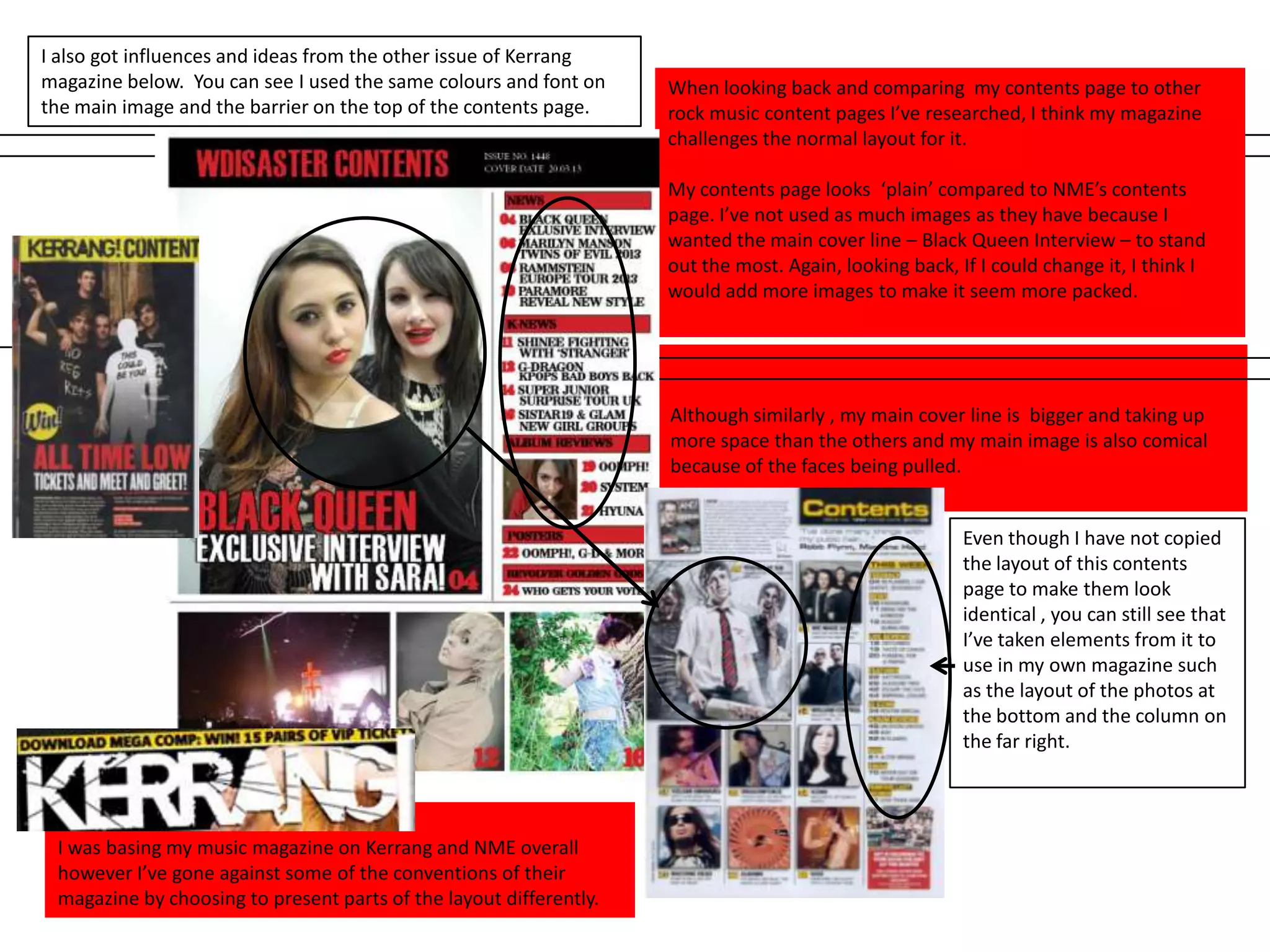
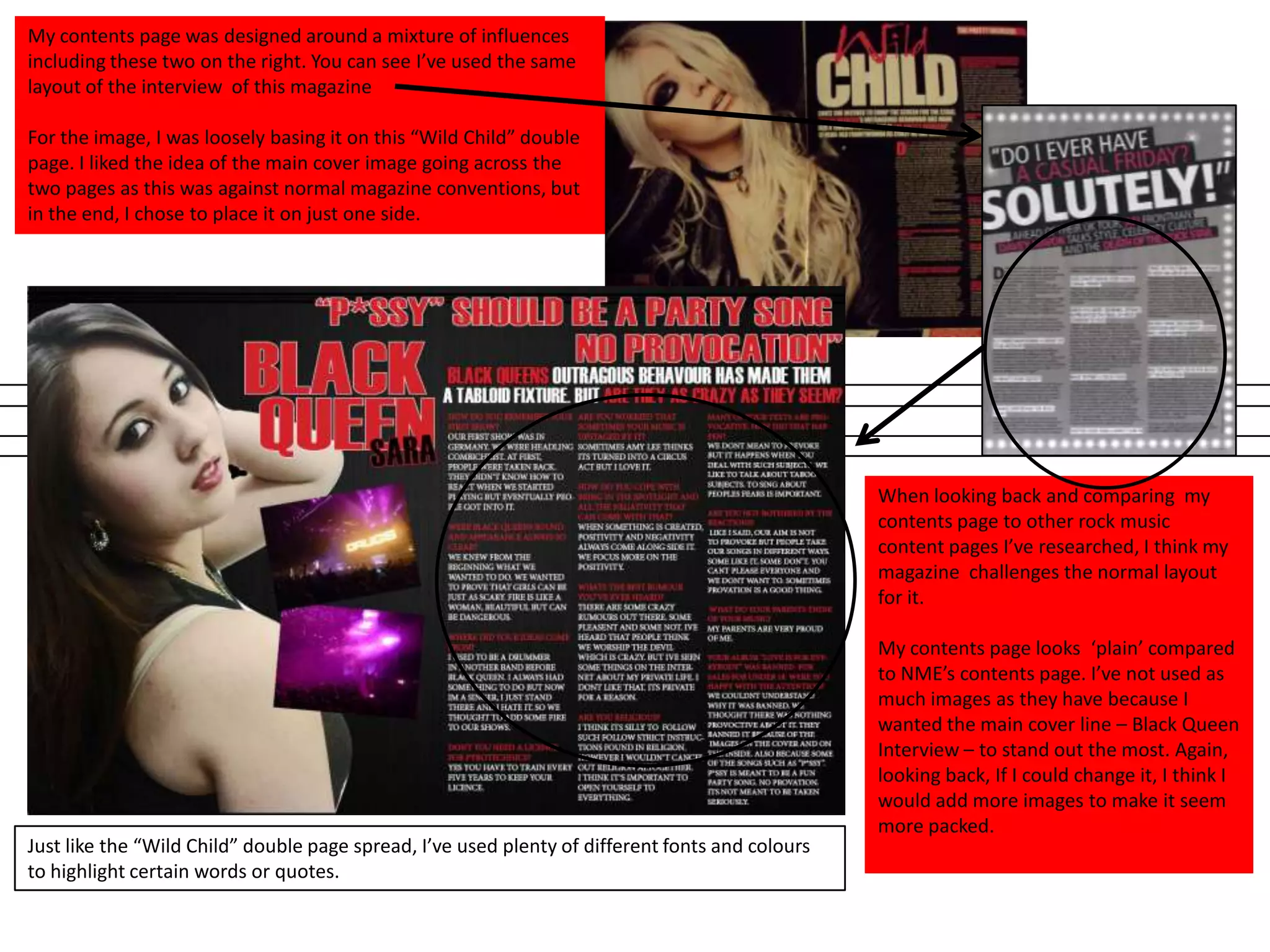

The document discusses how the student's media product, a music magazine, uses and challenges conventions of real music magazines like Kerrang and NME. The student based various elements of their magazine's layout on Kerrang, such as using close-up images with direct eye contact and a consistent color scheme. However, the student also challenged some conventions by designing their contents page differently from Kerrang and NME, making the main interview stand out more clearly on the plain layout. The student drew inspiration and influences from multiple magazine issues but presented elements in their own way.


