This presentation contains an analysis of images that I considered using as the main image on the front cover image for my magazine and why they would or would not be suitable.
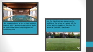
1. This image displays a facility of the school so it
links the school with the magazine so it would
be appropriate as the cover image for my
school magazine.
Like the first, this image also shows the
facilities of the school so it would link the
school with the magazine, therefore this
would be a suitable cover image.
2. This image would not be suitable for the main
image on the front cover of my magazine as
there is no focus of the image.
I think this image would be appropriate as the
main image on the cover of my magazine as it
shows part of the school so it links the
magazine with the school and it’s not too busy.
3. This image shows the faith of the school which
is a good representation of the school,
however it would not be suitable as it is too
dark.
This would not be
appropriate as the
cover image of my
magazine as it
doesn’t show
much about the
school but it
would be suitable
to go with a
headline.
4. Although this picture shows pupils from the
school it would not be suitable as the main
image on the cover as it would give someone
the impression that the magazine is all about
sports.
This image would
be suitable inside
the magazine to go
next to an article
but not for the
front cover as it
doesn’t have a
focus to the image.
5. This image would
not be suitable as
the main image on
the cover of my
magazine as it is
too dark, however,
it would be suitable
to go with the
headline of an
article later on in
the magazine.
This image may be
appropriate for the
cover image of my
magazine as it only
has one person in it
and it doesn’t seem
like there is too
much to focus on.