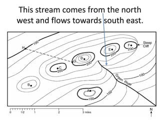
L.O: REVIEW GRAPHS AND
CHANGE
“A PICTURE IS WORTH A
THOUSAND WORDS”
SCIENTISTS USE “PICTURES” IN THE FORM
OF GRAPHS AND TABLES TO ORGANIZE
OBSERVATIONS.
GRAPHS AND TABLES MAKE IT EASIER TO
UNDERSTAND THE “STORY” THAT THE DATA
IS “TELLING” US!
THE EARTH SCIENCE REGENTS HAS
MANY, MANY, MANY TABLES!
A DIRECT RELATIONSHIP GRAPH: AS
THE X-AXIS INCREASES, THE Y-AXIS
ALSO INCREASES.
A INVERSE RELATIONSHIP GRAPH: AS
THE X-AXIS INCREASES, THE Y-AXIS
DECREASES.
A NO RELATIONSHIP GRAPH: AS THE X-
AXIS INCREASES, THE Y-AXIS DOES NOT
INCREASE OR DECREASE.
A CYCLICAL RELATIONSHIP GRAPH: AS THE
X-AXIS INCREASES, THE Y-AXIS INCREASES
AND DECREASES OVER AND OVER AGAIN
MOST NATURAL PROCESS ARE CYCLICAL
(EX. TIDES, THE SEASONS, CELESTIAL
MOTION OF PLANETS ARE CYCLICAL)
I MUST BE ABLE TO READ THE
GRAPHS ON THE EARTH SCIENCE
REGENTS.
Base your answer on The GRAPH below indicates the average number of
daylight hours and the average surface air temperature over a 12-month
period at a specific location on the Earth.

Based on the graph, the
highest average surface air temperature occurs
• a. on June 21
• b. between June 21
and September 23
• c. on December 21
• d. between December
21 and March 21
Which statement is best supported by
the graph?
• a. The infrared radiation given
off by the Sun occurs at a
wavelength of 2,000 angstroms.
• b. The maximum intensity of
radiation given off by the Sun
occurs in the visible region.
• c. The infrared radiation given
off by the Sun has a shorter
wavelength than ultraviolet
radiation.
• d. The electromagnetic energy
given off by the Sun consists of a
single wavelength.
I WILL HAVE TO DRAW AT LEAST
ONE GRAPH ON THE EARTH SCIENCE
REGENTS!
ISOLINES (TOPOGRAPHIC MAPS), CONTOUR
LINES, ISOTHERMS, ISOBARS ARE GRAPHS THAT CONNECT
POINTS WITH EQUAL MEASUREMENTS.
I MUST REMEMBER TO “CONNECT THE DOTS”. TO CONNECT
THE SAME MEASURES TO EACH OTHER.
Does the map below show isolines, isotherms or isobars?
How do you know?
Draw the 1024- and 1028-millibar isobars on the weather
map provided below.
Remember: isobars are always circular
are these HIGH pressure or LOW
pressure system? How do you know/
Is this an isoline, isobar or isotherm?
How do you know?
On the field map provided, draw only the
15°C and the 20°C isotherms. Isotherms
must be extended to the edge of the map.
Remember: I must draw isotherms from the
edge of the field map to another edge.
Contour maps (topographic maps):
connect points of equal elevation
(height above sea level)
Contour maps (topographic maps): connect
points of equal elevation (height above sea
level)
CONTOUR INTERVAL shows the distance in
elevation between two contour lines
I must be able to find the contour
interval, if it isn’t given.
What is the contour interval of this
map?
• a. 10 m
• b. 50 m
• c. 100
m
• d. 150
m
On contour maps, v-shaped lines
represent a stream (river)
The point of the v-shaped lines show
where a stream (river) comes from.
This stream comes from the north
west and flows towards south east.
On a contour map, the steepest slope is
where the contour lines are close together.
On a contour map, the gentle slope is
where the contour lines are far apart.
A hole (a depression) is represented by
hachure lines
A contour profile is “side view” of a
contour map. I will have to draw one
on the regents.
I will also have to calculate the
gradient (the slope) of a contour
map.
Turn to page 29 of the green
workbook.

Review#2 graphs&change

  • 1.
  • 2.
    “A PICTURE ISWORTH A THOUSAND WORDS”
  • 3.
    SCIENTISTS USE “PICTURES”IN THE FORM OF GRAPHS AND TABLES TO ORGANIZE OBSERVATIONS.
  • 4.
    GRAPHS AND TABLESMAKE IT EASIER TO UNDERSTAND THE “STORY” THAT THE DATA IS “TELLING” US!
  • 5.
    THE EARTH SCIENCEREGENTS HAS MANY, MANY, MANY TABLES!
  • 6.
    A DIRECT RELATIONSHIPGRAPH: AS THE X-AXIS INCREASES, THE Y-AXIS ALSO INCREASES.
  • 7.
    A INVERSE RELATIONSHIPGRAPH: AS THE X-AXIS INCREASES, THE Y-AXIS DECREASES.
  • 8.
    A NO RELATIONSHIPGRAPH: AS THE X- AXIS INCREASES, THE Y-AXIS DOES NOT INCREASE OR DECREASE.
  • 9.
    A CYCLICAL RELATIONSHIPGRAPH: AS THE X-AXIS INCREASES, THE Y-AXIS INCREASES AND DECREASES OVER AND OVER AGAIN
  • 10.
    MOST NATURAL PROCESSARE CYCLICAL (EX. TIDES, THE SEASONS, CELESTIAL MOTION OF PLANETS ARE CYCLICAL)
  • 11.
    I MUST BEABLE TO READ THE GRAPHS ON THE EARTH SCIENCE REGENTS.
  • 12.
    Base your answeron The GRAPH below indicates the average number of daylight hours and the average surface air temperature over a 12-month period at a specific location on the Earth.

Based on the graph, the highest average surface air temperature occurs • a. on June 21 • b. between June 21 and September 23 • c. on December 21 • d. between December 21 and March 21
  • 13.
    Which statement isbest supported by the graph? • a. The infrared radiation given off by the Sun occurs at a wavelength of 2,000 angstroms. • b. The maximum intensity of radiation given off by the Sun occurs in the visible region. • c. The infrared radiation given off by the Sun has a shorter wavelength than ultraviolet radiation. • d. The electromagnetic energy given off by the Sun consists of a single wavelength.
  • 14.
    I WILL HAVETO DRAW AT LEAST ONE GRAPH ON THE EARTH SCIENCE REGENTS!
  • 15.
    ISOLINES (TOPOGRAPHIC MAPS),CONTOUR LINES, ISOTHERMS, ISOBARS ARE GRAPHS THAT CONNECT POINTS WITH EQUAL MEASUREMENTS.
  • 16.
    I MUST REMEMBERTO “CONNECT THE DOTS”. TO CONNECT THE SAME MEASURES TO EACH OTHER.
  • 17.
    Does the mapbelow show isolines, isotherms or isobars? How do you know?
  • 18.
    Draw the 1024-and 1028-millibar isobars on the weather map provided below.
  • 19.
    Remember: isobars arealways circular
  • 20.
    are these HIGHpressure or LOW pressure system? How do you know/
  • 21.
    Is this anisoline, isobar or isotherm? How do you know?
  • 22.
    On the fieldmap provided, draw only the 15°C and the 20°C isotherms. Isotherms must be extended to the edge of the map.
  • 23.
    Remember: I mustdraw isotherms from the edge of the field map to another edge.
  • 26.
    Contour maps (topographicmaps): connect points of equal elevation (height above sea level)
  • 27.
    Contour maps (topographicmaps): connect points of equal elevation (height above sea level)
  • 28.
    CONTOUR INTERVAL showsthe distance in elevation between two contour lines
  • 29.
    I must beable to find the contour interval, if it isn’t given.
  • 30.
    What is thecontour interval of this map? • a. 10 m • b. 50 m • c. 100 m • d. 150 m
  • 31.
    On contour maps,v-shaped lines represent a stream (river)
  • 32.
    The point ofthe v-shaped lines show where a stream (river) comes from.
  • 33.
    This stream comesfrom the north west and flows towards south east.
  • 34.
    On a contourmap, the steepest slope is where the contour lines are close together.
  • 35.
    On a contourmap, the gentle slope is where the contour lines are far apart.
  • 36.
    A hole (adepression) is represented by hachure lines
  • 37.
    A contour profileis “side view” of a contour map. I will have to draw one on the regents.
  • 40.
    I will alsohave to calculate the gradient (the slope) of a contour map. Turn to page 29 of the green workbook.