1. Corey Balsom AS MediaStudies
ResearchTask 3 – Analysis of another magazine
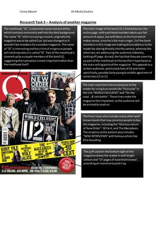
The masthead,“Q”, iscolouredinpure redand white,
whichcontrastsextremelywellintothe darkbackground.
The name “Q” referstocueinga record,originallythe
magazine wasto be calledCue,butwaschangedso it
wouldn’tbe mistakenforasnookermagazine.The name
of “Q” isinterestingandhasa hintof enigmaaspeople
will notknowwhy itis called“Q”.Part of the mastheadis
coveredupby a couple membersof the bandU2,
suggestingtheirpresence ismore importantratherthan
the mastheaditself.
The main image of the band U2 isframedacross the
entire page,witheachbandmembertakenupa fair
amountof space,butwithBono at the frontwhich
makessense,since he isthe mainsinger.2of the band
membersinthisimage are makingdirectaddress tothe
readerby staringdirectlyintothe camera,whereasthe
othertwo are addressingthe audience indirectly,
lookingoff page.Assaid,the factthat theyare covering
up part of the mastheadreinforcestheirimportance as
the mainsellingpointof the magazine.Thisappealstoa
certainaudience,particularlyfansof U2 and more
specifically,possiblyfairlyyoungtomiddle agedmenof
social class C2 or C1.
The main coverline triestostandout tothe
readerby usingbuzzwordslike “Exclusive”in
the line “WORLD EXCLUSIVE”and “On the
road… & intobattle”.These linesmake the
magazine feel important,sothe audience will
be enticedtoread on.
The front coveralsoincludesmanyotherwell-
knownbandsthat mayconvince people tobuy
the magazine,includingthe “Gloriousreturn
of New Order”,50 Cent,and The Maccabees.
The strapline atthe bottomalsoincludes
“NEW INTERVIEWS”withfamousartistslike
Ellie Goulding.
The puff usedon the bottomrightof the
magazine drawsthe readerinwithbright
coloursand “27 pagesof essentialreviews”,
providinganincentivetopickitup.
2. Corey Balsom AS MediaStudies
There are multipleimageseachwithpage
numbersrelative towhatisonthat page,
includingphotosof lotsof different
artistslike NewOrderandThe
Maccabees. Thisis usedto tell the reader
visuallywheretofindwhattheywantin
the issue.
The mastheadisshowninthe title
“The Q Review”.Aboveisanimage of
Mick Jaggerwhichis showntobe in
Page 96. Underneaththe title,the
readerisshownwhatis includedinthe
“World’sFinestMusicGuide”.
The imagesof Mick Jaggerand
New Ordermay appeal to
adultswho have beenaround
whenthese artistswere in
theirprime,possiblythe
eighties.Thesepeople maybe
middle-agedadultsof social
classC2 or C1.
Fans of the otherartists
like The Maccabeesand
Kurt Vile willalsobe drawn
indue to these artists
beingfeaturedhere.
The house style of the contentspage
matchesup withthe frontcover,making
the magazine visuallyconsistentand
pleasingtothe eye,stickingtothe
contrastingcoloursof red,white and
black.The typographyusedismainly
generic,plain,sansserif font,possibly
takenfroma website (Dafont.com).
However,more importantthingsonthe
page like the title have unique fontswhich
catch the audience’sattention.
3. Corey Balsom AS MediaStudies
The house style of the double page
spreadalsomatchesboththe front
coverand contentspage,showing
that the whole magazine isvisually
consistent,usingsimilarfontsand
coloursto grab the attentionof the
reader.
The mastheadshowsupyet againnextto
the title “The Month inMusic” to yet again
showthe readerthat they’re readingQ
magazine.The typographyof the fontisbig
and bold,withclean,professional-looking
fontusedfor the restof the textinthe
article.
The main image of the band
U2 takesup mostof both
pages,andthe blackand
white filtergivesavery
sombre feel,showing
connotationsof sadnessor
depression,perhaps
professionalism.
The double page spreaduseswords
like “Special Deliveryand“If it
matters,it’shere”to interestthe
readerand entice themtoread on
by givingthemavague but
interestingdescription.
A dropcap isusedat the beginningof the
article to give ita bitof flairandto draw the
audience’ssighttothe beginning.There are
alsopull-outquotesusedfromthe article
that will interestthe readerbygivingthem
eye-catchingpartsof the article.