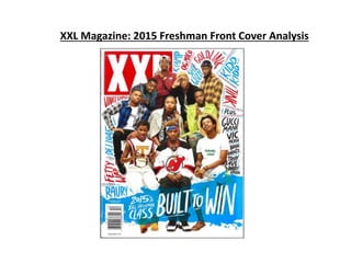
2. Main Image
The main image here takes up a good
proportion of the page. It’s a longshot to
ensure everyone is in the picture. There
are multiple models on the cover. They
are centralised and all looking directly at
the camera to provide direct address.
They are positioned almost like a class
photo. This links to main cover line, they
are the freshman class of 2015. Some of
them are quite serious, some are acting
silly and some really posing. Each way the
model is, whether they are posing or just
sitting their, is meant to link to their
artists’ personality.
Masthead
The classic and very visible ‘XXL’
masthead is hidden behind the main
image. This is because they see the
article as more important. However the
XXL logo is still very obvious. This is
because of the massive red box with the
huge capital letters of ‘XXL’ in white.
Cover lines
They haven’t actually put any cover lines as this
is a special annual edition, so they want to focus
completely on this article. What they have done
though however, is added the ‘freshman class’’
names radiating off the main image. The creative
urban font used is a continuous font in the
magazine. This defies codes and conventions.
Main cover line
The main cover line is located in the
bottom third, this takes up the
majority of the bottom third. This tells
us that they really want it to stand out.
It’s the same font as the names
surrounding the picture. It has a blue
strip behind it to make sure it stands
out from the rest.
Barcode
The barcode is placed in a dead area
as it’s not key to be noticed. Yes, it
states the price and the issue number.
But that’s not key to the magazine
cover.
Layout
XXL is following codes and conventions
here with a very traditional layout. It has
the masthead placed in the primary
optical area and the main image is
centralised. The main cover line is
placed in the top of the bottom
third/bottom of the middle third, which
is traditional. Instead of cover lines they
have just mentioned artists names,
which doesn’t follow codes and
conventions.
Mise-en-scene
The mise-en-scene here is a large
variety of everyone having a style
that represents their own
style/personality. Their pose
whether it’s still, waving etc. is
also to represent their artist
personality. The majority definitely
look hip hop (genre) artists due to
the style and poses. (e.g. chains,
arms crossed, bandana etc.)
Colour scheme
The colour scheme is very simple of
white red and blue. The white and red
comes from the masthead. It connotes
simplicity which links to the genre. Hip
hop is known for very plain and not
fancy. The blue comes from the strip of
blue behind the main cover line.
3. Target Audience
The target audience of this magazine is
people with an interest in hip-hop/rap
music. More specifically probably black
males aged about 16-25. This is the typical
person with the most interest in this
genre. XXL is aimed at the class in between
middle and upper. This is clear as the
magazine looks very high quality and
designed like a more high end magazine.
It’s aimed at a relatively mass market. Hip-
hop/rap is a very rapidly growing genre,
this issue in particular has some very
recent and popular artists which helps
suggest possible a mass market target
audience.