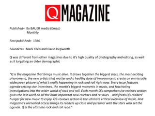
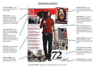
3. Published= By BAUER media (Emap)
Monthly
First published= 1986
Founders= Mark Ellen and David Hepworth
Q was different from other magazines due to it's high quality of photography and editing, as well
as it targeting an older demographic
“Q is the magazine that brings music alive. It draws together the biggest stars, the most exciting
phenomena, the new artists that matter and a healthy dose of irreverence to create an unmissable
widescreen picture of what’s really happening in rock and roll right now. Every issue features
agenda-setting star interviews, the month’s biggest moments in music, and fascinating
investigations into the wider world of rock and roll. Each month Q’s comprehensive reviews section
gives the last word on all the most important new releases and reissues – and feeds Q’s readers’
hunger for new music to enjoy. Q’s reviews section is the ultimate critical overview of music. And
magazine’s unrivalled access brings its readers up close and personal with the stars who set the
agenda. Q is the ultimate rock and roll read.”
4. The original target audience for Q magazine is the generation of people in their 30's and 40's.
This demographic prefers a more sophisticated form of address that in other magazines such as
CLASH and MOJO, and the audience wants to know more about the music, as opposed to trivial
aspects of the music industry, such as musicians clothing and personal life (which is often covered
in “Kerrang” for example.) Despite the founders stating that they want to appeal to all the older
generation, from statistics, it seems that Q magazine doesn't appeal to many woman of that age.
Despite originally targeting an older audience, over the years, ‘Q’ magazine has increasingly
pandered to a younger demographic.
Q still features classic bands and musicians that would appeal to the original audience, however,
they have progressively been publishing more and more main stream artists and chart toppers.
This would explain why Q has been reaching a wider-scale audience demographic.
Q Readership and Demographics
The magazine appeals
predominantly to males,
at around roughly 70%.
The majority of readers
are aged 15-24 at
35.5%).
5. Some sources state that Qs circulation figures from 01-Jul-2008 to 31-Dec-
2008 were at 103,017 (81,240 being in the UK and republic of Ireland)
However, other sites claim circulation figures to be anywhere from 80,000
to 100,000
Q Circulation and Price
The cover price is £3.90.
From 01-Jul-2008 to 31-
Dec-2008, the single copy
subscription figures are
22,798.
(19,097 being in the UK
and republic of Ireland)
6. MASTHEAD- red icon with
large white bold Q , (which is also
the logo of the magazine.)
located at the top left corner, its
the first aspect people will
notice, (as people read from left
to right.)
TAGLINE- is simple, yet
effective. Alludes to the idea that
is the sole means to `discover
great music.`
COVERLINES- band names in
black font which stand out
compared to the smaller
coloured print beneath each,
which provides context for them.
QUOTATION- frontmans
famous brother mentioned.
Colloquial language (tit) is used
to sound more authentic to the
speaker (Noel Gallaghers) actual
vocabulary. The Ellipses illicits
intrigue.
MAIN COVERLINE- is the
second largest typography on the
cover. Frontmans name is in red,
which along with the mast head
is eye catching. If someone
doesnt recognise the face on the
cover, the name ensures that
they remember
TEXT BUBBLE- historically
famous band featured. Word
`exclusive` is in red, emphasising
it. The exclamatives indicate
urgency.
COVERLINES- same format as
on left side of cover. However,
`lives orgy? Is in red font and
ends in an exclamation mark, so
that the taboo noun òrgy`stands
out and captures attention
BARCODE- placed in bottom
right corner for practicalityCOLOUR SCHEME- Image= dark, gritty shades of black, brown, grey and khaki. Text= red
(is a bold colour that has a striking impact visually,) white, black and khaki (that is sampled
from the musicians jacket.)
PLUS SYMBOL- indicates
additional coverlines using
minimalistic iconography
Q Cover Analysis
MAIN IMAGE- close up of Liam
Gallagher facing towards lens.
Three other band members are
reflected in his sunglasses.
MES- The sunglasses add a sense
of mystery and anonymity, and
are a trademark of the musician.
Liams khaki turtleneck-shell suit
is distinctly mancunian and his
hairstyle emphasises the
symmetry of the image. The
singers facial structure is
accentuated with heavy shading
and contoured cheekbones
7. MASTHEAD- red strip
running across top of page,
outlined in black. The word
`Contents` is in black print,
which differentiates it from the
Q logo which is printed beside
it.
FEATURES STRIP- white
font in red strip seperating it
from other text and providing
structure.
Photo of a band inserted
beneath, the bands name
italicised and the description in
red font. This hints that it is a
featured article
INSERT IMAGE- Long,
Action shot of band `Biffy
Clyro` playing on a roof top
INSERT IMAGE- of issues
cover reinforces Dave Grohls
importance in the creation of the
issue
INSERT IMAGES- to preview
the issues articles, and also
enhance the visual quality of the
page
MAIN IMAGE- long shot of
Dave Grohl walking towards
camera lens, with a guitar slung
over his shoulder. His head is
turned away.
MES- Guitar emphasises how
music is intergral to Grohls
identity. His casual dress reflects
his laid back attitude and his
tatoos make the muscian appear
edgy.
FEATURES ARTICLE PAGE
NUMBER- in extremely large
print, as it points towards the
main article, and is possibly used
as a space filler
PAGE & LOGO- in small print
at the bottom right of the page
ISSUE NUMBER- in white
print in masthead, next to an
insert of cover
Q Contents Analysis
ARTICLES- are all capitalised
and seperated from the
descriptions in small font by
thin red bars, which break up
each article in the column
COLOUR SCHEME- image and text- white, red & black (classic rock colours)
8. Q Double Page Spread
ARTIST
NAME- in
large print,
`lady`is
italicised,
whilst
`GAGA`is in
larger
capitalised
font. The
emphasised
capitalisation
may be due to
Gaga meaning
crazy, and
madness is
something
that the
musician
embodies and
embraces
ARTISTS INITIAL- L covers the expanse of page, overlaying
the text. High opapacity.
DATE &
LOGO-
bottom right
corner
TEXT- three
colums of
main body
text, broken
up for
structure. The
fitst letter of
certian
paragraphs are
blown up for
visual appeal
MAIN
IMAGE-
Medium close
up of artist
looking straight
into the lens.
She is covering
her chest with
her hands
MES- the
musician has
heavy dark eye
makeup and
her
cheekbones
are strongly
contoured. She
is wearing
nothing but
heavy chains
around her
neck. This
simplicity is
unusual for
Lady Gaga, but
despite the
lack of
frivolous dress,
she still looks
edgy. Perhaps
the fact that
shes naked
alludes to the
truth and a
candid
interview
COLOUR SCHEME- image and text- black & white. Initial- red
(adds a splash of colour)
9.
10. Published= by Music Republic Ltd after Clash Music Ltd went into liquidation.
Four times a year
First published= 2004
Founders= Iain Carnegie - Art Director
Jon-Paul Kitching - Advertising Director
Simon Harper - Editor
John O'Rourke - Publisher
“Clash Magazine is the flagship product in the Clash portfolio. Award-winning and widely revered,
Clash provides in-depth features and stunning shoots, alongside informative news, exclusive
interviews and respected reviews. Our opinion-forming audience is treated to a premium print
product which challenges convention like no other across twelve monthly issues, many of which are
themed specials..”
11. The CLASH’s gender statistics tend to be fairly balanced, however, the demographic tends
to be approximately 70% male and 30% female. Also, the audience is around 21-31 years
old
CLASH’s target audience is displayed as being avid tech users with a strong interest in music. Finally,
the magazines target audience is primarily located in the UK, with 43% of readers located in London
and the east of England.”
CLASH Readership and Demographics
“They are in employment and own plenty of music, films, books, gadgets and clothes. When
they choose to spend their hard-earned cash, it’s well considered and based on
recommendations from the sharpest sources. The Clash reader considers print and digital to be
of equally importance; they love the convenience of digital storage but relish pouring over vinyl;
cherishing a visit to the cinema but happy to watch great content on YouTube. They care what
they read but don’t mind if it’s free, as long as it’s worthy of their time and attention. They are
as likely to find their favourite jacket or bag in a second-hand store as they are in Urban
Outfitters. They buy The Guardian on Saturday for The Guide and on Sunday The Times for
Culture and Style. They are gig-going, fashion conscious, tech hungry and consider the
Noughties the decade of cheap money, and ‘nothing’ politics. The 30+ are settling down to
laugh at the days of Acid House with the 18+ creating what’s new.”
12. CLASH Circulation and Statistics
CLASH magazines circulation figures tends to be around
40-50,000
Its unlear what the definitive cover price for CLASH magazine, but it appears
that at the time of publication, Clash may have been priced at £3.99.
Due to the popularity of the covers artwork, prices can range up to £7, some
even selling for as high as £10.
At £3.99, the magazine is afforadable for students, and for avid fans of the
magazine/digital art its clear that the higher prices are worth it.
13. MASTHEAD- large, bold white
font spread across top of cover
stands out against dark
background
COVERLINES- band names
listed beneath mast head are
each seperated by a solidus.
SPLASH IMAGE- three band
members with one positioned
closer towards the camera; his
head turned towards lens-
indicates that he is the
frontman. The rest of the band
are hanging their heads.
MAIN COVERLINE-
“REUNION” is in an
unconventional font, different
from others on the cover. The
lines underneath are smaller, in
the same font as other coverlines.
The featured band “The XX” is
mentioned, and the editor uses
alliteration to create rhythm,
which suits the theme of a music
magazine. The coverline stands
against a large, faded blue lens
flare, which adds a sense of
moodiness and atmosphere to
the cover
BARCODE, PRICE & DATE-
bottom right corner. The UK and
the US prices are both listed
COLOUR SCHEME- strong, dark shadows, and the lighting is royal blue. All of the font
on the cover is white, which stands out against the darker colours.
CLASH Cover Analysis
MES- as the unconvential
lighting is so prominant , the
clothing colours are unclear.
However, the dark dress appears
mysterious and edgy
14. INSERTED IMAGES- the
issues front and back covers. As
the only pictures on the page,
they add colour to the pages
simple layout
HEADING- word `Contents`
in same capitalised font as the
headline on the cover. It is
relatively unconventional for
a music magazine
DATE- that issue is published
printed here, beneath the top
bar
COVERS, FEATURES,
REGULARS & FASHION- in
bold font, with fine lines,
seperating them from articles
listed below
CLASH Contents Analysis
BAR/ RUNNER- across top of
page provides structure/ acts as
a type of mast head. Due to ist
width ist one of the first aspects
of the page that the reader will
notice
TEXTS- artists on both of the
issues covers have their
articles printed in larger font
here than other articles in the
contents as they are featured
COLOUR SCHEME- images- orange, red, brown, grey, pink and white (soft colour palette=
unconventional for music magazines) text- black and grey
15. CLASH Double Page Analysis
TEXT- three columns of
main body text provides
structure. First letter of
the first word is in large
print
MAIN IMAGE-
is stylistic and
minimal. The
artists is hanging
his head in a
close up.
MES- heavy
shadows conceal
most of the
musicians
features,
indicating this is
more of an
artistic image
than a
commercial one.
He is wearing a
patterned
button up shirt,
which appears
to be high-
fashion
COLOURS- Image= orange, green, black, grey and
red= abstract use of colour. Text= black & white
(simple and minimal)
HEADLINE-
incorporates an
artistic variety of
fonts. Musicians
name is in larger
bold font to make it
one of the main
visual emphasis`
CREDENTIALS- for the
writer, photographer and
stylist are in white font,
highlighted in green
INTRODUCTION
HEADLINE- the
number four is
blown up so that it
stands out. The text
introduces the
muscian in the form
of a fictional
storybook style.
This sets CLASH
apart from other
magazines, and the
standard form of
writing
16.
17. Published= By Bauer Consumer Media Ltd
Monthly
First published= 1993
Founders= Founding editor Paul Du Noyer
“At MOJO we cover the good stuff. Our award-winning editorial team prides itself in
delivering a magazine that is packed with insight, passion, and revelatory encounters
with the greatest musicians of all-time, be they established or emerging musicians.
The magazine is loved by its readers and artists alike because it engages them on the
subject they love the most: music itself.”
18. The MOJO audience is typically enjoyed by an older generation of music lovers, specifically men
around 30-40 years old.
Because Mojo focuses on a specific genre, it narrows down its target audience, to people to like
rock, especially hard rock
The magazine features genres from modern rock, folk, soul, country and reggae. Readers of Mojo
are rather more influences than followers.
Younger people who love old rock and classic bands also read the magazine, however there is a
larger majority of people from older generations who enjoy this music, so MOJOs demographic is
predominantly older.
MOJO Readership and Demographics
19. Circulation= (2015)
Total- 70,445
Y/Y % change- -0.4
% actively purchased- 98.9
Bauer Media's classic rock magazine Mojo had an average monthly
circulation of 98,484 in the second half of 2009.
It overtook fellow Bauer title Q, which fell 8% year on year and 5.4%
on the first half of the year to 94,811.
MOJO Circulation and Prices
It appears that MOJOs cover price can range from £2.50 to £4.99, but older issues
can be far more expensive
20. MOJO Cover Analysis
BARCODE- tucked away at the
right side of cover
MASTHEAD- MOJO in large white
font, that contrasts with coloured
background overlays inserted
pictures located above.
MAIN COVERLINE- like mast
head, in large white font. The band
is a famous British band that people
will recognise if they walk past a
magazine rack
TAGLINE- simple and impactful,
emphasises the idea that it is the
only music magazine worth
reading. Overlays the mast head in
hot pink font.
INSERTED IMAGES- of other
artists preview issue articles.
Coverlines- band names in pink
which stand out compared to other
text which is in white
MAIN IMAGE- of four band
members- two positioned closer to
the lens. Their mancunian street
style is casual yet stylish, fitting
the context behind the bands
background. Their arms are either
crossed or their hands are in their
pockets, reflecting the bands
casually confident vibe. They stand
before an urban city background
which also reflects the bands
background
DATE- in very small print located
between the M and the O in the
mast head, tucked away for
convenience
COVERLINES- in hot pink font,
taboo nouns attract attention and
reflect rock n roll lifestyle
COLOUR SCHEME- Image= apart from the green door and blue shirt, the colours on
the cover are all relatively dark and muddy. Fonts= White stands out against background
and hot pink adds an electric edge
21. DATE & ISSUE NUMBER- in
small white print within two red
bars that add structure and break
up lines of text
MOJO Contents Analysis
FEATURES COLUMN- in form
of an inserted red strip. A grey
menu strip falls beneath it listing
the issues articles
QUOTATION- includes name
of famous musician who is widely
recognised
MAIN IMAGE- high angle of
muscian playing at a concert. It
feels as though the reader is in the
front row, looking uo at Townsend.
The shot is in black and white,
which gives an old rock, retro vibe,
and the stage lights shining behind
the artist add visual interest to the
page
CONTENTS TITLE- 3D white font
across top of page, bold against
black background
ARTICLES- band names are
capitalised, with small text
beneath selling the article to the
reader whos interested. The page
number for each article is in eye
catching red font
22. MOJO Double Page Analysis
TEXT- three
columns of main
body text- broken
up to provide
structure. It also
aids in dividing the
spread into four: the
same number as the
amount of members
photographed,
which creates visual
symmetry
HEADLINE- is in
capitalised yellow
font. The repetition
of the word FUN
emphasises it and
the exclamatives
add a sense of
excitement and
urgency. However,
the question mark
inserted at the end
adds an uncertainty,
making the reader
want to find out
more about the
article CREDENTIALS-
for photograph
inserted here. It
states the date and
that the shoot is for
an album. From left
to right, the band
members names are
listed. Two of them
have fun childlike
(stage) names that
mirrors the playful
photo shoot.
PAGE NUMBER-
printed in bottom
right, next to the
magazine name
INTRODUCTION-
in black font againt
yellow highlighter
instantly catches the
readers attention.
The bands name as
well as the writer
and photographers
credits are in red
font. The text
provides context on
the band
MAIN IMAGE- of four band members in mid-action, medium
close up shots. It is stated in small print that these are outtakes
from a shoot, which, along with the headline, add a sense of
playful energy to the piece.
COLOUR SCHEME- image= black, white and shades of
orange and blue. Text= black, white, red and yellow. Black and
yellow are indicative of danger and excitement