
Recommended
More Related Content
What's hot
What's hot (17)
Similar to Magazine Analysis
Similar to Magazine Analysis (20)
More from Smith_
More from Smith_ (20)
Recently uploaded
Recently uploaded (20)
Magazine Analysis
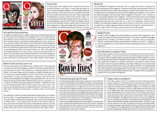
- 1. House Style In every copy of the ma ga zi ne ‘Q’, the general s tructure remains the same. In thi s way, in every copy we expect to see the same masthead, typefaces, contents page layout and colour scheme. In the ca se of ‘Q’, the re is a clear House Style of red and white with various fonts used. These are generally seri f typefaces in black or white framing the image. It i s usually along both the l eft and right columns but can be jus t one depending on how the rule of thirds is followed. The use of red, black and white creates a rather sophi s ticated look whi ch appeals to a large percentage of the readership of ‘Q’, i t al so reflects the sophisticated nature of the music ins ide. Key signifier/Star marketing Us ing the principal of thirds, a large medium shot of David Bowie ta kes up the front cove r of this e dition of ‘Q’ ma gazine. This is star marke ti ng; the key s ignifier of such a famous face will s ell the magazine, so the producers don’t ne ed to worry a s much about making other cove r l i ne s s ta nd out. Thi s also links to Dyer’s Star Theory; iconic characters like David Bowie are used by media institutions for financial gain. Sta rs are manufactured by the music industry to make money, each artist usual ly having thei r own unique selling point (USP). In the case of Bowie, hi s USP i s the l ighting s trike down one side of hi s face and hi s eccentric hai rs tyle which, in recent times, he has become quite well known for. Part of the reputation of ‘Q’ ma ga zine is built upon the excel lent camera qual i ty and effects often used which are di spl ayed in the large image of David Bowie. Masthead The ma sthead of ‘Q’ ma gazine is the l e tte r ‘Q’ i n a l a rge re d s qua re , taking up the primary optical area of the magazine. The white s erif Q looks very dominant on the red background which makes it particularly s triking to someone who would see it. There i s a large element of formality here which suits the ta rgeted demographic. Al so within thi s dominant graphic are the phrases ‘Music magazine of the ye a r’ a nd, i n whi te on bl a ck, ‘The world’s greatest music magazine’. In the primary optical area, the masthead can confidently be covered as it i s already familiar with i ts audience. Original ly, the ma ga zine wa s goi ng to be ca l l e d ‘Cue ’ a s i n the a ct of re a dyi ng a re cord to pl a y, however the name was changed so that, when i t was fi rs t released, i t would not be mi s taken for a snooker magazine. Another re ason for the large ‘Q’, ci ted by Q i tsel f, i s that the s ingle letter ti tle looks more prominent on news s tands . The Guttenberg Design Principle The Guttenberg Design Principle splits a magazine cover into different sections which employs the knowledge of a human’s subconscious line of focus to decide where the most important features of the front cover should be placed. ‘Q’ magazine uses this. For instance, the masthead of the magazine is placed in the primary optical area (top left corner). This is because it’s important and helps to reinforce the brand. By human nature, we read diagonally across the page. As such, ‘Q’ magazine has placed the key signifier of David Bowie in this region. The cover lines and sell points are positioned as flashes and badges along the left and right columns of the magazine so that we notice them all as our eyes follow the axis of orientation. Furthermore, along the bottom line of the magazine, the model credit takes up both the weak fallow area and the terminal point. Merging these two areas provides support to the weak fallow area which is often ignored or else not noticed by readers. This way, none of the valuable space on the cover is wasted. Model Credit and main cover line The ma in cove r line on this e dition of ‘Q’ i s ‘Bowie Li ves!’ This is arguably a reference to Christian theology in which the word was spread that Jesus was alive after he died. Thi s reference i s supported by the fact that Bowi e, in the main image, looks as though he is naked; the body parts of him that we can see are denoted as bare. Furthermore, the cover l ine underneath i t speaks of Da vi d Bowi e ’s i mpa ct on the worl d. Thi s reference would appeal to teenagers and young adults who can see the reference. Musical artists often reference this to various responses , as s imilar to the attack of the press against The Beatles in 1966 when John Le nnon famously quoted “We ’re more popul a r tha n Je s us now.” The attempt at a historical allusion i s underscored by the exclamation mark a fter ‘Li ves’. This kind of punctua ti on i s s e l dom us e d i n pri nt-based media. The typeface is smart and sophisticated which would appeal to viewers who are older. It is superimposed over the torso of David Bowie which l inks the model credit with the key s ignifier. We can also tell that they link a s ‘Bowie Li ve s !’ i s the l a rge s t pi e ce of text on the cove r a s we l l a s because of the link between the picture of David Bowie and the use of his na me . Bowie’s s tar a ppeal i n large letters will attract a greater number of readers than the use of a les s popular arti s t as the model credi t. Badge/Flashes A wide variety of badges are used to display the contents of the magazine so that readers are aware of what they will find inside. In this case, the flashes and badges a ppeal to fans of ‘Suede ’ a nd ‘Pa l ma Vi ol e ts ’. Ins i de the ci rcul a r re d gra phi c feature, it a dve rtises that this copy will feature ‘124 a lbum re vi ews ’. It s ugge s ts that the magazine has a lot of contents which will persuade someone to buy the magazine Barcode/date/convergent media The barcode and date are necessary features of a magazine at the point of sale and as general information. In this area we also find a link to the magazine’s website. This is convergent media. Convergent media is especially important on recent magazines as print-based media is going out of date. Providing a website means that ‘Q’ magazine can extend their viewership. A website is important to readers as it provides a source of more information that can be quickly updated. These days, people are less incline d to buy magazines as they are expensive and all of the information inside them can be found quickly and easily online. There is also a limit to how much information they can provide and how often. With a website, usually alongside links to social media, ‘Q’ can extend the magazine company beyond its monthly released paperback prison. Convergent media also appeals to a younger and a more modern demographic. Target audience and genre The target audience of ‘Q’ is more affluent than the readership of other popular magazines. According to a recent questionnaire, 68.3% of ‘Q’’s readers are male and 35.5% are between ages 15-24. Despite this, a large proportion of readers are also between the ages 25-34. To cater to this wide demographic, the magazine retains a large degree of formality by using smart typefaces and cover lines aimed at various age groups. Similarly, the house style regularly uses a colour scheme of red, white and blue which, whilst being striking and noticeable which a young readership would appreciate, retains a very sophisticated aesthetic look. Unlike magazines such as ‘KERRANG!’, ‘Q’ magazine does not ever use amateur photography but sells itself by advertising its use of professional photographers. The model credit references the large image of David Bowie, an English singer who was popular in the 1970s. As well as this, the artist is also quite popular among young people, especially those of whom are likely to purchase a copy of ‘Q’ magazine. The magazine genre is an amalgam of alternative and classic rock, thus appealing to people with interes ts in music from this genre.
- 2. House Style In Mixmag, the House Style remai ns the same in every i ssue. The masthead remains the same and the model credi t i s in the same pos i tion with the same typeface. However, in some editions the colour of the mas thead i s di fferent, depending on the colour in the mise en scene. The people on the cover are never the main focus and are often anonymous , reflecting the genre of the magazine as being dance. Similarly, the majority of the badges and flashes are a white font with a black background. In general, effects are usually added, l ike the blur a nd the ‘re fl e cti on’ or l i ke the bri ght colours and the graphic pen l ines in these other editions of Mixmag. There are often a large amount of cover lines on Mixmag. This hous e style is recognisable by people who regularly buy the magazine. The typography used is quite futuris tic, connecting dance, pop, electro and club mus ic. Masthead The masthead for Mixmag consists of the magazine ti tle and slogan, whi ch i s ‘The worl d’s bi gge s t da nce mus ic a nd clubbing magazine’. Here i n the s l oga n, the ma s the a d ca pture s the ge nre of mus i c tha t the magazine covers so as to immediately catch the attention of people who are interested in dance mus ic and clubbing. The masthead i s, conventionally, the same on every i ssue, thus creating a symbolic l ink between the Mixmag covers and the Mixmag brand. Likewise, the masthead i s partially covered by the head of the person in the main image which tells us that the magazine has a ve ry well established brand. The word ‘mi x’ i s insistent upon the image of DJs and turntables, thus connoting the dance genre. Mixmag uses a curved sans-serif typeface with all lower-case l etters. This creates a simple yet sophisticated look which will appeal to people who are in their mid-20’s. Similarly, the l ower-case letters ca pture the ma ga zi ne ’s i nforma l i ty. Model Credit The model cre dit on this edition of Mixmag i s ‘Sub Focus ’, the na me of the artist featured in the key s ignifier. We can tell that they l ink becayse thi s feature uses the second bigges t text on the cover (after the mas thead) and covers an unimportant part of the main image. The typeface is quite futuristic and creates a pixelated look representing the electronic and dance genre. Thi s i s further accentuated by the black graphic feature behind i t. There is a certain informality to the position of the model credit which, once again, reflects the genre of the magazine. Target audience and genre The ta rget audience of Mixmag is a demographic of people aged 20-35 which is reflected by the information given about the contents in the cover l ines and the photography di splayed. There i s an element of formality to the cover such as the typefaces used and the position of the cover l ines , yet there i s a noticeable degree of informal i ty which suggests that i t is ta rgeted towards young adul ts . Not only that, the informality tells us that it i s a dance and clubbing magazine. It i s mus ic that builds up i ts popularity based on the sound, not on the lyrics . We can see thi s genre mi rrored in the photography, mas thead and typefaces . The general information section of the magazine is in very small text at the bottom right hand corner, giving the reader the website link for the we bsite, e specially useful to Mi xmag’s young re adership. The Guttenberg Design Principle The masthead of Mixmag is conventionally placed to take up the primary optical and strong fallow area of the magazine cover, making it one of the first things we notice when we look at the cover, reinforcing the brand. The sell-lines are in columns along the left and right side of the cover in columns which we read following the axis of orientation. Often, the House Style of Mixmag will involve placing a large graphic feature into the weak fallow area (bottom left corner). On this cover, however, that often ignored corner presents the caption and photograph rights for the main image. These details are important to consider when using somebody else’s photography but are not significant to the success of the magazine, so they are placed in that corner. In the terminal area, there is a flash which contains a short list of information entitled ‘PLUS’ which refers to the fact that it is the last one you will read. The barcode and price are also in this corner for use during the purchase and selling transaction of the magazine. Key Signifier/Main image The photograph on thi s cover i s of Sub Focus , an electro-house musician. The photograph is very much edited, with a blurred and sepia effect. The photo i s s e emingly cut i n half along the mi ddl e by Sub Pop’s model credit. This main cover line appears to cut the image in two and creates almost a reflection/l ine of symmetry effect as the image is flipped on the bottom of the magazine. These Photoshop effects seem to di s tort reality and, in this way, represent the unreal cl ub s cene. Li ttle attention is placed upon the a rti s t’s face or cos tume which implies that the focus is not on who i s in the image but how it makes the reader feel . Sub Focus is not a very famous mus ician outs ide of s trong club fans and it seems unlikely that he is being used to sel l the magazine. As i t i s captioned and referenced in the weak fallow area, we can as sume that the photograph i s appreciated and used for the excel lent photography skills that i t displays. It captures the genre of the magazine and appeal s wel l to an audience of young people in thei r 20s . Badges/Flashes Mixmag uses a large amount of badges and flashes in almost every edition as part of i ts house s tyle. Some e xa mples from this one include ‘Ibiza Ma dness’, ‘Inside The Swe de s ’ fi na l UK gi g’, ‘DJ Hi s tory’, ‘20% OFF Be a tport downloads’, ‘DJ l ookal i ke s ’, a s we l l a s a ‘PLUS’ he a di ng wi th mul ti pl e more . Evi de ntl y, the magazine is aimed at people with a background understanding and knowledge about di fferent DJs and da nce groups. Flashes such as ‘Ibiza Madness’ a nd ‘20% OFF Be atport download’ tell us that the magazine is aimed at people in their mid-to-late 20s. Ibiza has become famous for its association with nightlife and the electronic music that originated on the small island. As i t is unlikely that teenagers or middle-aged people would be interested in the nightlife in Ibiza, we can see the intended readership. In the same way, the Beatport downloads inside would interest young adults more than other potential readers. The purpose of tel ling people that there is ‘20% OFF’ inside provi de s a furthe r i nce nti ve for s ome one to purcha s e the magazine. There is a great abundance of cover lines on Mixmag, however there is also a section that begins wi th the word ‘PLUS’. This a cts as a buzz word, i t suggests that, aside from what has been mentioned, there wi l l be a great deal more inside the magazine. It i s a marketing technique which encourages more people to purchase a copy of the magazine under the bel ief that there i s a lot of content.
- 3. Masthead The ma sthead of ‘Ke rrang!’ magazine constitutes of just the magazine’s ti tle. Its name, ‘Ke rrang!’ is a n onomatopoeic term deriven from the sound an electric gui ta r makes when the power chord i s s trummed. Thi s connotes the genre of the music ‘Ke rrang!’ features: rock and metal. Similarly, there are lines through the letters that are supposed to symbolise broken glass. This effect may be interpreted as the smashing of glas s , mos t l ikely hinted to be a result of the symbolic e lectric guitar that ca used the ‘kerrang’ s ound. Without the e ffect, the typography used is the s tereotypical look of simple graffiti letters. The letters are a vibrant, s triking red colour which, interwoven with all of the aforementioned elements, connote the rebelliousness and aggression behind rock and metal music. The masthead has been partial ly covered because of the s trength of ‘Ke rra ng!’’s ba nd i de nti ty, the y ca n cove r pa rt of the na me wi thout worryi ng tha t pe opl e wi l l not re cogni s e i t. As s uch, we c a n s e e tha t, de s pi te ‘Ke rra ng!’’s ni che a udi e nce , i t i s s ti l l ve ry pop ular. House Style ‘Ke rra ng!’ tends to use a colour palette of re d, whi te a nd bl a ck. De s pi te us i ng the same colours a s ‘Q’ ma ga zi ne , i t doe s not gi ve off a n a ura of sophistication but manipulates them to connote rock mus ic, pas s ion and da nger. ‘Ke rrang!’ is a ve ry busy magazine as ve ry often the key s ignifier will feature bands and music groups rather than individuals . The mas thead of ‘Ke rra ng!’ is the same in every i ssue. There tends to be a s trip cover l ine along the top and the bottom of the magazine. Likewise, the arti s ts on the cover are often photoshoot images which include a direct mode of addres s from al l on the cover. The magazine i s not very formal as the ta rget demographic i s mos tly teenagers and some young adults. It i s often very busy with lots of cover l ines and graphic features. Most editions of ‘Ke rra ng!’ offe r a noti ce a bl e incentive to buy the magazine, general ly in the form of free pos ters or exclus ive, rare pictures . General information The barcode and webs ite are given in the weak fal low area of the magazine. Thi s i s neces sary information. The website also appeal s wel l to the young reade rs of ‘Ke rra ng!’ Target audience and genre The ta rget a udience of ‘Ke rrang!’ magazine i s teenagers and young a dul ts . It i s published cheaply on a weekly basis so i t can be regularly purchased by readers without a regular income. There is a great element of informal i ty and amateur publ i shing to thi s magazine which sui t the intended demographic. In the same way, this reflects the rock/meta l genre of the magazine which is often denoted as informal . Rock and punk arti s ts are often viewed as those that do not conform to social s tandards .The colour s cheme in the magazine’s house style is re d, black, white and ye llow. These are used to represent the danger and passion often associated with Rock mus ic. It is a very busy magazine with a lot of content. Often, thi s content includes features from smal l or upcoming bands and groups and competi tions that appeal to younger readers of the magazine. Key Signifier/Star marketing The key s ignifier on this cove r of ‘Ke rrang!’ i s an i mage of the mus i ca l group Paramore taken from a photoshoot. Al l members have a di rect mode of a ddress and are n’t smiling. The girl i n the middle, Hayley Wi lliams, i s gri tti ng her teeth. These facial expressions suggest that Paramore are quite rebellious and noncomformist. These represent general bands that are rock, punk or meta l. Li kewise, their costumes a l l fol l ow the col our pa l e tte of ‘Ke rra ng!’ magazine. The full bodies of the members of Paramore are depicted in the main image. The photoshoot has used this technique to incorporate the model credi t and s ignature cover l ine of the magazine into the image i tsel f. The band hold a s ign with this wri tten in ink, highlighting once more the informal i ty of the magazine and the ta rget demographic. The Guttenberg Design Principle The masthead of the magazine takes up the primary optical and strong fallow a re a of the magazine. This positioning re i nforce s the ‘Ke rra ng !’ bra nd a nd makes i t very noticeable for readers. The cover lines are usually accompanied by pictures and are placed in columns down the left s ide of the magazine. Sometimes there are some on the right hand side but usually not as many. By nature, most people l ook at s omething as if they’re reading a page of words ; by pos i tioning them along the left side, i t is assured that everything wi l l be seen and read (they partially follow the axis of orientation). The weak fal low area, in this edition, contains a cover line and the general information such as the date of the issue release, the barcode and the price. Furthermore, the terminal point of the magazine contains a yellow graphic feature shaped l ike an arrow encouraging the reader to open the magazine. Badges/Flashes Badges are used in a column down the left hand s ide of thi s i s sue of ‘Ke rra ng!’ to me rge pictures with cover l ines. This appe a l s to the younge r demographic of the magazine brand. Thes e badges use star marketing to inform readers as to whom they can find inside the magazine and to persuade people to buy them. Al so, i f a reader l ikes the look of an artis t ins ide that they may not have heard of before, seeing what they look l ike can encourage them to explore new content. Another badge on the cover tells the reader that the magazine comes with a pul l-out poster inside. This provides an incentive to buy the magazine as i t makes i t seem l ike you get more for your money. Model credit The model credit on this front cover has cleverly been incorporated into the image itself. The members of Paramore are holding up a sign with their band na me on it a nd information a bout the contents of thi s i s s ue of ‘Ke rra ng!’ relating to them. It is made to imitate a handwritten sign but we can tell that i t i s printed. The typeface is designed to imitate handwriting which, alongside the words expressed in the model credit, captures the informal nature of the magazine brand. The model credit here is the second largest text on the front cover, after that in the mas thead, and i s pos i tioned in the image. Main cover l ines are generally superimposed over the key signifier so we can tell that thi s i s i t. It a l so uses the ba nd na me ‘Pa ra more ’ wi th the ba nd fe a ture d be hind i t. Paramore are a very popular band so attract readers as a model credi t.