
Recommended
More Related Content
What's hot
What's hot (16)
Viewers also liked
Similar to Q Magazine explores Madonna's dominance in the music industry
Similar to Q Magazine explores Madonna's dominance in the music industry (20)
Recently uploaded
Recently uploaded (20)
Q Magazine explores Madonna's dominance in the music industry
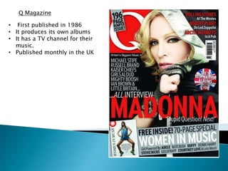
- 1. Q Magazine • First published in 1986 • It produces its own albums • It has a TV channel for their music. • Published monthly in the UK
- 2. Masthead The “Q” is the left hand corner so it can be seen when stacked with others in a shop. The bold white on the bright red really shows up against the black background. This could be to represent the lust and romance about the celebrities in the magazine. The Q is the logo for the magazine and is recognised by its audience
- 3. Main Image Analysis The main image is trying to appeal to fans of “Madonna” as she is the central image. Her clothing blends in with the background colour which connotes how Madonna fits in to the music industry as a whole. The mid-shot shows her dominance over the music industry. The main image is also overlapping the masthead which suggests her power and authority over the magazine
- 4. Anchorage Text Analysis The artist’s name “Madonna” is in large red typography reflecting her superiority of the magazine. Red also connotes danger which suggests she’s a bold and durable character. The quote underneath “Stupid Question! Next!” also encourages people to buy it as it creates an enigma.
- 5. Skyline/Strapline Analysis Unusually the strapline is placed over the masthead rather than at the top of the magazine, maybe to suggest a special edition that is slightly different from previous issues. “196” is in the largest font to suggest value for money. The exclamation mark at the end also highlights the disbelief of the offer, encouraging people to buy it.
- 6. Layout The layout has no sell line, this may be because the main image is Madonna who is major pop star. The magazine doesn’t feel that they have to include a skyline as the Main focal image draws you in. The general layout is fairly basic, and sticks to the regulations of the “Q” magazine.
- 7. Colour Scheme The grey banner at the bottom advertise advertises another story. It completely disobeys the colour scheme of the cover, red, white and black. However the banner and stands out to the reader with its own colour and style of writing, but does not take over the main story/ idol. Notice the different colours in the text. Words in the same sentence are different colours, styles and have different boldness. Magazine companies often use this to identify the more important parts to a slogan or sentence.
- 8. Sell lines The sell lines make people want to read inside the magazine by showing small snips of stories that will entice people. “Rolling stones” will catch the secondary audience of the magazine as people who like these bands will want to read it.
- 9. Covermount The offer at the bottom is for a woman’s magazine, this freebie appeals to the target audience of the magazine, and offers extra entertainment. We can tell that the magazine is aimed at women because of the feminine dominance over the magazine. By using Madonna and a booklet of female musicians it really overpowers the magazine. In saying that though, men might find the women attractive in the magazine by the use of the male gaze.